Got a tip for us?
Let us know
Become a MacRumors Supporter for $50/year with no ads, ability to filter front page stories, and private forums.
From the Forums: Apple Watch Size Comparison
- Thread starter MacRumors
- Start date
- Sort by reaction score
You are using an out of date browser. It may not display this or other websites correctly.
You should upgrade or use an alternative browser.
You should upgrade or use an alternative browser.
After my experience with the iPhone 6 plus, I am now of the opinion that regarding ANYTHING with a screen you should buy the biggest one available.
I am absolutely DELIGHTED with my 6 plus after long believing that it was too big and the iPhone 5S size was perfect. But I tried the 6 plus and it is FABULOUS.
I'm getting a bigger size Watch. I wouldn't miss owning the first generation version for the world! That's where all the fun is!
I am absolutely DELIGHTED with my 6 plus after long believing that it was too big and the iPhone 5S size was perfect. But I tried the 6 plus and it is FABULOUS.
I'm getting a bigger size
 Watch. I wouldn't miss owning the first generation version for the world! That's where all the fun is!
watching this "life size" prints remind me on how this watch is even uglier in real life than on screen
Lol, that's exactly what I thought, a watch that only a mother could love.
So i've printed this out twice, made sure it was printed at actual size/100% and when i overlay the printout on top of the Apple Store app size comparison tool, they're smaller.
Any thoughts? Maybe since the official measurements have been put out, these templates are useless now?
Any thoughts? Maybe since the official measurements have been put out, these templates are useless now?
I just don't see the appeal...
I would have to say it's not for you then. I am excited about it, though I don't like the price of the SS link band.
I would have to say it's not for you then. I am excited about it, though I don't like the price of the SS link band.
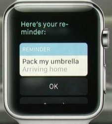
Some of the UI, specifically app stuff, looked very clunky. The home screen and watch faces are OK, but stuff like this...
http://photos.reportinglive.com/p/2015-03-09/f1425924707.jpg
"Here is your re-
minder:"
....looks like crap, tbh.
I suggest you don't buy one then.
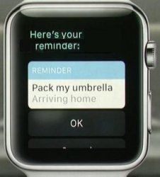
Some of the UI, specifically app stuff, looked very clunky. The home screen and watch faces are OK, but stuff like this...
http://photos.reportinglive.com/p/2015-03-09/f1425924707.jpg
"Here is your re-
minder:"
....looks like crap, tbh.
Register on MacRumors! This sidebar will go away, and you'll see fewer ads.


