You can. But you have to go into the settings app under wallpaper.Well that’s not good. Like you, those photos are different for me. I’m installing. Will post if I find a way.
Got a tip for us?
Let us know
Become a MacRumors Supporter for $50/year with no ads, ability to filter front page stories, and private forums.
Hands-On With the New iOS 16 Lock Screen
- Thread starter MacRumors
- Start date
- Sort by reaction score
You are using an out of date browser. It may not display this or other websites correctly.
You should upgrade or use an alternative browser.
You should upgrade or use an alternative browser.

trifid
macrumors 68020
What's up with those font choices and colors? Looks ugly AF.
turbineseaplane
macrumors Penryn
What's up with those font choices and colors? Looks ugly AF.
When I saw those fonts I was immediately hoping you could customize that further.
Those were the most vanilla milk toast boring choices -- killed the whole concept for me there
biracialfamily91
macrumors 6502
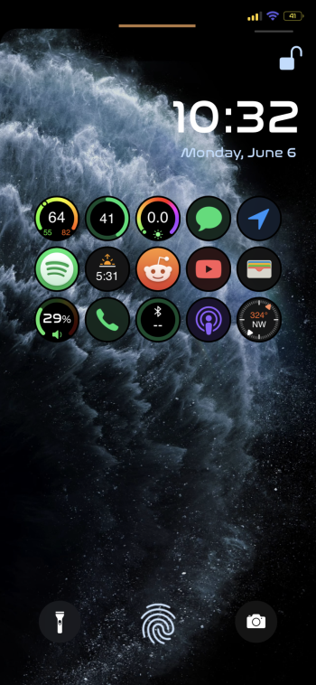
You can't get rid of ii. Not yet anyways.I cant get rid of the flashlight??
turbineseaplane
macrumors Penryn
I cant get rid of the flashlight??
I wish they'd allow mapping the flashlight to a hardware button combo press
For years I've had jailbreak tweaks that activate the flashlight when both volume buttons are pressed (many ways to do it -- up to user)
It's...magical..
anthogag
macrumors 68030
I like the new lock screen. You can still swipe down and get Search and Siri app suggestions, right......
Why is the camera button at the lower right? Swiping left shows the camera. You can also double-tap (Settings-> Accessibility) to take a picture.
Why is the camera button at the lower right? Swiping left shows the camera. You can also double-tap (Settings-> Accessibility) to take a picture.
FelixDerKater
macrumors 68040
nvmls
Suspended
It's unbelievable Apple's priorities, no wonder their software has taken a nose dive.
You can't scrub an audio message timeline but you can edit a sent msg, an OS release for that, brilliant. Reality distortion field intact.
They literally haven't even touched Music, FaceTime is still an abomination to make calls with, Safari more of the same, 1 year to "improve" tab groups? Apparently web devs were complaining of updates pace for the sake of it 😅
Steve jobs iphone
macrumors newbie
visualseed
macrumors 65816
it would be nice if there was a way to use the original font for the lock screen clock so it didn't seem so foreign. None of the six font choices work for me and every time I look at my phone I feel like I have picked up some strange android phone.
visualseed
macrumors 65816
I agree about the fonts. You can have different lock screen and wallpaper settings but you need to choose them under wallpaper in the settings app.Horrible font choices, no option for resize these fonts, only one picture for both lock and home screen, limited count of widgets and no choice of placement for any of the items (date/time/sunset/sunrise, clock, widgets) other than wherever Apple felt like should be. For a oh-so-much-praised-revamped-redesigned-new Lock Screen, as is, looks like garbage and a move backwards. Great ideas, sub-par implementation.
Razorpit
Suspended
With FaceID why not?All I wanted was slide to unlock.
turbineseaplane
macrumors Penryn
Can the clock font be changed?
You know about that trick, right?
You can add the words Apple doesn't like auto-correcting each as contacts and then suddenly they don't auto "un-correct" the words whenever you are using them.
The Game 161
macrumors Nehalem
In fairness even android don’t have this level of customisation ok Lock Screen certainly for widgetsSo excited for the Android lock screen. This entire update is android copy and paste for the most part but Im happy about it. All things I have missed the past few years after going back to iPhone. Granted, Android is still more flexible and offers far more options but i’ll take it.
MetaBunny
macrumors newbie
While I like Apple's clean aesthetic, more choice generally is a good thing for users.You must have never seen MySpace.
The thumbnail for the video (and the low contrast between the text and background) is a perfect example of what is wrong with this approach.
I'll admit I cringe when I see screenshots of people's Android phones with all the text set to some awful handwriting font. But you should have seen my Windows 98 machine when I was in high school. It was insane: loud colours, weird icons, animated cursors, crazy app skins. I loved it. I could spend hours on DeviantArt looking at peoples' cool mods. The massive popularity of widgets and customization apps like Widgetsmith tells you how many iPhone users love this stuff too.
Why shouldn't we do whatever makes our phones spark joy for us, even if that means, say, using a wallpaper that's not optimal for readability of the text over it? (How many people use their favourite pictures of their kids or pets regardless of how much background clutter they have in the clock area?) And unlike MySpace pages, no one has to look at it but ourselves.
TheMountainLife
macrumors 6502
Am I the only one that still manages to accidently activate the flashlight from the lock screen but can never turn on the camera?
A welcome change, but it was touted like a major feature.... I mean really?
Lounge vibes 05
macrumors 603
Maybe I would agree with you if this was years ago when most people didn’t understand how to use a smart phone or were just learning, but we’re really not in that phase anymore.Call me conservative but I preferred the time when good designers just came up with the best idea. I don’t believe this level of aesthetic customisation is necessary at all for the average user.
Functionally it would make sense (being able to change the flashlight button etc.). But why should users be able to pick fonts? Couldn’t Apple just choose the best one?
When the iPhone and iPad were getting popular, Apple used real life objects to emulate different features, to make the operating system more easy for people less knowledgeable about computers and technology to understand.
As the world got used to multitouch, all of those real life ties could be removed.
In doing that though, that may the operating system have a lot less personality of its own.
But now that everyone has a smart phone and smart phones are so personal, it makes sense that Apple allows you to make your phone yours, while still staying in their perimeters.
who cares if it’s not aesthetically pleasing, The only person who will see it is the person who the phone belongs to.
people understand how to use a smart phone, now it’s time for them to make their smart phone truly theirs.
Oh and of course if you don’t like it, you can stick with the default and just never touch any of these settings.
BvizioN
macrumors 603
More than likely. They are paving the way for always ON.Probably, iPhone 14.
Apple Mac Daz
macrumors 68040
Bit rubbish you can only add 1 row so limited to about 3 widgets