Got a tip for us?
Let us know
Become a MacRumors Supporter for $50/year with no ads, ability to filter front page stories, and private forums.
Have you gotten used to the multi colored status bar?
- Thread starter KittyKatta
- Start date
- Sort by reaction score
You are using an out of date browser. It may not display this or other websites correctly.
You should upgrade or use an alternative browser.
You should upgrade or use an alternative browser.
I absolutely hate it. It is simply unprofessional, it makes it all look washed out. The status bar is one thing that should be very distinguishable from the rest of the screen, and they ruined that. It is awful. The lack of color in the Music app is comparably idiotic, and terrible.
I won't upgrade to iOS 6 until Google releases a Google Maps app, but when I borrow my girlfriend's iPhone 5 I tend to fixate on the status bar and don't like it. I like the color of the icons in the standard status bar in iOS 5 and earlier, where the cell signal, wifi signal, Location Services icon, battery icon, et cetera are all in color as opposed to in grayscale.
A consistent user interface, something apple is known for...
What Apple are you talking about ? Ever since they shipped OS X, they haven't had a single release with a consistent UI... Aqua to brushed metal to some kind of in-between theme to their letter/wooden/metallic/book like interfaces...
I loved it from the start. Some colors (red, dark green) look kinda weird though. Still like em overall, likes others have mentioned- makes the screen look taller. I honestly think its less distracting then having a random black above a blue bar for example. For me at least.
I don't mind the colored status bar as much as I hate the ugly blue used in safari, the setting app, and other places. They need to redesign other aspects of the os like they did with the music app.
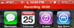
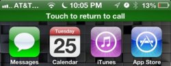
I'm surprised that so many people prefer the colored bar over the (IMO) more elegant (and easier to read) black, but I still can't figure out what the colors mean. The red and green status bars indicated an action being performed but I don't see a consistency with the new colors. So do the different shades mean something? Are app devs in control of the color?
Attachments

Last edited:
At first I'd noticed it every time I'd open an app, and especially when the colour wouldn't match. Like Safari, it stays black. But other apps match the colour most of the time.
But now I barely notice it.
But now I barely notice it.
The red and green status bars indicated an action being performed but I don't see a consistency with the new colors. So do the different shades mean something? Are app devs in control of the color?
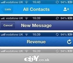
The bar doesn't have a colour. It's transparent.
It is simply the same colour as the app you are running.
Cheers
")
The coloured status bar really confused me to begin with as well.
I always thought Green= in a call, Blue= Tethering, etc.
Now there are colours all over the place and I've looked for something it's 'notifying' me about when it's really just being match-matchy.
Irritating.
I always thought Green= in a call, Blue= Tethering, etc.
Now there are colours all over the place and I've looked for something it's 'notifying' me about when it's really just being match-matchy.
Irritating.
The bar doesn't have a colour. It's transparent.
It is simply the same colour as the app you are running.
Cheers
Sometimes yes... sometimes no. It's up to the developer and whatever mood they happen to be in.
Sadly, it's (yet another) thing in iOS6 that shows how all over the place Apple is and how they can't decide upon or finish anything.
A lot of people are claiming to not even notice, defending that these jarring colors are an improvement over standard monochrome banners or claiming that noticing this stuff is "nitpicking". But it will be interesting to watch these same people flip flop now that Forstall is out and the Jony Ive, The King of Nitpicking, is in.Sadly, it's (yet another) thing in iOS6 that shows how all over the place Apple is and how they can't decide upon or finish anything.
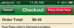
I think its a safe bet to say that the guy who created some of the most gorgeous and iconic product designs ever would say "Text should blend into its background so we'll be using a lot more high contrast colors like white text on light gray background" or "It's beautiful that the green Papa Johns app banner look exactly like the green banner that indicates you're on a bloody phone call".
My bet is that these random app banners will be the first thing to go leaving colors to be used more as alerts for phone calls or functions.
Attachments
Last edited:
Stupid idea. I'd love to know who came up with this....and who signed off on it. Oh and why make the copy/print/bookmark icons light and dark silver when the mail/message/Facebook/Twitter icons are colored? There's nothing cohesive about it at all.
If you go into Messages and have an iMessage chat with someone, there is a disgusting amount of blue tinge on the screen (status bar, message bubbles, header, send button, background). I don't like the status bar colors anymore, they make the nav. bar chunky and distracting.
Oh yeah, I like it better than having the black bar on top for any and every application.
However the one quibble I have, but it doesn't REALLY bother me, is that it is inconsistent with the Mac OS X top bar--which is ALWAYS silver/gray regardless of anything else.
I dunno if it's a fair (apples to apples, so to speak) comparison, tho. Thoughts?
However the one quibble I have, but it doesn't REALLY bother me, is that it is inconsistent with the Mac OS X top bar--which is ALWAYS silver/gray regardless of anything else.
I dunno if it's a fair (apples to apples, so to speak) comparison, tho. Thoughts?
Register on MacRumors! This sidebar will go away, and you'll see fewer ads.