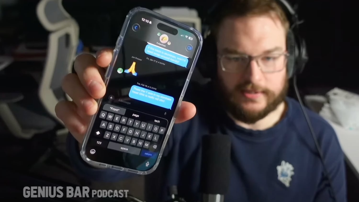
Leaker Jon Prosser today shared a mockup of what he says the Messages app will look like in iOS 19, demoing an interface with rounded, translucent bubble-shaped navigation buttons at the top and softer, rounder corners for the keyboard and word suggestions.

The return button, a button for going back to the Messages list, and the FaceTime button have a deeper blue shade that has a bit of a glow about it, but Prosser's mockup does not show fundamental changes to the layout. The iMessage demonstration is at 42:50 in the video below, and it lasts for about a minute.
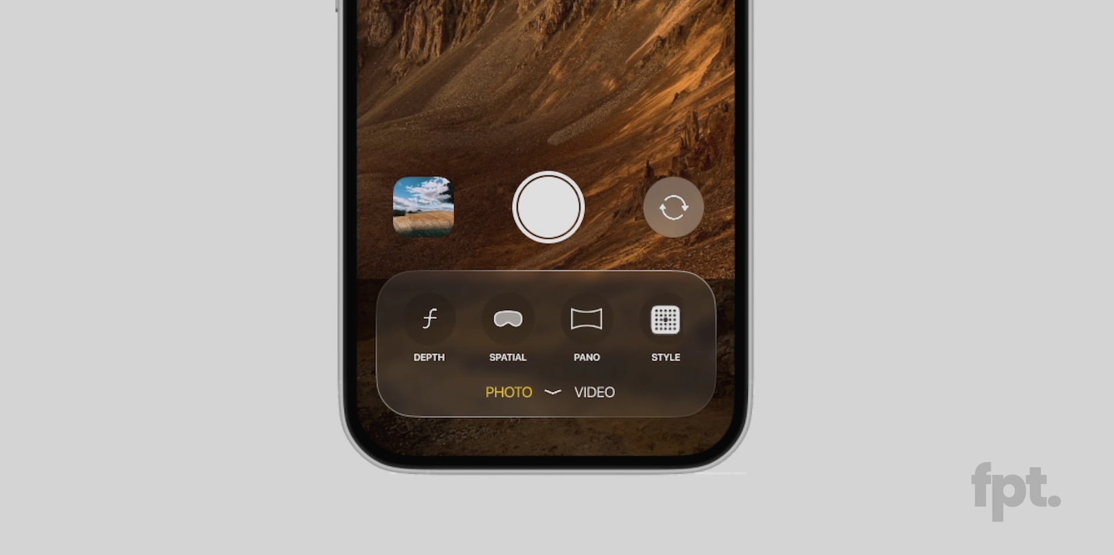
Prosser previously showed off a mockup of what the iOS 19 Camera app supposedly looks like, with the updated design featuring visionOS-like translucency for the tool bar that gives more visibility to the underlying photo.
When sharing the Camera app mockup, Prosser said that he based it on the actual iOS 19 Camera app that he obtained from unnamed sources. He recreated the design rather than showing actual screenshots, and it appears that's what's been done here as well. Prosser noted that the Messages app and the Home Screen have not seen significant redesigns in iOS 19, despite rumors that we're going to see the biggest redesign since iOS 7.

Prosser says that he has an iOS 19 video coming tomorrow, where he will share additional info on iOS 19's design.
iOS 19, iPadOS 19, and macOS Sequoia 16 are rumored to be getting a complete design overhaul, with Apple refreshing menus, system buttons, apps, icons, and more. Apple plans to focus on translucency and rounded buttons, design elements that are taken from visionOS. According to Bloomberg's Mark Gurman, the update will "fundamentally change" the look of each operating system while also introducing a more consistent cross-platform experience.
Article Link: Here's What Apple's iOS 19 Messages App Might Look Like


