Maybe the technology is there come June for a numbers row on the biggest screen sizes?I wish they could redesign the keyboard, I always hit the period button on safari and the keys are to close, the keyboard needs updating
Got a tip for us?
Let us know
Become a MacRumors Supporter for $50/year with no ads, ability to filter front page stories, and private forums.
Here's What Apple's iOS 19 Messages App Might Look Like
- Thread starter MacRumors
- Start date
- Sort by reaction score
You are using an out of date browser. It may not display this or other websites correctly.
You should upgrade or use an alternative browser.
You should upgrade or use an alternative browser.
I couldn't agree more with thisA number row would be very welcome too.
I mean, the iPhone's screen whether you have the regular size or the Plus or Max size, is large enough to where the OS could easily incorporate an extra row for numbers
Having to tap another button just to change it to the numbers and symbols keys is super annoying and it's that right there that has made me do dictation for messages all the more now even when I'm not in my car with CarPlay
Right???Thank god this is a Prosser "leak". At least I know with upmost confidence this won't be what iOS 19 looks like because wow would that be a disappointing redesign.
Yeah, if anything, the one that is pretty much spot on when it comes to anything Apple is that of Mark Gurman
I trust him before anyone else
Jon Prosser
Please stop giving this guy attention…
Exactly. Can’t believe MacRumors posted this garbage lmaois it too late to get on the Prosser hate train? stop giving this guy a platform.
OK? I guess?
Honestly, I would settle with staying with iOS 18 for another year. Spend the next year making iOS 18 perfect and rolling out a useful Apple Intelligence. Then do iOS 19 in Fall 2026.
Would anyone care if iOS looked the same until September 2026 but continually got less buggy and more stable with more usable AI features? I can't imagine folks would be upset...
Full redesign for messages? What are you, f*cking high? There's nothing new except a bubble around the keyboard. That looks stupid af
Number row on top is the ONLY thing I've wanted for almost 2 decades now. Is it that hard for them? At least give the option!!!Ah, good. It’s Prosser so this is what it *won’t* look like.
But seriously - that keyboard looks like android gingerbread when you zoom in on it. I get it’s a mockup, but that just looks bad.
Side note: fingers crossed we can get a number row on top lol
Would be great to add my own alert sounds also, across the boardone change I really hope we can get are two different toggles and sliders for sounds.
I would love to have my phone ringtone turned down but my alert/text/mail sound loud.
There are so many decent alert sounds but I can’t use them because they aren’t loud and if I turn up the volume the ring tone sound blasts out like it could shatter the sound barrier.
Or a toggle that lets me turn off the ringer completely but allow me to have alert sounds on.
Prosser noted that the Messages app and the Home Screen have not seen significant redesigns in iOS 19, despite rumors that we're going to see the biggest redesign since iOS 7.
Bro either Prosser got an early alpha or Mark Gurman straight up lied by saying this would be a big redesign
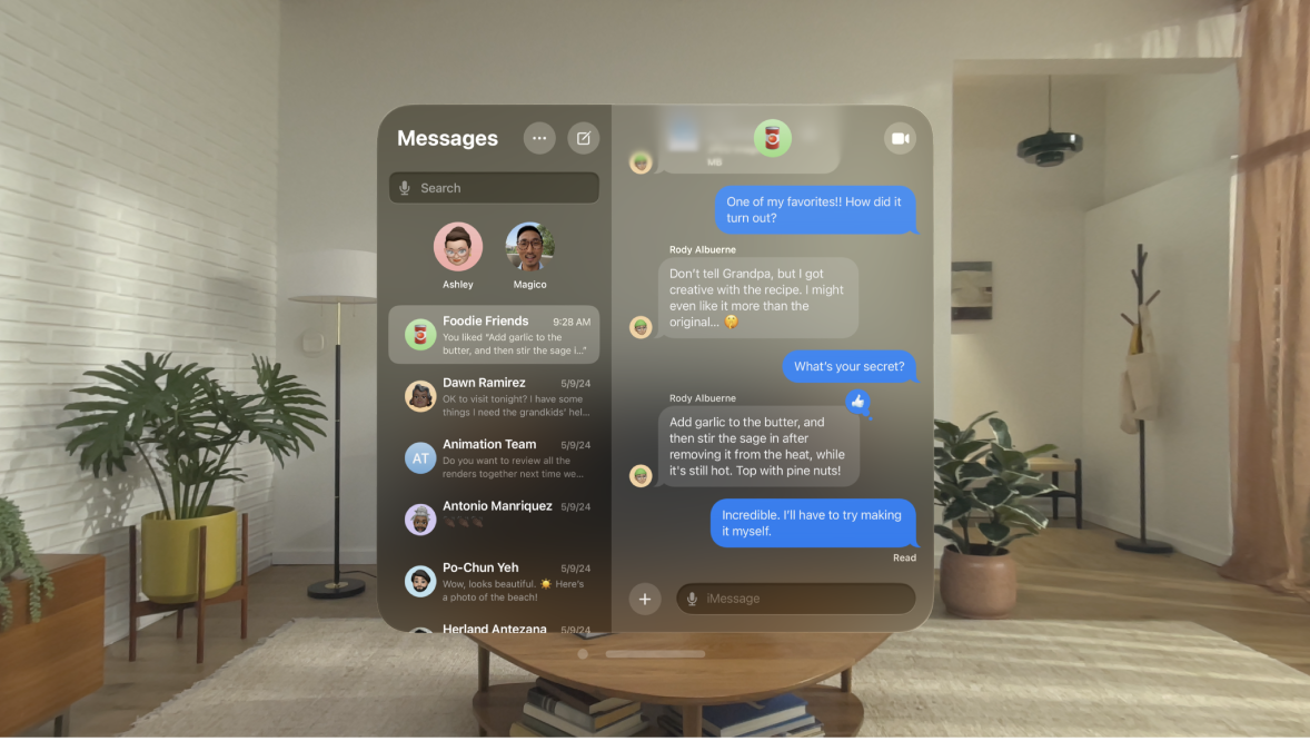
I’m confused about how this mockup can be said to be based on visionOS. This is messages on visionOS:


im thinking Jon is right, and apple has done a minor change, and mark is wrong, everything has been disappointed with appleBro either Prosser got an early alpha or Mark Gurman straight up lied by saying this would be a big redesign
So since green text bubble are so universally berated, do you think they'll finally change the message app icon to blue instead of green?
Register on MacRumors! This sidebar will go away, and you'll see fewer ads.

