Become a MacRumors Supporter for $50/year with no ads, ability to filter front page stories, and private forums.

usagora

macrumors 601
Nov 17, 2017
4,869
4,451
Not at all.
No nostalgia - I finish the day at work and my eyes are dead.
I don’t hate the new UI - I find it extremely straining on the eyes.
I miss those less saturated UIs.

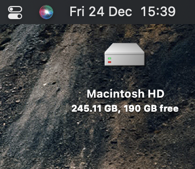
You made no mention of eye strain in your original comment, and I've never heard of eye strain from a certain color scheme. I sure don't experience that at all. Usually the culprit there is a combination of your distance from the screen and brightness. You might also try different accessibility settings such as making your display grayscale (there are other options, of course):

Screen Shot 2021-12-24 at 10.19.15 AM.png


But again, I've never heard of a particular color scheme causing eye strain in and of itself. Maybe try simply turning down your display brightness.
 

Brandon42

macrumors regular
Jul 24, 2019
186
565
Early Mac OS X was definitely less stable than OS 9 but the preemptive multitasking in OS X made a huge difference. Gone were the days of a program crashing and causing you to have to reboot. I remember having MacsBug debugger installed which could sometimes save you from a reboot by “force quitting” a frozen program.
 

Amazing Iceman

macrumors 603
Nov 8, 2008
5,316
4,072
Florida, U.S.A.
Oh I remember those days. But as i recall most were using dialup modems in those days so video conferencing was only available in schools and corporations.
There was videoconferencing available back then, over dial-up, but it was either black & white or horrible quality and tiny resolution.
 

Kissmo1980

macrumors 6502
Feb 16, 2021
441
1,220
You made no mention of eye strain in your original comment, and I've never heard of eye strain from a certain color scheme. I sure don't experience that at all. Usually the culprit there is a combination of your distance from the screen and brightness. You might also try different accessibility settings such as making your display grayscale (there are other options, of course):

View attachment 1933390

But again, I've never heard of a particular color scheme causing eye strain in and of itself. Maybe try simply turning down your display brightness.
Been using Macs since 2008.
I turned off transparency and put a neutral wallpaper but it’s still too much.
I had the chance to play with SL in a VM and I realized how much clearer text and some other elements are.
Anyway, maybe I am getting old - I just with Apple will allow to some extent - which is within their view - some theming
 
  • Like
Reactions: HappyIntro

bradman83

macrumors 6502a
Oct 29, 2020
916
2,258
Buffalo, NY
Mac OS 9 and all the ones before it crashed way too often. Daily crashes was the norm in my experience. Also OS 8 was the real star. OS 9 was just a slight (and bloated) refinement of OS 8.
Mac OS 8.6 was arguably the best of the later Classic releases. All the refinements brought in by 8.5 (32-bit icons, more PowerPC native code, font smoothing, HFS+, etc.). I remember how cool and cutting edge 32-bit icons with transparencies were at the time. It was just a few years prior that most Mac system icons were only 32 colors.
 
  • Like
Reactions: StoneJack

pacmania1982

macrumors 65816
Nov 19, 2006
1,168
520
Birmingham, UK
its worth noting that os9 and os8 only utilized 1 processor even though Dual Processor Machines were sold

It was not until the first version of OSX that the second processor was utilized.
This isn't technically true. There was a multiprocessor extension that could load and run, and applications that had been designed to take advantage of the dual CPUs would use both if this extension was enabled. It would have been pointless to sell something like the 9600/200MP if you couldn't use both CPUs.
 

pacmania1982

macrumors 65816
Nov 19, 2006
1,168
520
Birmingham, UK
Mac OS 8.6 was arguably the best of the later Classic releases. All the refinements brought in by 8.5 (32-bit icons, more PowerPC native code, font smoothing, HFS+, etc.). I remember how cool and cutting edge 32-bit icons with transparencies were at the time. It was just a few years prior that most Mac system icons were only 32 colors.
HFS+ was introduced in Mac OS 8.1. On a 68K Mac, you can't boot from HFS+ but you can on a PPC machine.
 

StoneJack

macrumors 68020
Dec 19, 2009
2,435
1,528
I had Blue and White G3 350 and installed an ATI Rage graphic card on that machine, I remember playing countless hours on Unreal Tournament, 2 Faces map :) my favorite map in any game, period :) and the computer was so great from engineering point of view - you can expand it by installing GPU, IDE cards, RAM and hard drives.
 

usagora

macrumors 601
Nov 17, 2017
4,869
4,451
Been using Macs since 2008.
I turned off transparency and put a neutral wallpaper but it’s still too much.
I had the chance to play with SL in a VM and I realized how much clearer text and some other elements are.
Anyway, maybe I am getting old - I just with Apple will allow to some extent - which is within their view - some theming

And I since 1989. Sounds like you're experiencing some unusual (statistically speaking) issue sort of like how some people are overly-sensitive to OLED displays (but most people aren't). I've got no argument against giving users more choices in terms of theme, though.
 

KALLT

macrumors 603
Sep 23, 2008
5,361
3,378
Been using Macs since 2008.
I turned off transparency and put a neutral wallpaper but it’s still too much.
I had the chance to play with SL in a VM and I realized how much clearer text and some other elements are.
Anyway, maybe I am getting old - I just with Apple will allow to some extent - which is within their view - some theming
The UI was easier to work with. Snow Leopard had thicker shadows and borders as well as much more contrast. Hence Apple started using more similar grey tones and less colour and since Yosemite also reduced contrast with this vibrancy. Big Sur removed the shadows and borders in many places too.

Aesthetically, Snow Leopard looks undeniably dated now, but that does not matter to everyone. If I had to use Big Sur in “bright mode” all day, I would have switched to another OS by now.
 

opeter

macrumors 68030
Aug 5, 2007
2,680
1,602
Slovenia
This isn't technically true. There was a multiprocessor extension that could load and run, and applications that had been designed to take advantage of the dual CPUs would use both if this extension was enabled. It would have been pointless to sell something like the 9600/200MP if you couldn't use both CPUs.
You're right, one of the first multiprocessor computer from Apple was the Power Mac 9500 MP.

Some apps could utilize both CPUs, like some effects in Photoshop, Bryce 3D, etc.
The best thing about MacOS 9 was the support of more than 1 GB of RAM memory.
 
  • Like
Reactions: Captain Trips

flashy-cat

macrumors regular
Apr 8, 2007
134
124
UK
Nothing beats the snappy response times of the os9 desktop!! I TOTAL JOY to use .
Spent many late nights on Wordperfect and MS Office typing up papers for school. Lots of Audio recording and editing too

I Got more stuff done and accomplished on OS9 than Sluggish OSX any day.

The whole OS fit on just 1 CD. 650 MB vs 12.5 GB for BLOATED and BUGGY Monterey and BIG TURD SIR..

I'll never get rid of a working OS9 machine and all my PRO software.

It may take longer to process audio and video back then But It was reliable and a real Work Horse.

Only the dreaded BOMB and FREEZE and restart happened once in a while.


Stopped watching after 52 seconds, that bloke is fooking irritating!
 

sudo-sandwich

Suspended
Aug 5, 2021
671
558
UI's now are overly cluttered or simplified and loose the intent of the application and the purpose. these familiar applications and interfaces made it apparent what it was and did not try to be anything else...I think we need to revisit these types of UI designs in macOS, iOS, etc...its completely cluttered and unimaginative.
I don't see what's wrong with modern Mac UIs. Everything else seems like the right balance between simplified and cluttered... except for iTunes aka Music, which hides things in weird places and also keeps changing for no reason.

Web interfaces are a different story. Most of them waste 80% of the page on margins and other uselessness. MacRumors did it right for once.
 
  • Like
Reactions: jackoverfull

FocusAndEarnIt

macrumors 601
May 29, 2005
4,624
1,063
I love this so much. I have great nostalgia for Mac OS 9. Crazy to think it was only in production from '99 - '01. Albeit, Mac OS 8 wasn't that radically different in overall feel from OS 9, and that was released in 1997.
 
  • Like
Reactions: Madd the Sane

sudo-sandwich

Suspended
Aug 5, 2021
671
558
I miss older computing a times. Just like older gaming, it was so much simpler, more pleasant to use.

I don't miss the old slow hardware.
Games were nicer before they presumed that you have entire days to spend on them. Even consoles went from "pop in the cartridge or disc, plug in controllers, play" to a much longer series of steps, usually including signing into something, updating software, and fighting with Bluetooth controller pairing.
 
Last edited:

Mousse

macrumors 68040
Apr 7, 2008
3,497
6,720
Flea Bottom, King's Landing
I don't miss the OS9 era at all. Yeah, the UI is clean--which I love--but OS9 was a haven for viruses, worms and trojans.? I can run an antivirus program which removes the virus and the next day it's back.

Gimme OSX with the Spartan UI of Finder 6 (the B&W UI).
 

Seanm87

macrumors 68020
Oct 10, 2014
2,125
4,159
Cool to see but looks awful by todays standards. Knew people would on here would claim its better, damn you all have bad taste.
 
  • Like
Reactions: citysnaps
Register on MacRumors! This sidebar will go away, and you'll see fewer ads.