People have been complaining for years that Apple is too much focused on the looks rather than usability, now people are complaining that Apple gives us a simple readable number icon rather than making us read a number cut in 2 different colors just because "it looks cooler".
Got a tip for us?
Let us know
Become a MacRumors Supporter for $50/year with no ads, ability to filter front page stories, and private forums.
Here's Why the iPhone Battery Status Icon in iOS 16 Is So Controversial
- Thread starter MacRumors
- Start date
- Sort by reaction score
You are using an out of date browser. It may not display this or other websites correctly.
You should upgrade or use an alternative browser.
You should upgrade or use an alternative browser.

iLoveDeveloping
Suspended
What an absurd thing to say about apple. Do you think Steve Jobs didn’t care about every tiny detail? Do you think in making a decision he said “oh grow up?” Like it doesn’t matter. No he didn’t. You have the phone you have and the eco system you have because of people exactly doing this thing. Obsessed over tiny things. A lot of people that like apple like them because of their insane attention to detail and making things perfect. Sharing your opinion on a tiny detail that’s not correct is part of the apple culture, it’s in apples blood. Maybe you just came from android and don’t care very much, who knows, but a lot of us.. REALLY care about a battery indicator. Sorry to burst your bubble loloh grow up, people.
MrRom92
macrumors 68000
I’m happy the percentage indicator is back in any capacity (seriously, it’s been 5 years and I missed it the moment it was gone!!) but yeah this design immediately struck me as bad.
I vaguely recall having a jailbreak tweak a loooong time ago that put the number inside the battery but looked more similar to examples B or C mentioned in the tweet above. Those examples were perfectly visible and would have been much more preferred!
Maybe with the iPhone 14 there will be enough room to put the number and battery icon side-by-side. The cynic in me might say that this is one way Apple is putting the “better” battery indicator behind a paywall. It wouldn’t be the first time they’ve locked a simple new software feature behind new hardware.
If I wanted to go really deep down the conspiracy rabbithole, I’d even go as far as to say that apple would do this to make something that visually distinguishes screenshots as having been taken on a new “notchless” iPhone rather than an old/undesirable notched iPhone, as some sort of subtle status flex. The same way screenshots taken on notched iPhones were immediately distinguishable from screenshots taken on old/undesirable iPhones with a homebutton.
darngooddesign
macrumors Core
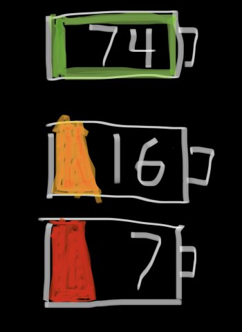
That's not better.Another suggestion
Just leave the white ouline of the battery icon with white numbers inside. No background until the red 20% one. That way the full background won’t trick you to thinks it’s full at 60%

With a solid background it has decreased legibility.
With a busy background, especially one with light and dark in it, it has even worse legibility
There is literally a number telling you that it is 60%. I think as people become accustomed to it they will stop reading the solid icon as 100%.
RoboCop001
macrumors 68000
Those alternative ones make the numbers a lot harder to read, especially the ones where the numbers are outlined or masked. The text is effectively sliced up, which is just bad UI design. Slows down the comprehension of what numbers are behind displayed.
Since the numbers are so small in this case, Apple’s design is best in terms of legibility. It’s a compromise but it makes it very glanceable.
Since the numbers are so small in this case, Apple’s design is best in terms of legibility. It’s a compromise but it makes it very glanceable.
Apple Knowledge Navigator
macrumors 601
Another suggestion - charge your phone when it’s run down?
I am glad this is being discussed so widely. It's a useful feature many have missed and good design is important. I like that users are taking the time to present Apple with other options. Some of the comments here add zero value to the conversation so why bother commenting? ("grow up", "get a life" etc). Back in the day, this was also a big deal on Android. Custom ROM's were huge because of features like this, before Google added it to stock Android.
pauloregan
macrumors 6502
heystu
macrumors regular
2022: Russia's invasion of Ukraine, monkeypox outbreak, record levels of inflation, the welcomed resignation of Boris Johnson and the unwelcome assassination of former Japan PM Shinzo Abe and the sad demise of Olivia Newton John. But what 2022 will really be remembered for is the reintroduction of the battery percentage on iOS...
Rogifan
macrumors Penryn
JM
macrumors 601
Proposals:
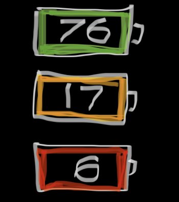
1. Have the green battery full green outline inside the white the whole time it’s green, and only show part empty for yellow and red.
2. Have colored outlines inside white (or black depending on wallpaper) for battery color with no indication of full or empty.
1. Have the green battery full green outline inside the white the whole time it’s green, and only show part empty for yellow and red.
2. Have colored outlines inside white (or black depending on wallpaper) for battery color with no indication of full or empty.
Attachments
However controversial or not… is it true that this will not be available on the mini iPhones?! If yes, that’s the real scandal here!!!
azentropy
macrumors 601
I can see why Apple went the route they did, it is easier to read.
MR and other Apple outlets make it a point to either denigrate the mini and those who appreciate its comfortable size and weight, if they aren't outright ignoring it. This particular article outright ignores it, even though the 13 mini has a higher DPI display than the 12, 12 Pro, 13, 13 Pro, and the Pro Max models.However controversial or not… is it true that this will not be available on the mini iPhones?! If yes, that’s the real scandal here!!!
I have a 12 mini and 13 mini here at my desk right now. I'll concede that the 12 mini likely doesn't have the space to reasonably display this level of detail in the compressed corner of the display. But this omission from the 13 mini was completely unnecessary, and just another twist of the knife in the wound of every mini owner who just wanted a 13 Pro in a more reasonably sized and lightweight device this entire time.
jwolf6589
macrumors 601
Excellent idea by Apple. I am tired of swiping to see the battery percentage.
In the latest iOS 16 beta, Apple has updated the status bar battery icon on iPhones with Face ID to display the exact percentage remaining rather than just a visual representation of battery level, and while the change has been largely welcomed, some users are unhappy with the way it has been implemented.
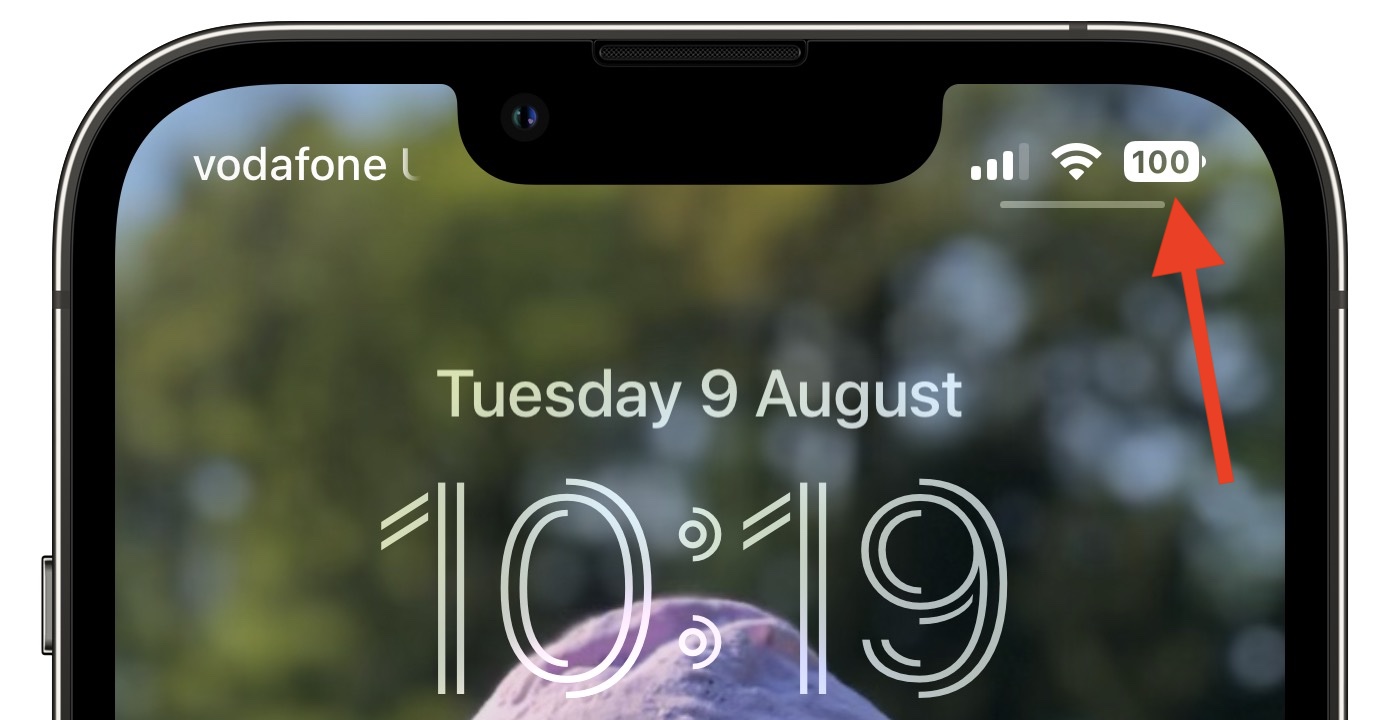
In iOS 15 and earlier, battery percent has not been present on iPhones that have Face ID because of the lack of space on either side of the notch that houses the TrueDepth camera hardware. The new design adds the specific battery level to the battery icon, providing a better idea of battery status at a glance.
In Apple's latest design, the white battery icon remains completely filled in as the battery level gradually depletes. When the semi-transparent percentage reaches 20% or lower, a fifth of the battery icon turns red and the rest of the icon becomes semi-transparent, while the percentage inverts to white.
Apple appears to have chosen this abrupt change in styling to ensure that the central percentage number remains legible as the battery level depletes – if a white bar depleted behind the number then it would be harder to make out at a glance, Apple's UI designers likely concluded.
Some users disagree with this approach, while others have suggested their own alternative designs for a battery status indicator with percentage level.
Perhaps Apple didn't anticipate that such a small design change would be so controversial, or that some users have a very clear idea of how they want their iPhone's battery level to be represented.
For some, it's simply a case of calling out what they consider to be poorly thought-out UI design. For others, it plays into low-battery anxiety, a major trigger of nomophobia. Either way, it's become a surprisingly heated topic, while it's easy to forget that the percentage display is optional (caveat: It's enforced when in Low Power Mode.)
Of course, the battery level indicator design isn't set in stone, and Apple well could change it in a later beta of iOS 16 or the final release. Whether you're testing the latest public beta or not, what do you think about the way it's been implemented? Let us know in the comments.
Article Link: Here's Why the iPhone Battery Status Icon in iOS 16 Is So Controversial

Not sure why is it so hard for Apple to design a battery icon with numbers when Android has gazillion iterations for it, along with various designs from 3rd party developers with widgets and custom lock screens. Just pick one that's decent instead of co fusing everyone. I mean if they want the number only, then just show the number without the icon. Change the number to red when low. Seems obvious.
Apple is like a child. "OH you want a battery percentage? We'll give it to you, but The battery bar will remain full for your convenience." (While snickering)
Apple is like a child. "OH you want a battery percentage? We'll give it to you, but The battery bar will remain full for your convenience." (While snickering)
JippaLippa
macrumors 68000
throwaway572937
macrumors member
Yeah for real. I just saw the Verge's headline "it's hideous" lmao, what the heck is going on with the quality of journalism these daysoh grow up, people.
I feel completely neutral about this. Happy to see an indicator, think the style is fine. Personally, in OP I think all the alternatives in that tweet are worse tbh.
tweaknmod
macrumors 6502a
I sincerely hope the MacRumors Directors and Writers stay out of their own comment sections. If not, I think they would find the reactions of their readers incredibly frustrating.But also LOL at people on MR complaining about UI designers complaining about this. It is literally their job!
You may not have an eye for details or simply don’t care but that’s probably why you are not a UX designer anyway 🙃
A few points I think MacRumors readers would do well to remember:
- People are discussing this, and it is controvercial to some people, as they referenced with the tweets.
- If you don't care about the topic, simply move on.
- The author even seemed to anticipate readers calling this topic unworthy of an article, and directly addressed why people might care about it. I'm sure many commenters haven't actually read the article.
- This is a business, and they need to produce a constant stream of content.
- They are producing content for a wide variety of readers; I guarantee there are many articles you find interesteing whereas I couldn't care less.
- Professionals work on these articles – human beings. Many comments here are just plain rude and disrespectful. The fact that is common practice online is no reason to ignore it.
Last edited:
antiprotest
macrumors 601
Good design cares about pleasure and practicality and user experience down to the most minute detail, so that the user often is not even mindful of good design, since there are no bumps or hurdles throughout.oh grow up, people.
The backlash you see is exactly the user base having grown up. People are now more aware. It is Apple design that needs to grow up, step up, and keep up.
Last edited:
q64ceo
macrumors 6502a
I can see how having the bar still full at 42% charge could lead to confusion considering that in the past the bar has receded when it's discharging.
It's a simple easy tweak to fix it and after this feedback Apple will most likely do it.
I personally like alternative-B in the mock-up.
It's a simple easy tweak to fix it and after this feedback Apple will most likely do it.
I personally like alternative-B in the mock-up.
Register on MacRumors! This sidebar will go away, and you'll see fewer ads.