Also, grey on grey even after you disable colouring. Brain dead.I am happy to come across this setting because I do not like the color changing bar. It's too distracting. The overall address bar top/nav is awful IMO on iPad. It looks cheap an unfinished with the thin outlines around the bar and elements.
Got a tip for us?
Let us know
Become a MacRumors Supporter for $50/year with no ads, ability to filter front page stories, and private forums.
How to Turn Off Tab Bar Coloring / Tinting in Safari
- Thread starter MacRumors
- Start date
- Sort by reaction score
You are using an out of date browser. It may not display this or other websites correctly.
You should upgrade or use an alternative browser.
You should upgrade or use an alternative browser.


Also, the level of stupidity in using grey on grey even after you turn off the colouring is just staggering.The logic of colouring the current tab dark is so wrong!
Look at the following. Which tab is current?
Previously, and as per all good UI design, the lighter tab looks on top and current. Not the darker one.
Yet Apple made this idiotic change with apparently no consultation or input from design professionals. Bonkers.
View attachment 1840706
By comparison look at Firefox. It is blooming clear which tab is the current one.
View attachment 1840714
How does one revert / fix this Apple Safari behaviour?
Attachments
Just updated Safari to the latest version (which reintroduces ‘separate’ tab layout) on Big Sur. Enabled Separate straightaway, because I just couldn’t get used to Compact. One thing I do find strange is that when turning on Separate, you actually loose website tinting/‘show colour in title bar’. Not that I find this a must, it’s just odd… Why can’t you have tinting/colouring when using the classic design? And in fact, I don’t see the option to just turn off title bar colouring either… Maybe it’s specific to the Monterey version of Safari? In the screenshots shown in the article, it clearly is there. In my case, though, it is conspicuous only by its absence.
Is this option gone in 12.2?
I cannot see this check box in Safari preferences anymore.
![]()
I just noticed the Apple website still has images of Safari with this feature active.


I cannot see this check box in Safari preferences anymore.

I just noticed the Apple website still has images of Safari with this feature active.
Safari
Safari is the world’s fastest browser. Enjoy more third-party extensions, powerful privacy protections and industry-leading battery life.
www.apple.com
I am writing this from Firefox. I only reluctantly upgraded to Monterey because I have to use Microsoft Outlook and it only works on Big Sur or later. Boy, am I sorry. I absolutely hate the gray on gray look of the user interface now, especially in Safari or iCal. I just can't find information quickly or easily on a lot of the apps. The thin outlines separating tabs are confusing and ugly. I have missed appointments because of poor layout design on the calendar. I am constantly finding myself in the wrong app because everything looks alike and I accidentally click the header to the wrong app. I had to buy a huge monitor to be able to see things better, but my eyes are stil killing me by the end of the work day. Because the font is so thin and fine, I have to use larger font sizes so part of the pages not visible. So I have to constantly zoom in and out so I can see if I might be missing something. Even if I liked using the changing color feature for the menu bar, I can't use it because it isn't an option in different scaled sizes of Safari. My frustration is enormous. Someone out to be fired.
In iOS 15 as well as Safari 15 for macOS Big Sur and macOS Catalina, Apple introduced some Safari interface design changes that haven't been universally welcomed. Fortunately, Apple has made some of these changes optional, such as the ability to disable tab bar coloring.
Tab bar coloring on (left) versus coloring off (right) in dark mode
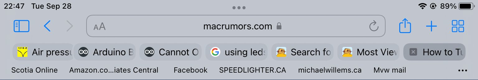
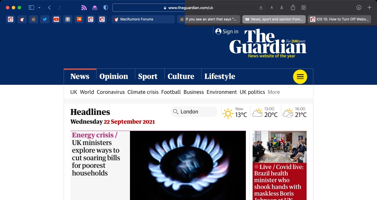
Tab bar coloring, or website tinting, happens when the color of Safari's interface changes around the tabs, bookmark, and navigation button areas to match the color of the website you're viewing.
The idea behind tinting is that it allows the browser interface to fade into the background and create a more immersive experience. However, the effect doesn't always look great, especially if you have several windows arranged on your desktop. Happily, Apple chose to include an option to turn it off.
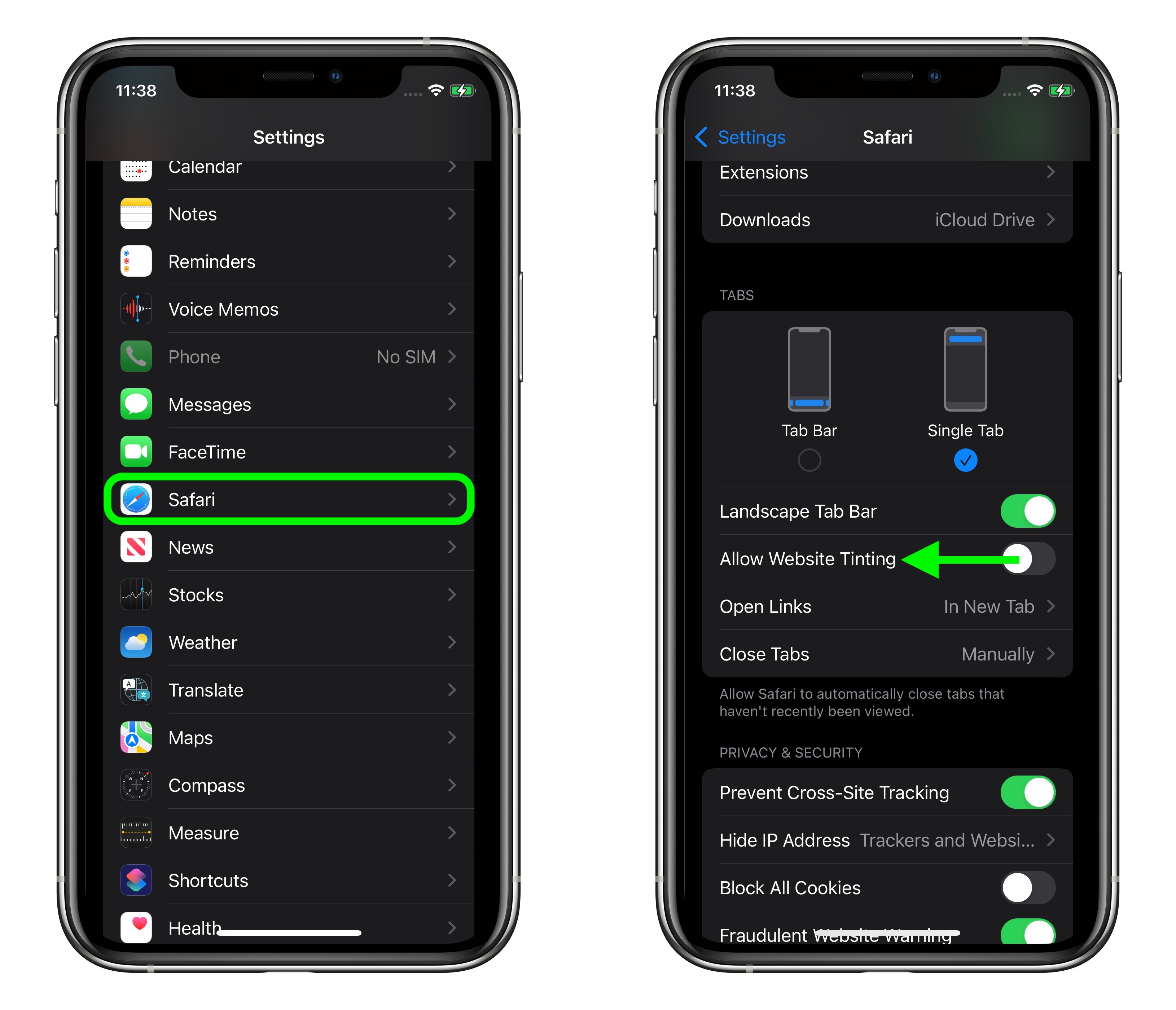
If you're using Safari in iOS 15, you can find the same option in Settings -> Safari. Under the "Tabs" section, turn off the switch next to Allow Website Tinting. On iPadOS 15, this option is called Show Color in Tab Bar, just like in Safari 15 for macOS.
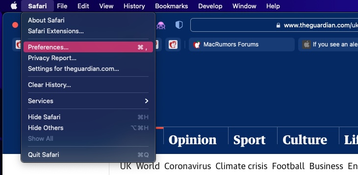
- Launch Safari, then select Safari -> Preferences... from the menu bar.
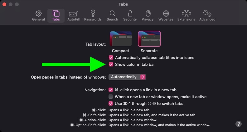
Select the Tabs panel.
Uncheck the box next to Show color in tab bar.
In previous versions of iOS, Apple included a "Show Color in Tab Bar" accessibility setting, which basically had the same effect as the new "Allow Website Tinting" toggle. The fact that Apple made the option more prominent suggests user aversion to tinting is more common than previously thought.
Article Link: How to Turn Off Tab Bar Coloring / Tinting in Safari


Register on MacRumors! This sidebar will go away, and you'll see fewer ads.