
Hulu today announced the launch of an updated interface that offers up content in a tiled view, similar to Netflix and other streaming services.
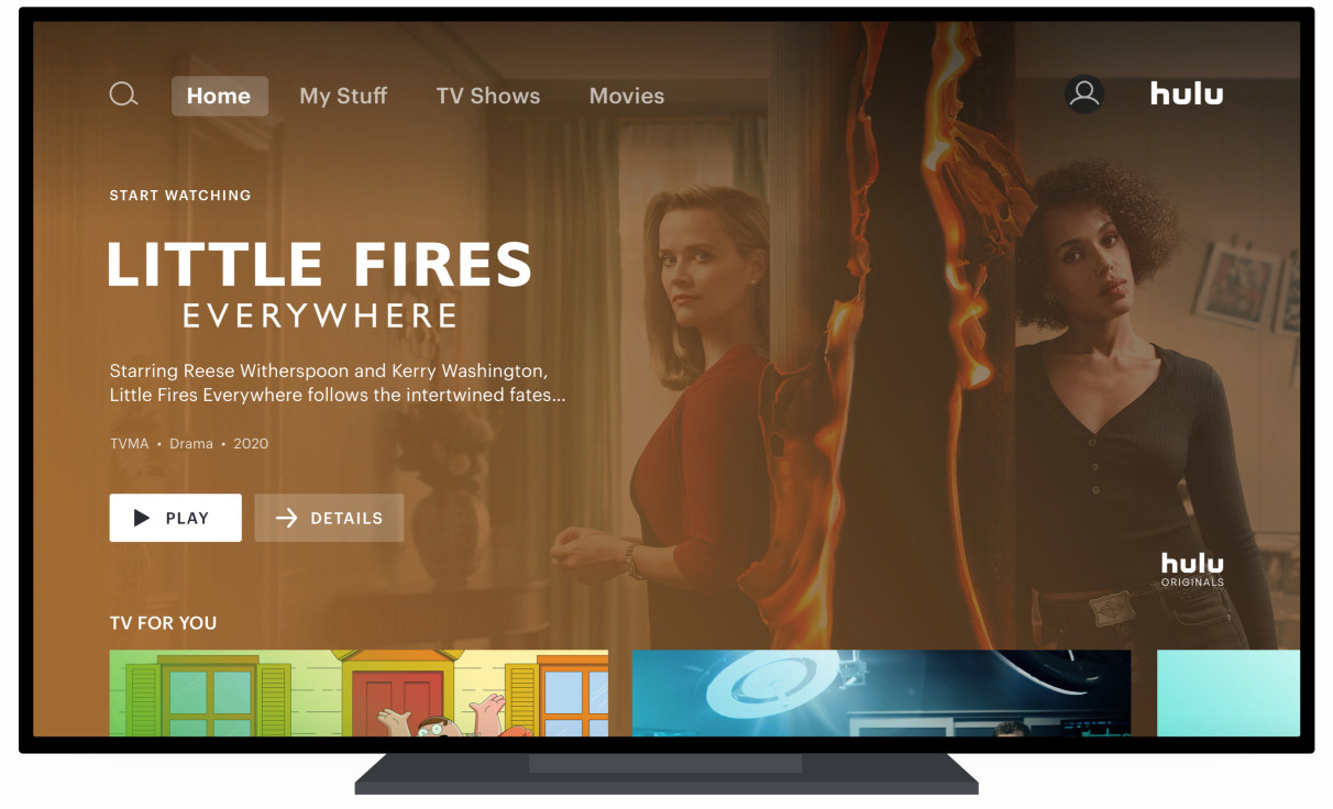
Hulu in 2017 unveiled a simplified user interface that eliminated the horizontal tiled view for TV shows and movies, instead adopting a vertically oriented design that focused on a single TV show or movie at a time with full-screen artwork.
On the Apple TV, Hulu's current design displays just three or four show listings at a time, making it difficult to browse through content to find something to watch, and it's an interface that many Hulu customers have not been satisfied with.
The updated interface that Hulu is rolling out as of today is designed to make it easier to navigate and discover new content. Navigating through collections is done vertically, but there's now an option to explore within a collection through horizontal tiles.
Hulu says that this design is something that viewers are accustomed to and that matches the navigation pattern in Disney+ and ESPN+, so it will make navigation easier for customers who have the bundle that includes all three services.
Categories of content like TV, Movies, and Sports will be moved to the master navigation menu, and Hulu says that navigating through content will take fewer clicks than before.
Hulu plans to use tile size to highlight new shows and movies, while "Keep Watching" tiles might be smaller so viewers can see more of their content at a glance and return to favorites more quickly.
There have also been some changes to improve how recommendations work, with fine tuning to make curated collections more personalized for each viewer.
Hulu's redesigned interface will come first to some viewers on Roku and Apple TV devices before rolling out more broadly over the course of the next few months.With this change, a viewer who may be a fan of medical dramas will see those titles first in a curated drama collection. In that same collection, a fan of romantic dramas may see those prioritized instead.
Article Link: Hulu Unveils Revamped Interface, Coming First to Apple TV
