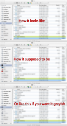
I want my color back in Finder! I seriously miss the color icons in the left pane of Finder. Monochrome does not make it more user-friendly.
Got a tip for us?
Let us know
Become a MacRumors Supporter for $50/year with no ads, ability to filter front page stories, and private forums.
I want my color back (in Finder)!
- Thread starter Bigmacduck
- Start date
- Sort by reaction score
You are using an out of date browser. It may not display this or other websites correctly.
You should upgrade or use an alternative browser.
You should upgrade or use an alternative browser.
No, however, I do find that it makes it less garish. I never thought the coloured icons played well together ... aesthetically. But to each their own, I suppose. I am sure someone will soon post instructions of how to replace the monochrome with colour versions again.
I want my color back in Finder! I seriously miss the color icons in the left pane of Finder. Monochrome does not make it more user-friendly.
I agree. A step backwards
Some people argue that it is for the designers who use OS X. Designers need monochrome tools to design with. But most design tools have options for previewing on a neutral background, so that's no good reason in itself.
Some people say (as does someone above) that colour in icons looks garish. How can a few subtle spots of colour in the icons in the Finder windows' sidebars or in the bar at the top of an application be considered garish. It's hardly Windows-like, is it?
Some say that it's functional as it helps the user to focus on the files in the right-hand side of the window. But the Snow Leopard design has a blue underlay to the icons at the left and the bar at the top is grey – so the files which are on white can still stand-out.
Some people say that it's cooler. But we have lost both colour and contrast* in the Apple desktop design and so what we have gained in cool designer-consumer values we have now lost in usability. We have been 'enjoying' this design in iTunes before OSX Lion and I for one have found it less clear to 'read' and navigate as a result. One could actually argue that this move discriminates against people with impaired vision. And as many people above 40 begin to suffer from a degradation in their near-sightedness then you could argue that this new design approach is also ageist - and that could include any of you sooner than you think. I don't think that saying it's cooler is any good reason if it makes a UI harder to use for people.
I'm surprised that Apple have gone down this route. I'm surprised that it does not contradict Apple's own HCI Guidelines and I'm surprised that disability groups have not raised the issue.
*The original Apple interface used high contrast before colour was introduced and it still looked cool. Contrast was reduced when colour was added but now colour is being removed and contrast is not being re-introduced.
Last edited:
Please revert back to Snow Leopard and provide feedback to Apple.
I'm happy to send my post to them. Where should I send it?
I thought this with iTunes then after doing the hack to get the colour icons back realised i prefer the cleaner monochrome look. Keep an eye out here http://macthemes.net/forum/ im sure someone will have a solution.
I like the mono look, less distracting and more unified.
Exactly, It is basically the same reason Apple products are white, grey and black. They are universally more appealing
My problem is that every favorite folder I have added has the same icon even if I have a custom one. See attachment.
I've filed a bug to bugreport.apple.com
I have an issue with this as well. I like the monochrome look, but I still want custom icons (I don't mind them being monochrome-d either)
Did the font in the Sidebar change size or is it just the monochrome look? The font looks larger to me. Is there anyway to make it smaller?
Did the font in the Sidebar change size or is it just the monochrome look? The font looks larger to me. Is there anyway to make it smaller?
It's hidden away in System Prefs > General.
Attachments

Did the font in the Sidebar change size or is it just the monochrome look? The font looks larger to me. Is there anyway to make it smaller?
It's there in the view options - small, medium or large.
One program I liked in Snow Leopard (don't know if it works in Lion yet) is Candybar: http://www.panic.com/candybar/
It's a shareware app that lets you change icons (including the generic system icons). There are boatloads of icons you can use. Pretty cool.
It's a shareware app that lets you change icons (including the generic system icons). There are boatloads of icons you can use. Pretty cool.
It's hidden away in System Prefs > General.
Awesome. Thank you for that tidbit. Much better now.
It gives it a much cleaner look.
Agreed. Elegant and subtle.
Leave the colour mish-mash to the other OS makers.
Please revert back to Snow Leopard and provide feedback to Apple.
Except this is not a bug. It's by design.
Agreed. Elegant and subtle.
Leave the colour mish-mash to the other OS makers.
Except this is not a bug. It's by design.
What seems even strange is Apple left the Background/Color/Picture selection. It's just grayed out. Why leave it in the menu if "it's by design"confused:
Also nothing wrong with giving people a choice. I like having a light gray background below the icons. That is just my preference.
Last edited:
Would love to have an option to put the colour back in (not just in finder)
But they removed it from iTunes and it never came back so I dont have much hope of it coming back to Lion
But they removed it from iTunes and it never came back so I dont have much hope of it coming back to Lion
I want my color back in Finder! I seriously miss the color icons in the left pane of Finder. Monochrome does not make it more user-friendly.
They just copied some linux themes.
to me the new sidebar has something about it that makes it look like an awful Windows explorer add-on for XP to make it look like OS X
It's hidden away in System Prefs > General.
Was trying to make the sidebar fonts smaller, thanks!
Please revert back to Snow Leopard and provide feedback to Apple.
Write your feedback here:
http://www.apple.com/feedback/macosx.html
The more, the merrier.
Another thing I noticed when changing the font size on the sidebar: That also changes the font size in Mail.app... so this sidebar is some sort of system wide thing. Which is wrong.
I don't object to the grey sidebar in Mail, it makes sense there, and Mail is generally way better than before.
In the Finder, it's just stupid, I can't find anything, I have to put some effort in even to find Applications, documents, etc. And it's hard to eject external disks now.
Register on MacRumors! This sidebar will go away, and you'll see fewer ads.