Become a MacRumors Supporter for $50/year with no ads, ability to filter front page stories, and private forums.

Vorkeyjones

macrumors member
Aug 20, 2016
82
341
I also miss the iOS 1-6 design.

I sometimes think about downgrading my Mac to 10.8 and my phone to iOS 6, just so I can experience the real Apple again.

Signal bars, sidebars in iTunes and Photos again... It's pretty funny watching Apple revert their UI to what it was 5 years ago. Unfortunately their pride will stop them from going all the way.
 
Last edited:

Tozovac

macrumors 68040
Jun 12, 2014
3,007
3,212
I don't think the signal bars replacing dots is slowly going back to iOS 6 style, I think it's because of the iPhone 8 and that there might be less space up there. Seems to me like iOS 7 went 180 degrees in another direction and eventually Apple will end up somewhere in the middle. I don't see faux leather and green felt coming back but thin fonts and icons are probably gone for good. More text will probably have shading around it to make it look like a button (see App Store redesign). One thing I wish is that they would replace the back button carrot "<" with an arrow. I think an arrow would look nicer.

If you're talking about this redesign as having some improvements:

https://www.macrumors.com/2017/06/08/ios-11-redesigned-app-store/

Then I'm really saddened. This looks awful, they're ruining the App Store like they ruined the Music app. I personally do not want an app to look like a magazine, or require me to constantly swipe to see things. I'd much rather prefer space be used to show a bunch of apps on the screen at one time in an organized, grid fashion. All Apple's doing is continuing to give their designers a chance to try something new, I assume to keep their jobs interesting. Apple UI sucks more and more.
 
Last edited:

itsmilo

Suspended
Sep 15, 2016
3,985
8,728
Berlin, Germany
Nothing about those iPad gestures is intuitive, you still forget 3D Touch is even a thing on the phone and merging the lockscreen with the notification center is pure crap. It keeps f with my head seeing the lockscreen background while i am on the springboard and swiping up to see missed notifications is annoying. I just found like 15 nots i never saw from like a week.

Also why did they remove the swipe to dismiss notifications from the lockscreen??? The amount of time i open the damn camera by mistake now

Oh and then we get the design that is all over the place. Why is transpirancy (is that a word?) missing on random places like the dialer but still there in other spots. Why is the font bold randomly in a few spots but still regular in others. If i wanted bold i would enable it in the accessibility settings
 

andrikosbo

macrumors newbie
Nov 26, 2008
7
0
30979675611_23877ce9d1_z_d.jpg

could you please share this wallpaper? :D
 

joesegh

macrumors 6502
Jun 17, 2009
338
157
If you're talking about this redesign as having some improvements:

https://www.macrumors.com/2017/06/08/ios-11-redesigned-app-store/

Then I'm really saddened. This looks awful, they're ruining the App Store like they ruined the Music app. I personally do not want an app to look like a magazine, or require me to constantly swipe to see things. I'd much rather prefer space be used to show a bunch of apps on the screen at one time in an organized, grid fashion. All Apple doing is continuing to give their designers a chance to try something new, I assume to keep their jobs interesting. Apple UI sucks more and more.
The App Store is for developers, too. That's definitely part of the redesign's goals and I think it basically achieves them - feature more content, as opposed to inundating you with a never ending, hard-to-process list of apps.
 
  • Like
Reactions: TouchedByAl

Vanilla35

macrumors 68040
Apr 11, 2013
3,344
1,453
Washington D.C.
The app names were way too legible in the old design. Clearly the version on the right is preferable:

home-screen.png

Shadow and bolder text in iOS 6. iOS 7 has neither. I agree shadows should be lost, but I think bold text is necessary, otherwise you can't read the names without focusing on them.

iOS 11 introduces the bold text again I believe. I know throughout the OS it does, can't confirm if that's true with the app names, but I'm sure it does.
 

epca12

macrumors regular
Jun 11, 2017
244
67
UK
Shadow and bolder text in iOS 6. iOS 7 has neither. I agree shadows should be lost, but I think bold text is necessary, otherwise you can't read the names without focusing on them.

iOS 11 introduces the bold text again I believe. I know throughout the OS it does, can't confirm if that's true with the app names, but I'm sure it does.
I hope so, and a subtle shadow would be good. I do prefer how it was on iOS 6
 

tkermit

macrumors 68040
Feb 20, 2004
3,581
2,833
Shadow and bolder text in iOS 6. iOS 7 has neither. I agree shadows should be lost, but I think bold text is necessary, otherwise you can't read the names without focusing on them.

iOS 11 introduces the bold text again I believe. I know throughout the OS it does, can't confirm if that's true with the app names, but I'm sure it does.
I think you're correct about the bold text. But the lack of a shadow still appears to make names unreadable depending on the background. This was simply never an issue before iOS 7 came along.

ios11.jpg
 

epca12

macrumors regular
Jun 11, 2017
244
67
UK
I think you're correct about the bold text. But the lack of a shadow still appears to make names unreadable depending on the background. This was simply never an issue before iOS 7 came along.

View attachment 704478
Yeah they should implement some aspects of the pre-iOS 7 design, I think they could do shadows while still having the new aesthetic
 
  • Like
Reactions: tkermit

epca12

macrumors regular
Jun 11, 2017
244
67
UK
Yeah, I hate everything about about iOS 7 design, this is just one of many reasons lol.
I don't like iOS 7 design but i do like much of iOS 11 and the refinements they have made. It still doesn't feel the same but it's not as unnecessarily flat and lifeless as iOS 7 was for me
 
  • Like
Reactions: Vanilla35

Feyl

Cancelled
Aug 24, 2013
964
1,951
Shadow and bolder text in iOS 6. iOS 7 has neither. I agree shadows should be lost, but I think bold text is necessary, otherwise you can't read the names without focusing on them.

iOS 11 introduces the bold text again I believe. I know throughout the OS it does, can't confirm if that's true with the app names, but I'm sure it does.
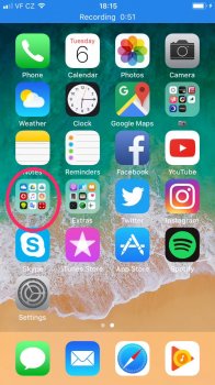
Can confirm bolder font on the homescreen. But it needs to have drop shadows too. Some app names looks horrible, especially the symbol under the folder that I highlighted. Prior to iOS 7 redesign this wasn't an issue.
 

Attachments

  • Soubor_000.jpeg
    Soubor_000.jpeg
    275.3 KB · Views: 274
  • Like
Reactions: Tozovac and tkermit

epca12

macrumors regular
Jun 11, 2017
244
67
UK
Can confirm bolder font on the homescreen. But it needs to have drop shadows too. Some app names looks horrible, especially the symbol under the folder that I highlighted. Prior to iOS 7 redesign this wasn't an issue.
That's good news, I was hoping for shadows as they have not been as strict with the no shadow in recent years. I guess it's another year of being careful when setting backgrounds
 
  • Like
Reactions: tkermit

Feyl

Cancelled
Aug 24, 2013
964
1,951
That's good news, I was hoping for shadows as they have not been as strict with the no shadow in recent years. I guess it's another year of being careful when setting backgrounds
I guess you're right. It's a shame because I have so many beautiful wallpapers that I can't use.
 
  • Like
Reactions: epca12

throAU

macrumors G3
Feb 13, 2012
8,759
6,920
Perth, Western Australia
I think the old design looks dated and over-done.

UI icons are meant to be simple and easily recognisable.

The current design is better, definitely.

UI re design just because it's been 5 years is stupid. If it works, leave it alone. If they can refine it, sure; go ahead. But don't go changing things just because its been 5 years. That's stupid.
 
  • Like
Reactions: souko

epca12

macrumors regular
Jun 11, 2017
244
67
UK
I guess you're right. It's a shame because I have so many beautiful wallpapers that I can't use.
Seems especially ridiculous now with increased screen sizes and larger gaps between icons, the background has become more prominent yet we're more limited in what we can do
 
  • Like
Reactions: Feyl

Feyl

Cancelled
Aug 24, 2013
964
1,951
I think the old design looks dated and over-done.

UI icons are meant to be simple and easily recognisable.

The current design is better, definitely.

UI re design just because it's been 5 years is stupid. If it works, leave it alone. If they can refine it, sure; go ahead. But don't go changing things just because its been 5 years. That's stupid.
Yeah and iOS 7 wasn't any of that. The original design was unique and something that only Apple had and no other phone looked similar. With iOS 7 Apple just did what Google and Microsoft had. It is simple now, but in the way that anyone can do it.
 

Vanilla35

macrumors 68040
Apr 11, 2013
3,344
1,453
Washington D.C.
I think the old design looks dated and over-done.

UI icons are meant to be simple and easily recognisable.

The current design is better, definitely.

UI re design just because it's been 5 years is stupid. If it works, leave it alone. If they can refine it, sure; go ahead. But don't go changing things just because its been 5 years. That's stupid.

Excuse me throAU, your kind is not welcome here :p
 

Rogifan

macrumors Penryn
Nov 14, 2011
24,069
30,940
I don't like iOS 7 design but i do like much of iOS 11 and the refinements they have made. It still doesn't feel the same but it's not as unnecessarily flat and lifeless as iOS 7 was for me
What is not flat about iOS 11? Bolder text? While maybe not as sparse it seems just as flat.
[doublepost=1497722698][/doublepost]
Yeah and iOS 7 wasn't any of that. The original design was unique and something that only Apple had and no other phone looked similar. With iOS 7 Apple just did what Google and Microsoft had. It is simple now, but in the way that anyone can do it.
Who cares if something is original if it's ugly. IMO iOS 6 style was ugly. Microsoft Bob ugly.

mza_5832530847417736514.jpeg
iOS-6-Lesser-Known-Features-22.jpg


16.jpg
 
  • Like
Reactions: throAU
Register on MacRumors! This sidebar will go away, and you'll see fewer ads.