Become a MacRumors Supporter for $50/year with no ads, ability to filter front page stories, and private forums.

MacRumors

macrumors bot
Original poster
Apr 12, 2001
67,490
37,778


The first beta of iOS 18.4 is now available, and it includes a small but useful change for CarPlay.

ios-18-4-carplay.jpg

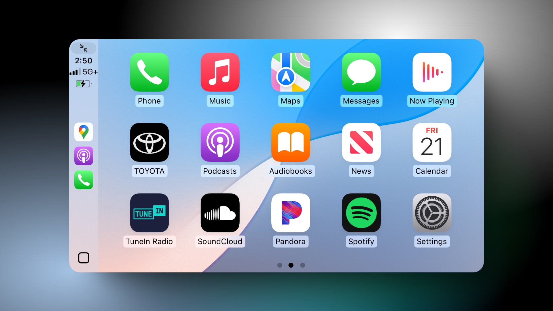
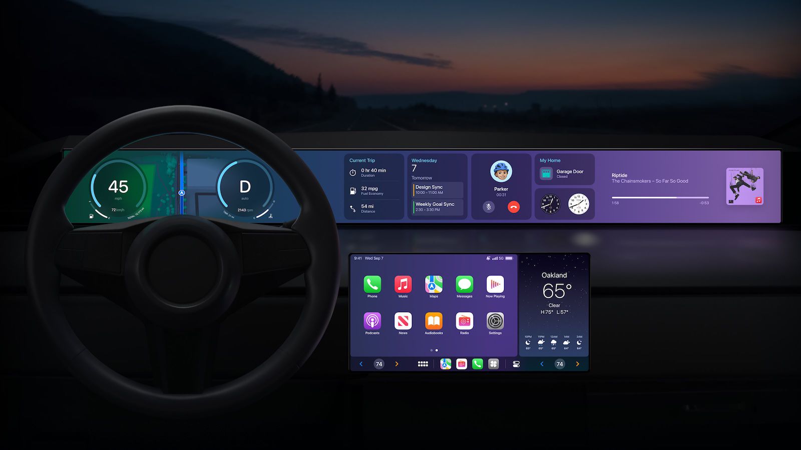
As we noted in our list of iOS 18.4 features, CarPlay now shows a third row of icons, up from two rows previously. However, this change is only visible in vehicles with a larger center display. For example, a MacRumors Forums member noticed the change in a Toyota Tundra, which can be equipped with up to a 14-inch screen.

In our testing, CarPlay still showed two rows of four icons in a Honda Civic with a 9-inch screen.

While this is only a minor change, CarPlay showing more icons when possible is a nice quality-of-life improvement for Apple's phone mirroring system, allowing drivers to quickly access more apps with less swiping between pages.

Following beta testing, iOS 18.4 is expected to be released to the public in early April.

Article Link: iOS 18.4 Includes a Small But Useful Change for CarPlay
 
Last edited:
That’s awesome

My dad has CarPlay in his Lexus and I use CarPlay when we go on long drives so I’m glad that Apple has made it better by offering an extra row of application icons on the display

I hope that more cars implement wireless CarPlay in the future as my dad’s car does not have wireless CarPlay so I have to use an adapter to get it to be wireless - it would be nice if Apple made their own adapter to allow people to use wireless CarPlay (if it’s not already built into their cars)
 
Is Apple now going to slowly roll out new CarPlay features only when they're ready like how they're doing with iOS features? Maybe this is how we'll be getting next gen CarPlay... in bits and pieces.

 
I just wish I could somehow toggle within CarPlay between listening to SiriusXM, listening to the FM radio, and listening to my music or podcasts. If I want to go to SiriusXM or to the FM radio, I have to exit CarPlay completely including the Maps function.
 
  • Like
Reactions: siddavis and ELman
Why is this not something that is customizable by the user?

All these cars have different screen sizes and orientations. Why not let users add more columns and/or rows and change their size too? So if you just want a few big ones that are easier to press or more if that's your thing...

It's crazy how little customization Apple allows on things that could actually make it more user friendly and more importantly: safe, since you're using the screen while driving.
 
I just wish I could somehow toggle within CarPlay between listening to SiriusXM, listening to the FM radio, and listening to my music or podcasts. If I want to go to SiriusXM or to the FM radio, I have to exit CarPlay completely including the Maps function.
This same limitation is why Tesla/Rivian do so well with their end-to-end solutions.

Don’t get me wrong, CarPlay is great and better than 99% of the OEM systems. But that doesn’t mean there’s nothing better or at least equal.
 
Find My should be on Car Play. How it isn’t is baffling.
Why would you need that? Your phone is literally right there in the car with you, and if you need to track down your AirPods or whatever, you can easily pick it up when you're stopped and do just that. There are already waaayyy too many people pulling boneheaded distracted driving crap without Apple putting toys on the big shiny screen on the dashboard.
 
Last edited:
So much wasted space on the current carplay layout with the large icons and huge gaps between the icons...
It's spaced out for a reason. You're reaching out a fair distance with one hand in a vehicle that may or may not be bouncing around, and often only looking at it for a second or two. All that points to a design with less information density and more visual and physical separation between UI elements.
 
Last edited:
It's spaced out for a reason. You're reaching out a fair distance with one hand in a vehicle that may or may not be bouncing around, and often only looking at it for a second or two. All that points to a design with less information density and more visual separation between UI elements.
Even more reason for it to actually work better without needing touched and distracting the driver.
 
Why would you need that? Your phone is literally right there in the car with you, and if you need to track down your AirPods or whatever, you can easily pick it up when you're stopped and do just that. There are already waaayyy too many people pulling boneheaded distracted driving crap without Apple putting toys on the big shiny screen on the dashboard.

Here's a primary example:
With a couple of taps, you're in Find My, select your out of town relative, request directions.
Boom, you're on the highway to Grandmother's house.

Here's another:
Where does my AirTag for my wallet say it is?
Oh crap, that little shop we hit after the restaurant.
Tap, directions back to my wallet without an address.

Just because something doesn't work for you, doesn't mean it doesn't work for someone else.
The point of CarPlay is to leave the phone down in the console or in your pocket.
If you can pick up your phone for all of those features, what is CarPlay's purpose at all then; by your logic?
 
Register on MacRumors! This sidebar will go away, and you'll see fewer ads.