Become a MacRumors Supporter for $50/year with no ads, ability to filter front page stories, and private forums.

MacRumors

macrumors bot
Original poster
Apr 12, 2001
67,482
37,742


As part of its Home Screen customization overhaul, iOS 18 lets iPhone users hide the labels on app icons for a cleaner look.

hide-app-labels-ios-18.jpg

Turning off the labels causes the icons to expand and take up the space where the text usually appears underneath. Here's how it currently works in the iOS 18 Developer Beta.
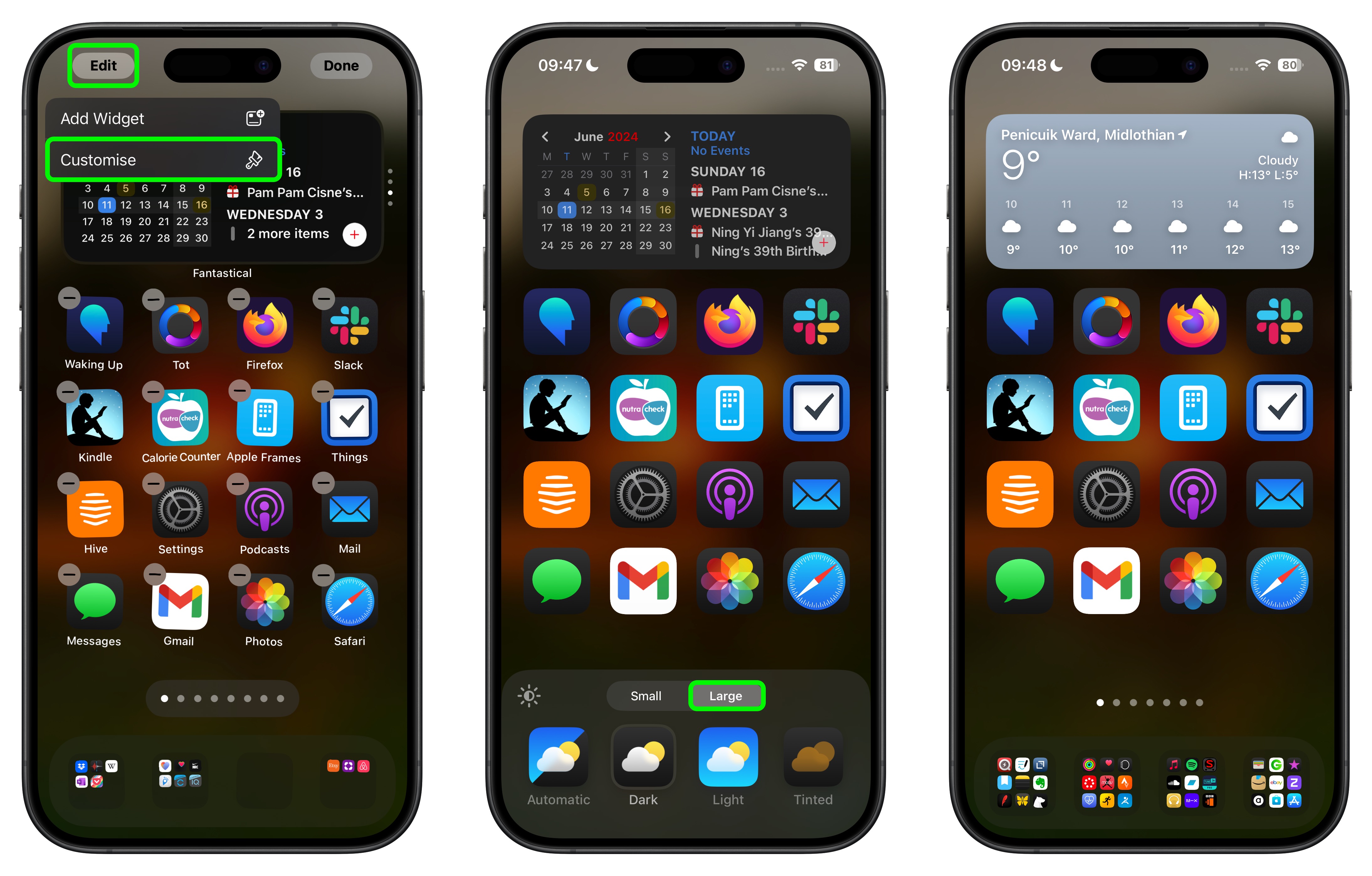
  1. On the Home Screen, press and hold on an empty area.
  2. Tap Edit in the top-left corner.
  3. Tap Customize.
  4. In the customization menu that appears, tap the Large button.
  5. Tap anywhere on the Home Screen to save your preference.
hide-app-labels-home-screen-ios-18.jpg


As things stand, it's not possible to hide labels and keep app icons small, but this could change in succeeding beta versions.

In addition to hiding app labels, other new Home Screen customization options in iOS 18 include the ability to place app icons anywhere, and a dark tint option for app icons.

Read our iOS 18 announcement coverage for more details about the update, which is now available in beta for members of the Apple Developer Program.

Article Link: iOS 18 Lets You Hide App Labels on Your iPhone Home Screen
 
  • Like
Reactions: danbuter
This was a feature first proposed during an internal ideas meeting at Apple for iOS 4.

The person was told to keep it up their sleeve for iOS18

😜 Joking, but amazing how such simple ideas can take so many versions of an OS to make an appearance.
 
People with Jailbreak had it for ages.
And Apple didn’t even allow to replace icons altogether. Are they blind or smth? Too much contrast, color palette more acidic than 90s rave pills, zero detail whatsoever.

I am probably wrong as usual and they just keeping this idea for iOS 26
 
This, is called choice. It's a great thing.
I'm all for choice. It's your phone, you should be able to do whatever you want with it, so I like this shift with Apple, definitely a step in the right direction. But I think choice can still render an artful result when allowing it is handled with intention. Current implementation just looks bad. Material You's approach is just better. Nothing I do with this newly allowed choice can offer me something I like. I just wouldn't use it, I'm sure many people will like it, but there was a better approach, as Google has shown.
 
I mean, they could have let us make the icons smaller, so we can fit more on a row AND remove labels, not exactly difficult I'm sure. :-/
Like this?
1718101266844.png

 
I wish I could edit app names. I have a folder with a bunch of smart home apps and the icons are pretty much all a house within a rounded square and some variation of "home", "smart" in it. I wish I could call them "temperature sensors", "lights", "security cam", "solar", "vacuum", etc.
 
Like this?
View attachment 2387415
No... not at all? The icons look exactly the same size as they have done since iOS began, there are still labels and still only 4 per row...
 
  • Like
Reactions: Mac_i_Am
My original reaction when I tried this was that the purpose of losing the labels was due to screen size constraints to accommodate the larger icons in the same screen space NOT to show icons only. Otherwise, why not just label it " Icons Only" instead of "Larger"?
 
This was a feature first proposed during an internal ideas meeting at Apple for iOS 4.

The person was told to keep it up their sleeve for iOS18

😜 Joking, but amazing how such simple ideas can take so many versions of an OS to make an appearance.
Had this been released in iOS 4, the forum would have been filled with sarcastic posts about this being the most important feature to implement.
 
Looks nice and clean, I like it 👍
I assume it will enlarge folders as well? 🤔
 
Register on MacRumors! This sidebar will go away, and you'll see fewer ads.