
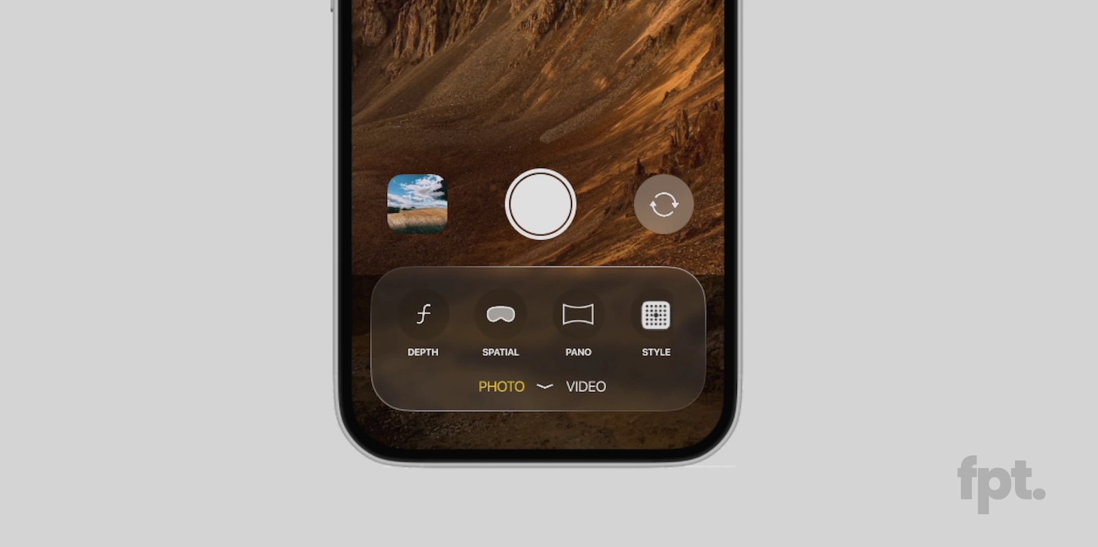
Leaker Jon Prosser today shared a "first look" at Apple's upcoming iOS 19 update, providing mockups of what different apps and features will supposedly look like. Prosser claims the mockups are based on "the real deal" version of iOS 19 that he has seen, but says he is sharing replica images in order to prevent his sources from getting into trouble.
Confusingly, Prosser's video features some design changes that are "real," and others that he made up as a joke. He includes a Home Screen view with round icons rather than square icons, for example, but at the tail end of the video, he says that's not an accurate depiction of what the icons will look like.
Here's what Prosser has to say about different iOS 19 elements:
- Lock Screen - There's no functional change, but there is a visual overhaul. In Prosser's mockup, it looks similar to the current Lock Screen, with some translucency changes to notifications and a more 3D floating look to the buttons.
- Settings and Popups - Menu elements, popups, and buttons have a more rounded aesthetic with a "glassy" styling.
- Apps - App menus and buttons will have the same look with rounded corners, circular design, and floating style modeled after visionOS.
- Keyboard - There's a more rounded design at the top with a visionOS glassy design. Prosser says that the keyboard "almost looks like it's floating."

According to Prosser, Apple's Sports app and Invites app offer an inside peek at what the iOS 19 redesign will look like, echoing previous discussion about how Apple has already been using glassy buttons and interface elements for its newest apps.
Prosser says that overall, there are no signs of any new major AI features or other significant additions, with iOS 19 focusing primarily on design updates.
Article Link: iOS 19 Again Rumored to Feature visionOS-Like 'Glassy' Design
