Become a MacRumors Supporter for $50/year with no ads, ability to filter front page stories, and private forums.

MacRumors

macrumors bot
Original poster
Apr 12, 2001
67,555
37,933


Earlier this month, Bloomberg reported that Apple is planning "one of the most dramatic software overhauls in the company's history" – an update that aims to bring iOS, iPadOS, and macOS into closer visual alignment. The redesign is said to be "loosely based" on visionOS, the software behind Apple's Vision Pro headset, and will reportedly update the look of icons, menus, apps, windows, and system buttons.

iOS-19-Rounded-UI-Elements-Light.jpg

These changes are expected to arrive later this year with iOS 19, iPadOS 19, and macOS 16, and are said to go "well beyond a new design language and aesthetic tweaks." More specific details are scarce, but it's supposedly the biggest update to iOS since iOS 7, and the biggest update to macOS since Big Sur.

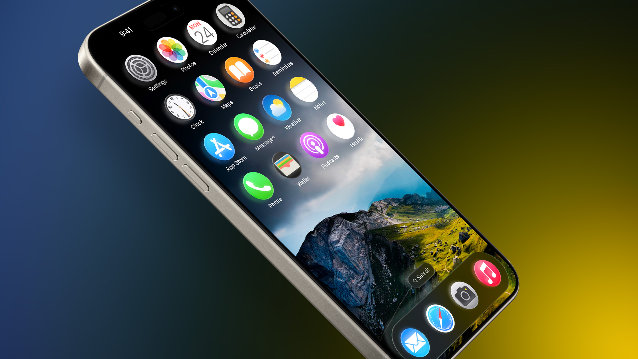
In the report, Bloomberg's Mark Gurman highlights some of visionOS's key visual elements: circular app icons, simplified windows, translucent navigation panels, and a deeper emphasis on 3D layering and shadows. While he stops short of confirming circular icons for iOS and macOS, the implication is there. (The careful wording hints at strategic ambiguity: if the icons do go circular, the report is validated. If not, Bloomberg retains editorial deniability.)

Gurman does acknowledge that "some elements won't apply to the 2D world of iOS and macOS," given visionOS's immersive, spatial interface. He leaves it at that. But even icons in visionOS aren't just circular – they're layered for a 3D world. They feature a background base, one or two foreground layers, and a subtle expansion effect when looked at. Shadows further enhance the sense of depth, making each icon feel like a tactile, dimensional object.

visionos-app-icon-showcase-ezgif.com-optimize.gif

If Apple's next-generation platforms are loosely based on visionOS, how far will the redesign go?
  • Are circular icons on the way? After all, watchOS has them already.
  • Will the UI gain "glassy" translucency and layered shadows?
  • Are the new Apple Sports and Apple Invites apps early indicators?
  • What about the reported iOS 19 Camera app revamp, with its visionOS-style translucent controls?
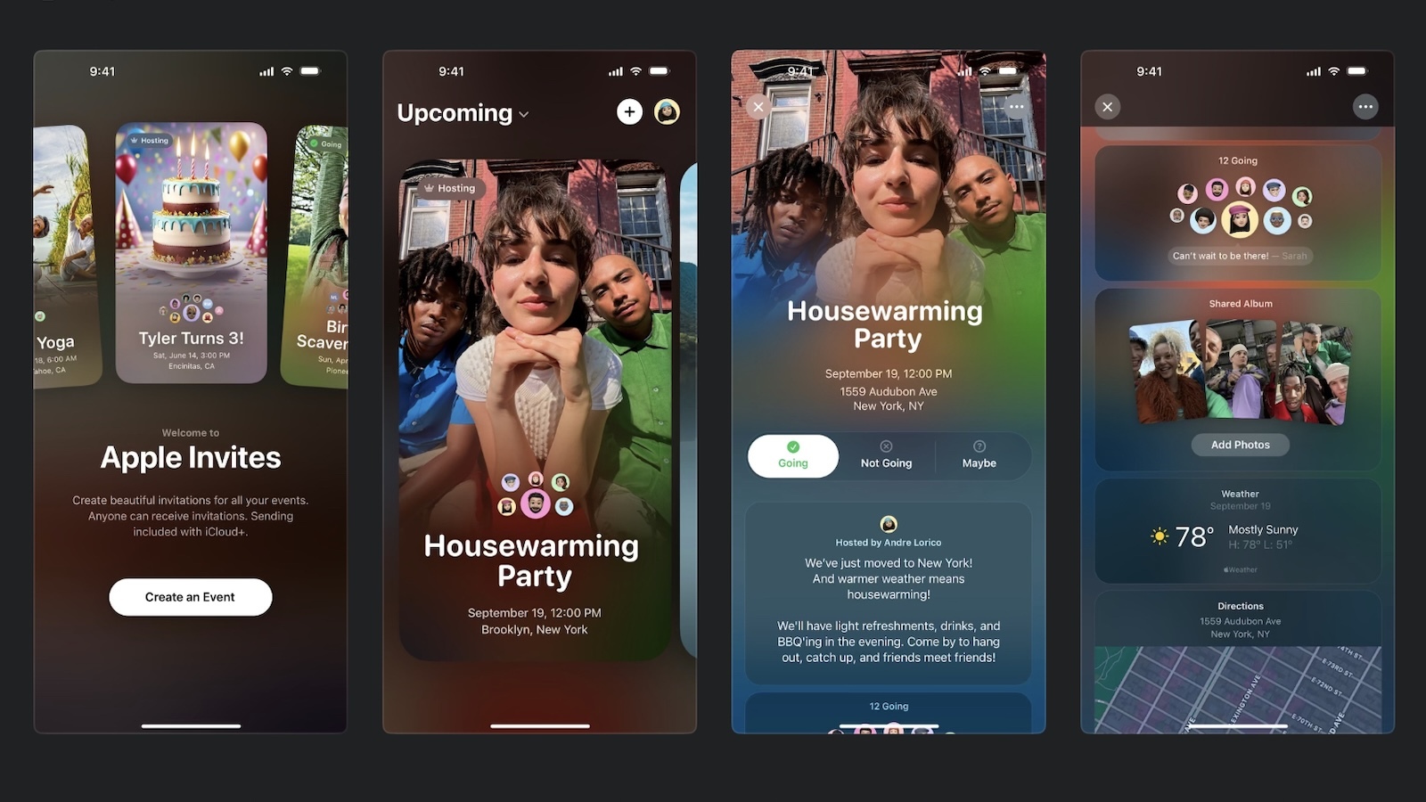
All signs point to a shift in this general direction. But how deep will the transformation be? And more importantly – is this a welcome direction for macOS and iOS users?

apple-invites-screenshots.jpg
Apple Invites app

Let us know your thoughts in the comments. Apple will preview iOS 19, iPadOS 19, and macOS 16 this June at WWDC, with a public release expected in September.


Article Link: iOS 19: What to Expect From Apple's Dramatic Design Overhaul?
 
  • Like
Reactions: SFjohn
Wasn’t there a rumor or two regarding new/refreshed universal gestures within iOS? Like easier and more standardized simple swipes to move forward and back within app pages? I’d be more excited by new gestures and smoother navigation than changing many visuals.
 
How about a CarPlay system taht actually reflects the realities of driving a car with buttons that are as large as they can be for clicking, common functions available on all screens without having to navigate, and being able to click an album cover and see all the songs on the album... how hard would that be?
 
I'm very excited for this, I think it's important to keep things fresh and interesting. IMO iOS has visually stayed pretty stagnant for some time now with only slight minor tweaks, so a new look is completely welcome.
 
Eh they are going to do this, can they also bring more functionality to say the dock? I’m fine with it. There’s other things here and there that would be nice to have in iOS and macOS but overall I’m fine with both still.
 
  • Like
Reactions: .wojtek
I expect visual changes but no significant change to underlying menus and workflows. We will still have to dive into different settings menus to do certain things that otherwise seem logical to group together like having independent volume controls for different things all in one common location.
 
That mockup is the first one I've seen that actually looks not only interesting but actually pretty good.
 
  • Like
Reactions: DanteHicks79
Circular app icons? Eeuww.
There was a jailbreak tweak to turn the springboard into a grid similar to WatchOS, I used it for a bit. The round icons worked alright.
The careful wording hints at strategic ambiguity: if the icons do go circular, the report is validated. If not, Bloomberg retains editorial deniability.
Despite most Apple icons already (inadvertently?) fitting within a circular frame, I personally doubt circular icons will come.
 
  • Like
Reactions: Kal Madda
I would have been excited for this, but seeing Apple’s recent design choices especially in software makes me very worried.

I dislike the new app colors picker, the way they have broken notifications, how some elements when you edit them jiggle like app icons which is great, but some “breath” barely visibly like when you edit control center, etc.
I just can’t trust the design team that thought it’s a good idea to allow you to change your wallpaper from the Lock Screen, so that occasionally I accidentally switch wallpapers and almost delete some just by holding the phone in my hand.

I hope I’ll be surprised for the best.
 
Last edited:
Android tried round icons on at least 2 occasions, 7 and 13, as far as I can remember and translucent windows are so 2004 Linux. 🤣

Seriously, I’ll wait and see how it looks, but it doesn’t really make me eager to upgrade on its own.
 
How about a CarPlay system taht actually reflects the realities of driving a car with buttons that are as large as they can be for clicking, common functions available on all screens without having to navigate, and being able to click an album cover and see all the songs on the album... how hard would that be?
My complaint with carplay is not only size of some elements, but positioning and proximity to others. It's easy to tap the wrong button, when two buttons are placed close to each other vertically (like in maps when navigating) while most roads aren't a buttery dream. There are also the buttons that are hidden beneath a first tap, like zooming and panning the map. This means tapping the screen, a distraction, then looking for the hidden button, another distraction, assuming you don't tap outside of the non-forgiving rounded bounds, and have to start over.
They seem minor and could fit interface guidelines for a phone, but not as a driver.
 
There is so much "guessing" going on here, we will know more in June. However, if you go back to iOS 7 and the massive update that was announced, look how it changed in a few months and the years that followed. They had to walk back ALOT of the changes as the clear look was not as exciting or useful as most would have liked. But, still excited to see what the changes are.

This will be the first time all of the OS's are updated to the same look at the same time.
 
Id love and welcome a complete redesign but lets be realistic here....

"BIG" change? Really? I dont think iOS7 was massive just aesthetically a little different thats all.

Whats changing here? Look and feel? Like a new skin on the OS? Will it materially change the way we interact with the phone and navigate features?
Or, more likely will it just have marginal cosmetic changes with everything else remaining the same underneath that veneer.
 
Register on MacRumors! This sidebar will go away, and you'll see fewer ads.