Become a MacRumors Supporter for $50/year with no ads, ability to filter front page stories, and private forums.
I bought the 15 Pro. If I was on Android now, I wouldn’t have bought the 16 Pro. Or 16. Or 16e. And I’m so displeased I’m at least perusing the new Androids out there. I still think the M1 iPad as the most amazing piece of hardware I’ve ever bought and would buy a new one today if it cost me a foot and an arm. The iPhone is comparatively the most underperforming piece of hardware (taking into consideration price) I’ve ever bought.
I have the M1 iPad and I really like it, but I hope it gets to see the day when(if) Apple puts a real Pro OS on it in the form of either MacOS or MacOS Lite. I'd like it to have something similar to DexOS which gives it proper desktop capabilites when you choose so. The M1 is still so ridiculously overpowered for iPadOS that it could probably function ten more years if Apple keeps supporting it.

I'm an Android user for life though when it comes to smartphones. There's so many little things I think are superior over iOS, but when it comes to tablets Apple dominates.

I don't really know what I brought to the conversation, but I've just been drinking energy drinks and I wanted to write something. :)
 
  • Like
Reactions: SebCohen
Think of something as simple as the lock screen.
On the iPhone and iPad, it’s an area that can be heavily customized. You can put shortcuts on the bottom of it, it houses all of your notifications, it has widgets, it has different clock styles, it has live activities.
On the Mac it’s… just where you enter your password. It has the benefit that you can put a moving screensaver behind it, but besides that, it’s literally just for logging in. No extra functions, other than logging in it’s basically completely useless.

Or the Notification center, iOS has long ago moved away from using the notification center to how’s widgets, that’s something back from the iOS 8/Yosemite days that the Mac hasn’t caught up with.
Or in several of the built-in apps, there are just functions and interfaces throughout the operating system that are inconsistent in ways that go way beyond just being different designs for different form factors.
Think the Apple Music app, the Apple Music app on the Mac is a completely different beast from the Apple Music app on iOS. There really isn’t any reason for them to be that different, yet they are. There are Apple Music features on the iPhone, completely missing from the Mac, and even more features on Apple Music for the Mac completely missing on the iPhone.

Your examples don't help making the point you're trying to make, at least for me.

1) Lockscreen/Notification Center/Widgets. I'm a minimalist, I don't actually like the extremely cluttered and customized lock screen on iOS and I very much do not want to see something similar on macOS. The lock screen should be that, a lock screen. It shouldn't display any sort of - possibly even private - information for everyone to see who just happens to open up the Macbook. That's the whole point of it being, well, a lock screen. It doesn't need - nor should have - "extra functions". Especially not on a mac. In contrast, I kinda miss the old iOS where there weren't a million different ways of getting the same information (notifications being shown on lock screen and notification center, e.g.). It makes it cluttered and actually more confusing, because while some information are accessible through different means, others are not, and it's very much not intuitive which applies to which.

I'm also oldschool enough that I STILL dearly miss the macOS dashboard.

2) Music App. The music app on macOS is basically the rebranded iTunes app. Long ago, Music and iTunes on iOS used to be separate apps altogether. I'm genuinely curious what specific every-day features are missing from Apple Music on the Mac that exist on the iPhone, and vice versa.

Don't get me wrong, I'm all for consistent functionality, even mirrored functionality where it makes sense. But that has very little to do with UI and also does not need to be forced on every single individual feature just for the sake of it.
 
  • Like
Reactions: ScanTheNavian
At some point, design changes feel a bit like rearranging the deck chairs on the Titanic. I want Apple bring new things to the table that are useful, and move technology forward.
 
  • Like
Reactions: SebCohen and Ankaa
1) Lockscreen/Notification Center/Widgets. I'm a minimalist, I don't actually like the extremely cluttered and customized lock screen on iOS and I very much do not want to see something similar on macOS. The lock screen should be that, a lock screen. It shouldn't display any sort of - possibly even private - information for everyone to see who just happens to open up the Macbook. That's the whole point of it being, well, a lock screen. It doesn't need - nor should have - "extra
I completely disagree, I find the lock screen on the Mac now to be completely useless and much preferred the way that iOS handles things.
I agree about the dashboard, but I personally think that widgets should be allowed in the launchpad anyway, which would be a full replacement for the dashboard.
Same goes for the control center, on the iPhone it’s a dedicated full space where you can pretty much put anything, on the Mac it can barely be customized and more is an extension of the menu bar than an actual control center.


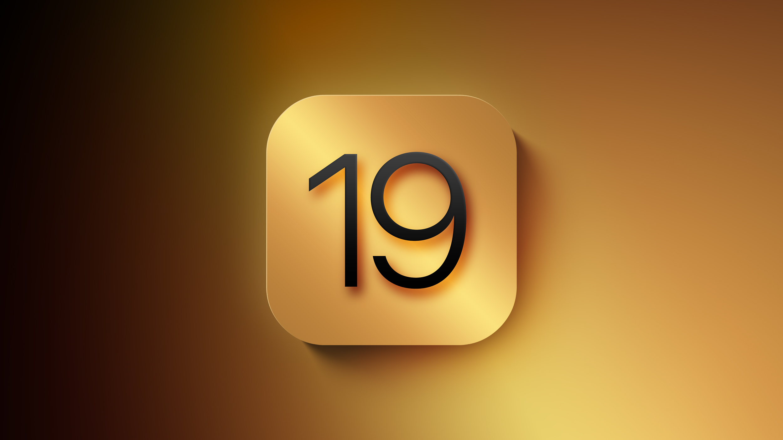
Apple is planning for a major design overhaul of the iPhone, iPad, and Mac interfaces with the introduction of iOS 19, iPadOS 19, and macOS 16 later this year, reports Bloomberg. The update will "fundamentally change" the look of Apple's operating system, introducing a more consistent cross-platform experience.

Generic-iOS-19-Feature-Mock-Light.jpg

Apple plans to update the style of icons, menus, apps, windows, and system buttons, and the company will simplify the way that users navigate and control their devices. The changes "go well beyond a new design language and aesthetic tweaks."

While specific details are scarce, it's supposedly the biggest update to iOS since iOS 7, and the biggest update to macOS since Big Sur.

There are design elements taken from visionOS, but the update is only "loosely based" on the Vision Pro interface. visionOS features round app icons with a lot of translucency, plus a simple navigation system and more use of 3D elements.

It is Apple's hope that a revamped interface will renew interest in its latest iPhones, iPads, and Macs and distract from the delayed rollout of Apple Intelligence Siri features.

We'll get our first look at the new design in iOS 19, iPadOS 19, and macOS 16 at the 2025 Worldwide Developers Conference, which will take place sometime in June. After that, the updates will be tested for several months before seeing a public launch in the fall.

Article Link: iOS 19 Will Bring Biggest Design Overhaul Since iOS 7
If they fix how iOS messages behave, it would be enough for me. Currently it feels like a Microsoft designed app: always in your way trying to “help” you
 
  • Like
Reactions: SebCohen and Ankaa
I hope it's good, I think we're due for a refresh. Apple's recent design choices on iOS have been terrible (letting people make their home screens hideous is very un-Jobs), so hopefully this is a fresh start, but they need to fire the person that made the multicolored tap-back emojis, they look so cheap.
 
I just want them to fix my broken OS Mail program. That failure has gone on for three years now.


Apple is planning for a major design overhaul of the iPhone, iPad, and Mac interfaces with the introduction of iOS 19, iPadOS 19, and macOS 16 later this year, reports Bloomberg. The update will "fundamentally change" the look of Apple's operating system, introducing a more consistent cross-platform experience.

Generic-iOS-19-Feature-Mock-Light.jpg

Apple plans to update the style of icons, menus, apps, windows, and system buttons, and the company will simplify the way that users navigate and control their devices. The changes "go well beyond a new design language and aesthetic tweaks."

While specific details are scarce, it's supposedly the biggest update to iOS since iOS 7, and the biggest update to macOS since Big Sur.

There are design elements taken from visionOS, but the update is only "loosely based" on the Vision Pro interface. visionOS features round app icons with a lot of translucency, plus a simple navigation system and more use of 3D elements.

It is Apple's hope that a revamped interface will renew interest in its latest iPhones, iPads, and Macs and distract from the delayed rollout of Apple Intelligence Siri features.

We'll get our first look at the new design in iOS 19, iPadOS 19, and macOS 16 at the 2025 Worldwide Developers Conference, which will take place sometime in June. After that, the updates will be tested for several months before seeing a public launch in the fall.

Article Link: iOS 19 Will Bring Biggest Design Overhaul Since iOS 7
Hollow promises. Can’t even release what was promised in the last iOS, why bother with a new version?
This is misleading crap to make people buy the next model.
 
  • Love
Reactions: dysamoria
This can go in a whole lot of different directions. App icons going circular everywhere? Or will they bring rounded rects to watchOS and visionOS? Will icons adopt the 3D look of macOS and visionOS? Or will everything go flat like it's right now on iOS?
I hope for depth and, you know, detail, to come back to everything, but since that's what I WANT, I bet Apple will go even farther down the path of awful with the obsessive minimalist flat nonsense and that Mac OS will look even uglier than it does now.

I still have iOS 6.x running on an iPhone 4, and with few exceptions, the whole system just looks fantastic and sophisticated, taking advantage of high-color, super high-density pixel displays... while iOS 7-onward look like utterly distinction-less, low contrast 90s era clip art, but sharp. Apple was once the master of UI design, but then they burned it to the ground for the arbitrary minimalist obsession.
 
I loved the round icons on OS X but on iPhone they just seem odd.
Oh, I completely agree with you. Round icons on iPhone (and iPad) seem completely out of place. But I really hated when they abandoned the round dock icons in their effort to make macOS and iOS visually more similar. I honestly still miss the round doch icons.
 
Register on MacRumors! This sidebar will go away, and you'll see fewer ads.