Not going to lie, I miss that UI so much.Well no, it was originally swipe to turn off.
View attachment 2576677
Note: this not me... I have upgradedGrabbed from interwebs.
Got a tip for us?
Let us know
Become a MacRumors Supporter for $50/year with no ads, ability to filter front page stories, and private forums.
iOS 26.1: Bring Back the Tap-to-Stop Alarm Button
- Thread starter MacRumors
- Start date
- Sort by reaction score
You are using an out of date browser. It may not display this or other websites correctly.
You should upgrade or use an alternative browser.
You should upgrade or use an alternative browser.
dude, give 'em a break! They're still trying to figure out how to put a backlight in the "Magic" Keyboard...Here's a genius idea...how about letting people have two options to choose from:
Option 1: Tap to stop the alarm
Option 2: Slide to stop the alarm
Really, really tough stuff to figure out here!
I don't believe that is the case, otherwise people wouldn't have anything to complain about.Isn't that already an option which this article is explaining how to change? Albeit I'm not sure what else it changes...
People research everything anymore.They had to do research to tell that someone that wakes up earlier is more productive?
I sleep with my watch on and it still has tap for both. It's not very often but I have tapped the wrong option before. I hope they bring this to the watch as well.
I also sleep with my watch on and have on occasion also tapped the wrong option.
I've discovered - far later than I should've - that pressing the crown is the same as tapping the snooze on the watch face.
Hope that helps.
Volume down on the iPhone also does thisI also sleep with my watch on and have on occasion also tapped the wrong option.
I've discovered - far later than I should've - that pressing the crown is the same as tapping the snooze on the watch face.
Hope that helps.
It's pretty poor when a global smart phone creator gets a flipping snooze button wrong on their latest OS.
Equally sized, adjacent buttons for stop and snooze was so obviously not going to go down well. Why does a company like Apple have to learn such a basic human tactile experience the hard way, when they are capable of doing things so well, and had already got this right!?!
It's almost as if someone that doesn't use an alarm clock designed it, having never met a human in it's life.
and then which option would you want as default?Here's a genius idea...how about letting people have two options to choose from:
Option 1: Tap to stop the alarm
Option 2: Slide to stop the alarm
Really, really tough stuff to figure out here!
seriously where does customisation end?
i dont like the font on the button...???
i dont like the colour of the button...???
this is making it safer for the majority of people to not dismiss the alarm accidentally.
that's usability over customisation.
No - i like the slide to stop function! If anything they should make it "Hold to snooze" and keep the slide to stop function!!
Apple has changed how you dismiss iPhone alarms in iOS 26.1, and your morning muscle memory may have needed tweaking as a result. By default, the Clock app now requires a slide gesture to stop an alarm from the Lock Screen, replacing the previous tap-to-stop button that was redesigned in iOS 26. Snoozing still works with a simple tap, but turning off an alarm entirely demands the extra swipe motion.
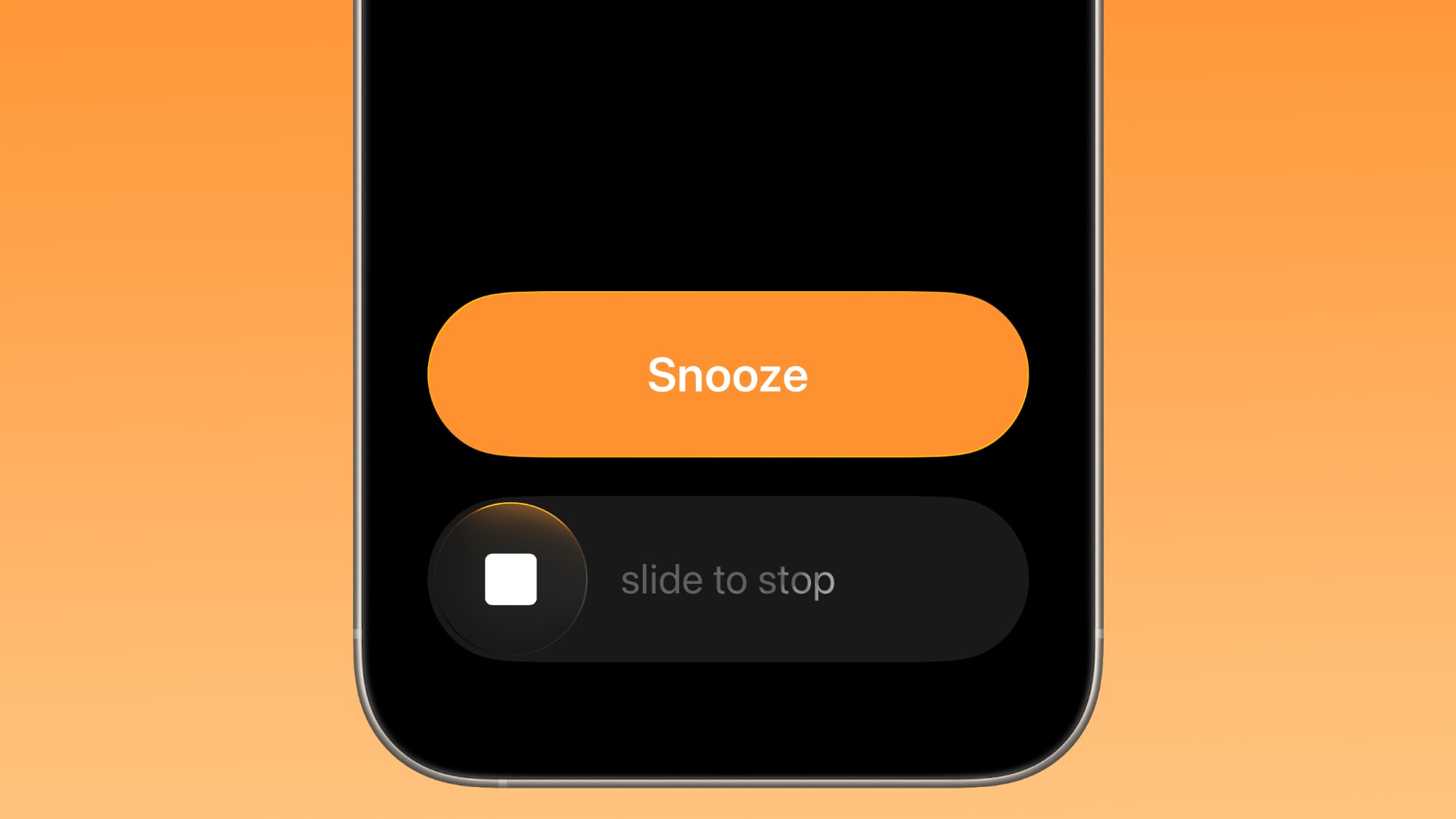
The change appears designed to prevent accidental dismissals when you're reaching for your phone in the morning. By requiring a more deliberate action, you're less likely to silence your alarm when you meant to hit snooze. If you don't like the change, you can revert the alarm interface back to the previous Stop button by following these steps.
The change will take effect the next time you set an alarm. If you want to revert back to the slider, simply toggle off Prefer Single-Touch Actions.
- Open the Settings app on your iPhone.
- Tap Accessibility.
- Under "Physical and Motor," tap Touch.
- Swipe to the bottom of the menu and toggle on Prefer Single-Touch Actions.
Article Link: iOS 26.1: Bring Back the Tap-to-Stop Alarm Button

I would never argue for less when it comes to customization options, I can tell you that much.and then which option would you want as default?
seriously where does customisation end?
i dont like the font on the button...???
i dont like the colour of the button...???
this is making it safer for the majority of people to not dismiss the alarm accidentally.
that's usability over customisation.
Or people just like to do things differently than you do or in ways you haven't thought of. I personally use my alarm to wake up and my snooze as a reminder to get up. I prefer to be awake for a few minutes before getting up. I'm not on army boot camp and am not a drop dead loser who has no self control.I agree, but I also think that most people that use snooze are either hung over, lazy, just like lying to themselves, or are the forever victim.
I mean, it is not hard to set the alarm for the time you want to get up, then get up, at least for adults.
and every customisation takes time to implement and introduces another fail point... I've seen plenty of screens that just dont work when (usually) older people use Extra Large fonts and buttons fall off the screen or text doesnt fit.I would never argue for less when it comes to customization options, I can tell you that much.
there is a limit of what works.
and a simple drag is a better choice for this button than a tap.
go read some interface usability design docs.
it's something i've read and worked with for 35 years in IT...
the whole flat design debacle took things too far and didnt make systems clearer to use for many people.
i'm glad buttons look like buttons again and not hover over links
we've endured some usablity nightmares over the years.
this button action is not one of them.
Finally someone gets it. Never used Snooze on any clock in my life.It takes a weak person to have to rely on snooze. Why not just set your alarm for a few minutes later and get up when it goes off? Ahh, I forgot about alcohol and drugs.
Me, I just want the damn thing off. I have no use for the slider.
I just want to tap it to turn it off.
Is this only available on the newest 26.1?For those that don’t snooze you can turn snooze off in the alarm settings. Clock > Alrarm > Change > Snooze.
It’s great in Standby where the Stop button is the entire length of the screen.
The real ones know that these changes are pointless because the Side Button can still dismiss and snooze alarms. Trust me, when you're half-asleep, it's way easier to press the Side Button than touching the screen.
I've worked in software myself for over 20 years now, and this would be very simple to implement. Especially since the code has mostly been written already, and it would give users two options instead of one.and every customisation takes time to implement and introduces another fail point... I've seen plenty of screens that just dont work when (usually) older people use Extra Large fonts and buttons fall off the screen or text doesnt fit.
there is a limit of what works.
and a simple drag is a better choice for this button than a tap.
go read some interface usability design docs.
it's something i've read and worked with for 35 years in IT...
the whole flat design debacle took things too far and didnt make systems clearer to use for many people.
i'm glad buttons look like buttons again and not hover over links
we've endured some usablity nightmares over the years.
this button action is not one of them.
I think Apple forgot Standyby mode exists when they made this change as the phone is more likely to be in Standby mode when you wake up.I noticed that in Standby mode when the phone is turned horizontal, it's still tap to turn off
You seem to be saying this somewhat tongue-in-cheek, but I think this is quite plausible; personally, I disabled Standby entirely during early public betas of the feature and have never turned it back on, because something having to do with it made me miss my alarm and get up late a couple of times. It wouldn't surprise me if some Apple employees did the same thing, for much the same reason.I think Apple forgot Standyby mode exists when they made this change as the phone is more likely to be in Standby mode when you wake up.
I'm all for testing betas, but some features just need to be rock solid... at least by the time they reach the public beta.
Last edited:
No, it’s been there since they added sleep health or whatever the alarm dial is.Is this only available on the newest 26.1?
i'm not arguing it is hard to implement.I've worked in software myself for over 20 years now, and this would be very simple to implement. Especially since the code has mostly been written already, and it would give users two options instead of one.
it;s just bad usability to allow a tap to dismiss something many see as critical...
...also see (or don't) Launchpad... 😒i'm not arguing it is hard to implement.
it;s just bad usability to allow a tap to dismiss something many see as critical...
Register on MacRumors! This sidebar will go away, and you'll see fewer ads.