Become a MacRumors Supporter for $50/year with no ads, ability to filter front page stories, and private forums.
...also see (or don't) Launchpad... 😒
Alarms would be used way more, and critical, than Launchpad.

You're hopefully awake when using Launchpad.
Less awake with glasses off fumbling around when an alarm to wake triggers.
And if you Snooze by mistake, more consequences.
Different league of interaction and outcomes.


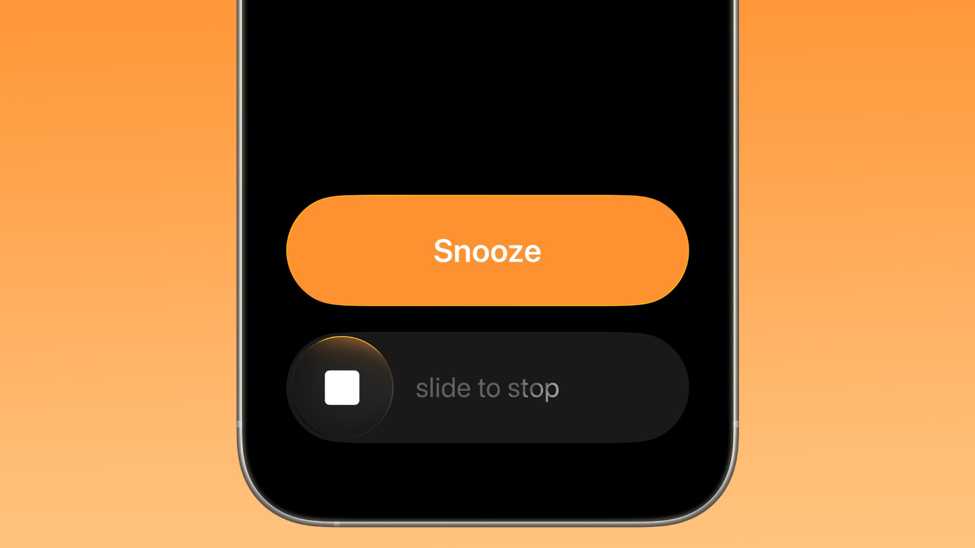
Apple has changed how you dismiss iPhone alarms in iOS 26.1, and your morning muscle memory may have needed tweaking as a result. By default, the Clock app now requires a slide gesture to stop an alarm from the Lock Screen, replacing the previous tap-to-stop button that was redesigned in iOS 26. Snoozing still works with a simple tap, but turning off an alarm entirely demands the extra swipe motion.

ios-26-1-slide-to-stop.jpg

The change appears designed to prevent accidental dismissals when you're reaching for your phone in the morning. By requiring a more deliberate action, you're less likely to silence your alarm when you meant to hit snooze. If you don't like the change, you can revert the alarm interface back to the previous Stop button by following these steps.
  1. Open the Settings app on your iPhone.
  2. Tap Accessibility.
  3. Under "Physical and Motor," tap Touch.
  4. Swipe to the bottom of the menu and toggle on Prefer Single-Touch Actions.
The change will take effect the next time you set an alarm. If you want to revert back to the slider, simply toggle off Prefer Single-Touch Actions.

Article Link: iOS 26.1: Bring Back the Tap-to-Stop Alarm Button

This change was frustrating for me, my iPhone is my alarm, I never use the snooze option and old habits die hard. Thank you for the instructions for changing it back to a simple tap. Someone else asked “What else does it change?” I frequently use the Timer function, that too now is single-touch. Yay!!
 
and every customisation takes time to implement and introduces another fail point... I've seen plenty of screens that just dont work when (usually) older people use Extra Large fonts and buttons fall off the screen or text doesnt fit.

there is a limit of what works.

and a simple drag is a better choice for this button than a tap.

go read some interface usability design docs.
it's something i've read and worked with for 35 years in IT...

the whole flat design debacle took things too far and didnt make systems clearer to use for many people.
i'm glad buttons look like buttons again and not hover over links 😉

we've endured some usablity nightmares over the years.
this button action is not one of them.
I had to come back to this one. It is all in good fun, but apparently Google agrees with me. 🙂 Now the hundreds of millions of people out there that use the Google clock app, me being one of them, will have the option to choose between a tap and a swipe to turn off their alarms. This is from an article I read yesterday on 9to5Google.

1769178212593.jpeg
 
I would rather have a button. Apple is right. The way it is now is very deliberate, and imo, annoying.
 
Register on MacRumors! This sidebar will go away, and you'll see fewer ads.