Become a MacRumors Supporter for $50/year with no ads, ability to filter front page stories, and private forums.
Am I the only one bothered by Alarm’s Slide to Stop text being that center-aligned? It should be left-aligned. Might look a bit more polished if it were aligned center between the stop grab and the right-edge of the slide. Idk, I’m not a designer, but it looks funny with the text super close to the stop grab.
 
Trying to solve the problem of limited screen space by layering multiple UI levels on top of each other makes no sense on a 2D display. It might work in a VR device like the Vision Pro, but even then the random apps, commands, and icons create pointless clutter.

This is exactly it.
It's fundamentally flawed concept to be implementing on this device type.
 
View attachment 2575996
This screen shows you everything that is currently wrong with the glass design. It's a visual mess.

Who thought this was a good interface? Even when approached objectively, it’s hard to read, difficult to understand, and a real pain to use.

Icons overlap, text is truncated, documents appear as nanoscopic miniatures, and the branding is obscure and unnecessary. What the hell is Quick Look, and why do I need to know about it? Wouldn’t “preview” suffice?

Trying to solve the problem of limited screen space by layering multiple UI levels on top of each other makes no sense on a 2D display. It might work in a VR device like the Vision Pro, but even then the random apps, commands, and icons create pointless clutter.

It’s time Apple looks beyond its bubble and acknowledges the growing disconnect between its products and users.
The biggest issue is describing the context of that screen? Half is missing in the screenshot. I have no doubt one could figure it out as navigating through the options as needed. But the screenshot lacked context.
 
so these so called hackers that call from your bank now now what your (preferred) bank is and your preferred app for communication. I would never share this info mate.
Thanks for pointing this out. I thought I chose a ‘safe’ screen, but I guess there is no such thing…


iOS 26.1 is the first major update to the iOS 26 software that came out in September, and it's now available for everyone. There are some useful new features in iOS 26.1 that address complaints about Liquid Glass and fix a longtime Lock Screen irritation.


We've complied a list of all of the new features in iOS 26.1, down to the tiniest interface change.

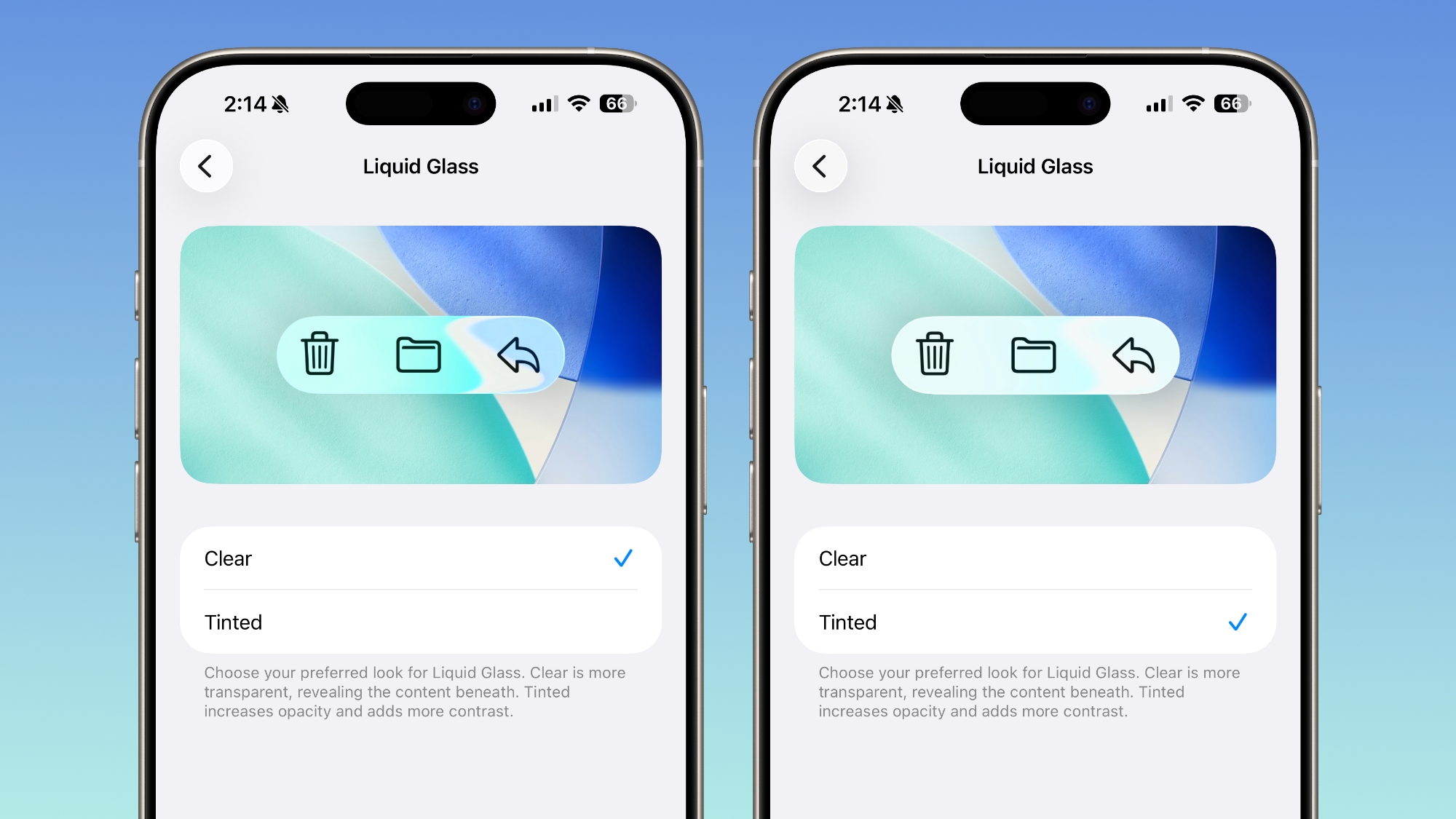
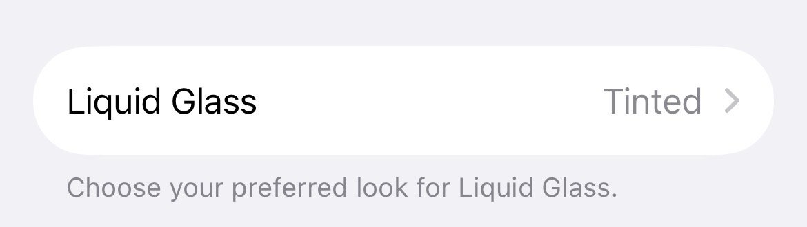
Liquid Glass Transparency Toggle

There is a new setting for customizing the look of Liquid Glass. You can now opt for a more tinted look that adds opacity.

ios-26-1-liquid-glass-opaque.jpg

Under Settings > Display and Brightness, there's a new option to switch between Clear or Tinted settings. Clear is more transparent and is the standard version of Liquid Glass that displays the background underneath buttons, menu bars, and other interface elements, while Tinted increases the opacity of Liquid Glass to improve contrast.

You'll see the most noticeable difference in apps and with Lock Screen notifications when Tinted mode is enabled.

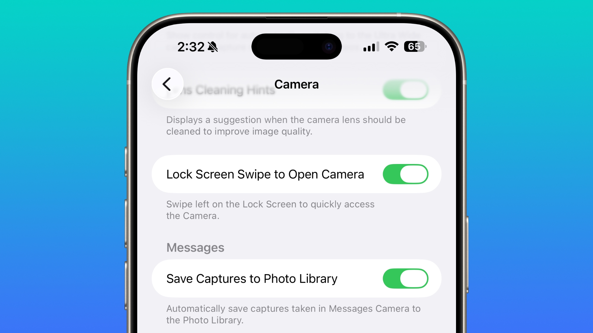
Lock Screen Camera Swipe

Apple finally added a way to turn off the Lock Screen gesture that opens the Camera app, which means no more accidentally turning on the camera when your iPhone is in your pocket.

lock-screen-swipe-disable-camera.jpg

In the Camera section of the Settings app, there's a Lock Screen Swipe to Open Camera setting, and turning it off disables the left swipe that opens the Camera app.

There was previously no way to turn off Lock Screen camera activation without disabling the camera app entirely.
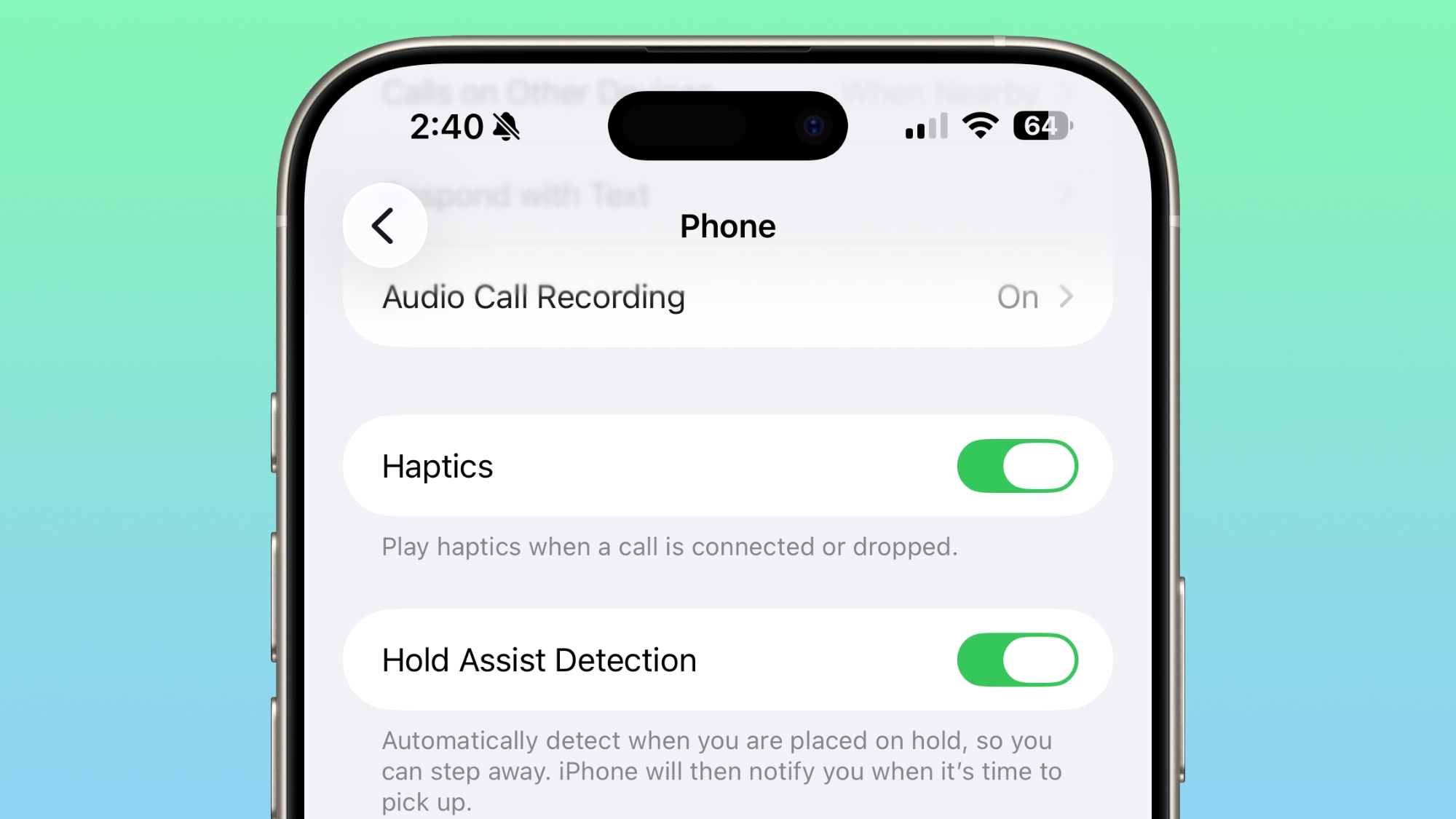
Phone Haptics

The Phone app includes a toggle to turn off haptic feedback when a call is connected or dropped, so if you find that little buzz irritating, you can now disable it.

ios-26-1-phone-haptics.jpg

Alarms and Timers

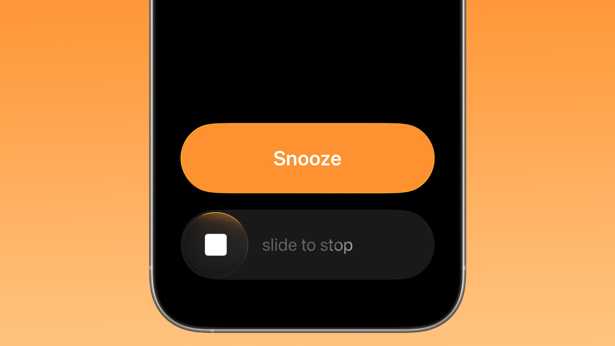
Apple updated the interface of alarms and timers in iOS 26.1. There's now a Slide to Stop bar on the Lock Screen instead of a tap to stop button.

ios-26-1-slide-to-stop.jpg


You can still snooze an alarm with a tap on the oversized button, but to turn it off entirely, you need to use a slide gesture that requires more dexterity.

If you've accidentally dismissed an alarm while trying to tap the snooze button and then overslept, this will be a welcome change. Unfortunately, there is no option to choose to stick with the tap to stop button.

New Apple Intelligence Languages

Apple Intelligence is now available in Danish, Dutch, Norwegian, Portuguese (Portugal), Swedish, Turkish, Chinese (Traditional), and Vietnamese.

The new languages join English, French, German, Italian, Portuguese (Brazil), Spanish, Chinese (Simplified), Japanese, and Korean, opening up Apple Intelligence to more people.

AirPods Live Translation Languages

AirPods Live Translation works with additional languages in iOS 26.1, including Japanese, Korean, Italian, and Chinese (both Mandarin Traditional and Simplified).

At launch, Live Translation was limited to English (US, UK), French (France), German, Portuguese (Brazil), and Spanish (Spain).

You can translate to and from all of the above languages with the AirPods Pro 2, AirPods Pro 3, or AirPods 4 with ANC.
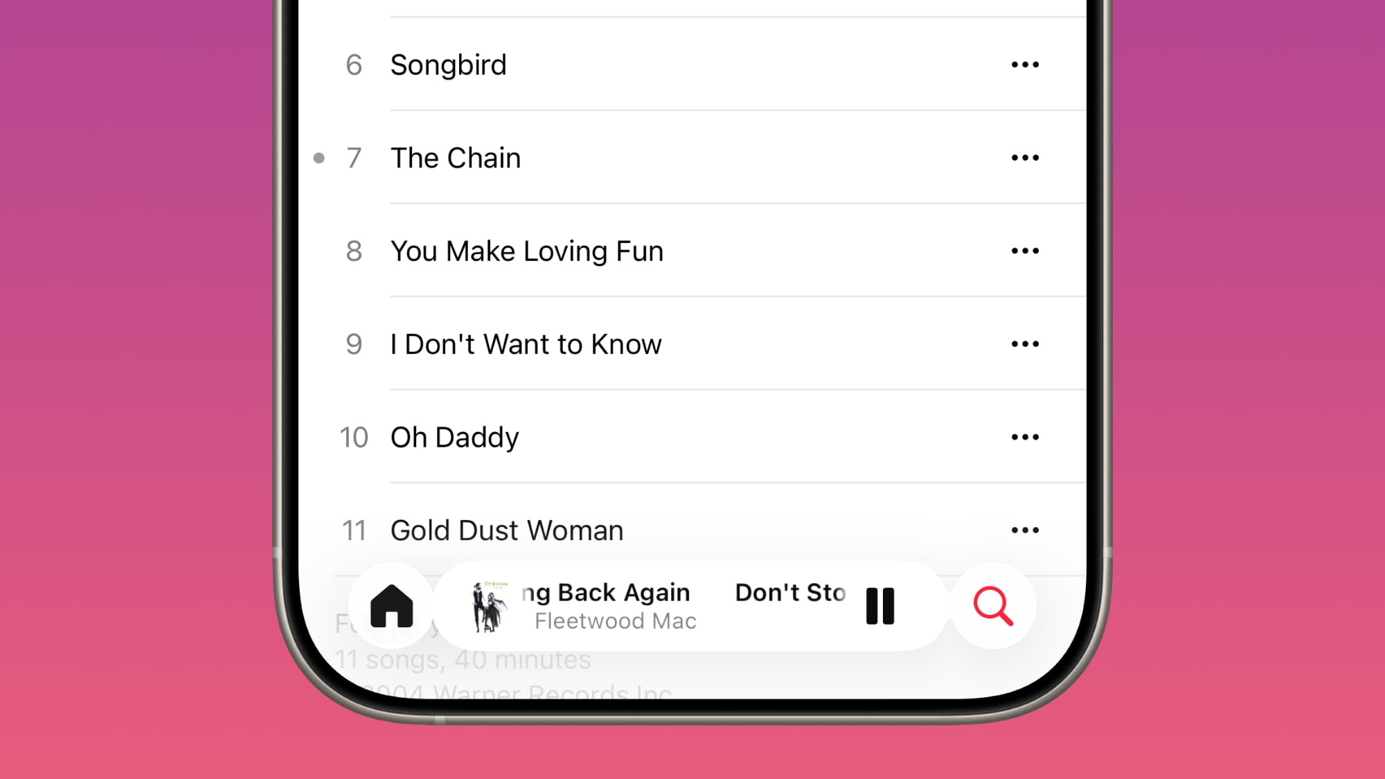
Apple Music

There's a hidden Apple Music gesture in iOS 26.1. You can swipe on the music player in the Apple Music app to switch songs. Just slide a finger over where the song title is listed, and it'll go to the next song or back to the previous song.

ios-26-1-apple-music-swipe.jpg


AirPlay

Apple Music AutoMix now works over AirPlay, so you'll hear AutoMix transitions when playing music over AirPlay 2-compatible speakers.

Apple TV App

The Apple TV app has a new, more colorful icon that adopts the Liquid Glass aesthetic. The redesign coincides with Apple's decision to drop the "Plus" from its Apple TV streaming service. Apple TV+ is now called Apple TV in the Apple TV app.
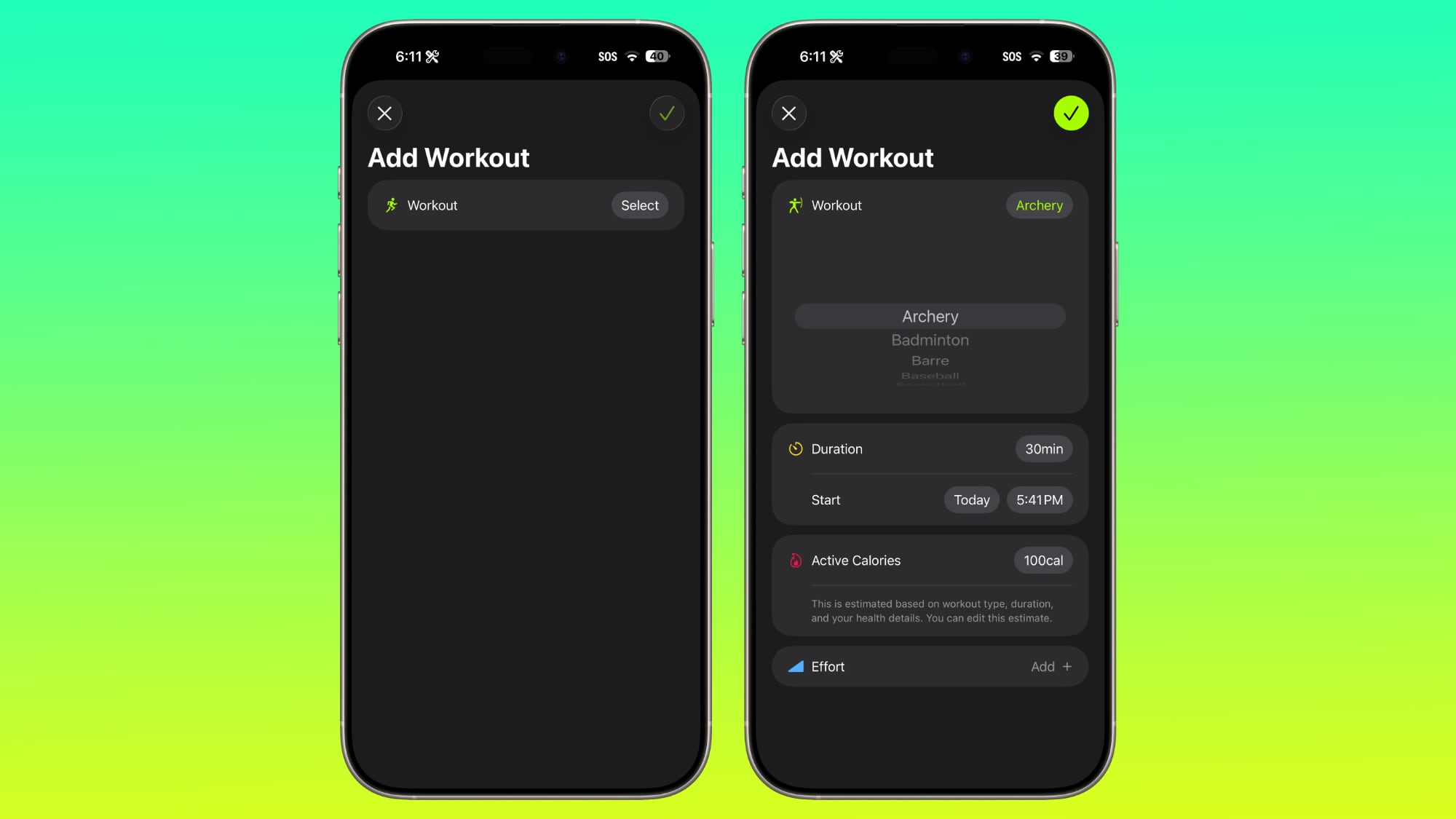
apple-tv-rebrand-icon.jpg


Fitness App

You can now create fully custom workouts in the Fitness app on iPhone. There are options for selecting workout type, estimated Active Calories, effort, duration, and start time.

ios-26-1-custom-workout.jpg


There were workout creation options before, but they were more structured than the open, custom creation options that are in iOS 26.1.
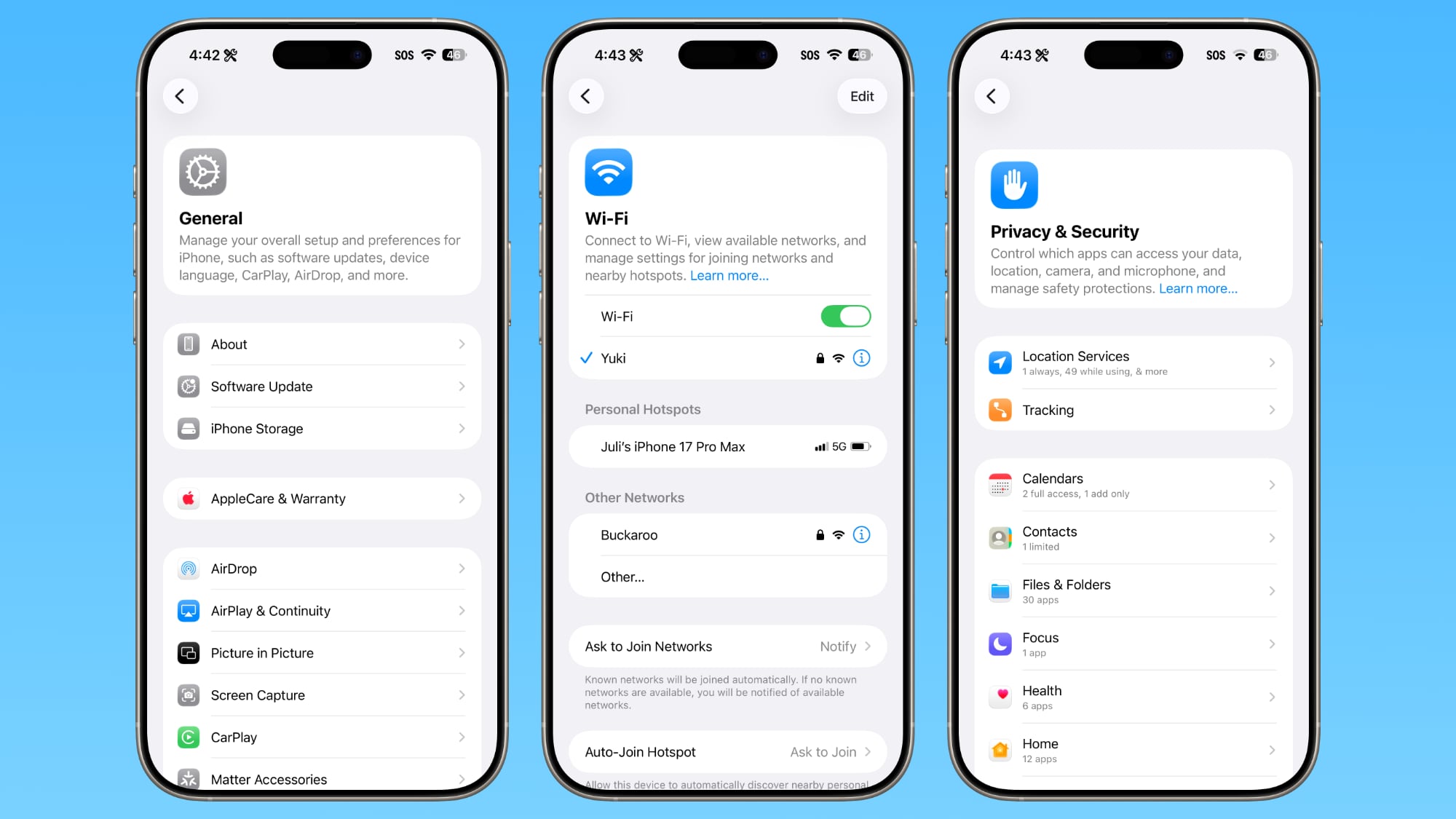
Settings App

Apple changed the alignment of icons and text in the Settings app. All settings with headers that feature text now have that text aligned to the left instead of center aligned. It's a small change that makes a big visual difference.

ios-26-1-left-aligned-settings.jpg

This includes General, Bluetooth, Wi-Fi, Cellular, Personal Hotspot, Accessibility, Apple Intelligence, and more.
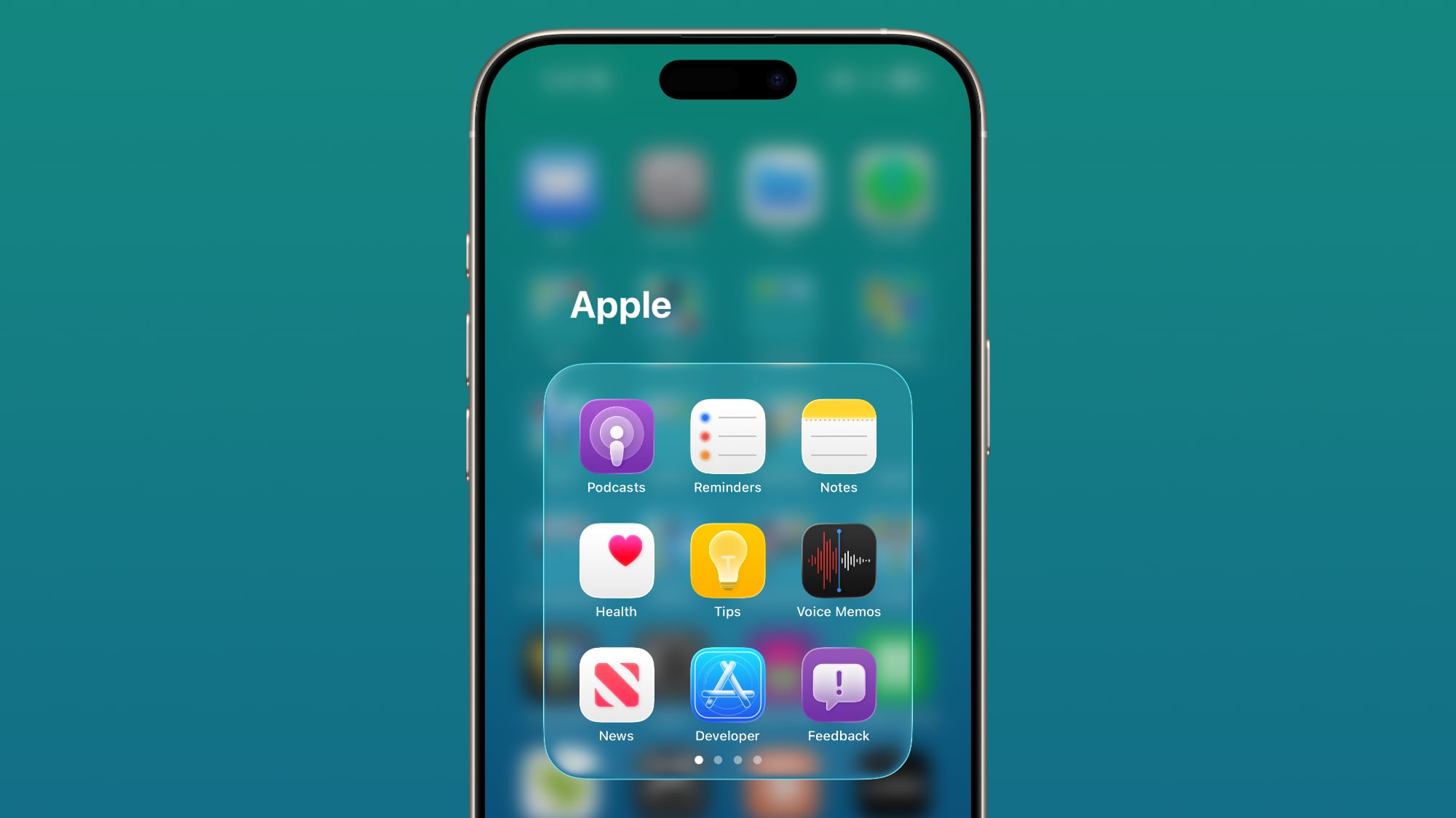
Home Screen Folders

When you tap into a folder on the Home Screen, the name of the folder at the top is left aligned instead of center aligned, matching the changes made in the Settings app.

ios-26-1-folder-alignment.jpg


Phone

The Phone keypad now uses Liquid Glass for the numbers, fixing a visual issue present in iOS 26... Click here to read rest of article

Article Link: iOS 26.1 Features: Everything New in iOS 26.1
The Liquid Glass tweaks notwithstanding, and at least on lock/homescreen, a wee bit of drop shadow keyed to the glass highlight motion is something I would like to see.
 
so these so called hackers that call from your bank now now what your (preferred) bank is and your preferred app for communication. I would never share this info mate.
I have an Amex card. Scam me. Even if this site was breached the email is not connected to anything important.(except this site)
 
My phone is still ruined by the camera button no longer turning on the camera in one push. Ruined my recent vacation in Costa Rica where I'd press it to take a pic and if it was off it would just wake it up and then I'd have to press it again and by then the animal or view was gone. Before iOS 26 I went to several concerts this year and the camera button simply worked. Immediately turned the camera on and I could start filming. Interface still slow. Battery life still awful. This is on a 16 Pro Max. Worst iOS update of all time.
 
  • Like
Reactions: m‘appleuser
My phone is still ruined by the camera button no longer turning on the camera in one push. Ruined my recent vacation in Costa Rica where I'd press it to take a pic and if it was off it would just wake it up and then I'd have to press it again and by then the animal or view was gone. Before iOS 26 I went to several concerts this year and the camera button simply worked. Immediately turned the camera on and I could start filming. Interface still slow. Battery life still awful. This is on a 16 Pro Max. Worst iOS update of all time.
Settings>Camera>Camera Control>Require Screen On turned to “Off”
Works for me.
 
  • Like
Reactions: rog and DailySlow
Tried tinted Liquid Glass mode. Hated it. Immediately re-enabled reduce transparency and increase contrast accessibility toggles
 
So far the only thing 26.1 has done for my 15 Pro Max is create a line across the screen about 1/4 of the way up which isn't there when it boots and wasn't there last night before my phone upgraded... ChatGPT claims a few people have been having this issue with the 15 Pro and 15 Pro Max... Hope they fix it soon. It's irritating.
 
  • Haha
Reactions: m‘appleuser
How else would they do it? It's a touch screen environment. If you slide your finger to the left you wouldn't want the interface element you're touching to move right as that would be totally confusing. You move it left so you can see what's to the right of it. Much like you would two sheets of paper on a desk. Move one in front of you to the left and bring the one to the right of you in front.
To me, pieces of paper are not the same thing as music. On my kindle, I find it logical that I swipe right to left to go to the next page, just like turning the page of a book. Somehow, I don't find this logical when swiping through music, even though other apps have implemented similar things, and I do find it logical in those apps. I will get used to it.
 
This may shock you but implementing AI across 5 product lines and 2 dozen or so devices may be a process that takes a few years.

What people don't seem to understand is that Apple HAS shipped a ton of work on Apple Intelligence. The problem is almost none of it is user facing, and the stuff that is directly usable by end users is pretty lame. Now over the next few years they will build on that foundation and hopefully come up with something that's pretty good.
Is it the user's fault for experiencing a poorly made product/service, or Apple's for consistently over promising and under delivering? If it wasn't ready, Cook shouldn't have been launching it. It's that simple.
 
It looks like they fixed the search in settings. I really missed that. I don’t know how a product goes to release with something like that broken. 🤷
 
  • Like
Reactions: m‘appleuser
To me, pieces of paper are not the same thing as music. On my kindle, I find it logical that I swipe right to left to go to the next page, just like turning the page of a book. Somehow, I don't find this logical when swiping through music, even though other apps have implemented similar things, and I do find it logical in those apps. I will get used to it.
But that's exactly what's happening in music unless im completely misreading your post. It doesn't matter whether it's music, paper or whatever. It's something that sits in front of you (your current song in this case). If you want to move to the next song which is hidden off to the right then you must move it left (because its off to the right) to bring it in front of you. Im describing it exactly as you would reading a book. You're on your current page. You move it to the left and the next page is waiting for you.
 
iOS 26.1 update introduces a new Liquid Glass popup Game Mode notification. It was not mentioned in any article and I wanted to share it with you!
 
That's right...to turn ON the tinted liquid glass you need to turn OFF reduce transparency in accessibility first. However, I just found that after tinted is on, you can go back and turn ON reduce transparency. Tinted now stays on. You can see an obvious difference with adding the reduce transparency when you swipe down the control center.
Wow that does really help a lot!
 
Register on MacRumors! This sidebar will go away, and you'll see fewer ads.