Become a MacRumors Supporter for $50/year with no ads, ability to filter front page stories, and private forums.

MacRumors

macrumors bot
Original poster
Apr 12, 2001
68,540
39,395


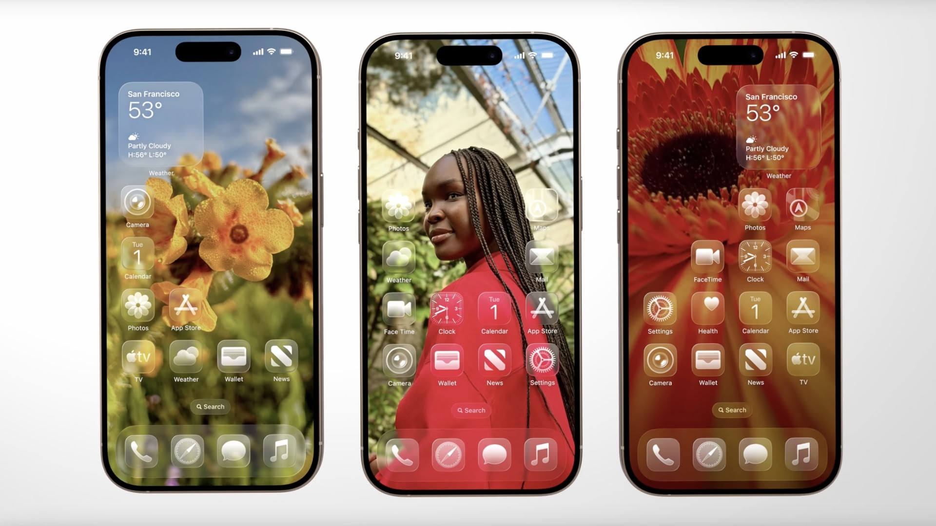
Apple in iOS 26 has introduced a third display appearance option called "Clear Look," expanding beyond the traditional Light and Dark Mode choices that have defined the iPhone experience in recent iOS versions.
ios-26-clear-look.jpg

The new mode leverages Apple's "Liquid Glass" design language, unveiled as part of the company's broadest new software redesign since iOS 7. Clear Look transforms app icons using multiple layers of translucent material that dynamically responds to content and context.

Unlike Light and Dark modes, Clear Look creates a more transparent aesthetic that allows underlying content to show through interface elements. The mode works in conjunction with Apple's new universal design system, which aims to create consistency across all Apple platforms "while maintaining each device's unique characteristics," according to the company.

App icons have been redesigned to support the new appearance option, featuring the same Liquid Glass material that adapts intelligently between different lighting environments. The mode extends beyond icons to widgets and other interface elements, offering users an entirely new way to customize their iPhone's visual appearance.

The feature will be available when iOS 26 launches this fall. In the meantime, developers can grab the iOS 26 beta now, while public beta testers can get their hands on the new software from next month.

Article Link: iOS 26 Adds All-New 'Clear Look' Option Alongside Light and Dark Mode
 
That seems like a good idea on paper...And it doesn't look intuitive and strips each app of its individuality to in a sense. But, I'm probably overthinking it.
 
  • Like
Reactions: gusmula and .wojtek
I still only see light and dark. even on 16 pro with the ios26 beta. Might be in a future beta...
searching for "clear look" doesn't give anything.

Edit: found it. Thanks for the help!
 
Last edited:
From a usability standpoint it’s terrible. People subconsciously automatically aim for a colour they associate with the app without actually looking at the icon, if they are all the same colour it makes that impossible.
 
Just put the beta on my phone and yeah not fan of this "all new design" it significantly affects legibility in either dark or light mode, control center is especially affected. And it feels very inconsistent with old elements mashed with the new Liquid Glass, and im not talking about the third party app icons or such, like even the mail app feels very disjointed and unfinished. Maybe its just cause its beta 1 but not super impressed by this
 
Anyone noticing the homescreen app icons are blurry? Chrome and Photos for instance are definitely blurry where as the Camera app, Phone and Messages are fine, Outlook and Teams also are noticeably blurrier.
 
  • Like
Reactions: sleeptodream
I dislike it less than I expected. Still, it's not some crazy change from iOS 18, really. Outside of the camera app. That'll take some getting used to having to tap then swipe photo and video modes.
 
Register on MacRumors! This sidebar will go away, and you'll see fewer ads.