ghostface147
macrumors 601
That’s a no from me. I’d be lost looking for stuff. At the same time, my Home Screen is all muscle memory and I use spotlight to open all apps not on my Home Screen in folders.
I have mine all in grayscale, I identify the apps by their location in the home screenClear mode looks downright stupid. I would think almost everyone identifies their icons quickly by color.
check the keynotewhat does it look like , do you have pics ?
I was merely pointing out its quite useless as an option functionally. I think it exists purely as marketing for Apple to really sell the ‘Liquid Glass’ look rather than something that’s actually usable. But for aesthetics sure some may just like the style.Then don't use the clear view? I see no issues so far with the UI
Should have been named Unclear Look.From a usability standpoint it’s terrible. People subconsciously automatically aim for a colour they associate with the app without actually looking at the icon, if they are all the same colour it makes that impossible.
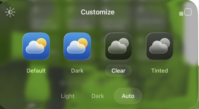
I see default, dark, clear, and tinted. In clear it allows light, dark, or auto for behavior. Dark just looks grey scale. Not a fan.I still only see light and dark. even on 16 pro with the ios26 beta. Might be in a future beta...
searching for "clear look" doesn't give anything.
It is the first beta.I was merely pointing out its quite useless as an option functionally. I think it exists purely as marketing for Apple to really sell the ‘Liquid Glass’ look rather than something that’s actually usable. But for aesthetics sure some may just like the style.
Hold anywhere on Home Screen then in the Top Left corner tap "Edit" then "Customize" and you'll have a "Customize" menu poup with "Default" "Dark" "Clear" and "Tinted".I still only see light and dark. even on 16 pro with the ios26 beta. Might be in a future beta...
searching for "clear look" doesn't give anything.
Agree. 👍From a usability standpoint it’s terrible
No - it is the first version of a Beta of a new OS. Do not judge based on the pictures, you are seeing, become a developer and give Apple the necessary feedback.This is such an accessibility failure that I feel embarrassed for the designers who were likely forced to ship a beta in this state to make the WWDC deadline. This is like not having font rendering on a word processor beta. Contrast ratios are basic stuff that every UI designer has to consider from the foundation of a project.