Become a MacRumors Supporter for $50/year with no ads, ability to filter front page stories, and private forums.
Status
The first post of this thread is a WikiPost and can be edited by anyone with the appropiate permissions. Your edits will be public.
So IOW, what you originally said isn’t true. Performance and the various issues will gradually improve over the coming betas.

What I find is that in general, there is usually a vast improvement by dev beta 3 / public beta 1.
Correct, but the actual RC is when we'll see what Apple deems as ready for prime time.. Again, they're obviously going to fix things along the way.. It's the indexing for Feedback that's always done in the background, and more intensely, that will still be around until then, and that alone can make "performance" seem like an issue.
 
  • Like
Reactions: Stiille
You can turn off transparency effects, which kills them systemwide. I‘d be fine if they introduced a reduce liquid glass effects toggle, so only the liquid class UX is toned down.

Liquid glass either gave me the sudden realization that my eyesight is drastically dropping or it‘s simply ineligible design. I surely can‘t be the only one scratching my head at how this was greenlit this way.
If you go into the Accessibility settings and toggle “reduce transparency“ it will do what you seek.
 
Noticed that if you apply a static photo as a background in Messages and you rotate your device to landscape, the image only shows on 1/2 the screen.

Rotating it back to portrait covers the whole screen again but the image is zoomed-in. (You have to exit the Message thread and re-enter to fix it.

This doesn’t happen with the dynamic backgrounds supplied by Apple.

Submitted feedback FB17981134
 
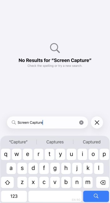
My Search seems to be glitched. Can anyone else get a different result when searching for Screen Capture in Settings search or system search?

IMG_3795.jpeg
 
My impressions of iOS 26 on iPhone 16 Pro-

1. Battery life is acceptable, not as goods iOS 18 but I would say for me it's like 80-90% of what iOS 18 was.

2. Design is alright, I am kinda neutral to it maybe because it's new idk. There are inconsistencies across the OS like the bottom tab bar in clock app, the current tab selected in shown in "Yellow" Colour like it has always been but in other apps it's blue like Notes. It's unnecessarily bouncy for my taste. I like the Music Player's design and audio mix feature.

3. Animations are choppy and frame drops everywhere even in some light games. I have never seen my 16pro lag before this beta but it eventually settles down. Initial time is rough. On the second day it got better but it's still stutters and lags.

4. AI. I hardly use these features but whenever I did iPhone just ***** the bed. Playground app is like useless to me. So many times it went to generate image but never gave me the result especially on Chatgpt style.

5. Messages app is a hit or miss for me. All the OTP I get from the third party apps never showed up in my notifications. I opened the messages app and it was gone into "Transactions" tab but it never showed up as a notification. Kinda needs fixing a bit. Had to cancel some transactions before I could figure out what was happening.

6. Initially it did overheat a bit but then it calmed down after a few hours. Second day, my phone didn't get hot at all but overall system is slow and janky which is expected as its first beta.

7. Torch toggle is a hit or miss as well for me. I regularly turn on the torch from lock screen and it's like 70% hit or miss. it goes into edit wallpaper section when pressed for turning on the torch. I had to intentionally look for the button and turn it on. It has become a muscle memory for me to turn on the torch but something in iOS 26 definitely had it wrong.

8. Sometimes screen doesn't react to touch. there are a lot of misses on touch interactions throughout OS.

9. Cellular connectivity has also been slow for me as compared to iOS 18. It needs tweaking.

10. Always on lock screen blur wallpaper is neat plus the lock screen depth effect on photos. That (Spacial Scene) was kinda trippy but fun but I don't think I will be using that feature often. Photos apps is like pre iOS 18 which is a relief.

I don't feel like it's a big leap forward. If you were bored of the iOS 18 style design then maybe it's a big deal but I feel iOS 18 looked and felt better (Personal opinion). All this glassy stuff is gonna add more weight on the cpu and gpu imo. It's like an extra overhead with all the new bouncy and glassy animations etc.
Think that we are in beta 1 and we still have to smooth out a lot of roughness, but I'm sure that as the betas come out the IOS will be smoother and will run better (I hope so). And according to several points that you have listed!! :cool:;)
 
  • Like
Reactions: maxrest
Installed on my 12 Pro and it's running pretty well, minus a few small bugs like the delay between the app closing and the icon getting the “glossy” effect. No hot phone, no extreme battery drain.
 
  • Like
Reactions: ocdeal and Reeneman
If any of the software designers are listening, why can't you add a dedicated numbers row in the keyboard, like Android has had for years now. Can't be that difficult and sure would be appreciated. Maybe you don't mind that I continue to use the Google Keyboard. Time to join the modern ages Apple iOS!!
 
If any of the software designers are listening, why can't you add a dedicated numbers row in the keyboard, like Android has had for years now. Can't be that difficult and sure would be appreciated. Maybe you don't mind that I continue to use the Google Keyboard. Time to join the modern ages Apple iOS!!
Was just coming on to say the same. Unbelievable we still don’t have the option. I would love to know crApple’s reasoning as to why. Going to put a feedback in.
 
Having the Sleep Screen turned on in the sleep focus causes the elongated clock font to return to normal. Probably intentional, but kind of a bummer. I really like the bigger clock and I’d think it would be beneficial at night?
Why not rotate to nightstand mode for an even bigger clock?
 
If any of the software designers are listening, why can't you add a dedicated numbers row in the keyboard, like Android has had for years now. Can't be that difficult and sure would be appreciated. Maybe you don't mind that I continue to use the Google Keyboard. Time to join the modern ages Apple iOS!!
Different strokes. There’s nothing modern about having numbers. My computer with a 40% keyboard doesn’t have a number row either. It’s by design and perfect for my use.

iOS did take circle to search (at least in screenshots), call screening, hold for me, and live translate from Android this year. It’s an evolution, not a revolution.
 
  • Like
Reactions: kmf1
Simple question, I prefer the smaller icons, the smaller icons come with titles underneath them. I prefer no titles. That means for no titles I have to use the big icons if I want the small icons I have to use titles. Why in the F*** can't Apple give us a freaking choice? No change from last year. This would be so simple. It's Apple's way or the highway. Was really hoping they might give this to us this year, a simple choice.
 
On a scale from 1 to 10, how buggy is the beta? I’m getting the itch to get it on my iPhone but not sure if I should hold out for the 2nd or 3rd beta
 
Register on MacRumors! This sidebar will go away, and you'll see fewer ads.