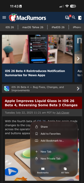
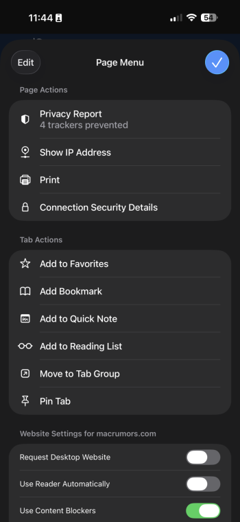
I prefer this beta.Safari should get back the b3 gradient, this one seems too soft.
Got a tip for us?
Let us know
Become a MacRumors Supporter for $50/year with no ads, ability to filter front page stories, and private forums.
iOS 26 Beta 4 ― Bug Fixes, Changes, and Improvements
- Thread starter Banglazed
- WikiPost WikiPost
- Start date
- Sort by reaction score
You are using an out of date browser. It may not display this or other websites correctly.
You should upgrade or use an alternative browser.
You should upgrade or use an alternative browser.
- Status
- The first post of this thread is a WikiPost and can be edited by anyone with the appropiate permissions. Your edits will be public.
Is it still defaulting to that stupid Home Screen instead of Now Playing?
Going into the music app usually always goes to the home screen does it not? I always just tap the album art in the main view of CarPlay which takes me right to the now playing screen.Is it still defaulting to that stupid Home Screen instead of Now Playing?
It stutters when changing a page in Home Screen and every swipe that I made from left to right example searching emojis
Anyone else get the sense the compact Safari navigation/menu items aren’t respecting Dynamic Type settings? I have them set to the small end of the scale, but safari menus have massive text!
Your phone will be indexing all day. As far as judging if it’s stuttering or not I’d wait till tomorrow or the day after.It stutters when changing a page in Home Screen and every swipe that I made from left to right example searching emojis
Mines working fine. Have my text size all the way down.Anyone else get the sense the compact Safari navigation/menu items aren’t respecting Dynamic Type settings? I have them set to the small end of the scale, but safari menus have massive text!
And it works on AirPlay to HomePods!Automix in Apple Music is completely different to the last betas.
Nope. Not until 26 did it do this.Going into the music app usually always goes to the home screen does it not? I always just tap the album art in the main view of CarPlay which takes me right to the now playing screen.
It also has required me to open Music on my phone for CarPlay to realize that I indeed did have something playing before.
This has been happening since beta 1 lol... I think that's more than enough time for it to settleGive the phone at least a moment to settle after such an update.
Honestly you know how it works after these updates…
The iOS 26 wallpapers are now also available as "dynamic". That wasn't there in beta 3 was it?
Isn’t that how it’s always worked? That’s why there’s a separate now playing button too, because it’s like the Apple Watch where the now playing screen is technically separate from the actual Music app?Is it still defaulting to that stupid Home Screen instead of Now Playing?
One noticeable thing. It’s already now, shortly after install pretty cool
I'm waiting for the PB1 to drop. Will do DP4, but want the comfort of knowing that it's good enough to be released as PB1.Damn getting itchy to jump on the 26b4 train after having tried b1 earlier and returning to 18.5. Now on 18.6.
Should I...?
I decided to give it a try with my iPhone 13 Pro as well, and it also runs incredibly smoothly compared to iOS 18. I didn't expect this from a beta at all.
On the iPad, I can’t get out of the view with wallpaper customisation – only locking the iPad works.
Some areas where the UI still sucks, as in there are problems with the contrast.


This looks ridiculous, in my opinion (the address bar, when collapsed):

And I will never understand the design logic behind the dividers that appear on hover - it’s just ugly and useless:

Some areas where the UI still sucks, as in there are problems with the contrast.
This looks ridiculous, in my opinion (the address bar, when collapsed):
And I will never understand the design logic behind the dividers that appear on hover - it’s just ugly and useless:
Maybe failed and is trying to do repairs. Could be checking the system integrity and or SSD healthMy update stuck at apple logo and loading bar. Is it normal for it to get stuck here for so long? (Updated at 6:30) still waiting…
This seems not normal, can you restore it? And I hope you have made an backup ?My update stuck at apple logo and loading bar. Is it normal for it to get stuck here for so long? (Updated at 6:30) still waiting…
Define good enough. For Apple it's good enough when your device doesn't get bricked or end up in a bootloop. DB4 being PB1 wont magically make it any less of a crappy release, if DB4 is one. Being released as a PB is not a quality seal nor is it a good indicator of the build being of high quality.I'm waiting for the PB1 to drop. Will do DP4, but want the comfort of knowing that it's good enough to be released as PB1.
They released first PBs with cellular data issues in the past (e.g. modem restarting or calls dropping), cause they deemed it to be not a high priority bug that needs hotfixes.
You can disable the awful collapsed address / tab bar in Safari Settings.On the iPad, I can’t get out of the view with wallpaper customisation – only locking the iPad works.
Some areas where the UI still sucks, as in there are problems with the contrast.
View attachment 2530905
View attachment 2530906
View attachment 2530907
This looks ridiculous, in my opinion (the address bar, when collapsed):
View attachment 2530910
And I will never understand the design logic behind the dividers that appear on hover - it’s just ugly and useless:
View attachment 2530911
The tab design is soooo fugly on both Mac and iPadOS. I think Safari is the worst part of OS 26 for me.
It is very ugly, and, unfortunately, it’s the app I use the most.You can disable the awful collapsed address / tab bar in Safari Settings.
The tab design is soooo fugly on both Mac and iPadOS. I think Safari is the worst part of OS 26 for me.
Register on MacRumors! This sidebar will go away, and you'll see fewer ads.


