Apple has been refining Liquid Glass during the developer beta testing process, and both beta two and beta three have introduced some major tweaks. There was little outcry over the updates that Apple made in the second beta, but the third beta's design updates have frustrated some users who feel that Apple is removing too much of the Liquid Glass aesthetic.
For context, Apple made navigation bars more opaque across many apps in iOS 26 beta 3, and we've got a series of side-by-side comparisons that demonstrate what's different. In all of the comparison images, beta 2 is on the left and beta 3 is on the right.
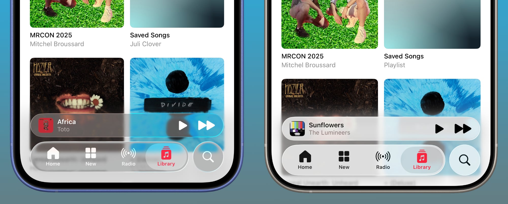
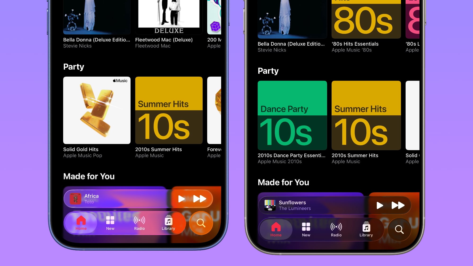
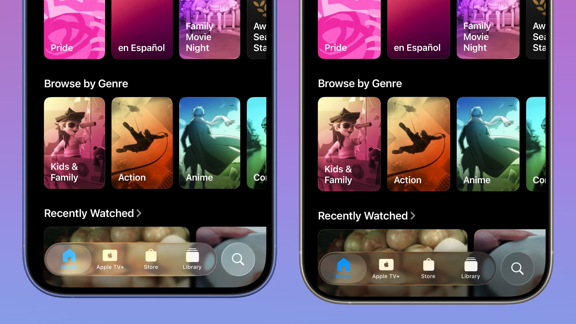
Apple Music
Apple Music's bottom navigation bar is more opaque, and it has the frosted glass look that Apple is now favoring. The change is most noticeable when scrolling over a background that has color. In beta 2, the navigation bar was almost translucent, allowing much of the background color to shine through. That effect is significantly reduced in beta 3.
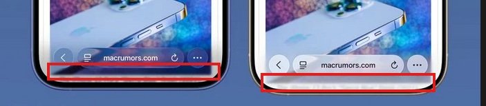
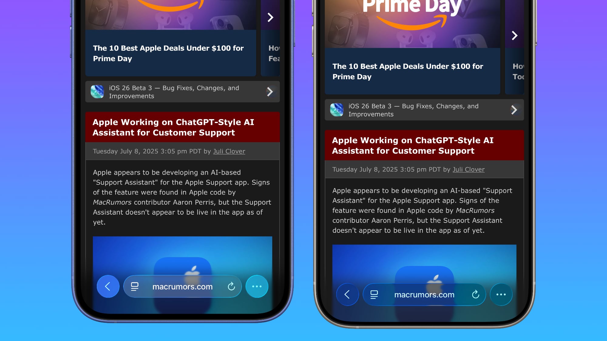
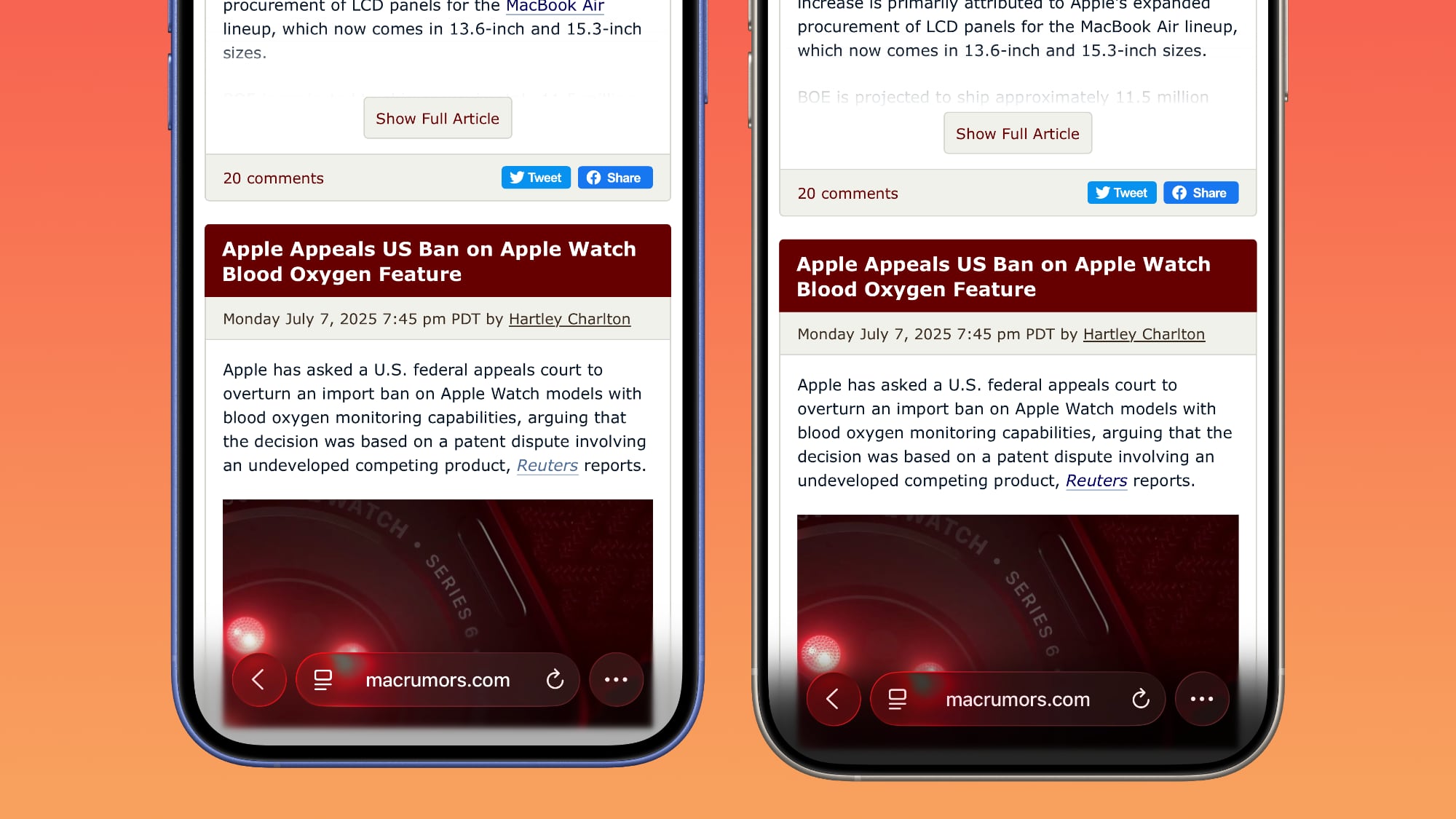
Safari
The changes in Safari vary depending on what you're doing, the background color of the website, and which Tab View design you're using. In general, the URL bar is more opaque and less prone to notable shifts in color. Less of the background comes through.
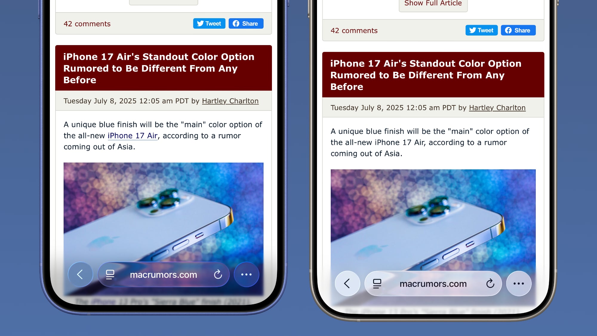
The URL bar will still change from light to dark if the content you're scrolling over is predominantly dark, but there's a higher threshold for that to kick on.
It's easiest to see the difference with the Compact View, because it was the most translucent view to begin with.
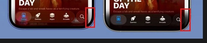
App Store
The App Store's navigation bar has one of the most noticeable changes, and it's almost entirely opaque now.
Podcasts
As with Apple Music, translucency has been almost entirely eliminated in the Podcasts navigation bar. The change is easiest to see with backgrounds that have color.
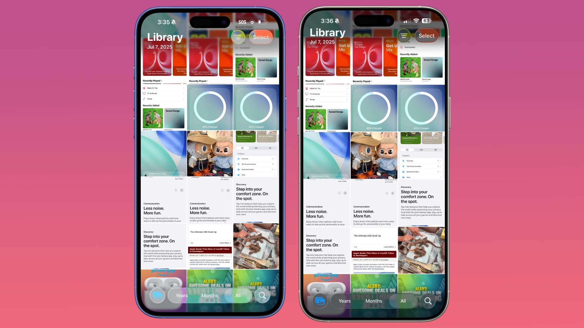
Apple TV
The Apple TV app has a darker background and the change is more subtle. The overlaying navigation bar is a darker glass color, but transparency appears to be similar.
Photos
For the Photos app, Apple tweaked the design in a similar way to the Apple TV app. The navigation bar is darker, but there's been little change to transparency.
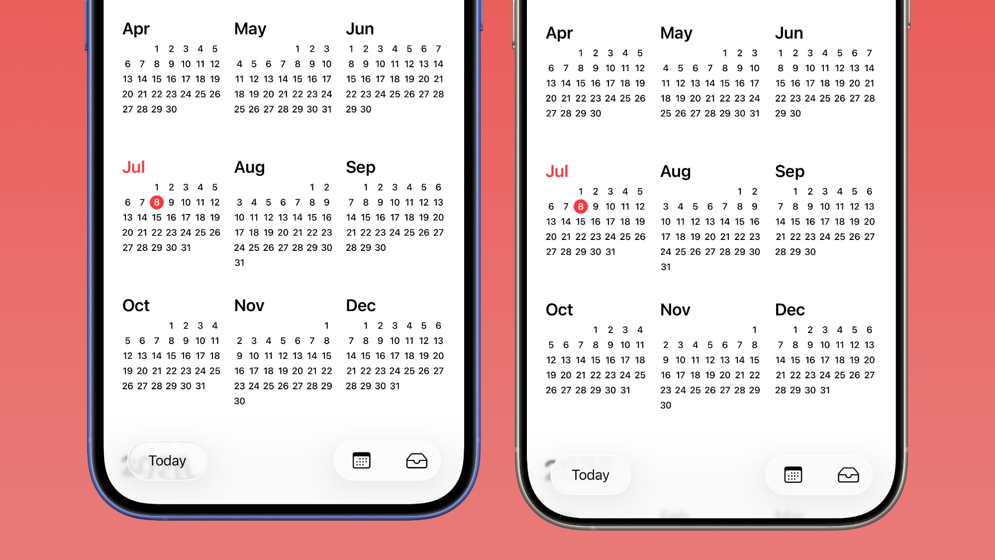
Calendar
Calendar's navigation buttons are more opaque, both in Light Mode and Dark Mode.
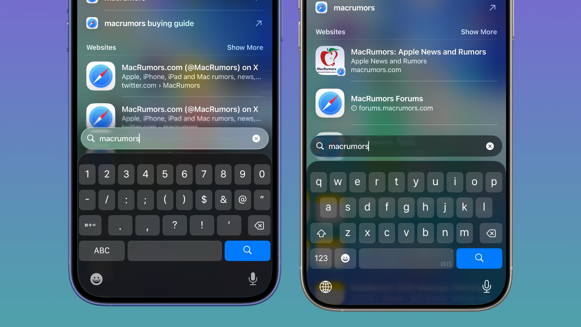
Keyboard
The Spotlight Search keyboard is both more and less translucent. The keyboard itself has slightly more background visible, but the search bar is darker.
Dark Mode
Dark Mode has retained more transparency than Light Mode for the most part, so you may see less of a difference if you have Dark Mode enabled permanently. Some menu bar elements are darker than before, but white text on a dark background is more readable so Apple had to increase the opaqueness less.
This isn't true for all apps, though, and there are areas with dark navigation bars that also have less translucency.
Color Dependency
The difference that you see between beta 2 and beta 3 can vary quite a bit depending on the color in the background. With some white backgrounds, it's hard to tell that the Liquid Glass has a more frosted appearance, and the updates are mostly noticeable with light colors.
Over content that is are darker, navigation bars will often transition to their Dark Mode view that appears more translucent, as can be seen in the Safari screenshot below. This is the same effect you'll see with Dark Mode enabled.
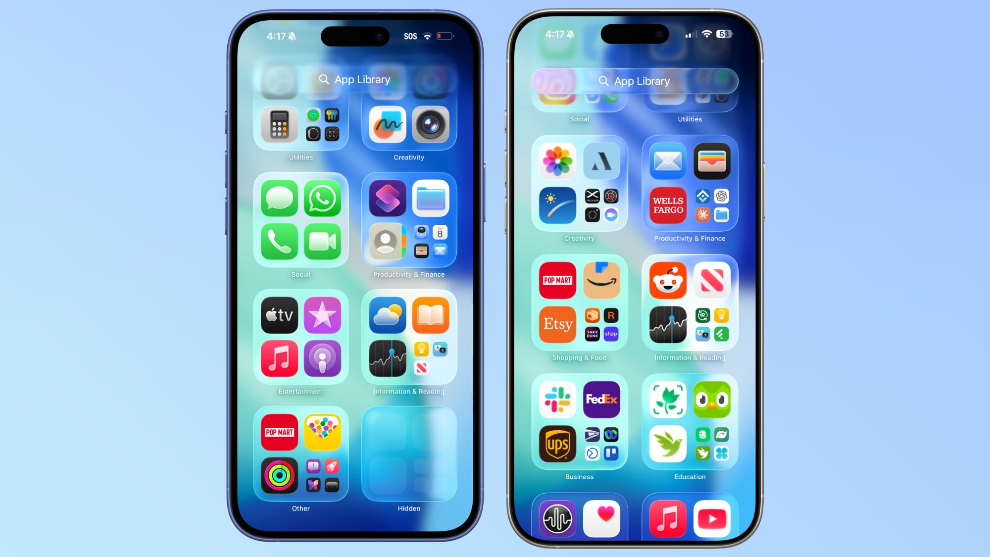
Notifications, Lock Screen, and Home Screen
On the Lock Screen, the time is ever so slightly more opaque than it was before. With some background colors, notifications also have a darker background than before, but this isn't always noticeable. Home Screen and Control Center haven't changed much if at all.
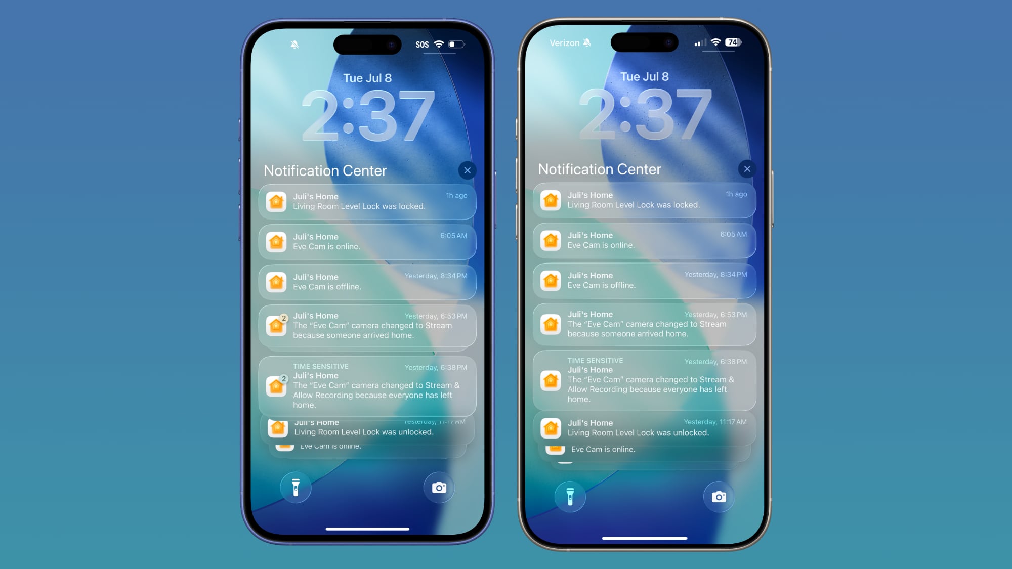
For App Library, the search bar doesn't have blurred edges when scrolling, which makes it easier to see. Apple hasn't changed translucency... Click here to read rest of article
Article Link: iOS 26 Liquid Glass Design Drama: Beta 2 vs. Beta 3 Changes in Every App
Last edited: