hasanahmad
macrumors 68000
cuteCowards. Playing it safe instead of doing something truly innovative.
Doesn't work well in some situations? Make it better.
Instead, they thrown the towel.
Rename it, because it's no longer glass.
cuteCowards. Playing it safe instead of doing something truly innovative.
Doesn't work well in some situations? Make it better.
Instead, they thrown the towel.
Rename it, because it's no longer glass.
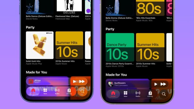
I just reported this article as the testing performed has been horribly badly reported on, there is a setting that enables the frosted glass look that is clearly turned on in the beta 3 examples, and not on in the beta 2 examples, that seems to have been missed by the tester, the reality is beta 3 is cleaner and easier to read, but the frosted glass effect IS NOT a beta 3 change, but merely a setting (Reduce Transparency in Accessibility I believe) that is turned on. Please get the testers to run there tests again making sure the settings are identical between devices so as not to get this kind of reporting error.
another example. Macrumors say the glass is completely opaque in App store...and yet..me...the same location@tim_apple For example, I am not getting the frost glass look in Apple Music that post clams is what beta 3 is doing, I only get that if I turn on Reduce Transparency first. The article is an example of bad reporting that I know is rare for Macrumors, so they need to be called out for it when they make those kinds of errors.
MacRumors and some users, tries to say that the buttons themselves have less glass effects and ignore the screenshot that there is a clear white and black haze layer between the content and the glass buttons which creates this effect depending on the light mode and background. the buttons themselves are not more opaque as in the design elements the Glass elements sit on top of every UX element on screen. where is the fundamental analysis of the design and physics of this instead of blind non detailed look . hilarious takes being had
To be fair, even og liquid glass beta was iOS 18.9.That's iOS 18.7. Lol. Stop playing in our faces, Apple.
You obviously have no clue what Reduce Transparency looks like in beta 3. Because if you did you‘d know that this isn’t it… which you can clearly see in the beta 3 Apple News screenshot. The color wouldn’t be visible on the right, but it is.I just reported this article as the testing performed has been horribly badly reported on, there is a setting that enables the frosted glass look that is clearly turned on in the beta 3 examples, and not on in the beta 2 examples, that seems to have been missed by the tester, the reality is beta 3 is cleaner and easier to read, but the frosted glass effect IS NOT a beta 3 change, but merely a setting (Reduce Transparency in Accessibility I believe) that is turned on. Please get the testers to run there tests again making sure the settings are identical between devices so as not to get this kind of reporting error.
another example. Macrumors say the glass is completely opaque in App store...and yet..me...the same location View attachment 2527178
Wait until you find out that frosted glass has existed since roughly the mid 1800s.Cowards. Playing it safe instead of doing something truly innovative.
Doesn't work well in some situations? Make it better.
Instead, they thrown the towel.
Rename it, because it's no longer glass.
@tim_apple For example, I am not getting the frosted glass look in Apple Music the article clams is what beta 3 is doing, I only get that if I turn on Reduce Transparency first. The article is an example of bad reporting that I know is rare for Macrumors, so they need to be called out for it when they make those kinds of errors.

Same location , this time in motion . you can even see the haze go from white to black on darker contentBeta 2 looks like this for me, but not beta 3. The screenshots aren't doctored -- they're taken in the same spot in the same way. I do not have this effect in the App Store navigation bar. Maybe there's some kind of display bug, but I don't see this in the third beta.
I think this latest version is pretty decent. The earlier one was too transparent for readability. I guess these things are pretty subjective and vary a lot between people.Only Apple could announce a cool new UI and utterly ruin it before it ships.
Im on beta three without RT on and it looks exactly like it does in this article.@tim_apple For example, I am not getting the frosted glass look in Apple Music the article clams is what beta 3 is doing, I only get that if I turn on Reduce Transparency first. The article is an example of bad reporting that I know is rare for Macrumors, so they need to be called out for it when they make those kinds of errors.
ok..lets test this. which location/app?Im on beta three without RT on and it looks exactly like it does in this article.
The article isn’t the problem here, your device apparently is.

