Become a MacRumors Supporter for $50/year with no ads, ability to filter front page stories, and private forums.

MacRumors

macrumors bot
Original poster
Apr 12, 2001
69,596
40,768


iOS 26's new Liquid Glass interface has been criticized for making some content illegible in certain circumstances, and now the UI design is reportedly causing another unusual visual problem for some users.

ios-26-liquid-glass-dark-mode.jpg

Liquid Glass adds subtle glowing effects to the corners of app icons, creating a dynamic glass-like appearance with depth and parallax effects. However, as noted by Gizmodo, this design choice can produce an optical illusion that makes icons appear tilted. Users impacted by the phenomenon report feeling disoriented, with some experiencing dizziness from the perceived slanting effect.

The issue has gained attention on Reddit, with one post receiving over 3,000 upvotes. "The frame glow effect makes apps look tilted, and it's really distracting," complained one user, while another said the update made them "feel drunk."

"All of iOS 26 is an optical nightmare," added another user. "It's horrible."

The tilting effect is most pronounced when icons are set to "Dark," "Clear," or "Tinted" modes against dark or black backgrounds, while colorful wallpapers seem to help mask the illusion by drawing attention away from the refractive corners.

Apple's transparency reducing options and the "Reduce Motion" setting (Settings ➝ Accessibility ➝ Motion ➝ Reduce Motion) don't seem to help minimise the illusion, with reports indicating most users fail to see a difference. Hopefully, Apple adds a dedicated control in a future update to adjust the icon effect that's causing the issue.

Are you suffering from the Liquid Glass optical illusion? Let us know in the comments.

Article Link: iOS 26 Liquid Glass Design Makes App Icons Look Crooked, Report Users
 
Last edited:
  • Haha
  • Like
Reactions: ikir and Starfia
"Are you suffering from the Liquid Glass optical illusion? Let us know in the comments."

No I'm not experiencing it or "suffering" from it.

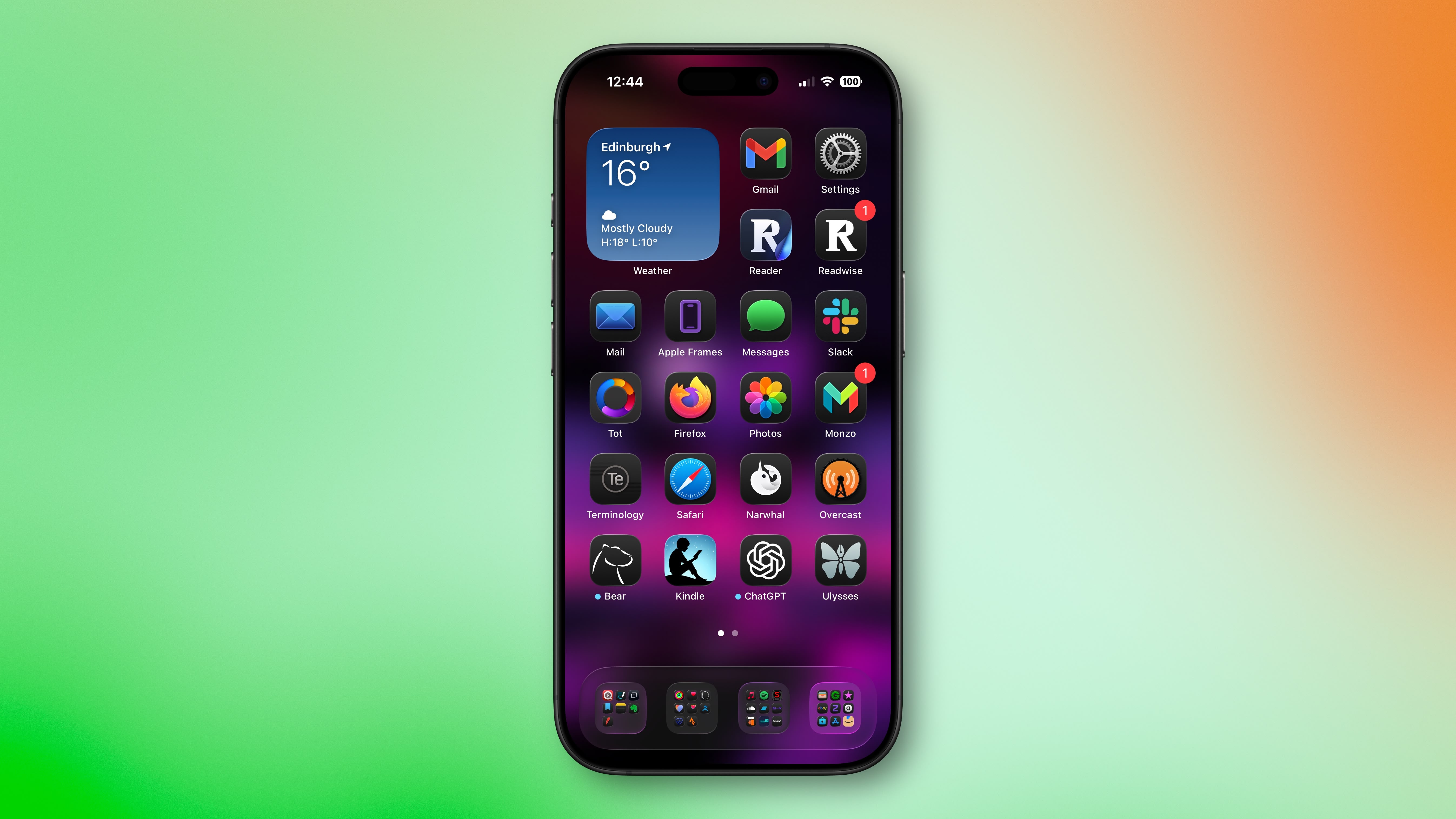
Edit: the linked Gizmodo article has at least one inaccuracy: "To create the effect of glass and all of its reflective and shimmering properties, iOS 26 forces every icon on your iPhone home screen to have a slight glow to them in the top left and lower right corners."

Unless that's referring to some other effect, that slight glow is around the icons and shifts as you tilt your phone -- it's not just the top left and lower right corners. If I tilt my phone, the glow will travel around the icons (easier to see on folders), shifting from the top/bottom/corners/sides to another location. It's a subtle effect that I think is a cool little detail.

2nd edit: I'm not saying other people are not experiencing the effect, just that I'm not, which is what the author of the Macrumors article asked us to do. Also, while it can be thought of as an optical illusion, it's a different type of one that only appears to affect a small number of people (or at least a small enough subset who care to comment online about it). Optical illusions typically affect most to all people who are not seeing impaired. That this is only affecting a subset of people suggests it is a peculiar intersection of how those individual's brains are working and the specific stimulus of iOS's UI. Most to all human behavior is understood to be on a normal (Gaussian) distribution. There will always be people who have and experience things that are "abnormal" (in one of the distribution tails). That's not inherently bad. In many instances it's thought to be positive (e.g, 'superior' IQ).

While there are people experiencing this particular effect, what complicates the potential issue is the effect of suggestion through social pressure. What this means is that some people don't really notice the effect but when it's brought to their attention they start to and might even state, "Now I can't unsee it!" That's because what we perceive is affected by what we pay attention to (we can perceive things we are not aware of) and how we interpret what we perceive.

In effect, some people experience the effect but others do not notice the effect until it's brought to their attention. Some other people also convince themselves or are convinced by others that it's there when they do not really experience it. That's not lying (although it's possible some people are lying about it), it's just the nature of how our brains work. Brains are kind of weird in that way. They are amazing, but weird.

It's possible that some people will adjust to the changes and their brains will stop perceiving the effect (e.g., https://news.uci.edu/magazines/articles/flipped-reality/). It's also possible some people will continue to experience it. Our brains are excellent at adapting and normalizing (adjusting to) new experiences most of the time.

If you are experiencing this effect, give it time and it might go away. If it doesn't go away and it is too distracting, hopefully various accessibility settings will rectify it.

3rd edit: "The issue has gained attention on Reddit, with one post receiving over 3,000 upvotes". Can we stop using things like this as a metric of anything meaningful? There's the issue of selection bias, bots, and more. It's data but unscientific and potentially useless and even misleading data. The data can be used in peer-reviewed research, but it's not a great way to accurately assess prevalence of something.
 
Last edited:
I can’t see this, but us humans are complex and I’m sure that the reports are true.

I hope that apple doesn’t bury a solution for this in the accessibility settings, but instead has a ‘please tone all of the Liquid Glass stuff down everywhere in the initial set up and then in the appearance settings.
 
Its basic design 101. The 'wonky' app icons just make everything looks messy. See through elements overlayed on text make everything illegible. The worst problems though are asymmetrical icons in circle buttons. Whoever thought using encompassing circles for ANYTHING was a good idea never went to design school. That goes for Mac Rumors profile pics too. Loads of wasted space and depending on content terrible optical alignment. Just look at all the terrible circular contact pictures in Apples contacts app. You can't fit a face into a circle without it looking terrible. Hence my very carefully crafted profile pic for MacRumors.
 
IMHO this update on the phone and more importantly the Mac is a disaster. For the first time ever I want to roll back my Mac.
On the iPhone I’ll probably get used to it eventually, but I agree about the Mac. It looks horrible there. The window corner radii are insane, and that ugly sidebar now sits on top of the content. I thought Apple’s philosophy for this update was to put the content in focus, so why is the sidebar the most visually dominant element?
 
Its basic design 101. The 'wonky' app icons just make everything looks messy. See through elements overlayed on text make everything illegible. The worst problems though are asymmetrical icons in circle buttons. Whoever thought using encompassing circles for ANYTHING was a good idea never went to design school. That goes for Mac Rumors profile pics too. Loads of wasted space and depending on content terrible optical alignment. Just look at all the terrible circular contact pictures in Apples contacts app. You can't fit a face into a circle without it looking terrible. Hence my very carefully crafted profile pic for MacRumors.
 
I honestly am in love with it! I don’t feel that anything looks crooked or that the glass effect prevents me from reading any text. I was so pleasantly surprised at how premium it feels. Please don’t have Apple ruin this! I’m ok with an accessibility option to disable it but I love Liquid Glass
 
If you compare some elements of Tahoe with an older MacOS's such as Mojave, things seem to have moved in a slightly ugly direction on the desptop as well.

The wallpaper preference panel for example used to be clearly layed out and consistent with Apple's general style guidelines, but now UI elements tunnel under the vertical slider on the right and under the selection panel on the left.

mojave.png


Tahoe.png
 
Apple didn’t have enough features for iOS 26, so it changed the design to make us feel like there were significant changes. But this new design is huge step back for minimalism. Apple is learning the hard way not to fix what isn’t broken.
 
The liquid glass UI may look fancy, but in terms of functionality, it doesn’t add much value.

That said, not everything has to be purely logical or robotic. Sometimes, good visuals can still enhance the experience by making us feel good, even if they don’t contribute much to functionality.
 
Register on MacRumors! This sidebar will go away, and you'll see fewer ads.