Porco
macrumors 68040
It’s ironic that making them clear makes them less clear.
It's likely a seeding process for some future smart glasses OS. Apple knows people are slow to change and so are subliminally making them compliant. That sounds more sinister than it is. In their eyes maybe the future is those transparent phones from The Expanse?Years ago, when I was still studying, we examined the WIMP system - Window, Icons, Menus and Pulldowns - how pioneers such as Xerox, Apple and others got the basic form of early GUIs so right.
Now, back in the late 70s and early 80s, icons were seen as revolutionary. In a world of plain text, they were a quick way of drawing the viewer’s eye. A user could locate, identify and activate a well designed icon far more quickly than they could find a piece of text. This is why we have icons - not because they’re pretty little pictures.
Is Apple simply providing users with a choice, or have they just forgotten what icons are for? I appreciate that an operating system having essentially monochrome icons is certainly not a new thing; most early GUIs had monochrome icons. But it’s not the 1980s anymore and colour is a key differentiator. Also, given that Apple limits the size and shape of its iOS icons, it doesn’t give icon designers much left to play with. It might make your home screen look cool, if that’s your bag, but it certainly doesn’t do much for usability. Of course, Apple would never prioritise form over function! ;-)
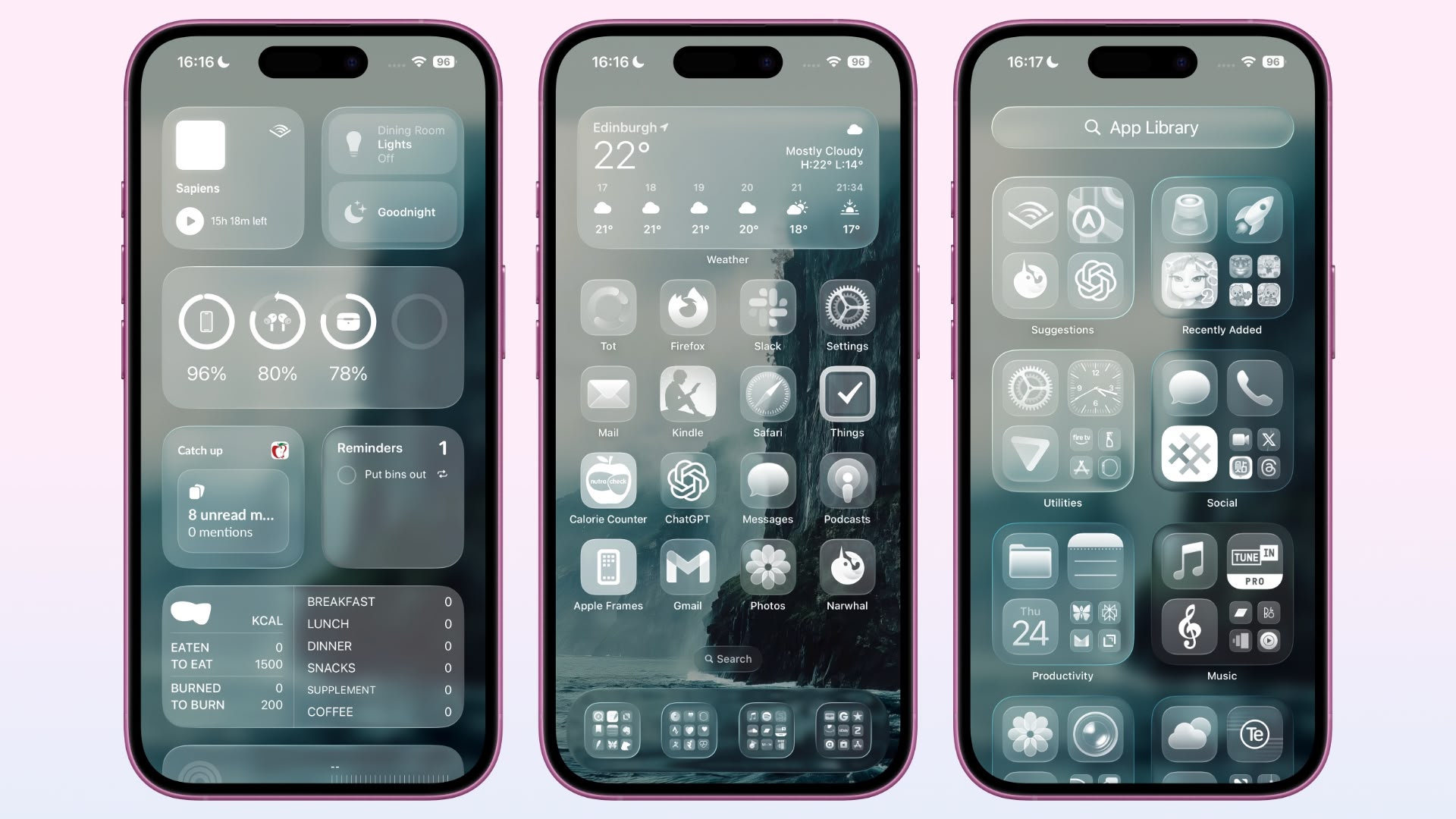
They really should show the moon for dark mode raher than the sun.
They really should show the moon for dark mode raher than the sun.
There is a reason we use whiteboards with colored markers instead of writing on windows and mirrors with white markers. There's also a reason why we don't have clear televisions.
Something is intended to be seen or seen through. Not both.
Liquid Glass is for those who relish that occasional frustration of sometimes taking a little longer to find a desired icon/app in Control Center than on the main screens, since the CC’s flat, monochromatic icons sometimes blend together visually.
This reminds me of the very first home screen examples of iOS 7, where all of the bright, flat, neon color icons pretty much blended together. Then it took a few years for Apple to walk back that mistake:
I know this can’t be an original thought, but: As the adjective “Liquid” makes no sense for describing this new look, is it possible Apple is using “Liquid” now so that they can later differentiate it from a design language applied to a future glass pane iPhone?
In iOS 27 they’ll debut invisible icons and talk breathlessly about how you can have a completely clean minimalist screen. You’ll just have to know where they are based on muscle memoryI've said it before and I'll say it again:
There is a reason we use whiteboards with colored markers instead of writing on windows and mirrors with white markers. There's also a reason why we don't have clear televisions.
Something is intended to be seen or seen through. Not both.
And they'll give you a swipe gesture that turns on icon visibility for 4 seconds then automatically turn it back off. That way you can learn the positions. AI will detect that you have used used the icons 10 times without the swipe gesture and then turn off icon visibility for good, or at least until you reinstall the OS.In iOS 27 they’ll debut invisible icons and talk breathlessly about how you can have a completely clean minimalist screen. You’ll just have to know where they are based on muscle memory
Much simpler: you get an electric shock when pressing the wrong position. Worked for Pavlov. 😉And they'll give you a swipe gesture that turns on icon visibility for 4 seconds then automatically turn it back off. That way you can learn the positions.
I don't personally like the clear icons, and there's a reason it isn't the default, but I don't have a problem with the option being there for those who do.Who in their right mode would want this ?
The verge has a good overview of Liquid Glass. The comments are a good read too.
Universally hated.
As the adjective “Liquid” makes no sense for describing this new look
Hmm, I foresee trouble if my dad gets the urge to install this iOS and gets his hands on those features.
He will be 80 in a month and his sight is declining fast.
C'mon Apple, you're going backwards.
