Got a tip for us?
Let us know
Become a MacRumors Supporter for $50/year with no ads, ability to filter front page stories, and private forums.
iOS 26: Make App Icons Clear on Your iPhone Home Screen
- Thread starter MacRumors
- Start date
- Sort by reaction score
You are using an out of date browser. It may not display this or other websites correctly.
You should upgrade or use an alternative browser.
You should upgrade or use an alternative browser.

I'm definitely going for this look, as hopefully it'll help me use my phone less as:
- I won't be able to identify what app is what
- And then I won't be able to read any text in it properly.
Bonus - and it'll look cool!
- I won't be able to identify what app is what
- And then I won't be able to read any text in it properly.
Bonus - and it'll look cool!
Please make a photo from your iPhone in a room and outside.I'm enjoying the change.
Then we could believe that you will enjoy the change ;-)
WorseIs Apple simply providing users with a choice, or have they just forgotten what icons are for?
In the delusion of eternal growth and progress, Apple is compelled to release something new. Otherwise, its primary target audience will turn away.
Americans want something new. So it has to look new.
That's why the same car is launched as a “new” model every year, with just a few minor changes to the front. And the most common article here on Macrumors is the question of what's coming new. Not what the rumors are, but what Apple might change.
At some point, everything will be changed for the worse.
And unlike with programs (Apple Photos, Final Cut, etc.), the company can't remove features and then offer them as “new” next year. That's not possible with the GUI. So something has to be developed. Something that no one has ever tested in everyday life. The main thing is that something can be advertised as new.
Bring back Jony Ive!
Oh god no, please. Keep him away.
His departure accompanied buttons to return (and increase) to the iphone, ports to return (and increase) to the Macbooks, and intuitiveness to return (and increase) to the mobile OS’s.
Oh god no, please. Keep him away.
His departure accompanied buttons to return (and increase) to the iphone, ports to return (and increase) to the Macbooks, and intuitiveness to return (and increase) to the mobile OS’s.
You don't have to worry ..
Right now he's probably stuck in a white room feeling the walls because it is so featureless he can't even find the door out.
Man I just hate this so much. This will be the first time that I prevent my phone from updating as long as I can.
As a UX Designer (my full time job) I’m embarrassed for the industry at this horrendous design, no matter how I dress it up I can’t fathom why they went this route, it makes zero sense. And from the company that essentially taught us all that good design matters, it’s what elevates the experience. No matter what you thought of Jobs, he clearly was very significant to Apple. The ideas have run out, and now desperation seems to be the order of the day.
I install these public betas because my father is blind and I am the only other iPhone user, so I have to help him with UI changes. I can say, absolutely, that this “liquid glass” is going to be what pushes him to ANY Android phone that doesn’t do this. “Reduce transparency” makes everything too dark for ME, let alone him! And “Increase Contrast” only makes that worse because white text on black is significantly harder for him than black text on white. The way the PW prompt works on restart is also going to lock him out of his phone if he is home alone.
Because decision-makers at Apple surround themselves with yes-men, a new UI is being forced out that is flat-out CRUEL for blind, low-vision, and otherwise visually-impaired users, and they even managed to screw it up SO badly that, depending on the vision problems, Accessibility settings may make it better or WORSE. If ADA applied here, Apple would be facing yet another lawsuit…
Because decision-makers at Apple surround themselves with yes-men, a new UI is being forced out that is flat-out CRUEL for blind, low-vision, and otherwise visually-impaired users, and they even managed to screw it up SO badly that, depending on the vision problems, Accessibility settings may make it better or WORSE. If ADA applied here, Apple would be facing yet another lawsuit…
Apple hardware team: our displays are the brightest, best, widest gamut, most accurate color reproduction anywhere.
Apple software team: let's create a monochrome UI.
Apple software team: let's create a monochrome UI.
WOW! This is so uninteresting. What truly would be interesting if Apple would allow locking your app icons into their existing positions. It is so annoying to add a new app, only to find that it has moved many of your existing apps. I prefer actual enhanced functionality over mere appearance change.
This is something else my dad struggles with a lot. He will move an icon, not realize he’s done so, and then of course he can’t find it later because he only has about 5% of his eyesight still online.WOW! This is so uninteresting. What truly would be interesting if Apple would allow locking your app icons into their existing positions. It is so annoying to add a new app, only to find that it has moved many of your existing apps. I prefer actual enhanced functionality over mere appearance change.
Let's play a game! Are the below MacRumors Forum complaints about iOS 7 or iOS 26? Have fun!
Quotes:
Answers:
Quotes:
- "Tim Cook should be fired right now ... the home screen is absolutely hideous - those icons!"
- "[Executive] left and they filled that position with a COO. A numbers/finance person. Not a designer. They really think they have intrinsic design chops and don't need any Creative Direction. They're finding out now."
- "Years of pure iOS UI design down the toilet. I can't believe Apple let fake designers work on their flagship OS."
- "Such an unnecessary and unwanted update. It's simply change for the sake of change because the functional improvements from each iteration of iOS are minimal, at best."
- "The new design is awful. I wouldn't use it if I had a choice."
- "This is what happens when management tells them "We need something shiny and new to wow people during the keynote!" and the designers try to push back but it's useless"
- "I'm not a fan. You can't look at any of that and call it tasteful. I wish they'd gone a completely different way and introduced something new and innovative that was genuinely a game changer"
- "The new look is much worse on an actual phone than in the screenshots."
- "It's a mash-mash, confusing, and inconsistent. Looks like design by committee; Apple needs someone with more UX experience.
- All in all, it seems they have forgotten what their goal should be, because this readability nightmare isn't it, and the low quality app icons don't help. The inconsistencies in the UI are glaring and, frankly, an ugly downgrade.
- "The beta feels rushed and inconsistent - design elements aren't fully implemented."
- "After two days I reverted. There wasn't enough contrast...if they don't fix it I might change ships."
- "I'm sticking with [current version] the aesthetics of [newer version] are just disgusting and not Apple-like."
- "After downgrading to [current version] my eyes feel rested.
- I never imagined to be let down by Apple's redesign but here I am, typing this on my MacBook while restoring [current version] on my [iPhone].
- "Everyone I know either hates [new version] or is indifferent … the design has made me rethink buying Apple devices
- "This might actually be a reason I just do not upgrade and then do not buy another iPhone apple. This is that kinda deal breaker, readability is not a joking matter"
- Forget about the old people because they sure as hell will be having a difficult time reading stuff when [new version] comes out. I already have everyone in the "elder" age group telling me it's difficult to see stuff now. Whoever's in charge of the design and UI department needs to be fired.
- "The UI is bland and child‑like and lacks contrast. It’s aimed at 12‑year‑olds … I’m staying on [current version] until Apple fixes this
- "Apple knows the value of appealing to children and young adults. It's been one of the companies long standing revenue streams"
Answers:
- 7
- 26
- 7
- 26
- 7
- 26
- 26
- 7
- 7
- 26
- 7
- 7
- 7
- 7
- 26
- 7
- 26
- 26
- 7
- 26
Both redesigns were a step back in usability, favoring showiness over function, and were published in a highly unpolished state, so that’s not exactly surprising.Let's play a game! Are the below MacRumors Forum complaints about iOS 7 or iOS 26? Have fun!
Last edited:
Well, if I can’t turn this feature off I won’t me updating to OS26.
If you've just downloaded the iOS 26 public beta on your iPhone, the first thing you'll notice is the new Liquid Glass design overhaul, which adopts translucent elements throughout the system interface and in stock apps.
On the Home Screen, the search bar, dock, and app folders are translucent. By default, app icons have a new layered glass look that gives them dimension, but there's also a new option for "Clear" glass-like icons. This setting turns your app icons transparent, and widgets too. So if you want the full glass effect, read on.
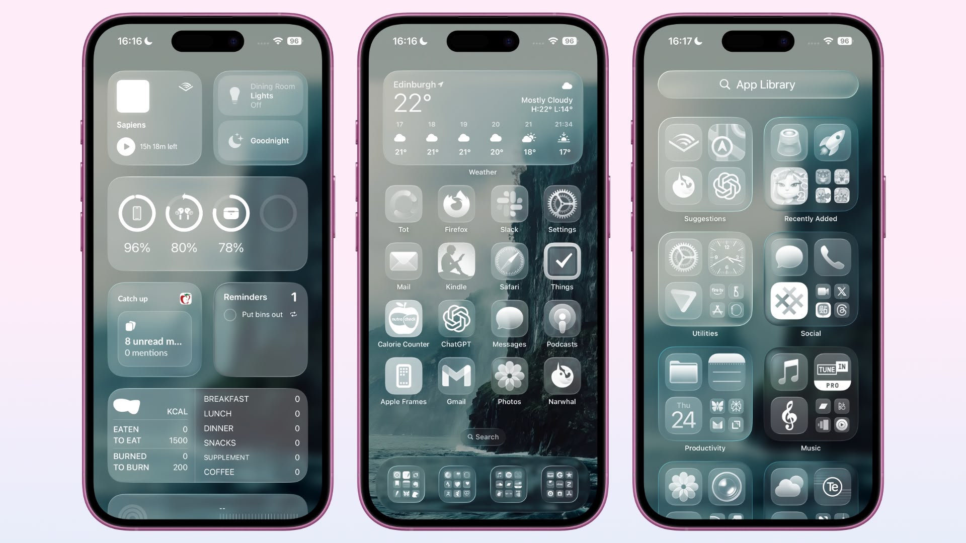
In iOS 18, Apple introduced Dark Mode and Tinted app icons. With iOS 26 and iPadOS 26, Apple adds a third visual style – Clear – that removes the color from app icons and widgets, and applies reflective, translucent effects to make them appear see-through.
There are two versions of the new Clear style. In Light mode, app icons appear semi-transparent, subtly darkening the wallpaper beneath them. Both icons and widgets resemble glass-like panels with layered text and images. In Dark mode, icons retain some transparency but feature a darker background, making them more pronounced while preserving the layered, translucent aesthetic.
Apple also includes an Auto option that dynamically adapts to the Appearance setting of your iPhone.
How to Get Clear App Icons in iOS 26
Accessibility Settings
- On your iPhone's Home Screen, long press an empty space until it enters jiggle mode.
- Tap Edit in the top-left corner, then tap Customize in the pop-up menu.
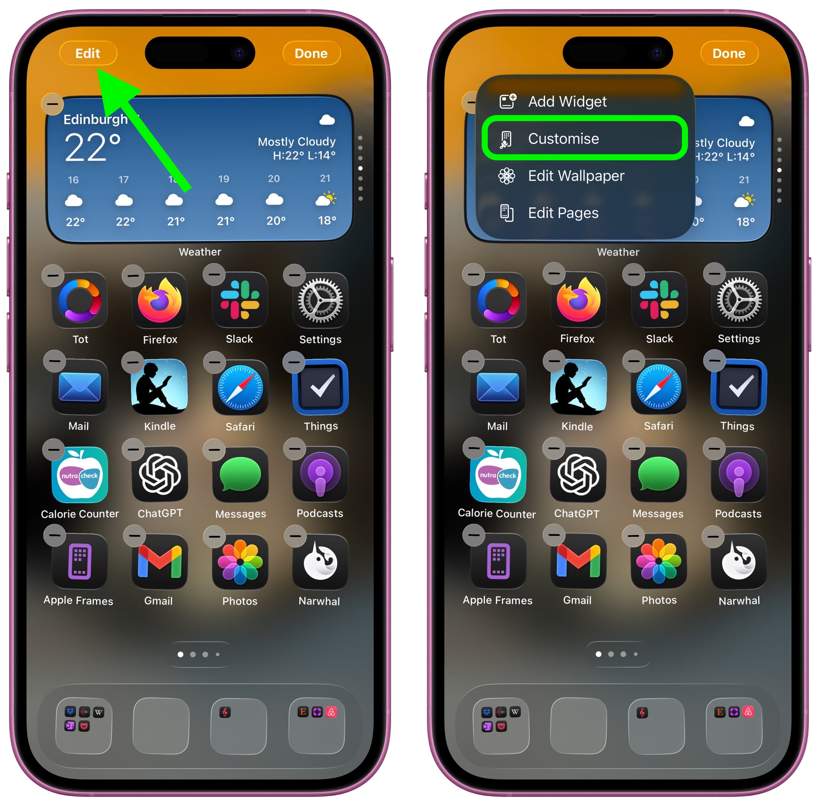
Select Clear in the panel that appears at the bottom.
Choose Light, Dark, or Auto mode. If a mode makes icons or app labels hard to see, tap the sun icon in the top-left of the Customize panel to dim the wallpaper.
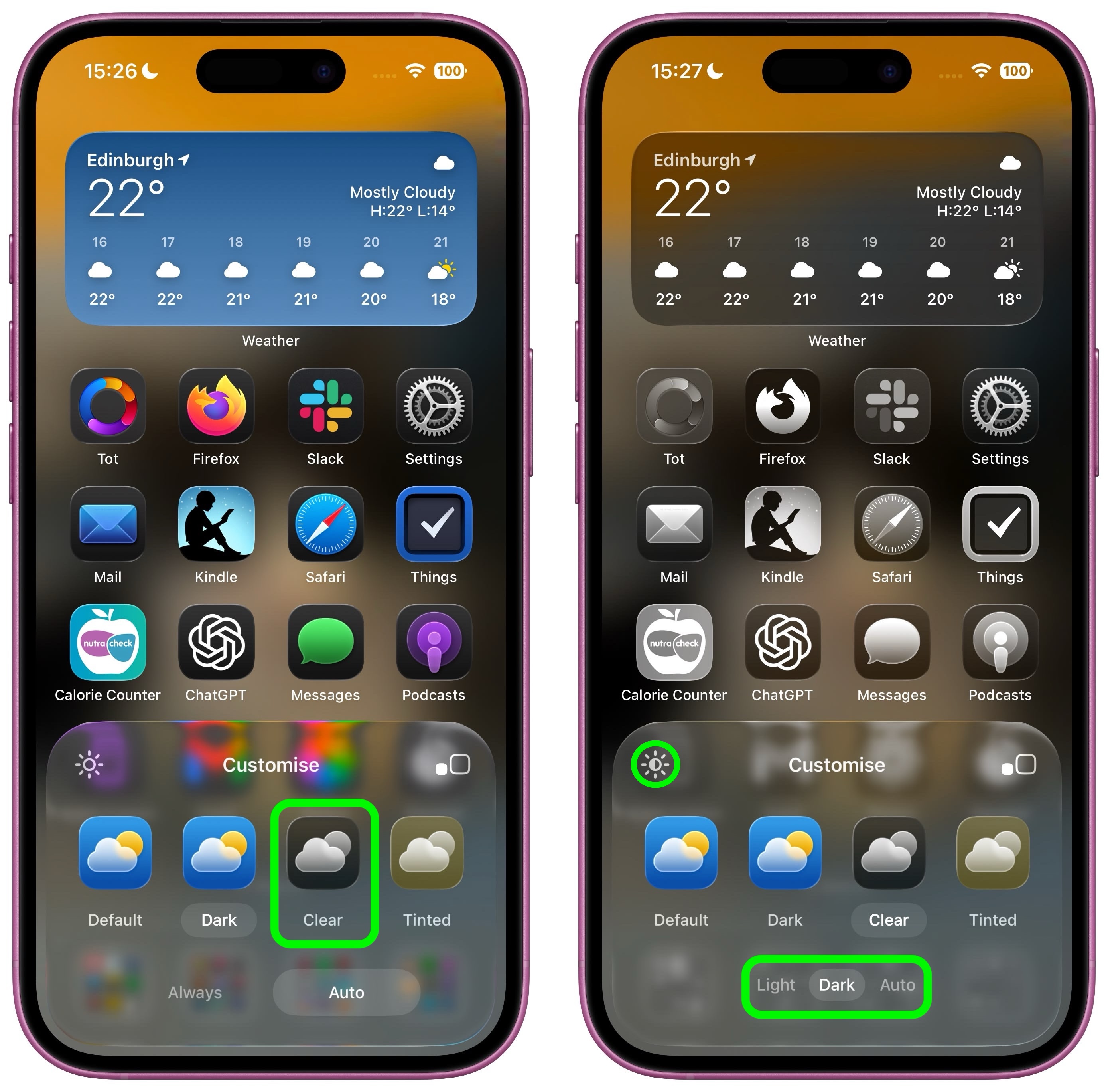
If legibility is a problem, there are two toggles in Settings ➝ Accessibility ➝ Display & Text Size that impact the look of the Clear style of icons. Try playing with Reduce Transparency and Increase Contrast – just note that toggling on both settings will cause the icons to lose most of their translucency.
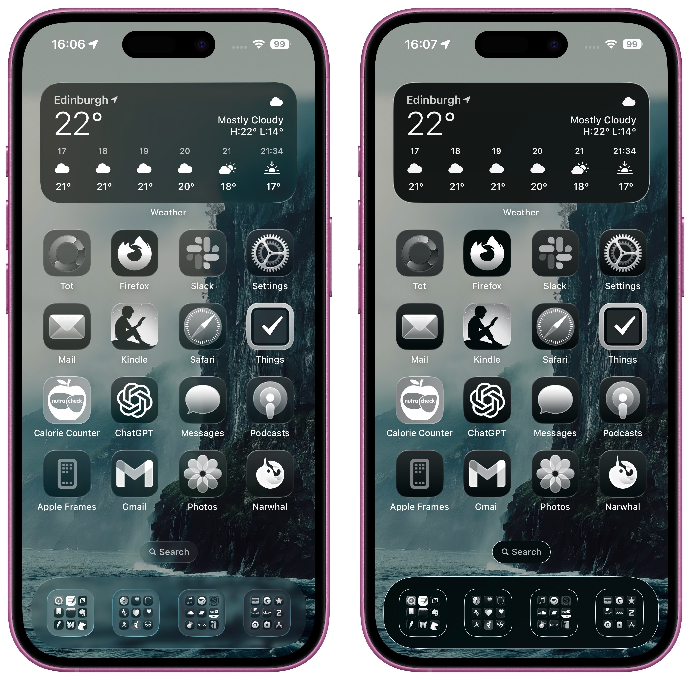
Clear icon style in Dark mode (left) vs. Accessibility setting toggles
Liquid Glass extends to iPadOS 26, macOS 26, watchOS 26, and tvOS 26. iPadOS 26 looks a lot like iOS 26, and macOS 26 has a translucent menu bar and dock background, plus it uses Liquid Glass for buttons, side bars, navigation bars, and the Control Center. What do you think of the new Clear style and the Liquid Glass redesign of iOS 26 more broadly? Let us know in the comments.
Article Link: iOS 26: Make App Icons Clear on Your iPhone Home Screen

Good news: not only can you turn it off, it’s not even the default. You have to actively turn it on, which is why the article is explaining how to do so.Well, if I can’t turn this feature off I won’t me updating to OS26.
Not sure if you had at one time in the past an Android phone. Do you remember the ugly glass themes from 10 years ago? Looks exactly like that. Only that now you have a trillion dollar company designed this crap and not amateurs. Though the look is the same. Amateurish.
Maybe I'm just weird, but I actually liked the skeuomorphic design and was sorry they removed it.Seems like the modern version of the failed skeuomorphic designs. Usability flies out of the window as form trumps function for a few designers to show off their ability to produce hard-to-use interfaces.
A large meh.
Maybe I'm just weird, but I actually liked the skeuomorphic design and was sorry they removed it.
For the most part, I agree.
I really loved how apps had personality and a vibe that was all their own.
I really loved how apps had personality and a vibe that was all their own.
Only to replaced with JIve’s vibe starting with iOS 7. And then the lemming design world followed Apple, a little bit off a cliff at the time, which at least got slowly corrected over the last decade of years.
I think surprisingly few in the world recognize the a large part of why Jony’s minimalist hardware exteriors worked was because ultimately, exterior appearance is transitory, and only the package. It’s the mechanism to get into the interface. What really matters more is a wonderful, engaging, efficient, intuitive interface. Even better if it’s beautiful and shows some true artistry.
Looking at the myriad of ugly PC laptop designs 20 years ago and even now, the minimalist exterior might have even made the thoughtful software and interface be even more special than if it were in some clunky, bland plasticky laptop case.
When Jony Ive was given too much power and inserted all the removals and minimalism into the software, that’s when things went to hell.
I acknowledge It’s a blessing to have so few big worries that this is a thing to complain about. So many people in the world clinging to life due to selfish leaders. I’ll never lose sleep over some poor design decisions made by Apple, I’ll just enjoy things a heck of a lot less than I used to or would have otherwise if they didn’t fumble around with things they really didn’t need to fumble around with too much.
Last edited:
I'm waiting for Apple to make the icons invisible. I really need to see my wallpaper.
I can’t even put into words how much of a mess that looks like. It’s worse than some Android skin coded by a high school student.
I’ve never once looked at my couch and thought I would love to see the wall behind it reflected on it, but here we are. Perhaps visionOS will make it a reality so we can all stub our toes at night.I'm waiting for Apple to make the icons invisible. I really need to see my wallpaper.
Register on MacRumors! This sidebar will go away, and you'll see fewer ads.