I had a work provided Windows phone and I really liked it, but then again, I still like Lego.Windows phone? Hahahahahah it looked like a Lego bricks nightmare.
View attachment 2525519
Deez ugly tiles, oh I still remember how much I hated them. When Windows 8 was out I was like “tf is that? Is this even usable?”
If there is liquid 🍑, it is indeed Microsoft design department
Got a tip for us?
Let us know
Become a MacRumors Supporter for $50/year with no ads, ability to filter front page stories, and private forums.
iOS 26: New Lock Screen Features
- Thread starter MacRumors
- Start date
- Sort by reaction score
You are using an out of date browser. It may not display this or other websites correctly.
You should upgrade or use an alternative browser.
You should upgrade or use an alternative browser.
Yes, the current one.There is no iOS 25. They're going from 18 to 26. Did you mean 18?
It’s not the case.Perhaps Apple is developing a glasses-free 3D screen. Maybe it will all make more sense if that is the case.
Apple should do Lively Cats instead of Liquid Glass.more cat pics please!
It’s just an option.Great article that perfectly highlights what's wrong with Apple these days. Why even have a clock on there when it's impossible to read it? Form over function nonsense.
Here's a suggestion for Apple: Don't even show the right time or a time at all, just render beatiful random numbers or shapes into the home screen with amazing liquid effects.
Features Features Features!!!
OMG Apple!! Why don't you open up you API and let third party companies code trillions of features? I guess I'm using 10% of the features the iPhone offers. But that path violates the core of Apple - high tech that is simple to use cause it is focused on key features.
But by the way, features I really would like to see, are missing. Like a state of the art voice assistant, AI driven image manipulation, "circle to search" from Google is awesome - so just send Google some billions of license fees and implement it - or even better: Change you Api, so that a Google App can hook in and provide "circle to search" and a digital assistant.
Last edited:
That’s probably the reason why Apple doesn’t do it. Can’t have their users start a killing spree.I would kill if we could freely move the clock to one side of the screen or another.
Yes. I have solid black wallpaper which has historically made nearly everything white on black, which is the highest possible contrast.I wonder, had iOS 7, 8, 9, 10, 11, 12, 13, 14, 15, 16, 17, 18 passed this WCAG Color Contrast Checker?
It seems like contrast is on the same level, that’s why I am asking
That’s the whole point of that post: I make it up to let that error seem logical, just for fun.By that logic, last year's OS was 24, and the OS before that was 23... until we get to the iOS version released eight years ago, which somehow also would have been iOS 18
That's what happens when you just make things up.
FWIW usability testing has demonstrated that extreme of a contrast difference actually reduces legibility.Yes. I have solid black wallpaper which has historically made nearly everything white on black, which is the highest possible contrast.
We truly are blessed to live in such a time as we get resizable clocks and hard to see buttons. Amazing stuff, thanks Tim.
I was just 10 minutes ago thinkingthat i dont spend enough time futzing with my lock screen so that i can not look at it ‘when im not using my phone’
I was just 10 minutes ago thinkingthat i dont spend enough time futzing with my lock screen so that i can not look at it ‘when im not using my phone’
The 1990s are calling. They want their excitement about image transparency back...
When you're not using your iPhone, the Lock Screen is what you see most often. Liquid Glass is everywhere in iOS 26, and it starts right when you pick up your device. The Lock Screen got a Liquid Glass overhaul, plus a few other new features.
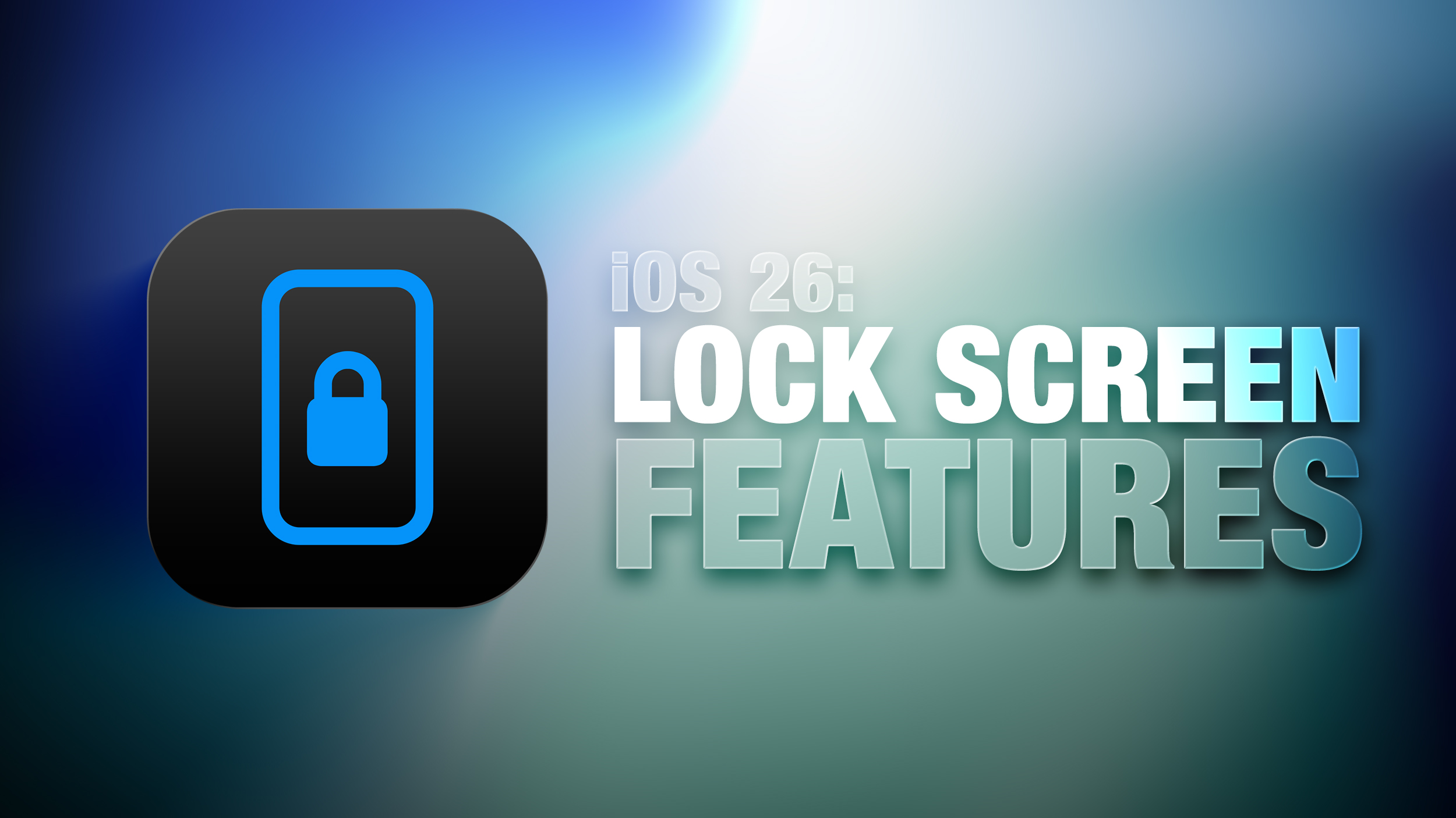
Here's what you'll see first when you upgrade to iOS 26.
Liquid Glass
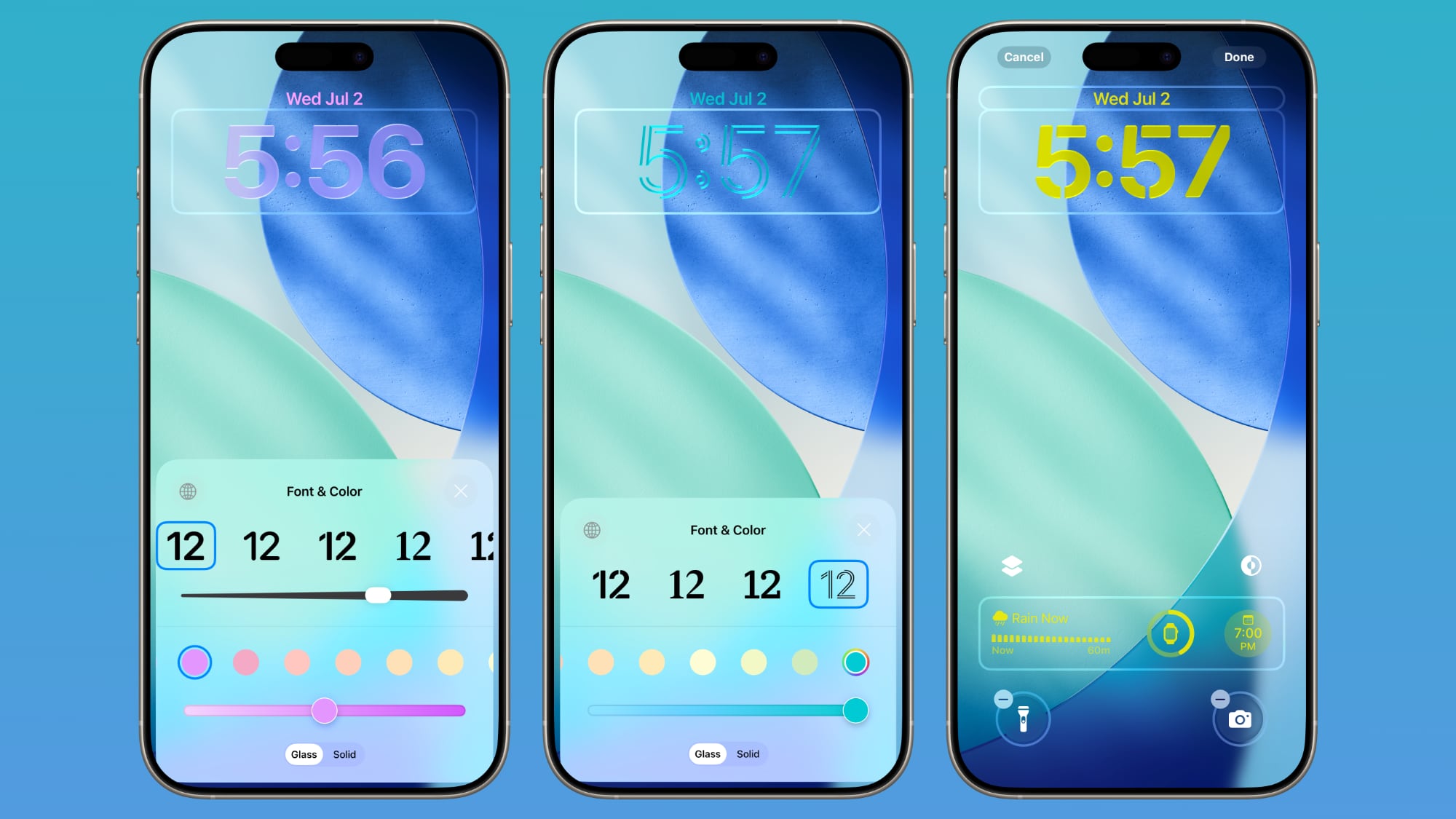
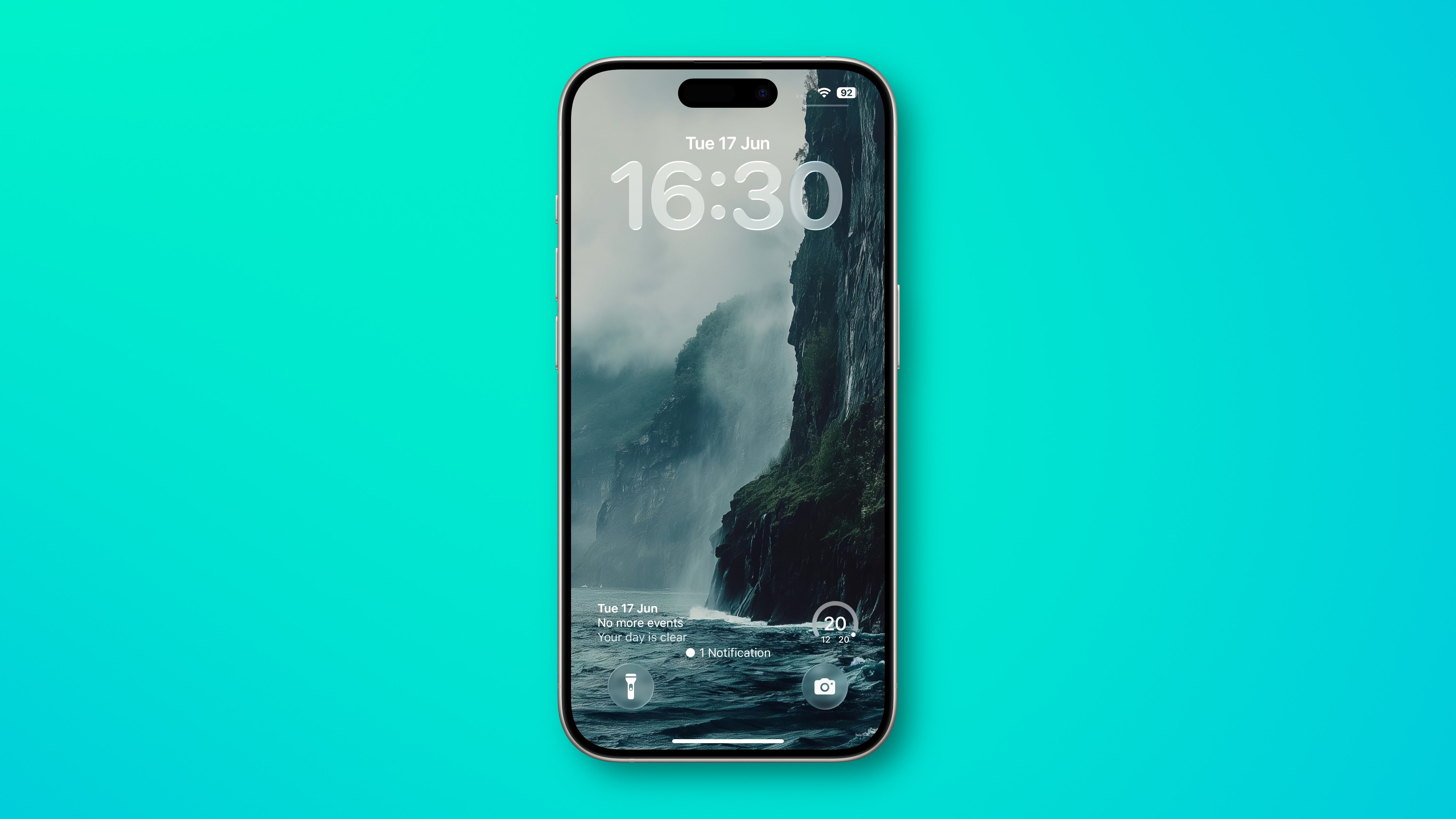
The two customizable control buttons on the Lock Screen are larger and have a floating, glass-like appearance like the other Liquid Glass interface options in iOS 26. The clock has a frosted glass appearance with the new "Glass" option, using lighting effects to make it look like glass in the real world.
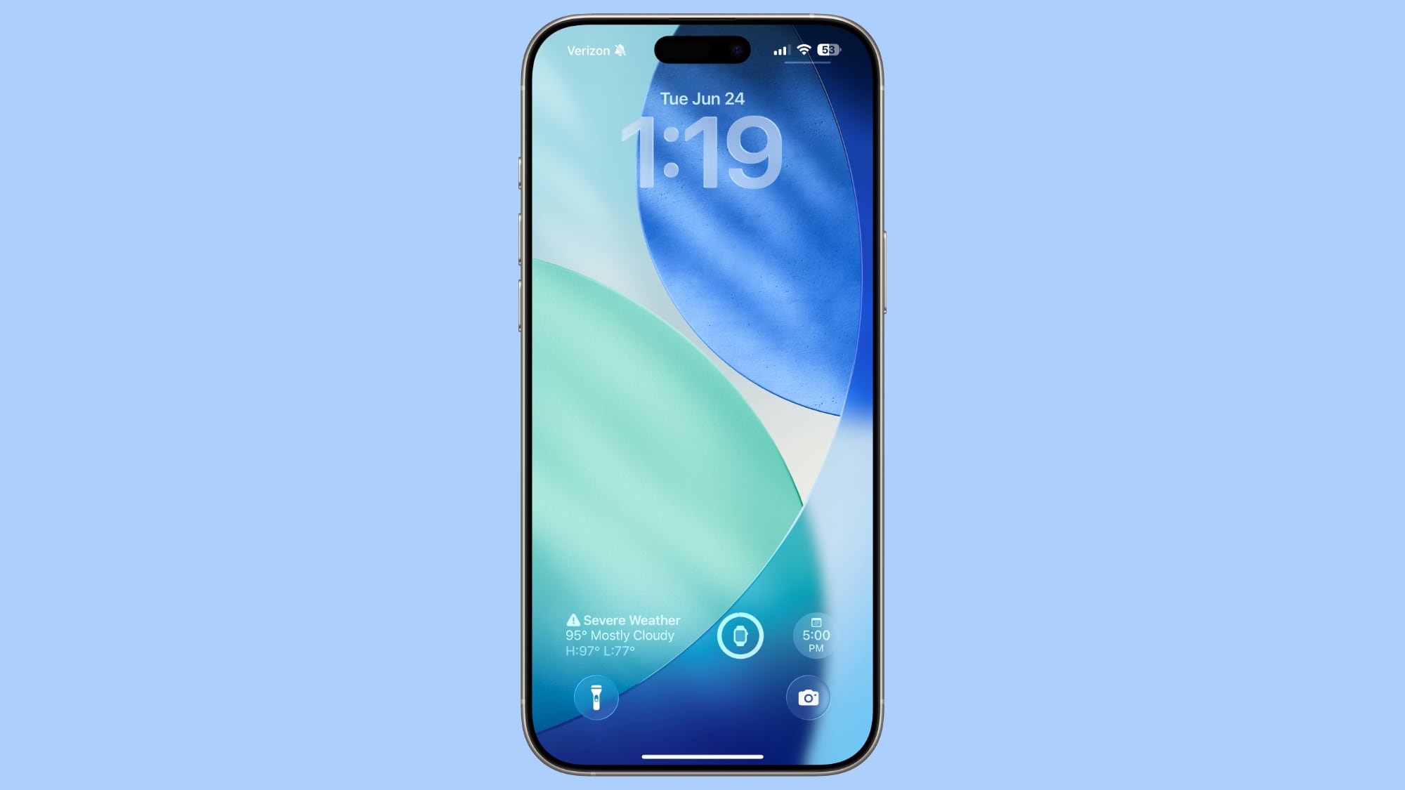
Glass can be selected for any of the clock fonts, and you can choose a color to tint the glass. Apple has multiple preset options, or you can select your own.
When you tilt your iPhone, light reflects and glints with the movement, for a realistic glass effect.
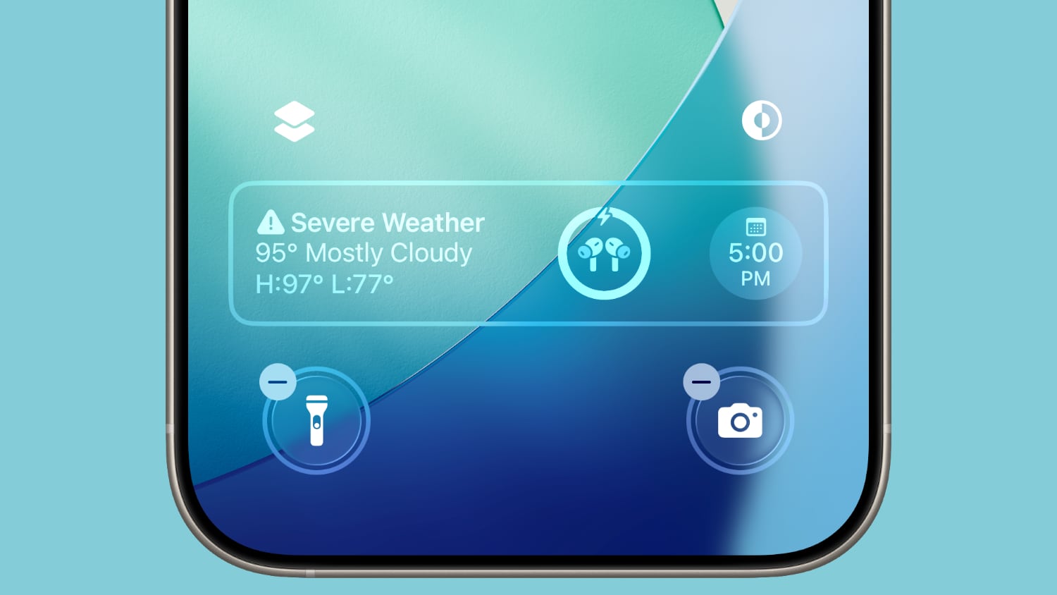
Notifications that are on your Lock Screen have a Liquid Glass aesthetic with a frosted glass look that leaves your wallpaper visible behind them.
Clock
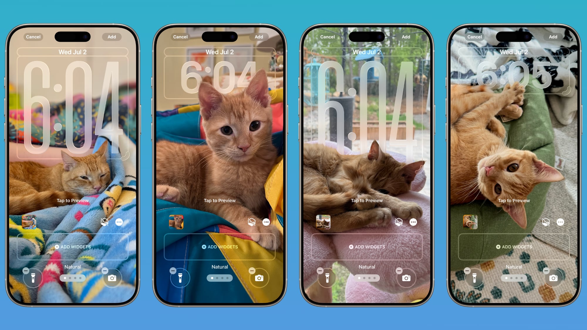
In addition to having a Liquid Glass aesthetic, the clock can be resized to better match your iPhone's wallpaper using a new adaptive feature. When you're customizing your Lock Screen, you can grab the corner of the time and drag it down to expand it.
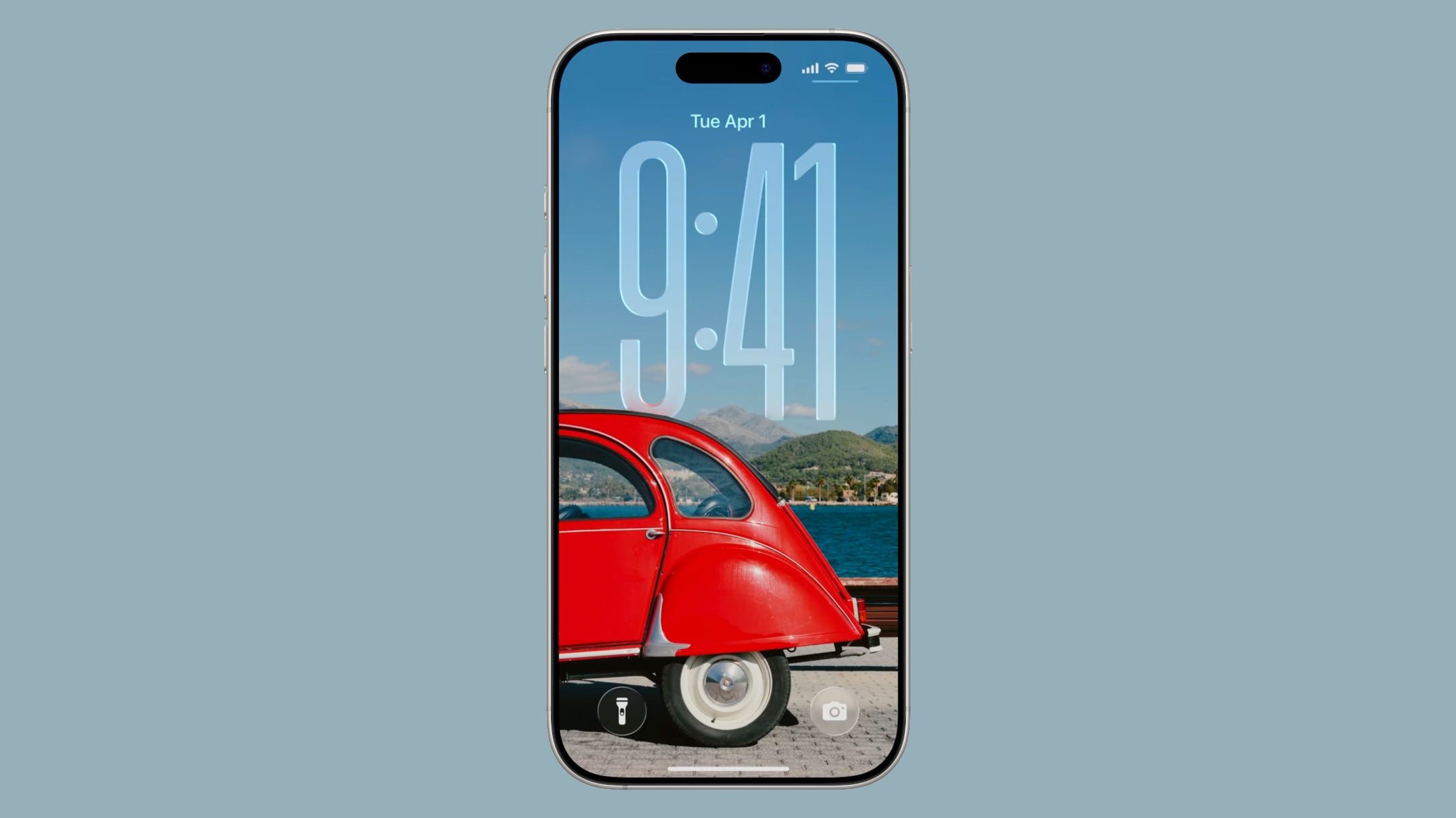
Adjusting the size of the time only works with the first font option, and only with the standard Arabic, Western numbering.
With photo wallpapers, the time can automatically expand to fill in missing space, and it can change based on the image if you have Photo Shuffle set. The subject in photo wallpapers is meant to always be visible, and can overlap the time in unique ways in iOS 26.
There is a Photos watch face for the Apple Watch that also supports time that changes size and position based on the wallpaper.
Wallpaper
There is a new default wallpaper that was designed for iOS 26. It's multiple shades of blue, with the same floating glass aesthetic that the rest of iOS 26 features. The wallpaper can subtly shift with iPhone movement.
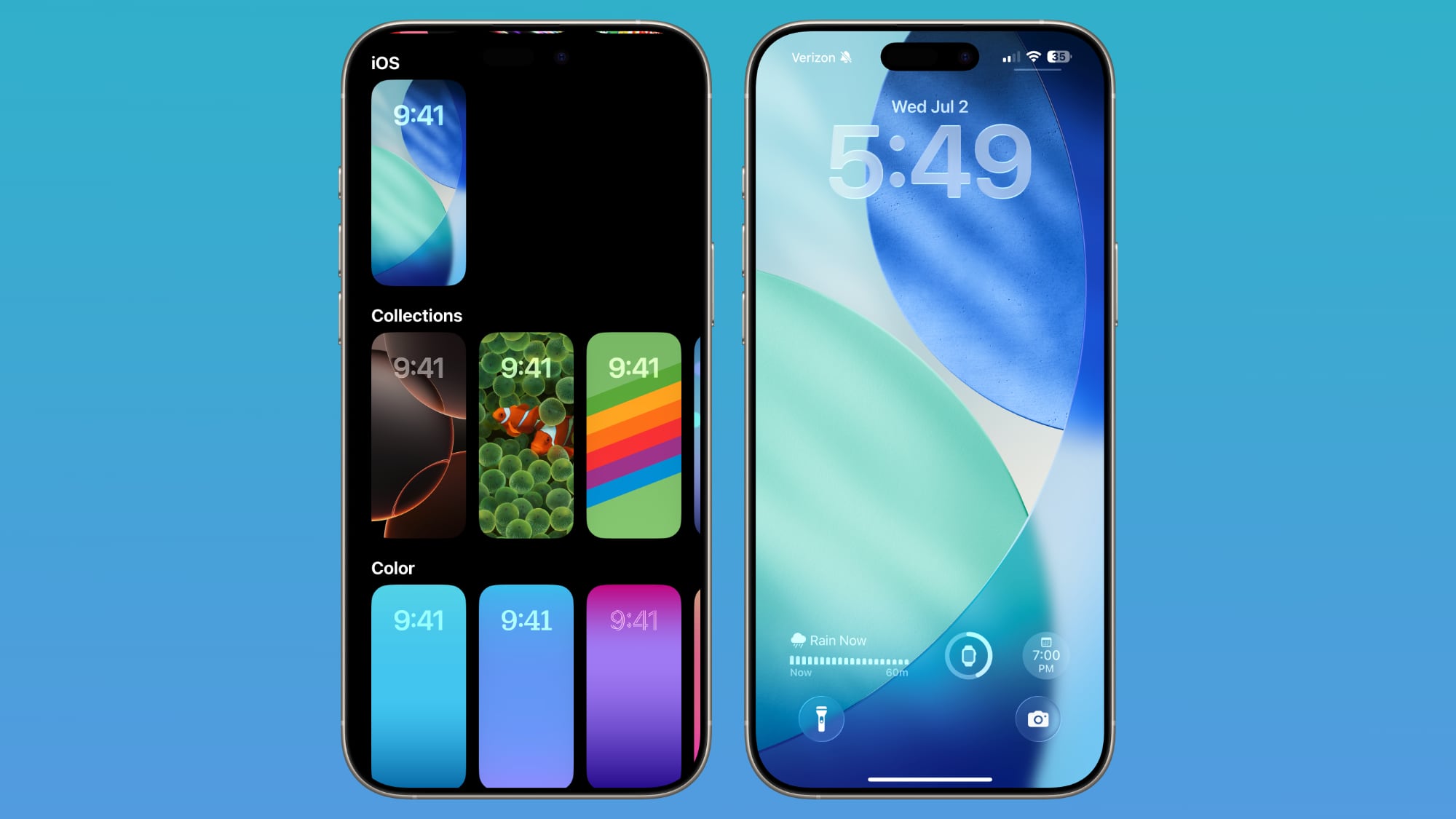
It's a small detail, but the icons for selecting different wallpaper categories have been updated to better match the Liquid Glass design.
Spatial Scenes
Aside from the Liquid Glass time, Spatial Scenes are the biggest change to the Lock Screen. 2D photos that you set as wallpaper can be turned into 3D spatial images that separate the subject of the photo from the background using depth information.
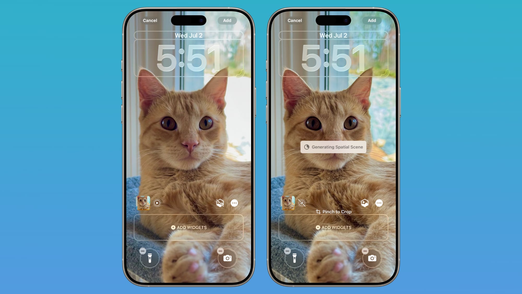
When you move your iPhone, Spatial Scenes shift and move along with it, making the images feel alive. Spatial Scenes is a feature in the Photos app too, and it can be added to any image that you've taken with your iPhone, including older ones.
Tap on the small icon with a mountain and a sun to activate the Spatial Scenes setting when choosing a photo wallpaper.
Widgets
Lock Screen widgets can be placed on the top of the display under the time, or at the bottom of the display. In earlier versions of iOS, you could only put widgets at the top of the screen. With the adaptive clock and new wallpaper options, widgets can also shift down automatically to ensure the subject of an image is always visible.
Apple Music
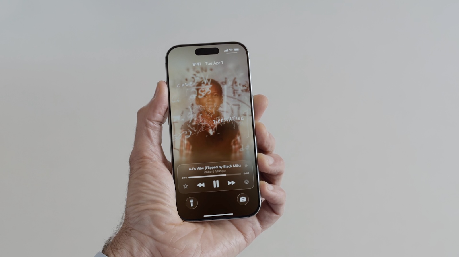
Apple added a new Lock Screen widget for Apple Music search, but there are no other new Lock Screen widget options. What is new, though, is a new full screen Now Playing interface that shows album art. Artwork expands and animates right on the Lock Screen.
Read More
We have a dedicated iOS 26 roundup that goes into detail on all of the new features that are available in the update.
Article Link: iOS 26: New Lock Screen Features
Use case: "Customer wants to be able to quickly see the time"
Apple Developers: "We have made the time look so freaking cool! You're gonna love it!"
Customer response: "I can't easily read the time at a glance, it's got stealth numbers partially obscured by objects in the wallpaper - playing 'can you find the time in this picture?' was not the goal"
The four pics with the cat and the time - yes, they're whimsical. No, they are not functional. When I glance at my phone's screen, I need functional. If you can add whimsy without detracting from function (I currently get a nice simulated-real-time view of the earth in the background), then so much the better. But sacrificing functionality for whimsy, makes it into an art project, rather than a tool.
Geez, on that fourth one, the digits are basically camouflaged into the background.
Does anyone else hate the lock screen?
The most common thing I do from the lock screen is turn the flashlight on.
The second most common thing I do is have my hand holding my "flashlight" slide the screen over to the camera and the flashlight turns off.
The third most common thing I do is hold my phone and changing wallpaper happens and ends up on something I don't want.
Call me crazy, but the lock screen should be in a state of your phone being ... well, locked.
If you turn the flashligh on, then it should not turn off again until you tap to turn it off or your battery goes dead.
I don't need a slide over action for the camera when there is a button - I don't need 2 ways to accomplish the same thing, especially when it interferes with the flashlight.
Changing wall paper by long pressing on the lock screen? Who comes up with these bad ideas. A lock screen should not be where you initiate customizations. That is what the settings app is for.
At the very least, give an option to turn this stuff off. I'd be fine with a setting to only show a flashlight icon and remove the camera icon, the slide to camera, and the long press to change wallpaper.
Well yes it’s cool and all, but I would like a review for people with less than perfect eyesight. Hope they will have a option not to go with this as it seems difficult to focus on the text and images.
I don’t have horrible eyesight, but I found some use of liquid glass to make text hard to read when the “glass” was placed over busy backgrounds. That improved a bit in the second developer release. So, it appears Apple is using the feedback it is getting to make it more useable. That said… liquid glass is not an improvement. It is just aesthetically different for the sake of being different. Apple has forgotten what Jobs said:
“Design is not just what it looks like and feels like. Design is how it works.”
And what Ive said:
“It’s very easy to be different, but very difficult to be better.”
Great article that perfectly highlights what's wrong with Apple these days. Why even have a clock on there when it's impossible to read it? Form over function nonsense.
Here's a suggestion for Apple: Don't even show the right time or a time at all, just render beatiful random numbers or shapes into the home screen with amazing liquid effects.
Meh, let them buy $$$$ Vision Pro Glasses!Well yes it’s cool and all, but I would like a review for people with less than perfect eyesight. Hope they will have a option not to go with this as it seems difficult to focus on the text and images.
You mean iOS 18?In OS25 I can toggle between displaying the album artwork and the Lock Screen (the album artwork minimizes into the control bar). Is this not in 26?
You can still minimize any displayed artwork by taping on it, yes.
They were talking about the play menu that appears when playing any sort of media than can play in the background, like music, podcast, PiP videos, audio messages etc.
Register on MacRumors! This sidebar will go away, and you'll see fewer ads.


