Become a MacRumors Supporter for $50/year with no ads, ability to filter front page stories, and private forums.

MacRumors

macrumors bot
Original poster
Apr 12, 2001
68,923
39,888


Apple's iOS 26 update, currently in beta, introduces a striking visual overhaul with its new Liquid Glass design language. However, if the translucent elements are causing readability issues or you simply prefer a more opaque interface, there's a quick accessibility setting that can help tone things down.

iOS-26-on-Three-iPhones.jpg

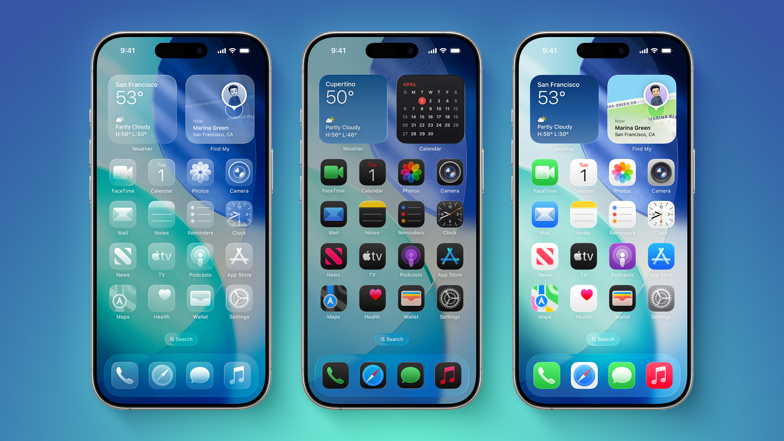
The Liquid Glass design brings transparency effects throughout the system interface and stock apps. On the Home Screen, you'll notice the search bar, dock, and app folders all feature translucent backgrounds. App icons themselves now sport a new layered glass appearance that adds visual depth and dimension to your device – plus there's a new Clear appearance option that ups the ante even more.

While visually impressive, these transparency effects can sometimes interfere with readability, especially for anyone with certain visual needs. Fortunately, Apple has included accessibility options to make the interface more accessible.

How to Reduce Transparency

The quickest way to make iOS 26's interface more opaque is through the Reduce Transparency setting:
  1. Open Settings on your iPhone.
  2. Tap Accessibility.
  3. Select Display & Text Size.
  4. Toggle on Reduce Transparency.
ios-26-reduce-transparency.jpg


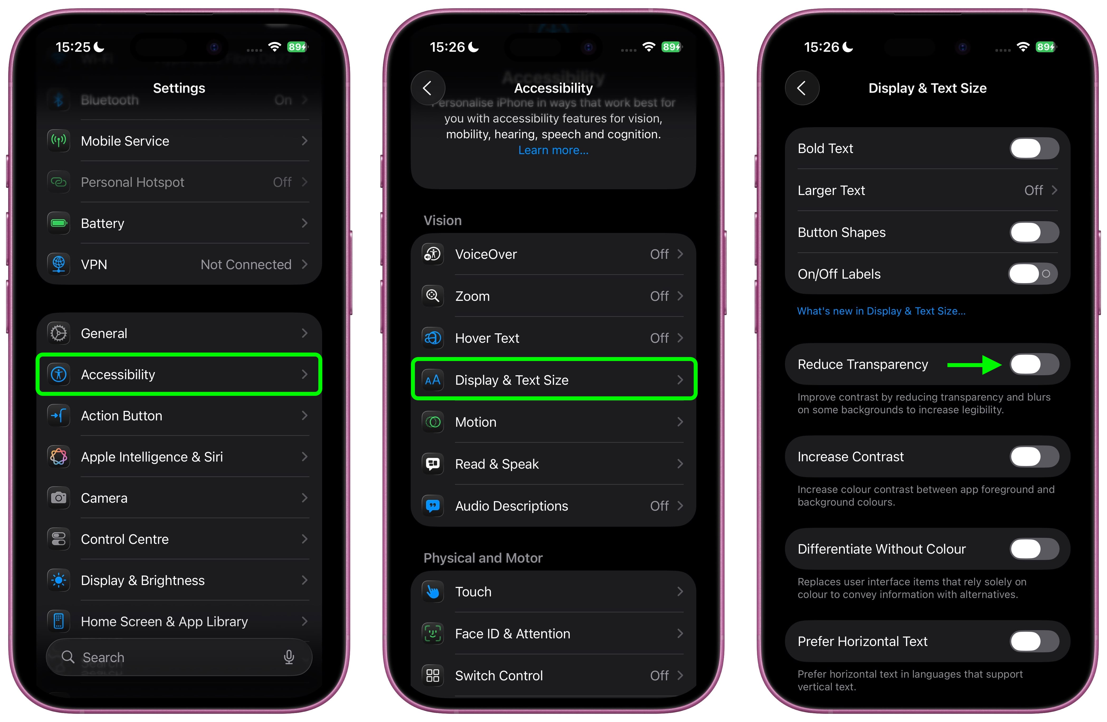
This setting adds darker backgrounds to translucent areas like Control Center, app icons, and app folders, so you should see increased contrast between elements throughout the system.

Note that Reduce Transparency doesn't completely eliminate all translucent elements or change button shapes – it simply makes translucent areas more opaque while maintaining the overall iOS 26 aesthetic.

Add Reduce Transparency to Control Center

For quick access to this setting, you can add it to your Accessibility Shortcuts to get to it from the Control Center interface:
  1. Go to Settings ➝ Accessibility.
  2. Scroll down and tap Accessibility Shortcut.
  3. Select Reduce Transparency in the list.
accessibility-shortcut-transparency.jpg


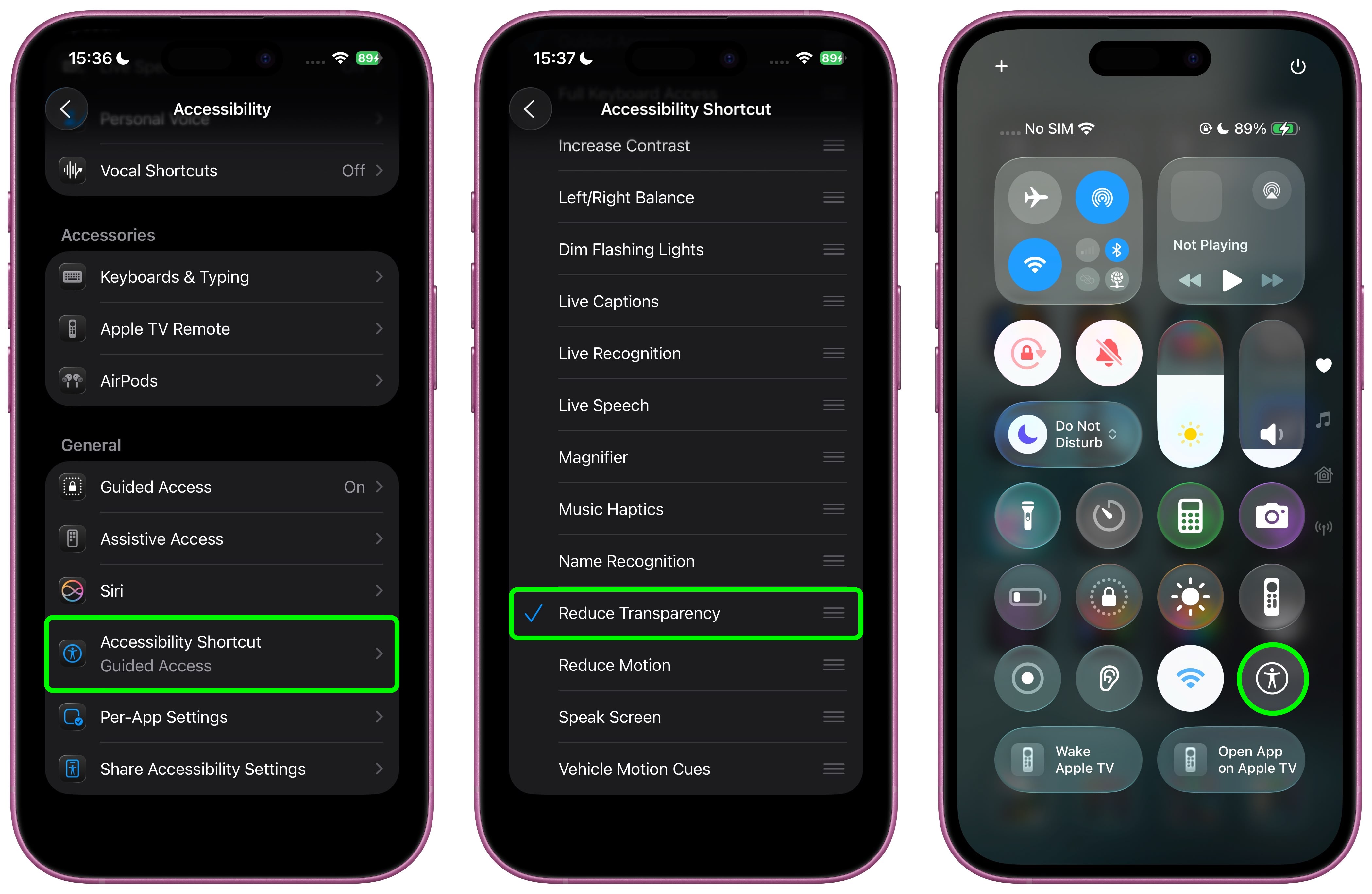
If you like, you can add the Accessibility Shortcut button to Control Center (long press a space between the interface's buttons, then tap Add Control). After you've done that, you can quickly toggle the setting on and off directly from Control Center, making it easy to switch between the full Liquid Glass experience and a more opaque interface as needed.

Additional Contrast Options

If you're still having legibility issues after enabling Reduce Transparency, return to Settings ➝ Accessibility ➝ Display & Text Size, then toggle on Increase Contrast. Note that enabling both Reduce Transparency and Increase Contrast will cause icons to lose most of their translucency.

The Liquid Glass design is still in beta, so Apple will likely continue refining the visual effects based on feedback. A wider official rollout of iOS 26 is expected sometime in September.

Article Link: iOS 26: Reduce Transparency of Apple's Liquid Glass Design
 
Last edited:
Shamefully bad UI team.

Users shouldn't need to enable a whole bunch of accessibility settings to get basic legibility and clarity.
Right. Now I feel like it's my fault that I can't see anything on the washed out default screen. What are they thinking? I wish they'd stop making things so white and polished just because it looks slick and cool at the price of readability and functionality.
 
Honestly I wish Apple would spend more time on more important issues in iOS, like using AI better to correct grammar and spelling mistakes by looking at the semantic content of text rather than looking a word at a time (which misses 'tot he' for 'to the' for instance). Indeed, you'd think the new computing power in iPhones, iOS would use simple AI to learn the kinds of typing mistakes one makes and correct them (possibly even adjusting the sizes and positions of keys to reduce errors - e.g., I keep hitting n instead of space, so why not make the n smaller and nudge it away from space by a few pixels?) rather than faffing about with GUI features that actually reduce visibility. We all want elegant design, but part of elegance is functionality. Just my two cents.
 
Phones if the average macrumor user got to decide
View attachment 2539619
I think a lot of us would be very happy to return to this after the privacy nightmare and general attention seeking the modern smartphone has become. I purposefully leave my phone sitting on my desk, don't carry it around with me just so it doesn't distract me. I would love returning to a dumb phone that could handle just a couple things I need tied around security, authenticators etc..
 
Apple in June: "Check out our new amazing design."
Apple in August: "Here's how to revert back to the old design because the new one is so ugly."

I don't know what's happening to the PMs at Apple but this the new design is ugly and leadership is ineffectual. A product person really needs to take the reins at Apple. I can do the job for just $1MM/year and spend the savings on expanding the engineering team to fix bugs.
 
Honestly I wish Apple would spend more time on more important issues in iOS, like using AI better to correct grammar and spelling mistakes by looking at the semantic content of text rather than looking a word at a time (which misses 'tot he' for 'to the' for instance). Indeed, you'd think the new computing power in iPhones, iOS would use simple AI to learn the kinds of typing mistakes one makes and correct them (possibly even adjusting the sizes and positions of keys to reduce errors - e.g., I keep hitting n instead of space, so why not make the n smaller and nudge it away from space by a few pixels?) rather than faffing about with GUI features that actually reduce visibility. We all want elegant design, but part of elegance is functionality. Just my two cents.
What makes you think that the visual design team is draining resources from the AI team? I doubt there collaboration between teams, but this is such a tired, and sort of illogical criticism to levy. It’s not always either-or.
 
  • Like
Reactions: ibh
I don't think this setting should be in Accessibility. This should be in an Appearance section like macOS.

View attachment 2539624

I feel the same way about not pressing the power button to end a call. Why is the default setting to press the button to end the call since it's so easy to do accidentally? Why not make the default action to do nothing or turn the screen off? And then have a special toggle to reverse this behavior. Why bury this in Accessibility? Makes no sense to me.
 
What makes you think that the visual design team is draining resources from the AI team? I doubt there collaboration between teams, but this is such a tired, and sort of illogical criticism to levy. It’s not always either-or.
Apple R&D funds are finite, making the trade-off between changing the GUI and refining the AI provision a zero-sum game. Assuming Apple has infinite resources is illogical.
 
  • Like
Reactions: Huck
I’m curious, if Android was supposed to implement this design in their next major software update, would you all still be bashing it the same way how you are bashing it now? Let me know your thoughts.
 
Shamefully bad UI team.

Users shouldn't need to enable a whole bunch of accessibility settings to get basic legibility and clarity.
For the first time ever I’m seriously considering to go Android instead of Apple… FOR THE UI!!! Unbelievable! I use all OSs because I’m a computer scientist, but I have Macs from the Classic II, and iPhones from iPhone 3GS… and always considered Apple the paramount of GUIs. Not any more. This reminds me a lot of Windows 8 catastrophe.
 
Register on MacRumors! This sidebar will go away, and you'll see fewer ads.