Reluctant to pile on here, love Apple, but I've given it several weeks now… I really don't like this Liquid Glass thing at all. It's "bubbles". That's it. Friggin bubbles everywhere.
The informed honesty is refreshing to see..
A+ 👍
Reluctant to pile on here, love Apple, but I've given it several weeks now… I really don't like this Liquid Glass thing at all. It's "bubbles". That's it. Friggin bubbles everywhere.
People would be bashing Android much more, If android made a transparent UI people would be laughing so much in here you could hear the earth shaking.I’m curious, if Android was supposed to implement this design in their next major software update, would you all still be bashing it the same way how you are bashing it now? Let me know your thoughts.
People would be bashing Android much more, If android made a transparent UI people would be laughing so much in here you could hear the earth shaking.
I don’t see that the article suggested otherwise. The fact is that Liquid Glass is transparent, this selection reduces transparency, and many people may not know that this option exists.Sigh. reduce transparency existed before Liquid Glass. It wasn’t designed as a way to tone down or turn off Liquid Glass.
Agreed. It’s like when Ford killed the Taurus/Sable brand by leaning hard into a polarizing oval design language that people rejected. (went from being best selling car in US to also ran). everything on those cars was bizarre oval shapes.Reluctant to pile on here, love Apple, but I've given it several weeks now… I really don't like this Liquid Glass thing at all. It's "bubbles". That's it. Friggin bubbles everywhere.
I don’t know... honestly, the liquid glass effect doesn’t feel noticeable across much of the GUI. It comes off kind of incohesive. For example, in Contacts, sliding across gives you this droplet-like bubble, but you don’t really see that effect elsewhere. I’ve spotted it in Music, but then other areas like Mail and the browsers remain completely flat. Overall, it just feels half-baked.
Apple's iOS 26 update, currently in beta, introduces a striking visual overhaul with its new Liquid Glass design language. However, if the translucent elements are causing readability issues or you simply prefer a more opaque interface, there's a quick accessibility setting that can help tone things down.
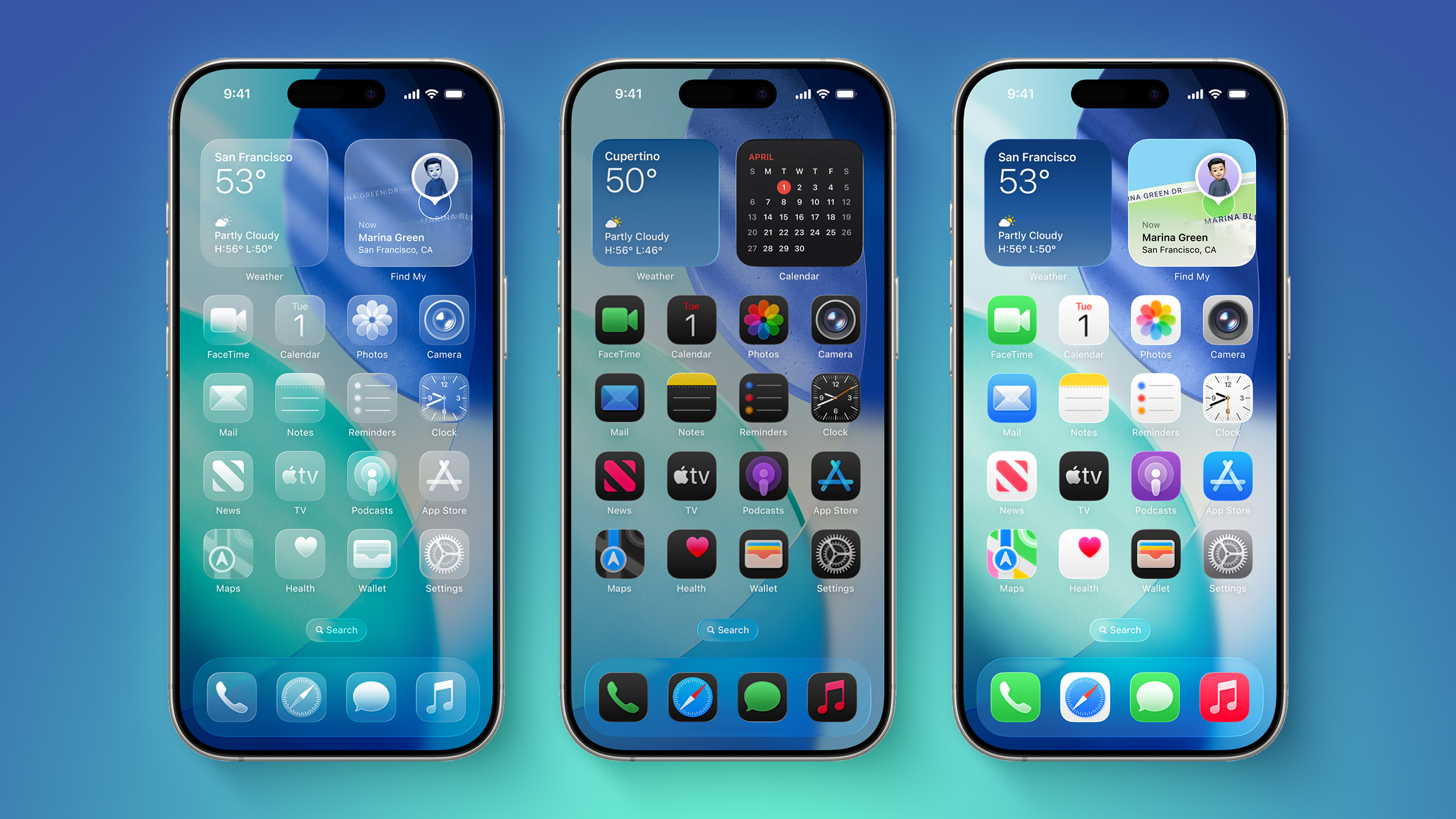
The Liquid Glass design brings transparency effects throughout the system interface and stock apps. On the Home Screen, you'll notice the search bar, dock, and app folders all feature translucent backgrounds. App icons themselves now sport a new layered glass appearance that adds visual depth and dimension to your device – plus there's a new Clear appearance option that ups the ante even more.
While visually impressive, these transparency effects can sometimes interfere with readability, especially for anyone with certain visual needs. Fortunately, Apple has included accessibility options to make the interface more accessible.
How to Reduce Transparency
The quickest way to make iOS 26's interface more opaque is through the Reduce Transparency setting:
- Open Settings on your iPhone.
- Tap Accessibility.
- Select Display & Text Size.
- Toggle on Reduce Transparency.
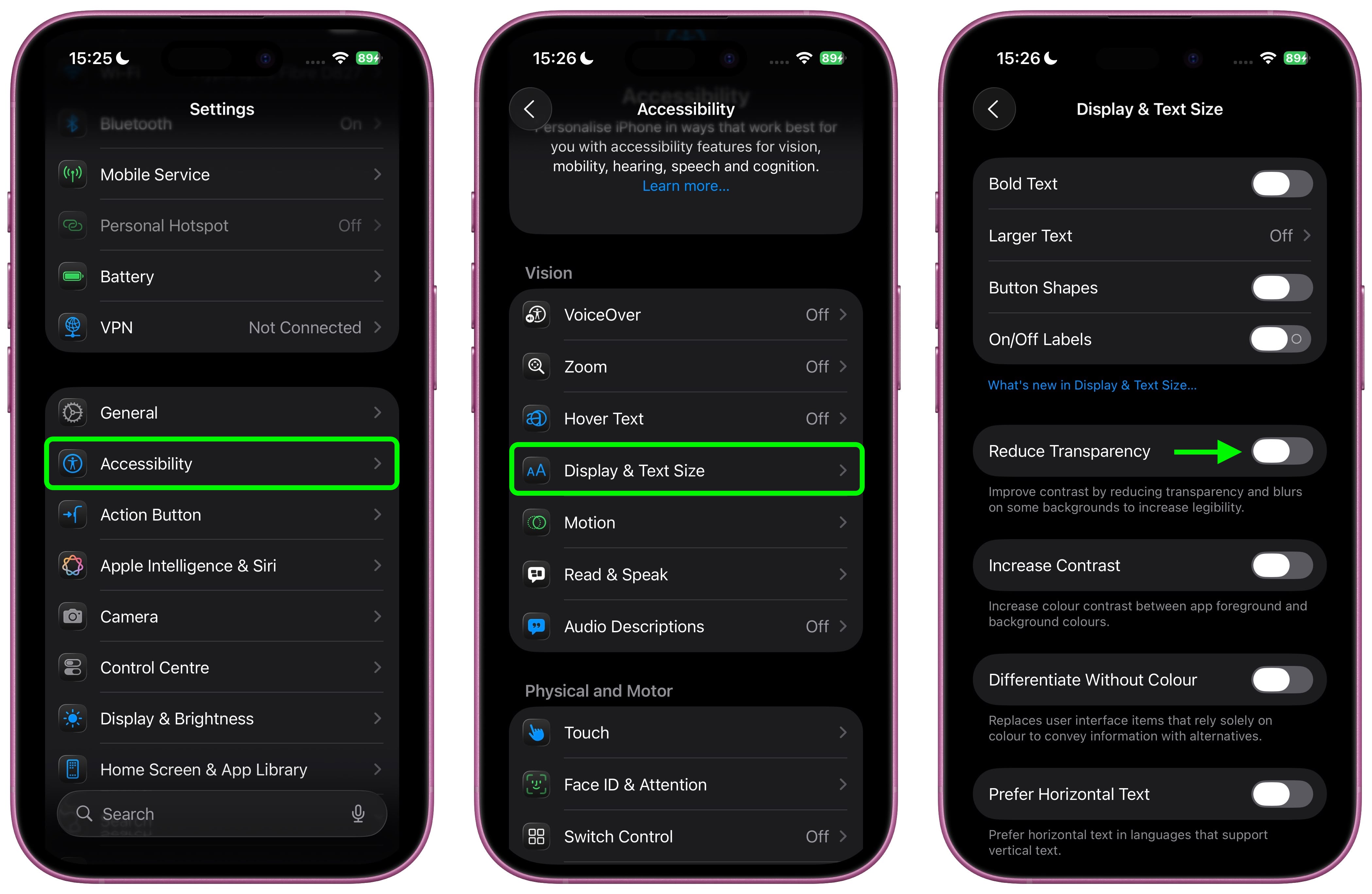
This setting adds darker backgrounds to translucent areas like Control Center, app icons, and app folders, so you should see increased contrast between elements throughout the system.
Note that Reduce Transparency doesn't completely eliminate all translucent elements or change button shapes – it simply makes translucent areas more opaque while maintaining the overall iOS 26 aesthetic.
Add Reduce Transparency to Control Center
For quick access to this setting, you can add it to your Accessibility Shortcuts to get to it from the Control Center interface:
- Go to Settings ➝ Accessibility.
- Scroll down and tap Accessibility Shortcut.
- Select Reduce Transparency in the list.
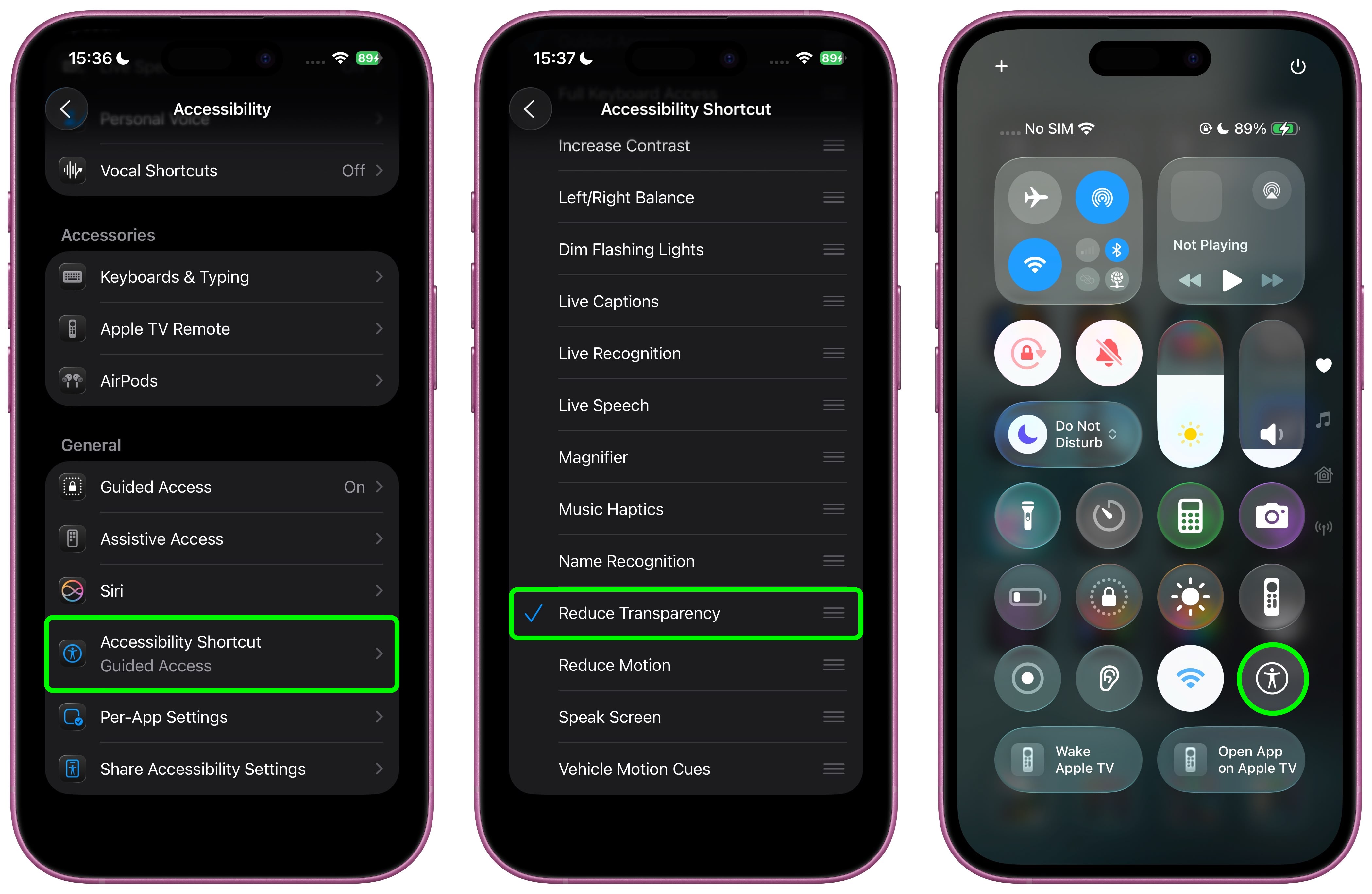
If you like, you can add the Accessibility Shortcut button to Control Center (long press a space between the interface's buttons, then tap Add Control). After you've done that, you can quickly toggle the setting on and off directly from Control Center, making it easy to switch between the full Liquid Glass experience and a more opaque interface as needed.
Additional Contrast Options
If you're still having legibility issues after enabling Reduce Transparency, return to Settings ➝ Accessibility ➝ Display & Text Size, then toggle on Increase Contrast. Note that enabling both Reduce Transparency and Increase Contrast will cause icons to lose most of their translucency.
The Liquid Glass design is still in beta, so Apple will likely continue refining the visual effects based on feedback. A wider official rollout of iOS 26 is expected sometime in September.
Article Link: iOS 26: Reduce Transparency of Apple's Liquid Glass Design
The wasted space isn’t getting nearly enough discussion. A sidebar that previously was indicated by a sharp, straight line is now contained in a separate rounded box that doesn’t add anything and requires so much more screen space to display. Why?!!! The previous approach looked and worked better.Shouldn’t have to tap 2x to get to tabs in safari bc somebody wanted these function hurried in a menu button.
Also, everything feels cramped now with all these round ended and cornered boxes.
Maybe I’ll get used to the shapes wasting space but I’m already pissed at the extra taps.
I’ll never go android bc I think Apple still is superior for security and privacy but that doesn’t men I have to like retrograde change for change sake moves.
I suggest that your phone's attention seeking behavior is because you chose set it up that way. Pretty easy make an iPhone into a pretty basic device with a great camera. What privacy nightmare has occurred on iPhones?I think a lot of us would be very happy to return to this after the privacy nightmare and general attention seeking the modern smartphone has become. I purposefully leave my phone sitting on my desk, don't carry it around with me just so it doesn't distract me. I would love returning to a dumb phone that could handle just a couple things I need tied around security, authenticators etc..
Are you new to product enthusiast forums?The really odd part of things here is that even when Android does something objectively better than Apple ... it still gets bashed.
When one just denigrates "the other", good or bad, it's a cult.
")
Well since you brought that up I always mistakingly go to displays to adjust my wallpaper & have done this in macOS too. I think it might make sense to house it there?It's fecking ironic (moronic) to place the setting for the visually impaired buried in Accessibility when it should be in Display & Brightness 🙄
It's often less than obvious where some setting is located which is why most of the time I just search for a setting. In some cases there are good reasons why the same setting could be in more than one place so unless you actually do duplicate it I can see why it's not always obvious.Well since you brought that up I always mistakingly go to displays to adjust my wallpaper & have done this in macOS too. I think it might make sense to house it there?It's fecking ironic (moronic) to place the setting for the visually impaired buried in Accessibility when it should be in Display & Brightness 🙄
Currently using a Pixel 9 Pro XL, loving it, love the design better than iphones and the Os is quite great.The really odd part of things here is that even when Android does something objectively better than Apple ... it still gets bashed.
When one just denigrates "the other", good or bad, it's a cult.
My main reason for preferring an iPhone starts with me much preferring a Mac over a Windows PC. From there it just seems simpler to have my phone have a very similar look and feel to my Mac along with little touches like I can COPY on my phone then PASTE it on my mac. Sure any Android phone may be ahead in some features at any given time but rarely are those in ways that compels me to give up that simplicity I like. So never really a matter of 'better' per se.Currently using a Pixel 9 Pro XL, loving it, love the design better than iphones and the Os is quite great.
I pick the best for me l, never pick one over the other depending on brands, but I am the minority I guess.
i think the correlation is that the resulting output of both are bad, questionable at best.What makes you think that the visual design team is draining resources from the AI team? I doubt there collaboration between teams, but this is such a tired, and sort of illogical criticism to levy. It’s not always either-or.
The first time I saw those clear icons, I thought it was a jokeI get the look of the lock screen with liquid glass in clear mode, but what it does to my home screen, where I spend most of my time and have several folders with grouped app icons, it's just a bridge too far regardless of the transparency settings. To each his own.
That annoyed me too. I have found if you long press on the button you can slide into the multiple tabs button easier than the 2x tapsShouldn’t have to tap 2x to get to tabs in safari bc somebody wanted these function hurried in a menu button.
Also, everything feels cramped now with all these round ended and cornered boxes.
Maybe I’ll get used to the shapes wasting space but I’m already pissed at the extra taps.
I’ll never go android bc I think Apple still is superior for security and privacy but that doesn’t men I have to like retrograde change for change sake moves.
Here, I made a mockup:I don't think this setting should be in Accessibility. This should be in an Appearance section like macOS.

