What about getting a used iPhone SE? I know someone who still uses oneBrutally!
Seriously, it's super maddening to me that iPhones don't have far more choice in the size options.
These devices are used very differently by folks and I want/need the smallest & lightest option possible.
Got a tip for us?
Let us know
Become a MacRumors Supporter for $50/year with no ads, ability to filter front page stories, and private forums.
iOS 26: Reduce Transparency of Apple's Liquid Glass Design
- Thread starter MacRumors
- Start date
- Sort by reaction score
You are using an out of date browser. It may not display this or other websites correctly.
You should upgrade or use an alternative browser.
You should upgrade or use an alternative browser.
The really odd part of things here is that even when Android does something objectively better than Apple ... it still gets bashed.
When one just denigrates "the other", good or bad, it's a cult.
That's not the definition of a cult. It's more aptly called Tribalism
Tim to team: I want you to make it even thinner.
UI Team to Tim: Well, we could make it seem even thinner by using impossible to see, transparent icons.
Tim: Now, that's a brilliant idea. Do it!
UI Team to Tim: Well, we could make it seem even thinner by using impossible to see, transparent icons.
Tim: Now, that's a brilliant idea. Do it!
Legibility is much better in "Reduce Transparency" mode, but it's still a lot more glitchy than regular mode, but hopefully that will get better over time.
What is interesting is how committed some apple fanbois actually are, and go straight into gaslighting mode when anyone legitimately raises concerns over this. For example, in the early betas, some text was so difficult to read as a result of the background mess of other text - yet people turned around and blamed me. Kind of wild.
If things do continue I'm actually considering shorting AAPL when iOS26 launches, because it is that bad, and I suspect there'll be significant online complaints over it, and possibly even lawsuits if they too quickly unsign iOS18.
If things do continue I'm actually considering shorting AAPL when iOS26 launches, because it is that bad, and I suspect there'll be significant online complaints over it, and possibly even lawsuits if they too quickly unsign iOS18.
For my personal experience, I do not suggest this. I sold a bunch of shares after iOS 7, based on the same logic and wish I hadn’t.
")
Some will love iOS 26. Some of us will hate it. Including my mother who wants things to work once and stop changing every few years for no good reason she sees. And most will just deal with it and not complain about what pains a lot of us.
I've been assuming they'd have some such setting. Some examples I've seen have made the controls a bit less readable (the option you need doesn't pop out as quickly). I figure I'll use the defaults for a week or so then decide whether to tweak things. So not a problem.
Yay, it took us to the 45th comment to see that someone is going to wait and see what the finished product is like before deciding, but you got us there. Thanks.
I tried the Beta through 7 on an iPhone 16 Pro - hated it. I now understand the effects of legal weed in CA..
Worse! I park in handicap spots.You're one of those people who complains about wheelchair ramps, aren't you?
Shamefully bad UI team.
Users shouldn't need to enable a whole bunch of accessibility settings to get basic legibility and clarity.
Alan Dye’s team isn’t the same as Jony’s!
Rarely use the copy feature myself but I see it being useful, I use exclusively Mac and iPad so an iphone would make sense, but to me the Pixel was better pick, I can airdrop easily on my Mac and from it from the Pixel Wich is the only real feature I gain with integration...well that and password management, but I get away with it using chrome.My main reason for preferring an iPhone starts with me much preferring a Mac over a Windows PC. From there it just seems simpler to have my phone have a very similar look and feel to my Mac along with little touches like I can COPY on my phone then PASTE it on my mac. Sure any Android phone may be ahead in some features at any given time but rarely are those in ways that compels me to give up that simplicity I like. So never really a matter of 'better' per se.
Android and iphone is are very similar in how they work so not a big deal for me.
It's good that we have choices, and that there are high quality choices around to please everyone.
Agreed, Apple's Continuity features don't get nearly as much credit as they deserve as quality-of-life improvements. My current setup is highly modular, anchored by a MacBook Air with dual external displays (one ultrawide, one 4K vertical), flanked by my iPhone and two different iPads. I can control all of them from the MBA's keyboard and touchpad, copy and paste anywhere, turn on and off whichever pieces I need, or take away the iPhone or either iPad whenever I wish, or unplug and take the MBA on the road. I also have an old 27" iMac that unfortunately can't fit on my desk so it's off to the side, idle. My desk informally looks like a studio control room where I can have 8 sources of streaming video content going at once and nothing chokes or overheats. It's a wonderful dream realized.My main reason for preferring an iPhone starts with me much preferring a Mac over a Windows PC. From there it just seems simpler to have my phone have a very similar look and feel to my Mac along with little touches like I can COPY on my phone then PASTE it on my mac. Sure any Android phone may be ahead in some features at any given time but rarely are those in ways that compels me to give up that simplicity I like. So never really a matter of 'better' per se.
Last edited:
Where’s the option to turn it entirely off? (Aside from not upgrading!)
The small details


 elk.zone
tylerhall (@tylerhall@social.lol)
Attached: 1 image I recently moved to a new city and am using Apple Maps a LOT more to help find my way around. I was stopped at a red light and couldn’t figure out why the map wanted me to make a hard right turn ahead. Then I realized it’s just the Liquid Glass design refracting the blue...
elk.zone
I use it accessibility to reduce motion. With the new iOS, I will certainly use the Reduce Transparency.
Just give us one further option please, remove transparency.
Apple's iOS 26 update, currently in beta, introduces a striking visual overhaul with its new Liquid Glass design language. However, if the translucent elements are causing readability issues or you simply prefer a more opaque interface, there's a quick accessibility setting that can help tone things down.
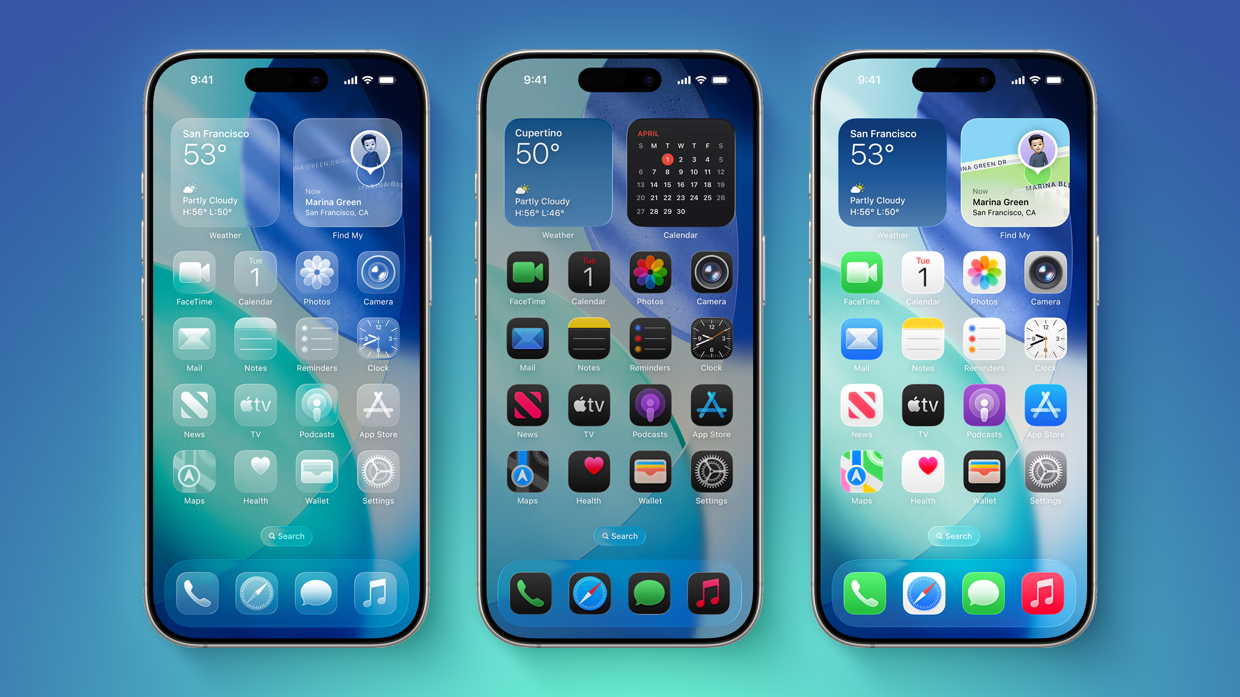
The Liquid Glass design brings transparency effects throughout the system interface and stock apps. On the Home Screen, you'll notice the search bar, dock, and app folders all feature translucent backgrounds. App icons themselves now sport a new layered glass appearance that adds visual depth and dimension to your device – plus there's a new Clear appearance option that ups the ante even more.
While visually impressive, these transparency effects can sometimes interfere with readability, especially for anyone with certain visual needs. Fortunately, Apple has included accessibility options to make the interface more accessible.
How to Reduce Transparency
The quickest way to make iOS 26's interface more opaque is through the Reduce Transparency setting:
- Open Settings on your iPhone.
- Tap Accessibility.
- Select Display & Text Size.
- Toggle on Reduce Transparency.
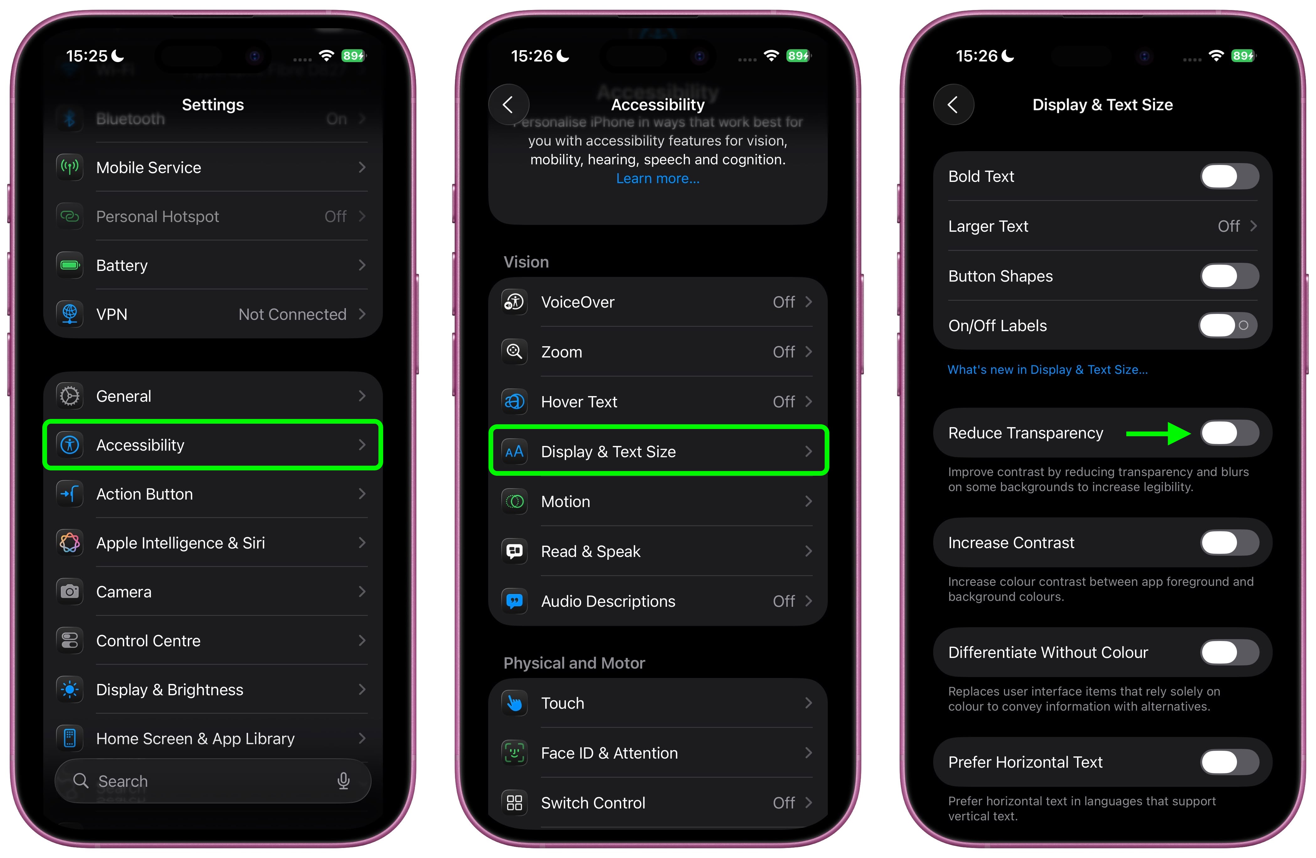
This setting adds darker backgrounds to translucent areas like Control Center, app icons, and app folders, so you should see increased contrast between elements throughout the system.
Note that Reduce Transparency doesn't completely eliminate all translucent elements or change button shapes – it simply makes translucent areas more opaque while maintaining the overall iOS 26 aesthetic.
Add Reduce Transparency to Control Center
For quick access to this setting, you can add it to your Accessibility Shortcuts to get to it from the Control Center interface:
- Go to Settings ➝ Accessibility.
- Scroll down and tap Accessibility Shortcut.
- Select Reduce Transparency in the list.
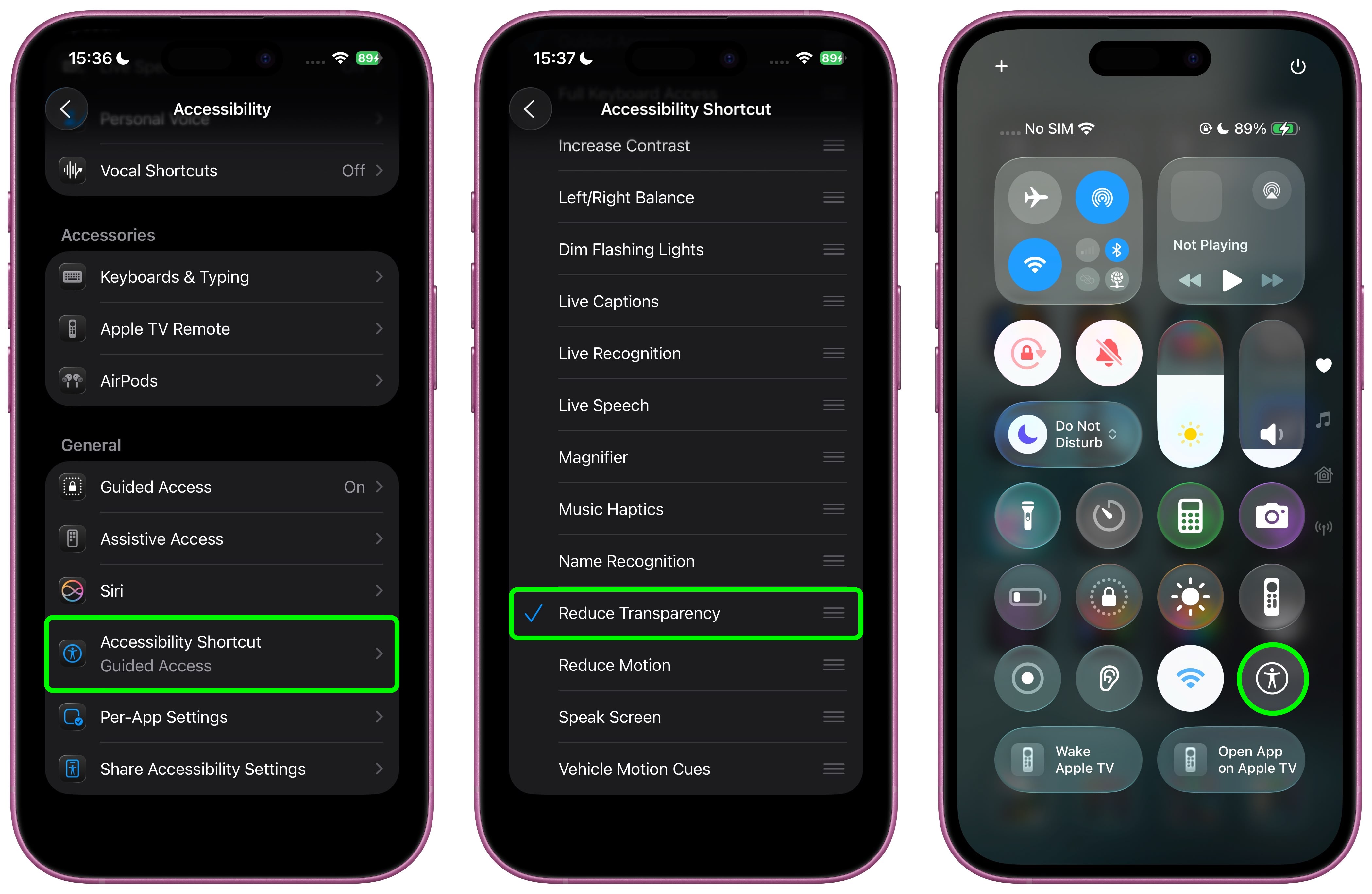
If you like, you can add the Accessibility Shortcut button to Control Center (long press a space between the interface's buttons, then tap Add Control). After you've done that, you can quickly toggle the setting on and off directly from Control Center, making it easy to switch between the full Liquid Glass experience and a more opaque interface as needed.
Additional Contrast Options
If you're still having legibility issues after enabling Reduce Transparency, return to Settings ➝ Accessibility ➝ Display & Text Size, then toggle on Increase Contrast. Note that enabling both Reduce Transparency and Increase Contrast will cause icons to lose most of their translucency.
The Liquid Glass design is still in beta, so Apple will likely continue refining the visual effects based on feedback. A wider official rollout of iOS 26 is expected sometime in September.
Article Link: iOS 26: Reduce Transparency of Apple's Liquid Glass Design

Looking at this translucent design just gives me chilles of vista.
Does anyone remember the aero interface?
Does anyone remember the aero interface?
A. This should be “Increase transparency” with the default being opaque. i.e maximum readability.
B. This should be a slider, acknowledging that the customer rather than Apple controls reduction/increase. Imagine the brightness control being a “Reduce brightness on/off toggle button”!!
B. This should be a slider, acknowledging that the customer rather than Apple controls reduction/increase. Imagine the brightness control being a “Reduce brightness on/off toggle button”!!
You press the power button to end a phone call? I’m puzzled by this - maybe I’m misunderstanding, but that is NOT how I end a call.I feel the same way about not pressing the power button to end a call. Why is the default setting to press the button to end the call since it's so easy to do accidentally? Why not make the default action to do nothing or turn the screen off? And then have a special toggle to reverse this behavior. Why bury this in Accessibility? Makes no sense to me.
For me:Essential tweak for me. It looks so much better.
Readability, first.
Navigational clarity & layout design, second.
Looks, last.
Some of you’ll have WAAAAYYY too much time on your hands and worry about nothing, yet everything all at the same time. I’ve installed the betas on my phone, iPad Pro, Macs, and wow, I can READ EVERYTHING just fine. Geez. Honestly, it’s hardly even noticeable from last years OS across all platforms.
Completely agree jbanning. Especially when it occupies so little screen footprint at the bottom of the screen. At least my experience so far. I just happen to enjoy a little visual flourish on occasion. In the end, just my opinion.
18.6.2 may be my last iOS and 15 Pro my last iPhone if they don't provide a means to turn this silliness off.
Well there are a number of nice Android based phones these days.18.6.2 may be my last iOS and 15 Pro my last iPhone if they don't provide a means to turn this silliness off.
Register on MacRumors! This sidebar will go away, and you'll see fewer ads.