View attachment 2536713
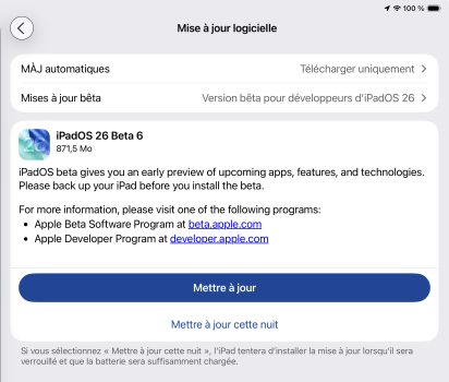
That’s how it looks here (b6, 16PM) … I think the tinting is working to highlight the active sheet and looks pretty glassy… don’t get what’s wrong
Same here, I’m pretty sure this is intended behavior. 👍🏻
PS an example of a similar tinted button in the Photos app on Apple’s official iOS 26 preview page. I think this proves that it’s expected behavior, unless I’m missing something.
Oh yes intended design - I just mean its one part of LG that I have trouble reading and I feel like a tinted background would work much better. I guess I keep expecting them to tweakit somehow to be a little clearer or something.
The colour picked by each app also matters, some colours are much harder to pick out.


