Become a MacRumors Supporter for $50/year with no ads, ability to filter front page stories, and private forums.
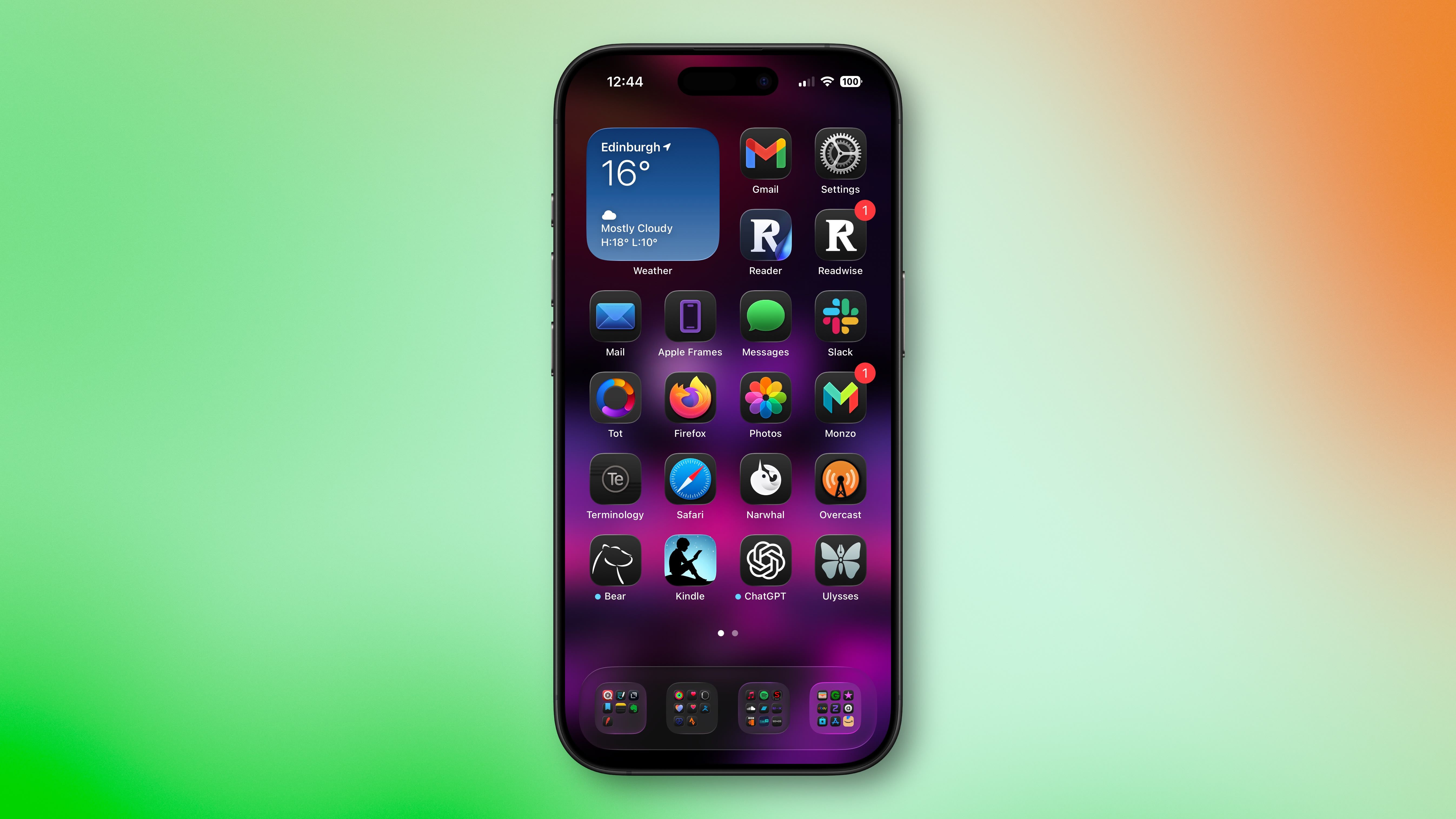
If you don't like Liquid Glass, I did something very simple that might work for a lot of people. I just changed my screen color to almost white or almost black. it removes a lot of the effects without changing settings.
 
Awful.

We tried this in 2007 with Windows Vista RTM and nobody liked it then. So far none of my friends and colleagues who have upgraded like it.

Thankful for the accessibility feature to reduce the transparency, but please oh please let us kill it with fire.
 
  • Love
Reactions: Huck
For me, the problem isn’t transparency or the contract. The real issue is with the new UI elements. For example, Safari’s controls have been completely redesigned, and they’ve become awful to use.
 
I hated it at first when the first Dev beta came out. Maybe because i’ve saw how far it’s came I don’t mind it so much now.

It’s not perfect. Definitely some things Apple can and probably will tweak with future updates.

Now I like it. Couldn’t go back.

People get angry and upset when things change. It’s not that bad. Nobody will care in 2 months time.
 
This reminds me of the late 90s when transparency was just popping up in UIs and then EVERYTHING had to be transparent, including the hardware. Yuck. Liquid Glass, like all the other skeuomorphic crap over the years is a fad gimmick and I hope it goes away with quickness.
And you recall who was wholly responsible for that, right?
Cook is copying Jobs.
 
A belated thanks to Juli for aggregating a range of opinions, and to the team for providing an ebullient place to chat and vent about it. There seems to be unusual demand for such a place this time around.
 
I absolutely love it. In fact I wish it was way more than it is. I have HATED the flat UI we have had since iOS 7. I hated it back then, and I never liked it. I got "used to it". I didn't start using an iPhone until I got an iPhone 7 CIRCA 2019-2020. Back when iOS 7 came out I had an HTC, and was able to keep it looking how I wanted. I did not update my iPod Touch to iOS 7.

macOS\iOS 26 brings back some of the character we had with Aqua, which shouldn't have ever left. Some people ignorantly compare liquid glass to Windows Aero, which while the comparison is incorrect, Windows Aero is another thing that shouldn't have ever left. It's like people don't have eyes. This is all a very welcome change, and I genuinely hope Apple doesn't let people bully them into going back to the horrendous flat UI I've been cursed at starring at for almost two decades.
 
  • Like
Reactions: ddhhddhh2
It's quite bad on iOS, and the point about additonal battery drain for some fancy UI effects is spot on, maybe that's their way to force user to buy new iPhones, but the UI looks even worse on macOS, look at the forums for screenshots to see examples, or just open the Contacts app on Tahoe and compare it to the previous version.
 
Last edited:
  • Disagree
Reactions: Project Alice
I hated it at first when the first Dev beta came out. Maybe because i’ve saw how far it’s came I don’t mind it so much now.

It’s not perfect. Definitely some things Apple can and probably will tweak with future updates.

Now I like it. Couldn’t go back.

People get angry and upset when things change. It’s not that bad. Nobody will care in 2 months time.

People get angry and upset when changes for the worse are forced on them. People don't stop caring; they stop complaining when it becomes obvious that the situation isn't going to improve and either switch to a different product or trudge along, dealing with the nagging frustration that things aren't as good as they used to be and never will be again.

But you can prove me wrong. Offer me a million US greenback dollars. By your view of the world, I will certainly refuse it because I fear change.

As a bonus, offer me the million and if you're in the northeastern US I'll even come by your house once a month for a year to rearrange your kitchen so you can prove how much you love change.
 
Yeah, a UI is not supposed to draw attention to itself. it should be invisible, transparent but not literally. In interior design I grade great design when you can casually walk into a space and enjoy and admire a space without anything blatantly drawing attention to itself to question it. When everything is so well thought out that it just works no matter how unconventional it might be once carefully dissected.
 
  • Love
Reactions: WarmWinterHat
Having watched the beta releases I was expecting this to be a disaster that needed a lot of turning off defaults.

I just upgraded, somewhat reluctantly, and have changed nothing.

It's fine. The look is subtle mostly.
I dont get the "crooked icons" that I saw complaints about.

The general non tech public arent going to be clutching their pearls over this.
 
I knew this was gonna be an issue
any major update gets slight changes as real world testing en masse reveals a few things.
but for .0 release, this is nowhere near the disaster it is being made out to be.

and if Apple had kept the interface the same, there would have been as many or more voices complaining that Apple are stale.

you cant win.
 
Register on MacRumors! This sidebar will go away, and you'll see fewer ads.