I'm not criticizing glass per se. Liquid glass is transparent (pun intended), and yes, it looks cheap, like a cheap piece of jewelry, but I can overlook that choice. The problem becomes apparent when you turn off the transparency, revealing poor interface design in every nook and cranny. The amount of space wasted to put in the glass bubbles requires me to make several more movements to achieve the same goal I had at my fingertips in iOS 18. If something was easily accessible, the space allowed for more legible information, and now there's less of that space due to decisions that aren't made for usability but for bragging about technology, then it's bad design. And I don't really care if the material used is glass, plastic, cotton candy, or anything else—it's primarily bad design.
Got a tip for us?
Let us know
Become a MacRumors Supporter for $50/year with no ads, ability to filter front page stories, and private forums.
iOS 26's Liquid Glass Design Draws Criticism From Users
- Thread starter MacRumors
- Start date
- Sort by reaction score
You are using an out of date browser. It may not display this or other websites correctly.
You should upgrade or use an alternative browser.
You should upgrade or use an alternative browser.

After killing the Mini and not updating Siri, the iOS 26 was the last spit in my face from Apple.
Switched to Android, because even Android is better than what Apple currently does to us.
Switched to Android, because even Android is better than what Apple currently does to us.
I’m so exited - 300 comments, I guess all loves this new “amazing” OS…. No
Rumors in the air : Even investors doesn't like it
Rumors in the air : Even investors doesn't like it
I don't like it on my Apple Watch or iPhone, but I absolutely hate it on my Macbook Pro. Every app is inconsistent. There's so much wasted space. The rounded window corners are ridiculous. I'm sure I'll get used to it, but I immediately disabled animations and would kill to get my Apple apps looking how they did before. This is the first major macos update in years that I wish I had not installed.
U do realize in EVERY iOS major update there are people who would say that??I knew this was gonna be an issue
I quite like it so far. Haven't used it on macOS yet though.
But it was actually one of the factors that brought me back to iOS from Android (not the only one though).
When I saw the first screenshots I didn't like it too much. But I then installed the beta on a iPhone 12 Pro Max I still had and while actually using it, I gotta say the design grew on me.
It kind of has that playfulness of the initial Aqua design on Mac OS X.
And while the skeuomorphism of early iOS was maybe a bit too much, so was that flat design in the other direction IMHO.
Does it have its kinks that need ironing out? Absolutely. But so did Aqua in the beginning.
Last edited:
I'm enjoying it and believe it's a net positive for the Apple ecosystem. The only downside of course is that it's sluggish on older hardware, though that's to be expected with the current way that technology progresses.
I was actually pleasantly surprised how well iOS 26 runs on my Pro Max 12. It's perfectly useable for day to day tasks. Granted, this was a flagship phone, but still I appreciate the long term support.I'm enjoying it and believe it's a net positive for the Apple ecosystem. The only downside of course is that it's sluggish on older hardware, though that's to be expected with the current way that technology progresses.
I've been using it a couple of days, and don't download the beta versions of these updates anymore. I don't think it looks particularly great TBH. Very wishy washy in places and the 3D glass bubbles feel a little bit like iOS 6 did all those years ago. Stuck with it now though so have to get used to it.
Anyone ass pissed off as me by the new radius of corner of windows / buttons etc… any content inside feel some much misaligned now
Frankly, I think we're going to see some major adjustments to Liquid Glass in macOS/iOS/iPadOS 27. And it is sorely needed.
I dunno, I'm liking it on my "old" 16 pro... the only thing is maybe a bit more battery use but isn't that the case when you install a major revision? A lot of background tasks etc. The graphics definitely impress me, looks way better than before. I'm not always in agreement with the post-Jobs/Ive Apple design (like the new iMac) but this OS upgrade is a good one IMO.
I have it on the phone and iPad, I can't really say it makes all that much difference to me. You'd be hard pressed to tell the difference, or most probably, I just don't care.
Last edited:
I really like the new interface, although for now the fact that almost no big apps have updated to the new design means that you don't find that usual "consistency" at Apple. It has some flaws, but I see it less traumatic than with iOS 7 (I also think the change was much bigger then).
A flaw that happens to me repeatedly is that when I unlock the phone it has as the brightness super low (although in settings it is in half). You relock it and turn it on and it looks like the usual normal brightness.
Let's see if it doesn't take long to adapt the apps to the new design (And to the new keyboard, which is annoying to look at the new keyboard and go into an app and go back to the old one that's very different).
Key reason I'm not upgrading from Sequoia. It's just disgusting visually and awful waste of space. Fortunately Apple supports older computer OSes (including reinstall) for many years. No reason for me to upgrade anyway (EU country with less popular language - so no support for most new features now and in foreseeable future). I expect (EDIT: hope) Tim Cook to be fired for 2nd misstep after AI and being replaced by somebody more product oriented like Jobs.Do we need these big curves? The traffic lights? On every window? Even more displeasure ad the bottom right in case you need to adjust the window size.
I am a designer and coder. Currently working on a playstation. Sounding like an angry old man, fully aware of that. But let's just say I would not let any of my apprentice designers get away with that.
View attachment 2551167
EDIT: Actually not 2nd misstep. There are more of them. Like Apple Vision.
Last edited:
I've only installed it on my AppleTV so far. Don't find it that ugly there, but there are definitely bugs and visual glitches caused by it. For example on the Apple TV app, if you bring up the sidebar menu, the "glass effect" menu zooms into view. But while the zoom animation is taking effect, it just looks grey and ugly. Then once the animation finishes, the proper glass effect suddenly is rendered. This is distracting and looks very amateur!!
And this is on the latest-model Apple TV 4K, so it's not like its scaling back the effect for old hardware or something.
And this is on the latest-model Apple TV 4K, so it's not like its scaling back the effect for old hardware or something.
People don’t like change. Most will get used to it within weeks and move on.
Bugs? There is a reason why the target in Enterprise, Govt, mission critical applications for SWIM (Software Image Management) is ALWAYS N-1. When stability is paramount one never jumps on the latest version. For non-mission critical users (the majority of Apple’s user base), Apple benefits from millions of post release Beta testers.
Who could be surprised that this is not ready yet?
Liquid Glass?
Retina sharpness, the most advanced monitors with ultra sharp resolution and we have someone obviously by now a seen as a genius (more likely someone with political clout within the Apple US design team) having moved us in the opposite direction via their brainchild. Madness.
I have an iPhone SE (3rd Gen)... the last iPhone with a Home button. Anyone have iOS 26 running on one and can tell me how it performs? Speed? Battery life?I immediately downgraded back to iOS 18. I was embarrassed for how silly, cartoonish, and fruity my phone suddenly looked. And it ran super slow. Surprised they don’t even let you switch it off. Avoid the upgrade especially if on an older iPhone.
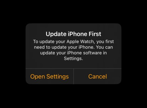
Also, one more thing I found out: you can’t update your Apple Watch to iOS 26 if your iPhone is on iOS 18.7… that's funny
It has always been this way with the Apple Watch. watchOS version must be the correct one corresponding to iOS on your paired iPhone.
I love the liquid glass design. With the software being available to all and since users have just started using it, this is expected. Apple might refine some elements in the future.
Register on MacRumors! This sidebar will go away, and you'll see fewer ads.