Got a tip for us?
Let us know
Become a MacRumors Supporter for $50/year with no ads, ability to filter front page stories, and private forums.
iOS 27 to Focus on Bug Fixes, Performance, and Design Tweaks
- Thread starter MacRumors
- Start date
- Sort by reaction score
You are using an out of date browser. It may not display this or other websites correctly.
You should upgrade or use an alternative browser.
You should upgrade or use an alternative browser.
fatTribble
macrumors 68030
I completely agree with your points about Search being so inconsistent across apps.So you're saying you don't use your devices? Otherwise, you would have noticed how illogical and unusable the design is.
Here are a few examples:
Previously, the search function was discreetly accessible by pulling down the respective menu. Today, the search function is a separate layer.
The second point is that it always looks different.
In Settings, it's a layer with a text field; in Health, it's a magnifying glass button with an additional function at the bottom right; in Reminders, it's a magnifying glass button without an additional function at the top right.
In the calendar, the search function is also a magnifying glass in the top right corner. However, it is not in the first position from the left, but in the middle.
As you can see, Liquid Design lacks consistency and logic.
Thirdly, functions are unnecessarily hidden.
In Health, categories can no longer be found by an individual buttons, but with a tap on the magnifying glass.
In Photos, the collections still have an individual button. The “Shared Albums” do not, however. Meanwhile, in Health, “Share Health” has its own button.
The App Store also still has the Arcade button, even though it is now a separate app.
In Music, there is still the “old menu bar” consisting of four buttons. But only with a click on “Home”.
Should I continue?
Regardless of its appearance, Liquid Glass is an absolute disaster in terms of user guidance. There is no consistency whatsoever, no similarities anymore. Every app now works and is operated differently.
When I read that people don’t like Liquid Glass I’ve been assuming (maybe wrongly) that they didn’t like the actual transparent look of things. I wish more people would give reasons why they don’t like or like something the way you did.

fatTribble
macrumors 68030
Completely agree. I don’t ever remember a developer saying they don’t need any more time to test.In my experience, the pressure to release is usually coming from the top, and reflected through middle management. Developers usually want to do a good job. If they're releasing rubbish, there must be a serious cultural problem.
The reality where I worked was that projects were always time boxed so what ended up getting cut was documentation and testing.
DownUnderDan
macrumors 6502a
That would make sense, but marketing would have a melt down. Remember the idea of yearly updates of hardware from a practicality perspective is equally pointless, but thats how they convince a sizeable proporition of their customers to upgrade on a yearly or bi-yearly basis. People want the new toys with the improved 'features' they plastered on to the operating system, regardless if it works well or not.Focusing on bug fixes is good. Maybe this wouldn't be necessary if Apple slowed down on the software releases and only released a new version every 2 years. It's not like they're adding value by rushing software only to have a bunch of messes to clean up later.
macos9rules
macrumors 6502
Thanks for the reply! I completely agree that the UI inconsistency is frustrating. I hadn’t connected it to Liquid Glass though. I always assumed Liquid Glass was just the gimmicky visual effect I barely notice. The UI inconsistencies have been bothering me for quite a while across both macOS and iOS, even before version 26.So you're saying you don't use your devices? Otherwise, you would have noticed how illogical and unusable the design is.
Here are a few examples:
Previously, the search function was discreetly accessible by pulling down the respective menu. Today, the search function is a separate layer.
The second point is that it always looks different.
In Settings, it's a layer with a text field; in Health, it's a magnifying glass button with an additional function at the bottom right; in Reminders, it's a magnifying glass button without an additional function at the top right.
In the calendar, the search function is also a magnifying glass in the top right corner. However, it is not in the first position from the left, but in the middle.
As you can see, Liquid Design lacks consistency and logic.
Thirdly, functions are unnecessarily hidden.
In Health, categories can no longer be found by an individual buttons, but with a tap on the magnifying glass.
In Photos, the collections still have an individual button. The “Shared Albums” do not, however. Meanwhile, in Health, “Share Health” has its own button.
The App Store also still has the Arcade button, even though it is now a separate app.
In Music, there is still the “old menu bar” consisting of four buttons. But only with a click on “Home”.
Should I continue?
Regardless of its appearance, Liquid Glass is an absolute disaster in terms of user guidance. There is no consistency whatsoever, no similarities anymore. Every app now works and is operated differently.
switz
Contributor
Somedays, it seems like I have a different vendor for each of Apple's operating systems and each is competing for larger budgets against the others while doing little to nothing fixing the existing bugs and or defective programming from day one. One can stack a bunch of flavors of ice cream on the cone, but if one was found in the bard yard, they all will taste the same.
Somehow the idea of each systems's operating system being fully compatible with the others must have gotten lost in the rush to see which one can cause the customers the most grief and be full of tedious tiny issues plus some some big ones.
New Apple motto: It Just does Not Work and You Will Hate It - Too Bad
Dr McKay
macrumors 601
I hope so, battery life has been noticably worse on my 15 Pro, and certain animations on it stutter 100% of the time, for example tapping the delete icon when looking at a photo, the box that expands from the trash can symbol seems to open with a very low frame rate every single time.
My wife owns the regular 13 and since iOS 26 she's has to start charging it at lunch whereas previously she would only need to do it at home after work.
My wife owns the regular 13 and since iOS 26 she's has to start charging it at lunch whereas previously she would only need to do it at home after work.
riverguide
macrumors regular
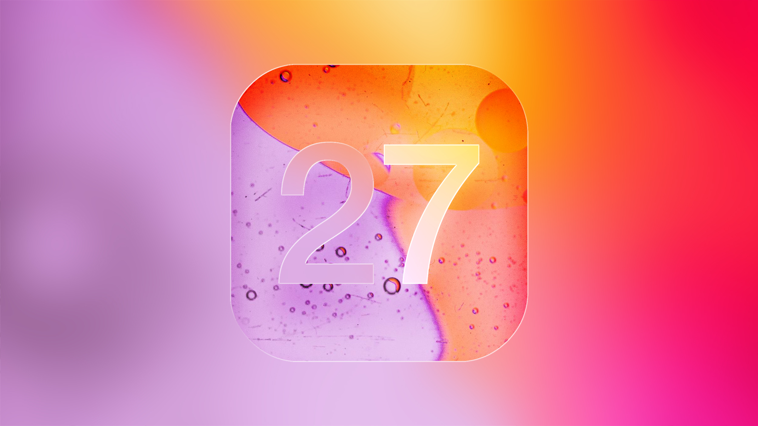
The graphic caught my attention in an earlier iOS 27 rumors article already. As far as Design Tweaks go, I propose to make the “2” as opaque as the “7”. The water drops in the background can stay transparent. To eliminate them though, would make the design look more professional (rather than cosmetic).
È
Snow Leopard was released in August 2009. That's over 16 years ago. It's time to do it again.
One year later in 2010, Apple released the wedge shaped MacBook Air, and the combination of stable software plus an affordable ultra-portable everyday laptop was the high watermark for me as an Apple's MacBook consumer.
One year later in 2010, Apple released the wedge shaped MacBook Air, and the combination of stable software plus an affordable ultra-portable everyday laptop was the high watermark for me as an Apple's MacBook consumer.
johnsawyercjs
macrumors 68000
Yeah, that one image captures several of the key legibility issues with Liquid Glass.The graphic caught my attention in an earlier iOS 27 rumors article already. As far as Design Tweaks go, I propose to make the “2” as opaque as the “7”. The water drops in the background can stay transparent. To eliminate them though, would make the design look more professional (rather than cosmetic).
johnsawyercjs
macrumors 68000
On the other hand, yearly hardware updates make sense in a competitive field where other manufacturers are guaranteed to do it. Also, some new technology or just improvements become ready to incorporate into a device every calendar year or sooner, and those competitors will add what they can of these each year. When Apple doesn't do that too, they're inevitably criticized for it.That would make sense, but marketing would have a melt down. Remember the idea of yearly updates of hardware from a practicality perspective is equally pointless, but thats how they convince a sizeable proporition of their customers to upgrade on a yearly or bi-yearly basis. People want the new toys with the improved 'features' they plastered on to the operating system, regardless if it works well or not.
That said, it's not always easy to tell when the yearly upgrade cycle is driven mainly by these factors, and when it's mainly the marketing factors you describe. Usually it's a roughly even mix of the two. Many (most?) people don't know about some or many of the significant hardware improvements to their devices that are added in many calendar year refreshes, but they often still benefit without realizing it.
But then there are the occasional hardware disimprovements...
johnsawyercjs
macrumors 68000
A fair number of new features are added most years, but too many of those are features that not a lot of people use. As you indicate, most people mainly want improvements and bug fixes for the features we already have, that is if we had a choice.We’ve been getting releases with little to no new features every year for at least a decade. The only difference with snow leopard is that despite the meagre number of changes the code quality and polish has only worsened. Apple is just not good at software anymore. It matters not how few new features there will be, iOS 27 will probably be just as unstable, buggy and inconsistent.
con2apple
macrumors 6502
You're right, the systems have always had a few design flaws.Thanks for the reply! I completely agree that the UI inconsistency is frustrating. I hadn’t connected it to Liquid Glass though. I always assumed Liquid Glass was just the gimmicky visual effect I barely notice. The UI inconsistencies have been bothering me for quite a while across both macOS and iOS, even before version 26.
But it was only with Liquid Glass and the obsession with reducing user interfaces as much as possible that designers were given complete freedom. They ignored rules that had been in place at Apple for 25 years.
That's why, in my opinion, it's clearly linked to LD.
johnsawyercjs
macrumors 68000
This sounds exactly like a description of what happened in Sept 2000 with the release of Mac OS X Public Beta.You're right, the systems have always had a few design flaws.
But it was only with Liquid Glass and the obsession with reducing user interfaces as much as possible that designers were given complete freedom. They ignored rules that had been in place at Apple for 25 years.
I recall that many of Apple's Human Interface Guidelines, which had been largely perfected under Mac OS Classic by the time of the final releases of OS 9, were pointlessly changed, removed, or broken in the initial public beta of OS X, and this was still largely true with the release of 10.0 six months later. At least one person at Apple said something to the effect of "we meant to do that", claiming this would lead to innovation in new ways of doing things in Mac OS. But of course this seemed like a dumb way of achieving that goal, and due to user complaints, many or most of the more important things that needed to be reintroduced were put back with OS 10.1 and 10.2.
But Apple's "reasoning" did pay off after a while, since a lot of new interface elements and ways of doing things were added and improved in the next few releases of OS X. One example is the reworking of Classic's Windowshade option, which allowed you to largely move a window out of the way by rolling it up into its title bar by double-clicking on the title bar. A lot of people used this, including me, to declutter the screen, but it was improved on with the Minimize button in the middle of the "stoplight" row of buttons in the upper left corner of windows, which sends a window to the Dock where you can more easily see and reopen it. This was one part of Apple's change in UI philosophy, from Classic's state changes in situ, to OS X's favored object destinations (the Dock, in this case).
Last edited:
con2apple
macrumors 6502
Yes, Apple is known for releasing half-baked products and improving them over the years.But Apple's "reasoning" did pay off after a while, since a lot of new interface elements and ways of doing things were added and improved in the next few releases of OS X.
But with all these visions, it has always been clear what the company wants to achieve. With the new Liquid Glass concept, however, this question remains unanswered.
I'll say it again: why are the search function and the button for creating a new entry always in a different place?
Compare calendars, reminders, and stocks.
Not even the number of buttons at the top right is the same.
And no one can tell me that Apple, as the most valuable company in the world with virtually unlimited resources, was unable to develop a consistent design and adhere to its own guidelines.
As a small underdog 25 years ago, maybe. But those days are over.
We can all expect from Apple to show interest in its image. Which is based on user-friendliness and simplicity.
Liquid Glass is the opposite.
Attachments


They just need to think deep in the roots of UI, what works and what doesn't, what aligns well adn what is off.I would agree to my own surprise. LG is just ok and I am one who can bare with it.
I think it would have gone a bit better "if" when they released it, it did not have all of what would be considered sloppy design that they have been slowly fixing since launch with each version release: Like overlapping text or LG can't read clearly due to glass look etc. It just looked like it was half backed when released and Apple decided to just fix it along the way.
"If" it was polished a little more or left in the oven more...maybe not all of the cries and hate (or at least not as much).
There are currently a lot of instances that LG is warped, inconsistent and just implemented poorly.
We all know Apple has the capital and talent to do it - I figure that it was a little too much lately in rushing the AI get to the level that is needed and OS polishing was put on a back-burner.
Now with 27 we'll be able to see a much better implementation of LG
26 would go into the history as one of the sloppiest in terms of design (but fortunately was ok for functionality)
Lion was the worst)
Last edited:
Lukelyke765
macrumors member
Yep. All same apps. After Mac OS upgrade it became sluggish. I just use it for browsing/ typing simple scripts. Moving between virtual screens has significant lag.Your m4 got sluggish?
S.B.G
Moderator emeritus
That would be a welcome bug fix and enhancement for me. I've adjusted it down as much as Apple allows. I'd be happy to have it fully reverted.Remove Liquid Glass.
Thanks.
SactoGuy18
macrumors 603
I think iOS 27 should concentrate on the following:
1. Redesign the code to improve battery life per charge.
2. Allow granular configuration of Liquid Glass elements, going from no effect to full effect in gradual steps. No effect will make iOS 27 look almost exactly like iOS 18.x versions.
3. Redesign the App Store app to accommodate up to three additional third party active App Stores besides Apple's own store.
4. Allow third party access to the NFC functionality. This could mean Walmart Pay can switch from optical QR code scanning to secure NFC wireless scanning.
5. Add a new Headphones app for better control of wireless headphones, including third party wireless headphones.
RumorConsumer
macrumors 68000
Sacto san yo must first learn to think like a bear in order to catch a bear. This is wolf thinking.I think iOS 27 should concentrate on the following:
1. Redesign the code to improve battery life per charge.
2. Allow granular configuration of Liquid Glass elements, going from no effect to full effect in gradual steps. No effect will make iOS 27 look almost exactly like iOS 18.x versions.
3. Redesign the App Store app to accommodate up to three additional third party active App Stores besides Apple's own store.
4. Allow third party access to the NFC functionality. This could mean Walmart Pay can switch from optical QR code scanning to secure NFC wireless scanning.
5. Add a new Headphones app for better control of wireless headphones, including third party wireless headphones.
Neblinio
macrumors member
Really looking forward to this "Snow Leopard" treatment for iOS 26. The sad part is that my beloved iPhone 11 will probably be dropped from iOS 27's supported devices list, despite it being one of the devices that would most benefit from the rumored improvements. Guess it's time to move on, I was already planning on upgrading this year anyways.
riverguide
macrumors regular
Occasional, yes. But one of the “disimprovements” was significant for me, not being able to replace the internal SSD anymore with a third-party one. By doing the latter and upgrading RAM, I extended the life of several of my Macs. The loss of both options was a little much. The reason for the RAM change with the M chips I understand, but the SSD lockdown I despise.… But then there are the occasional hardware disimprovements...