What about one that increases the Liquid Glassification?

Got a tip for us?
Let us know
Become a MacRumors Supporter for $50/year with no ads, ability to filter front page stories, and private forums.
iOS 27: Tone Down Liquid Glass Transparency
- Thread starter MacRumors
- Start date
- Sort by reaction score
You are using an out of date browser. It may not display this or other websites correctly.
You should upgrade or use an alternative browser.
You should upgrade or use an alternative browser.
Although it isn't named "completely opaque", there is an option in the accessibility settings called "Reduce Transparency"...The article is literally about the slider, if you need it 100% opaque that's not happening, because it never happened even on iOS 18 and 7...
We also need the freedom to be able to do anything on the devices LEGALLY. Or customizing the devices, something like that.We need Freedom so that a user can pick what the user likes. So more Liquid Glass - fine. No Liquid Glass - also fine.

dannyyankou
macrumors P6

akbarali.ch
macrumors 6502a
I want it more transparent, so i can see through the phone.

superarijit
macrumors member
Out of its own arrogance and sheer refusal to accept responsibility, Apple deigns to give a "solution" to its own problems.
If you've never been a fan of Liquid Glass – Apple's glass-like interface effect introduced in iOS 26 – then there's some good news in iOS 27. Apple has added a setting that lets you finely adjust the level of translucency, giving you more control over the look and feel of your iPhone.
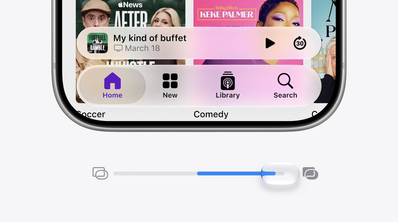
Perhaps you find notifications too see-through, or you want to see more of your wallpaper through Control Center. Fortunately, iOS 27 includes a dial that can help with that. Apple has swapped the two-option Clear and Tinted setting for a continuous slider that puts translucency anywhere between barely-there glass and a heavy frost.
The earlier presets arrived in iOS 26.1 and gave you two positions on a spectrum, whereas iOS 27 gives you the whole spectrum. It also locates the control in "Appearance" – a new section in Settings that gathers up interface options previously scattered through Display & Brightness, including Light and Dark mode and text size.
Not only that, Apple has also tweaked the default look, and says that Liquid Glass now diffuses complex content behind it more effectively while drawing a clearer separation between layers.
How to Change the Liquid Glass Effect
When you first install iOS 27, you'll be presented with the slider to change the Liquid Glass effect, but it's good to know how to get to it later if you want to switch up the look.
- Open Settings on your iPhone.
- Tap Appearance.
- Tap Liquid Glass.
- Drag the slider left for a clearer, more transparent effect, or right to add tint and opacity.
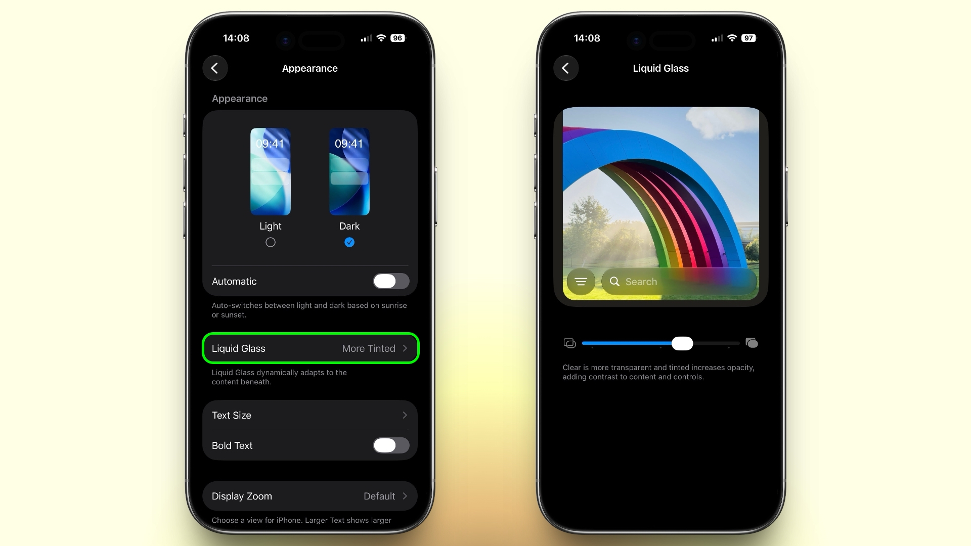
The midpoint on the slider is Apple's default. The UI preview redraws in real time as you drag it, so you can watch it instead of having to back out of Settings to check. Note that the setting applies across the system, and affects everything from Control Center and Home screen folders to app overlays and Lock Screen notifications.
If the Slider Doesn't Go Far Enough
Even at the tinted end, Apple's interface retains a degree of glassiness. If you're not satisfied with the result, two Accessibility options push it further:
You can find both in Settings ➝ Accessibility ➝ Display & Text Size.
- Reduce Transparency strips out nearly all translucency, leaving only flat, solid backgrounds.
- Increase Contrast sharpens the boundaries between buttons, text, and whatever sits behind them.
You'll find that iPadOS 27 also offers these controls in the same place, and the same goes for macOS 27 Golden Gate (albeit in System Settings). All three software updates are in public beta now, with a general release expected in September.
Article Link: iOS 27: Tone Down Liquid Glass Transparency

Never had an issue with Liquid Glass but then I have better things to occupy my time with than mindless complaining on internet forums
Slagging on Apple every day is the only way some people can feel good for the rest of the day.

Jodeo
macrumors 6502
THIS!
The lack of this setting has been the reason my iPhone 16 is still cruising along with iOS 18.7.8.
Hopefully I can leap frog over iOS26, altogether.
The lack of this setting has been the reason my iPhone 16 is still cruising along with iOS 18.7.8.
Hopefully I can leap frog over iOS26, altogether.

johnsawyercjs
macrumors 68000
Yeah, it makes no sense to have the settings to control transparency split between two different locations in the Settings app (though that's typical for Apple).Alas...Apple arrogance still at play. All Apple needed to do was go 4mm farther to the right and achieve 100% opacity, but no... they force users to go into Accessibility too. Even then, there are still LG effects.
This seems to be a legacy of the Reduce Transparency and Increase Contrast settings being located for some years in the Accessibility prefpane, which made sense before Liquid Glass, but now that we do have LG, it would make more sense to consolidate transparency/ translucency settings into one prefpane, and maybe even the Increase Contrast toggle too.
At the least, it would make sense to move the Reduce Transparency toggle out of the Accessibility > Display & Text Size prefpane and into the same Appearance > Liquid Glass prefpane where the slider is currently located, rather than getting rid of the Reduce Transparency toggle altogether and making one end of the slider the maximum opaque setting, since it's nice to have a single, simple control switch to turn it off and on if desired, if you don't want any degree of transparency at all. Though if moving the slider all the way to one end achieved the same effect as Reduce Transparency currently does, that might be fine.
johnsawyercjs
macrumors 68000
Replace those crosspoint screws with pentalobes, and you've got a product!
johnsawyercjs
macrumors 68000
Apple occasionally admits its errors, though rarely out loudThat would require admitting failure which is not something Apple are capable of.
Even if there’s a class action.

Alpha Centauri
macrumors 68000
Human beings are made of 60% water and 5 L blood. So I say make Liquid Glass even more liquid for integral assimilation with your device. As always...resistance is futile.
Alpha Centauri
macrumors 68000
Pentalobe is so 2009. But let's stick to uneven numbers and introduce the Septalobe or Heptalobe screws? Got the marketing department working overtime to check if either name is woke enough, whilst being PC in 2026. I'm sure we'll love it.Replace those crosspoint screws with pentalobes, and you've got a product!
I thought fully-tinted was going to be the answer to the nightmare that was iOS 26. Unfortunately for us, it makes a bunch of UI components really unnecessarily ugly.
These screenshots are all light mode. Dark mode is only slightly better.
I landed on one notch up from center. Makes things readable but still as pretty as possible IMO.
Alpha Centauri
macrumors 68000
Good grief. Associated extreme heat warning with apocalyptic end-of-days boiling temps and calmed down once I spotted Fahrenheit. 🥵View attachment 2648941
I thought fully-tinted was going to be the answer to the nightmare that was iOS 26. Unfortunately for us, it makes a bunch of UI components really unnecessarily ugly.
These screenshots are all light mode. Dark mode is only slightly better.
I landed on one notch up from center. Makes things readable but still as pretty as possible IMO.
You don't say.Never had an issue with Liquid Glass but then I have better things to occupy my time with than mindless complaining on internet forums
mrochester
macrumors 603
I don’t understand this whole concept of being able to ‘switch liquid glass off’.
iOS has code that determines how things are displayed on the screen. The code for that in iOS26 and later is collectively known as a style called Liquid Glass.
To have an ability to turn that off would require iOS to have a whole entirely different set of UI code to fall back on, and all the design and UI guidelines for apps and developers would have to allow for two completely different UIs to be possible, which would dramatically increase the complexity of app design and OS consistency.
iOS has code that determines how things are displayed on the screen. The code for that in iOS26 and later is collectively known as a style called Liquid Glass.
To have an ability to turn that off would require iOS to have a whole entirely different set of UI code to fall back on, and all the design and UI guidelines for apps and developers would have to allow for two completely different UIs to be possible, which would dramatically increase the complexity of app design and OS consistency.
Luigis3rdcousin
macrumors member
You must be one of those people who wants to lock up and arrest everyone who puts pineapple on their pizza and who doesn’t believe in choice.We need Liquid Glass charging cords, adapters, AirPods, EarPods, the whole shabanga!
Ummmm, no.
Apple knows best in most cases and this is one of them….its all headed towards the Apple Vision Pro meets iPhone mashup that comes out in 10-20 years…LIQUID GLASS EVERYTHING, LETS GO!!!
Luigis3rdcousin
macrumors member
I am not a fan of this opaque see-through liquid glass thing, I like solid colors and contrast, currently I am looking on my keyboard, and some of the letters have random colors behind the dark gray (dark mode) it’s really confusing when things in the background blend through the keyboard causing it to look weird at the most random time, if it was a solid contrast color I wouldn’t bother noticing those things at all, I would just see the same keyboard and never think twice
We need Freedom so that a user can pick what the user likes. So more Liquid Glass - fine. No Liquid Glass - also fine.
Because “freedom” was italicized and capitalized, they thought it was a product ad and were really annoyed …People downvoting this basic statement is wild to me in 2026. 🤣

mrochester
macrumors 603
But people hated that and wanted to get rid of it 😂Just get rid of Liquid Glass, which is a flat design variant, and get rid of all flat design, and replace it with the exact same skeuomorphic designs that were in iOS 6.

SalisburySam
macrumors 65816
…and worth every penny! But there is the issue of putting the phone in your pocket admittedly.
SalisburySam
macrumors 65816
Yup, indeed. And your point is?I don’t understand this whole concept of being able to ‘switch liquid glass off’.
iOS has code that determines how things are displayed on the screen. The code for that in iOS26 and later is collectively known as a style called Liquid Glass.
To have an ability to turn that off would require iOS to have a whole entirely different set of UI code to fall back on, and all the design and UI guidelines for apps and developers would have to allow for two completely different UIs to be possible, which would dramatically increase the complexity of app design and OS consistency.