When the iPhone originally launched, the UI was nothing more than 15 apps on a black backdrop. All you could do was literally launch and close apps. Although simple, it was actually a fantastic UI for doing just what it was designed to do. Of course, I'm just referring to all the ways in which you interact with the OS outside of apps (the springboard).
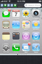
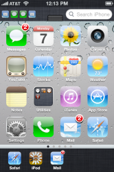
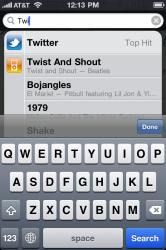
Since then, Apple has added a number of features that have expanded how we interact with iOS - multitasking, notifications, spotlight, folders, and iPod controls. All these features call for UI elements that the iPhone OS was never designed for. Instead of designing a new UI to incorporate new functionality, however, Apple has continued to patch features in to the original design. Each time they have done just enough to get it working. Consequently, we have ended up with a nonsensical control scheme that feels like it has no continuity:

Spotlight is a homescreen - except with an out-of-place text field at the top, no icons, and the virtual keyboard. They didn't have a place for multitasking so they decided to just push up the entire UI off-screen a little bit and put the recently used apps in a tray. The iPod controls are in the multitasking tray if you go to the left, otherwise you get apps that have been used less recently. Notifications are now collected and pulled down from the top, but there's no feature in the UI that reflects that which also means that there is no indication that there are even new notifications in there!
Frankly, it's pretty damn stupid; the iOS UI is well overdue for some fresh design (and not because a grid of app icons is "stale"). Unfortunately we'll probably have to wait until next year. I'm tired of waiting, however, so I stitched together some mockups of what things might have been. The goal here was to unify the major features of iOS in a more cohesive design while maintaining the current UI scheme as much as possible. All major UI dimensions are to scale. Let me know what you think (click to enlarge):

1.) Status bar remains unchanged.
2.) Notifications and search bar. The most recent 4 notifications are shown as the small app icons to which they belong. These icons are to scale - the same size seen in spotlight search results. In the middle is the notification center "grip" which can be dragged down or tapped to open notifications.
3.) The Spotlight search field will fill the length of the device (covering up the notifications) when focused just like Google search in Safari. The home screen will dim and the keyboard will slide up, covering the bottom. Search results are shown over the homescreen just like it is now.
4.) Typical homescreen with support for folders and widgets. The spotlight screen is obviously removed as well as the dock. Icons can now be snapped to any position on the grid without autmatically filling any empty spaces between icons.
5.) The homescreen page indicator is now contained within a UI element that seperates the homescreen from the multitasking tray.
6.) The multitasking tray is always displayed. Although the icons are smaller (space contraints) they are to scale - they are the iPad versions. The multitasking tray still lists the most recent apps although now it only contains the apps whose state is saved (still in RAM). Any app currently processing in the background (through the various APIs) is shown as dimmed with the spinning "working" symbol overlaid.
Double-clicking the home button is no longer used to switch apps. A single-click brings you back to the main screen which can now be used to switch apps (as well as to access anything else such as widgets or notifications).

1.) Homescreen showing the three of the four standard sizes of widgets. Widgets snap into place much like large app icons. The widget content can potentially be scrolled vertically within the widget and can contain many sorts of controls.
2.) Much like how a folder opens, an in-line widget can potentially be expanded to show additional lines. For example, a news app that shuffles through one headline at a time may be expanded to quickly browse through several headlines.

Example homescreen with the last standard widget size arranged neatly above app icons.

Example homescreen with various widgets arranged among app icons. Blank spaces demonstrate that apps can be arranged anywhere on the homescreen (snaps to grid). Possible widgets include music controls and quick access to particular settings. The flexibility of this control scheme is that clicking the home button allows one to control the iPod, check a notification, or launch a different app while still being able to return to the app with a single tap.
Since then, Apple has added a number of features that have expanded how we interact with iOS - multitasking, notifications, spotlight, folders, and iPod controls. All these features call for UI elements that the iPhone OS was never designed for. Instead of designing a new UI to incorporate new functionality, however, Apple has continued to patch features in to the original design. Each time they have done just enough to get it working. Consequently, we have ended up with a nonsensical control scheme that feels like it has no continuity:

Spotlight is a homescreen - except with an out-of-place text field at the top, no icons, and the virtual keyboard. They didn't have a place for multitasking so they decided to just push up the entire UI off-screen a little bit and put the recently used apps in a tray. The iPod controls are in the multitasking tray if you go to the left, otherwise you get apps that have been used less recently. Notifications are now collected and pulled down from the top, but there's no feature in the UI that reflects that which also means that there is no indication that there are even new notifications in there!
Frankly, it's pretty damn stupid; the iOS UI is well overdue for some fresh design (and not because a grid of app icons is "stale"). Unfortunately we'll probably have to wait until next year. I'm tired of waiting, however, so I stitched together some mockups of what things might have been. The goal here was to unify the major features of iOS in a more cohesive design while maintaining the current UI scheme as much as possible. All major UI dimensions are to scale. Let me know what you think (click to enlarge):

1.) Status bar remains unchanged.
2.) Notifications and search bar. The most recent 4 notifications are shown as the small app icons to which they belong. These icons are to scale - the same size seen in spotlight search results. In the middle is the notification center "grip" which can be dragged down or tapped to open notifications.
3.) The Spotlight search field will fill the length of the device (covering up the notifications) when focused just like Google search in Safari. The home screen will dim and the keyboard will slide up, covering the bottom. Search results are shown over the homescreen just like it is now.
4.) Typical homescreen with support for folders and widgets. The spotlight screen is obviously removed as well as the dock. Icons can now be snapped to any position on the grid without autmatically filling any empty spaces between icons.
5.) The homescreen page indicator is now contained within a UI element that seperates the homescreen from the multitasking tray.
6.) The multitasking tray is always displayed. Although the icons are smaller (space contraints) they are to scale - they are the iPad versions. The multitasking tray still lists the most recent apps although now it only contains the apps whose state is saved (still in RAM). Any app currently processing in the background (through the various APIs) is shown as dimmed with the spinning "working" symbol overlaid.
Double-clicking the home button is no longer used to switch apps. A single-click brings you back to the main screen which can now be used to switch apps (as well as to access anything else such as widgets or notifications).

1.) Homescreen showing the three of the four standard sizes of widgets. Widgets snap into place much like large app icons. The widget content can potentially be scrolled vertically within the widget and can contain many sorts of controls.
2.) Much like how a folder opens, an in-line widget can potentially be expanded to show additional lines. For example, a news app that shuffles through one headline at a time may be expanded to quickly browse through several headlines.

Example homescreen with the last standard widget size arranged neatly above app icons.

Example homescreen with various widgets arranged among app icons. Blank spaces demonstrate that apps can be arranged anywhere on the homescreen (snaps to grid). Possible widgets include music controls and quick access to particular settings. The flexibility of this control scheme is that clicking the home button allows one to control the iPod, check a notification, or launch a different app while still being able to return to the app with a single tap.
Last edited:


