Become a MacRumors Supporter for $50/year with no ads, ability to filter front page stories, and private forums.

batting1000

macrumors 604
Original poster
Sep 4, 2011
7,468
1,905
Florida
Continuing the tradition from previous betas....

Post any bugs, new features, or changes in iOS 7.1 beta 3 that you notice compared to beta 1 and 2 and/or iOS 7.0.4. I'll keep this post updated with everyone's findings

New features / changes:
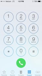
- Phone, Messages, and FaceTime icons are slightly less neon green
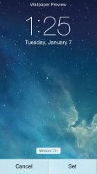
- Ability to turn off home screen parallax when setting a wallpaper
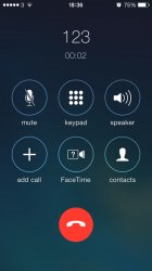
- Modified Phone dialer and answer UI
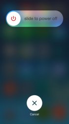
- New shut down UI with circular slider
- More distinct Shuffle and Repeat buttons in Music
- Reduce White Point option in Accessibility settings
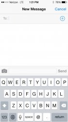
- Slightly bolder keyboard letters

Bugs:
 
Last edited:
.
 

Attachments

  • image.jpg
    image.jpg
    107.8 KB · Views: 389
Is the copy & paste bug fixed? What about the one where you click on a YouTube link and it takes you to a blank tab?
 
You could say a word or two about the difference that's in the screenshot...sometimes int's not exactly obvious what it might be in reference to.

----------

Is the copy & paste bug fixed? What about the one where you click on a YouTube link and it takes you to a blank tab?
What copy and paste bug?
 
You could say a word or two about the difference that's in the screenshot...sometimes int's not exactly obvious what it might be in reference to.

----------

What copy and paste bug?
Where you double click to copy and paste and it selects a bunch of extra stuff.
 
Wow! The colour calibration on my iPhone 5 is MUCH better for greens. Before, the Phone and Message icons were a vile lime green. The yellow has been toned down, and they are a bit darker - more like how they look on my old iPhone 4. Pleased with this.

edit: Actually yes, as above poster notes... I think the icons are just darker rather than the general colour calibration being adjusted.
 
The animation for accepting a call on the dialer screen has changed to a virtual button that you drag instead of the green bar from 7.1.2.
 
Wow! The colour calibration on my iPhone 5 is MUCH better for greens. Before, the Phone and Message icons were a vile lime green. The yellow has been toned down, and they are a bit darker - more like how they look on my old iPhone 4. Pleased with this.

edit: Actually yes, as above poster notes... I think the icons are just darker rather than the general colour calibration being adjusted.

they changed the icons not the color calibration of the screen
 
Also, I don't seem to remember the quick settings menu having the "bouncy" effect when you slid it up before. Now it does.
 
Call screen. The phone icon in the green button on the dial pad (posted above by another user) does a neat animation to flip round into this:
 

Attachments

  • image.jpg
    image.jpg
    78.9 KB · Views: 449
The animation for accepting a call on the dialer screen has changed to a virtual button that you drag instead of the green bar from 7.1.2.

So they are going back to sliding buttons instead of text? :confused:
Please don't fix things that aren't broken Apple.
 
Can anyone confirm if the copy paste bug or the YouTube bugs are fixed?

(Copy paste being where you go to copy paste something you are typing and it selects a bunch of extra stuff.
YouTube being where you clink on a YouTube link in Safari and it takes you to a blank tab. And even if you hold down and click open in YouTube it does the same thing.)
 

It's finally fixed! People can set their wallpaper like they want it to be!

----------

Can anyone confirm if the copy paste bug or the YouTube bugs are fixed?

(Copy paste being where you go to copy paste something you are typing and it selects a bunch of extra stuff.
YouTube being where you clink on a YouTube link in Safari and it takes you to a blank tab. And even if you hold down and click open in YouTube it does the same thing.)

I don't have problems copying words
 
General > Accessibility > Increase Contrast

New option 'Reduce White Point' (white slightly slightly duller)

70dnvc.jpg
 
Might be my imagination but I think parallax is a lot more exaggerated and noticeable on the home screen. More movement and the effect seems to jump out a lot more. Before sometimes I didn't really get the 3D feeling and it just looked like things shuffled around a bit. Anyone else feel the same?
 
Register on MacRumors! This sidebar will go away, and you'll see fewer ads.