Got a tip for us?
Let us know
Become a MacRumors Supporter for $50/year with no ads, ability to filter front page stories, and private forums.
iOS 7 Beta 2 Bug Fixes & Changes
- Thread starter danielceleste
- Start date
- Sort by reaction score
You are using an out of date browser. It may not display this or other websites correctly.
You should upgrade or use an alternative browser.
You should upgrade or use an alternative browser.
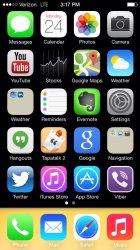
My iPad calendar icon still says the 24th. When I click it, I can see it quickly change to the 25th, but at the home screen it's still the 24th.
Edit: just fixed it by moving it in and out of a folder.
Edit: just fixed it by moving it in and out of a folder.
Occasionally the time and date on the lock screen will move down to the center of the lock screen. Anyone else seeing that?
Yup.
Occasionally the time and date on the lock screen will move down to the center of the lock screen. Anyone else seeing that?
Yep, on my 4S as well as on my iPad 4.
Occasionally the time and date on the lock screen will move down to the center of the lock screen. Anyone else seeing that?
Yep.
How many of you restored to beta 2 rather than doing the OTA? Considering doing it to see if it works out any of the kinks.
Occasionally the time and date on the lock screen will move down to the center of the lock screen. Anyone else seeing that?
I saw this as well. Thought I was seeing things at first.
Occasionally the time and date on the lock screen will move down to the center of the lock screen. Anyone else seeing that?
Yes
Battery life seems significantly improved on B2.
Unplugged my phone at 7:30 AM, I'm at 87% battery.
Yesterday, with the same usage, I was at like 60% by this time.
Unplugged my phone at 7:30 AM, I'm at 87% battery.
Yesterday, with the same usage, I was at like 60% by this time.
I noticed that there were some changes to Siri mentioned on the front page article. Could anybody please check for me and see if the UK/British version of Siri has an option for male or female voices?
I would check myself but I do not have a developer account and therefore don't have access to the iOS7 beta releases.
Currently the updated voices are only available for English (US & Canada only), French (France & Switzerland only), and German (Both Germany and Switzerland) Canadian French, UK & Australian English, as well as all the other languages have yet to be updated.
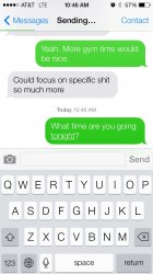
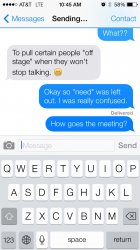
Character displacement when you text a photo is a nice added glitch and the fact that notification center and control center is disabled after you quit apps in multitasking.
(I'm sure someone already mentioned those, too lazy to trace back the thread.)
(I'm sure someone already mentioned those, too lazy to trace back the thread.)
Currently the updated voices are only available for English (US & Canada only), French (France & Switzerland only), and German (Both Germany and Switzerland) Canadian French, UK & Australian English, as well as all the other languages have yet to be updated.
If you compliment Siri on her new voice in Australia she will still think she did in her old robotic voice.
Occasionally the time and date on the lock screen will move down to the center of the lock screen. Anyone else seeing that?
I'm noticing this one as well, it does it for like ten seconds then jumps to the top of the screen where it should be, other than that, pretty solid beta 2 in my opinion, everything is noticeably faster, no more battery drainage issues, can't wait for beta 3
I have tested the lock screen with non technical iPhone users and asked them to unlock my phone when presented with the lock screen.
5 of the 8 non iOS7 users (3 iOS users, 1 blackberry and 4 android) slid up on the lock screen.
Two android users swiped to the right and the blackberry user slid right. Blackberry user is highly non technical but one of the two android users who correctly swiped right is also an iPad user so that may have tainted the result.
Another android user got to the control center and was completely baffled as to what to do next as they thought the unlock was supposed to be there somewhere.
User breakdown:
1 female android user (slid up)
3 male android users (2 swiped up, 2 swiped right)
1 male blackberry user (swiped right)
1 female iOS user (slid up)
2 male iOS users (slid up)
Just thought it was interesting how a user who's never seen iOS7 interacts the first time.
I have tested the lock screen with non technical iPhone users and asked them to unlock my phone when presented with the lock screen.
5 of the 8 non iOS7 users (3 iOS users, 1 blackberry and 4 android) slid up on the lock screen.
Two android users swiped to the right and the blackberry user slid right. Blackberry user is highly non technical but one of the two android users who correctly swiped right is also an iPad user so that may have tainted the result.
Another android user got to the control center and was completely baffled as to what to do next as they thought the unlock was supposed to be there somewhere.
User breakdown:
1 female android user (slid up)
3 male android users (2 swiped up, 2 swiped right)
1 male blackberry user (swiped right)
1 female iOS user (slid up)
2 male iOS users (slid up)
Just thought it was interesting how a user who's never seen iOS7 interacts the first time.
This really is a poor design decision. Maybe change that up arrow to a dot or something? Add side arrows to the slider? Of course once you figure it out, you are good to go, but for something that simple, you should be able to skip that step.
There is something about the ios7 that I don't like... don't know what it is
Shall I submit this as a bug report??
ok, so i updated my iphone 4s from ios7 beta 1 to beta 2 through OTA.... what can i say... i think this beta have even more bugs than beta 1 hahaha
*music player crash time to time, other apps too (twitter, chrome, facebook)... it's just how it happened to me when i used to have a Nokia N8, open to many apps, device out of RAM, get stuck and then, CRASH!
example: on twitter, clicking a link the app begin to load and crash... re open the app, try to do the same thing and crash again. open the multitask, close twitter, re open it, try to open the link and it would work fine.
i'm still thinking that is a memory management issue or something like that.
*in some cases when i'm using an app and i want to "invoke" the control center or the notification center, swiping from top or bot do nothing, i mean yes it scrolls the page of the app that i'm using but doesn't bring any center, i have to go to the homescreen then back to the app and if i have luck swiping will work.
those are ones of the bugs that i most often have to deal with.
PD: sorry about my english.
I have tested the lock screen with non technical iPhone users and asked them to unlock my phone when presented with the lock screen.
5 of the 8 non iOS7 users (3 iOS users, 1 blackberry and 4 android) slid up on the lock screen.
Two android users swiped to the right and the blackberry user slid right. Blackberry user is highly non technical but one of the two android users who correctly swiped right is also an iPad user so that may have tainted the result.
Another android user got to the control center and was completely baffled as to what to do next as they thought the unlock was supposed to be there somewhere.
User breakdown:
1 female android user (slid up)
3 male android users (2 swiped up, 2 swiped right)
1 male blackberry user (swiped right)
1 female iOS user (slid up)
2 male iOS users (slid up)
Just thought it was interesting how a user who's never seen iOS7 interacts the first time.
This really is a poor design decision. Maybe change that up arrow to a dot or something? Add side arrows to the slider? Of course once you figure it out, you are good to go, but for something that simple, you should be able to skip that step.
I don't understand what's so difficult. Ever since the iPhone launched 6 years ago, you've always had to swipe to the right to unlock it. It's also been this way with the iPod touch and iPad. Even if Apple did some huge redesign, bigger than iOS 7, and I had never seen it before and there were two small arrows at the top and bottom of the screen, the first thing I would try would be to slide to the right to unlock it because that's what I'm used to. Plus, the slide to unlock text is animated telling you to swipe to the right. Even if you've never had or used an iPhone, it's highly likely you've seen/heard about it's lock screen.
I don't understand what's so difficult. Ever since the iPhone launched 6 years ago, you've always had to swipe to the right to unlock it. It's also been this way with the iPod touch and iPad. Even if Apple did some huge redesign, bigger than iOS 7, and I had never seen it before and there were two small arrows at the top and bottom of the screen, the first thing I would try would be to slide to the right to unlock it because that's what I'm used to. Plus, the slide to unlock text is animated telling you to swipe to the right. Even if you've never had or used an iPhone, it's highly likely you've seen/heard about it's lock screen.
Your experiences don't speak for the majority of people. Just because you understand the idea of the lock screen through years of using iPhones/iPads doesn't mean others use those experiences that same way or even have the experience of an iOS lock screen.
These people I tested are generally decent, well educated, typical users out there. They don't read Macrumors or wait with baited breath for the WWDC. Just very standard people who, when presented with a UI/UX scenarios, responded with a certain behavior.
It's important to note their behavior in response to the UI and make changes accordingly to make it more obvious for them to use the operating system.
As I noted, only 4 of the testers were iOS users (one an android but uses an iPad) so I'm not sure why you tie previous usage to the group I tested since many aren't even iOS users to begin with.
Apple isn't targeting only me or you. They want everyone and the ease of use for the typical user reflects on them and want to ensure it's a positive one. Not a confusing, frustrating one.
Battery life seems significantly improved on B2.
Unplugged my phone at 7:30 AM, I'm at 87% battery.
Yesterday, with the same usage, I was at like 60% by this time.
ive noticed this too. perfect timing just before i leave for vacation too.
thank god!!!
Register on MacRumors! This sidebar will go away, and you'll see fewer ads.


