Become a MacRumors Supporter for $50/year with no ads, ability to filter front page stories, and private forums.
I don't understand what's so difficult. Ever since the iPhone launched 6 years ago, you've always had to swipe to the right to unlock it. It's also been this way with the iPod touch and iPad. Even if Apple did some huge redesign, bigger than iOS 7, and I had never seen it before and there were two small arrows at the top and bottom of the screen, the first thing I would try would be to slide to the right to unlock it because that's what I'm used to. Plus, the slide to unlock text is animated telling you to swipe to the right. Even if you've never had or used an iPhone, it's highly likely you've seen/heard about it's lock screen.

Yeah I agree. Ever since the ipad came out, Apple always advertise that people already know how to use this tablet with the iphone. All iphone user should be familiar with ipad.

And now iOS is six years old, its a bit of dilemma I think.
By making it familiar with the user base who have used it before or move to a more advance state where we assume that people would know what "slide to unlock" means. And many basic gestures like swipe from right to left to delete or pull down to refresh (even though its twitter who introduce this)

But I think Apple has done the right thing. To move forward one step at a time. Slide to unlock without arrow in ios 7 is one example I think.
 
Your experiences don't speak for the majority of people. Just because you understand the idea of the lock screen through years of using iPhones/iPads doesn't mean others use those experiences that same way or even have the experience of an iOS lock screen.

These people I tested are generally decent, well educated, typical users out there. They don't read Macrumors or wait with baited breath for the WWDC. Just very standard people who, when presented with a UI/UX scenarios, responded with a certain behavior.

It's important to note their behavior in response to the UI and make changes accordingly to make it more obvious for them to use the operating system.

As I noted, only 4 of the testers were iOS users (one an android but uses an iPad) so I'm not sure why you tie previous usage to the group I tested since many aren't even iOS users to begin with.

Apple isn't targeting only me or you. They want everyone and the ease of use for the typical user reflects on them and want to ensure it's a positive one. Not a confusing, frustrating one.

The lock screens on BlackBerry 10 and Android don't exactly tell you where to slide either...
 
Would you guys recommend updating and restoring from backup, or do new, because I don't wanna break anything when I backup and update when it's officially out, you know what I mean?
Like backing up with a beta, and stuff is glitchy, then restoring from that backup when the iOS is complete and have something still broken
 
Reset All Settings cleared this up for me.

----------


Reset All Settings also cleared this up for me.

----------


Reset All Settings fixes this as well.

----------

These are all related to the portrait mode status bar being stuck on. You get all the normal homescreen status bar stuff like green for phone calls and blue for navigation, red for recording, even in the app you are using. Went away after the reset.

See also https://forums.macrumors.com/threads/1601596/

Brilliant find. Worked great for me!

Edit: After a few minutes, it started acting up again. Must be a persistent little bug!
 
Last edited:
Beta 2 has to be one of the worst beta 2 iOS I have ever experienced, The lag is mixed with speed and in beta 1 I didn't have many issues with my iPod crashing, now in beta 2 I am experiencing ALOT more crashing, and it's all due to SpringBoard apparently, after glancing through my crash logs, SpringBoard is the main culprit, when pressing the home button to see the lock screen there is lag there as well, even though in beta 1 it was smoother.

Not for me... This is way better than beta 1. No crashes yet, no overheating and battery drain. Much improved.
 
Brilliant find. Worked great for me!

Edit: After a few minutes, it started acting up again. Must be a persistent little bug!

Are you getting just the added white space with the dock bar or the black status bar, or both came back? Did you have both before?
 
The lock screens on BlackBerry 10 and Android don't exactly tell you where to slide either...

Not really relevant. Apple is usually pretty good about UI queues for users. Android and Blackberry are notoriously bad (if you are to use my parents as test cases... ha)
 
I can't close newsstand , I click everywhere but it just doesn't close. I have to lock the screen to go back to springboard. iPad here , is this happening to anyone else?? Please let me know.
 
Not for me... This is way better than beta 1. No crashes yet, no overheating and battery drain. Much improved.

I feel the same. I find beta 2 a massive improvement over the first beta. The overheating seems to have been resolved and that was my main gripe.
 
Disappearing wallpaper

Here's a strange little bug. Launch any app. Go to app switcher and close the app you were just in. Press the home button. You'll return to the home screen and your wallpaper will disappear. You'll get a black background instead. Happens every time I've tried it.

Fortunately, it's easy to get your wallpaper back. Just launch any app and then press the home button.

I have reported this bug to Apple.
 
Last edited:
My iMessage badge is stuck at 1, and I have deleted all of my messages.

I really wish you can reset badges.
 
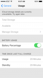
Weird Battery Issue

my usage and standy are the same time. it happened all day yesterday and i just thought it was a one time thing. anyone else seeing this?
 

Attachments

  • photo.PNG
    photo.PNG
    76.9 KB · Views: 99
I don't understand what's so difficult. Ever since the iPhone launched 6 years ago, you've always had to swipe to the right to unlock it. It's also been this way with the iPod touch and iPad.

What's so difficult is that the lock screen displays contradictory visual cues. I've been using an iPhone, and before that an iPod Touch for four years, and I dismiss the lock screen without even looking at it. It's automatic. But you know what? A couple of times when I did happen to look at the screen, I started to swipe up. Apparently, that's what my brain thought the phone was telling me to do. I had to think about the fact that you swipe right to unlock.

I know the text is animated, and that's supposed to be a clue, but it's far too subtle, especially with the thin font.

This really is a poor design, and they need to change it. Maybe they could add some arrows to the "slide to unlock" text and/or make the animation more obvious. Maybe they could put a "control center" label next to the up arrow to make its function obvious. Something like that.

Or simply have the ability to customize which way to unlock...

Jailbreak allows you to do that, and I really don't think it's too much to ask how people would like to unlock their phone.
 
Has anyone else noticed that the Control Center is now disabled when using the App Switcher? It was enabled in Beta 1 but now it's disabled. I guess it might be because the stock apps (Clock, Calculator, Camera) would glitch the Springboard animations.
 
Im still getting duplicate notifications on apps like facebook messenger in beta 2 is anyone else getting this too. Wondering if there's a way to fix it?
 
Has anybody noticed in the music app under artist it shows the iTunes picture of the artists. Not the 1st album like in beta 1

Does this only work with iTunes bought music? Because this isn't the case at all on my phone :(

It works with non-iTunes music as well. Seems the only criteria is that the artist has a photo in the iTunes store. I'd say about 10-15% of my music now shows the artist photos from the store, and pretty much all of it came from CD, not iTMS. I assume the rest either aren't in iTMS at all (some), or don't have an official artist photo there (most?).

Unfortunately, now a lot of my music looks like the same group of 4 or 5 dudes wearing slightly different clothes.

Yeah, this sounds like a nice idea, but I'm not sure how well it works in practice. I can usually identify album art much more easily than some random photo of the group (which is probably subject to change).

I don't recall seeing this feature in iTunes, but I assume it's coming there soon...
 
Register on MacRumors! This sidebar will go away, and you'll see fewer ads.