Become a MacRumors Supporter for $50/year with no ads, ability to filter front page stories, and private forums.
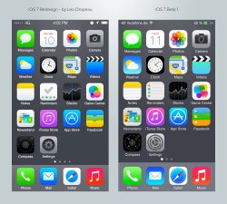
although i didn't get what i wanted (better icons and better battery life) but the new update makes it a lot more smooth and faster.

I'm on an iPhone 5 and after running it all day... words with friends, im, a couple of phone calls, I definitely have to say that my battery life has indeed improved over beta 1.
 
The obsession with the "in fashion" flat design, directed the design team of Apple to failures about look of iOS 7. The simplicity should be the design direction. Probably before the finale release of IOS, the icons will change, but I'm not sure about a significant improvement in these.
 
I have had no freezes or reboots yet (had a few a day on B1)

Few things I have noticed:

-I had the keyboard appear then remain with the phone even when "homed" out, had to reboot to get rid of it (that was first reboot) hastnt happened again.

-I keep getting icloud messages to enter password.

-My lock screen seems to be buggy.

-The clock keeps jumping from the middle to the top.

-Also sometimes when I switch between orientations the status bar remains on the side even though the rest of the phone is back in portrait.

anyone seeing any of these?

The only one in your list I'm seeing is iCloud messages to enter password.
 
To add a complete UI redesign on it is going to take some time to say the least. They are all probably drinking coffee nonstop.

Complain around beta 4, but give them some breathing room right now

Ah, see, I agree with you in theory, but if you don't complain now, then beta 4 will be far too late. If you don't complain now, your complaints might never get heard.
 
Dear America,

The word you seek is "TITbits", not "TIDbits". Sorry if that's too un-P.C. for you, but the word is what it is, ok?

Seeya :)
 
Bugs?

Hey guys. Was wondering if any of you guys have ran into these bugs that i've experienced upon updating to beta 2.

- When waking up the phone from the lockscreen. The clock would sometimes pop up near the middle and jump straight to the top where it's suppose to be..

- Deleting a City from the Weather app causes it to crash

- The "Define" option doesn't display the definition of a word.

- Keyboard won't switch to the alternate keys when hitting the key... (I always have to either go back to the previous page or close the app then use the keyboard again -- It use to happen in Beta 1 only in Messages app. Now in Beta 2 it happens everywhere occasionally)

- Adding a song/track in a playlist a black/gui glitch happens

I'm sure there's more that i just totally forgot. Writing this at 2:45AM
 
I like the direction Apple is pointing the appearance of iOS 7, but there are a few things I don't like about the icons and their layout.

But I love this re-rendered version by Leo Drapeau (on the left), which incorporates a better interpretation of "flatter design", and shrinks the size of the apps, bettering the proportion of each within their place in each row.

I'd much prefer Apple to use this aesthetic in iOS 7.
 

Attachments

  • image.jpg
    image.jpg
    373.2 KB · Views: 234
I usually poke fun at iOS. Have been doing so for years now, but this looks slightly more interesting. Haven't had a chance to play around with it but if it's as similar to Android as I think it is, then I'll look into getting an iphone 6 whenever they release it.

Apple copied some of the best features from Android. As a result iOS 7 gets a big boost in functionality. It's nice to see Apple improve the iPhone by giving it a more up to date OS
 
Totally Different hahaha

Oh interesting. They decreased the font size for the time, but increased the size of the battery icon. That could be part of the reason for it looking cumbersome as well. That really makes it look like the bars and carrier are larger than the time, and it limits the space on the right of the status bar as well (especially when charging). Thanks for posting.
 
I like the direction Apple is pointing the appearance of iOS 7, but there are a few things I don't like about the icons and their layout.

But I love this re-rendered version by Leo Drapeau (on the left), which incorporates a better interpretation of "flatter design", and shrinks the size of the apps, bettering the proportion of each within their place in each row.

I'd much prefer Apple to use this aesthetic in iOS 7.

Those look so similar between the two that I think these are just designer-nerd nits.

I have heard the argument before that the ring around the app store and itunes store is too close to the edges but I do not like Leo's smaller version. Probably something between the two would be smoother, though I certainly do not mind the current ios7 set other than gamecenter, which Im sure will be redone.

Lets face it gamecenter icon is obviously an oddball in the mix and does not fit.
 
I like the direction Apple is pointing the appearance of iOS 7, but there are a few things I don't like about the icons and their layout.

But I love this re-rendered version by Leo Drapeau (on the left), which incorporates a better interpretation of "flatter design", and shrinks the size of the apps, bettering the proportion of each within their place in each row.

I'd much prefer Apple to use this aesthetic in iOS 7.

While I don't have an issue with the new icons, I must say I think this mockup looks better..
 
For some weird reason messages now uses Nicknames if available to display the name of the contact you're talking with, i'm looking if there's a way to disable it, kind of annoying.

EDIT: Found it

Great; I will appreciate the nickname function and also that it can be turn off is a plus
 
The new safari reader mode confuses me

The text is not really any bigger or better than the website text zoomed in.

How do you change the reader size and font?
 
Overall I'm pleased with what apple have done in Ios7 so far, I done an OTA download of Beta 2 and the battery drain was worse than Beta 1. Downloaded the full ipsw today and its improved instantly.

Wonder what Beta 3 will hold? I'm still have issues with the airplay features glitching. (4S)
 
Hey guys. Was wondering if any of you guys have ran into these bugs that i've experienced upon updating to beta 2.

- When waking up the phone from the lockscreen. The clock would sometimes pop up near the middle and jump straight to the top where it's suppose to be..

- Deleting a City from the Weather app causes it to crash

- The "Define" option doesn't display the definition of a word.

- Keyboard won't switch to the alternate keys when hitting the key... (I always have to either go back to the previous page or close the app then use the keyboard again -- It use to happen in Beta 1 only in Messages app. Now in Beta 2 it happens everywhere occasionally)

- Adding a song/track in a playlist a black/gui glitch happens

I'm sure there's more that i just totally forgot. Writing this at 2:45AM

I've experienced the first two 100% of the time. Specifically for the time app, it's New York that makes it crash for me.
 
Yeah, it takes a pretty solid understanding of the alphabet. Just wait for first grade-- that one's a doozy!

No I know my alphabet but it doesn't make sense to first find out if the letter your looking for is hidden or a dot, then you have to look for 2 letters which surround that letter. If it takes even 1 millisecond longer (spoiler: it will) then its the wrong way to do it, especially since the dot takes up more space than the letter itself.
 
Register on MacRumors! This sidebar will go away, and you'll see fewer ads.