Become a MacRumors Supporter for $50/year with no ads, ability to filter front page stories, and private forums.
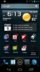
I don't know about you guys, but I use folders to get more apps on my homescreen (see below).

My main page has Google search, time, date, alarms, weather, calendar of events, and moon phase widgets... plus about 60 apps available with one or two taps in or out of folders.

A swipe from the top gives me notifications and access to quickset controls. A swipe from the bottom shows me my current Google Now cards.

So for most of my daily activities, I rarely move off my primary homescreen. I only go to other home pages when I want to use an uncommon app like say, a broadband speed test, or I'm sitting and have time to go surfing for houses on Trulia or look up restaurants.
myhomescreen.png
 
I don't know about you guys, but I use folders to get more apps on my homescreen (see below).

My main page has Google search, time, date, alarms, weather, calendar of events, and moon phase widgets... plus about 60 apps available with one or two taps in or out of folders.

A swipe from the top gives me notifications and access to quickset controls. A swipe from the bottom shows me my current Google Now cards.

So for most of my daily activities, I rarely move off my primary homescreen. I only go to other home pages when I want to use an uncommon app like say, a broadband speed test, or I'm sitting and have time to go surfing for houses on Trulia or look up restaurants.
That is exactly how I use folders and setup my home page. I only have two launcher pages.

I really don't think newagemac was serious. No one could seriously think having a page full of icons is the most efficient way to launch apps--especially iOS icons.


Michael
 
OK this is beyond even the most rabid iOS fan. I get it. You are just joking. A prank. Ha ha ha.... that was funny. You got me! :D

Whew, for a minute there I thought you were being serious.


Michael

Are you seriously suggesting Android has more choice than iOS in apps, content, and accessories? You are either clueless or a troll then. iOS clearly offers the user more choice and Android's options are limited by comparison.

iOS simply has more apps not to mention more high quality apps. I can also choose from far more accessories than with Android. With iOS I get plenty of choices that you are never offered because developers, content producers, and accessory manufacturers prioritize iOS over Android. It must really suck for you to have less choice being on Android OS. Maybe one day if you can convince all of them that Android isn't a second rate fragmented mess that it will get priority and you will begin to get the kind of freedom of choice for these things that iOS users enjoy over Android users... I wouldn't hold my breath though.

Again, please don't tell me you think Android offers more choice in apps, content, and accessories and that it isn't limited compared to iOS in these choices. Surely you must be joking. If not, you're making a public spectacle of yourself. Everyone knows iOS offers more choice than Android just as I have repeatedly pointed out.
 
Last edited:
Are you seriously suggesting Android has more choice than iOS in apps, content, and accessories? You are either clueless or a troll then. iOS clearly offers the user more choice and Android's options are limited by comparison.

Moving goals? because he has been talking about the ****ing UI, not accesories or number of apps. Perhaps the clueless or the troll is not him.
 
Personally I think that looks pretty awful.

- Double tapping icons is not practical and will introduce delay with single taps.
- Mission control is unnecessary and just clutters the screen.
- That bookshelf looks HIDEOUS.
- That monstrosity that opened when he clicked "settings" looks foul.

BUT,

+ Quickly reply to messages looks good.
+ Swiping the time in the lock screen to reveal controls looks like a good idea.
 
That is exactly how I use folders and setup my home page. I only have two launcher pages.

I really don't think newagemac was serious. No one could seriously think having a page full of icons is the most efficient way to launch apps--especially iOS icons.
Michael

You do realize you are making a public spectacle of yourself right? I just showed a coworker of mine your posts (who works on UI as well) and she literally burst out laughing at you. She said this guy can't be serious.

Do you seriously believe burying your favorite apps in an "App Drawer" or in a folder somehow makes it more efficient to get to than being directly on the home screen? :eek:

So multiple taps is faster than a single one? Please do tell me you're joking because you are making a public spectacle of yourself.

----------

Moving goals? because he has been talking about the ****ing UI, not accesories or number of apps. Perhaps the clueless or the troll is not him.

Considering what you're known as around here by everyone, your defense of hime just lost him any credibility he had left. But in any case, we were discussing choice because he went on a tangent trying to say iOS users don't have the choice of using a terribly inefficient UI with widgets taking up huge chunks of space with double clocks on the home screen and apps buried in folders and "App Drawers" requiring multiple clicks to get to.

Try and keep up.
 
Considering what you're known as around here by everyone

And what I'm know as around here?

But in any case, we were discussing choice because he went on a tangent trying to say iOS users don't have the choice of using a terribly inefficient UI with widgets taking up huge chunks of space with double clocks on the home screen and apps buried in folders and "App Drawers" requiring multiple clicks to get to.

The discussion was about the UI and the UX and when it was clear that you were wrong you changed the goal to the number of apps and accessories.


Try and keep up.


Potr, kettle
 
.... he went on a tangent trying to say iOS users don't have the choice of using a terribly inefficient UI with widgets taking up huge chunks of space with double clocks on the home screen and apps buried in folders and "App Drawers" requiring multiple clicks to get to.

Try and keep up.

I don't know where the original conversation started, but in terms of UI, Apple gives users the same options at Android. You can load pages upon pages full of icons, or you can have one pages with a host of folders.

The biggest difference, and advantage in Android is the ability to remove apps that are never going to be used or seldom used from the homescreen and keep them in the app drawer. Also, the ability to have widgets, which again, are extremely useful to many.

As far as widgets go, other than being extremely useful for many users, everything else is just opinion.
 
Waoo the video is amazing, i been telling myself unless the stuff from the video aren't there in the next iPhone i wont buy it any more, that and a bigger screen. I been running iPhone5 and my Galaxy S3 and every day i like the S3 more for the larger screen and widgets + easy access to the settings.
Apple need to make these changes like yesterday.
 
wow. that's terrible. This looks like something out of cydia or the android market.

i find most people like the simplicity of apple products and when you kludge loads of "power user" crap, you ruin the experience.

does your average person need immediate access to airplane mode? no. do they turn their wifi on and off all of the time? no.

it's a bunch of useless features for no reason other than that you want apple to be more like android.

i think they'll replace the mute toggle with a button that will mute on click and do not disturb on press and hold.

Not everyone needs to mute their phone. Why not just remove the button?

I agree. The animation is basically a "What if iOS worked like Android," but I wouldn't even call the options they showed "power user options." It'd be nice to change screen brightness and toggle some basic settings without having to press 4-6 buttons/swipes.

As it stands now, the only simple thing about iOS is turning it off and on, swiping to other pages, and launching apps. After that, it's a button pressing, finger swiping nightmare.
 
Does this happen to you daily? The current settings app is easy enough to use for turning wifi off.

yes, I have bad wifi coverage in my house and at work. it happens multiple times, every single day, and having a shortcut would make a noticeable impact in a good way.
 
I think iOS is fine the way it is. I upgraded from a 2007 button phone to an iPhone 4, the evolution is great and I have no need to be picky like most people seem to be. A new phone every year is just ridiculous and makes people get like this I guess.

With any new changes that are actually made in iOS7 and beyond, an option to revert back to the original style would be cool, in case people don't like that either.

 
Would it have been better if iOS 7 did end up looking like this, instead of a brand-new design?
 
Register on MacRumors! This sidebar will go away, and you'll see fewer ads.