Become a MacRumors Supporter for $50/year with no ads, ability to filter front page stories, and private forums.

Andrew73875

macrumors regular
Original poster
Feb 1, 2022
225
598
I've noticed there are certain elements in iOS design language which could be improved.

1) Apple should take a good look on iPhone's basic functionality.

There are more and more amazing features with each iOS iteration. However, some basic apps look forgotten. First of all, why do we have round buttons on a square phone now? They have smaller surface area and harder to hit. For example, on iOS 6 and earlier you could tap anywhere on the bottom part of the screen to "end call":

614599d1351199740-iphone-5-call-failed-image.jpg
c38403a7c7338ffc6a3f93e4b5bda44e.png
0044-4-iphone-keypad.png
iphone-6-how-dial-call-3.jpg


And the prime example is the "second call" screen. When we are getting a second call we don't have time to think. Notice how "End Call+Answer" is at the bottom of the screen and has a red colour. We understand that it is related to the current call.

"Ignore" and "Hold+Answer" are located in the submenu, so we have a hierarchy in our mind. Also if we don't want to decide, we can just tap "Ignore" and return to the current call.

205611510_564938721551898_869730947225904655_n.jpg


It's surprising how that design evolved into this:

iphone-second-incoming-call-screen.jpg


This option even became a meme. Because no one can understand what to do. There's no hierarchy of any kind.


2) Some apps could benefit from skeuomorphism.

I know there're many views on skeuomorphism, but some apps would only benefit from it. Take the Books App, for example. The old iteration of the app made it more fun to read and buy books. It was also easier on the eyes. This point is especially relevant for an iPad.

booksstand.png


The new iteration is just too simplified. Yes, it's possible to read books even using TextEdit app. But is it enjoyable?

apple-books_reading-now_06122018_big.jpg.large.jpg


Same argument goes for Apple TV app. For example, I just want to browse through my movie library and watch something. Currently it's a labyrinth of different options. But it was not always like that.

e3f74537b6251e89319d297576611046.png
overview_videos.jpg


Same goes for Music app and full screen album covers. Why album covers are smaller and repeat/shuffle buttons disappeared? There's no landscape view anymore (cover flow or similar).

overview_music.jpg
screenshotmusic-jpg.1959369


We also can't rearrange the icons in the tab bar of the Music App anymore. And this ability was there since the very first iPhone.
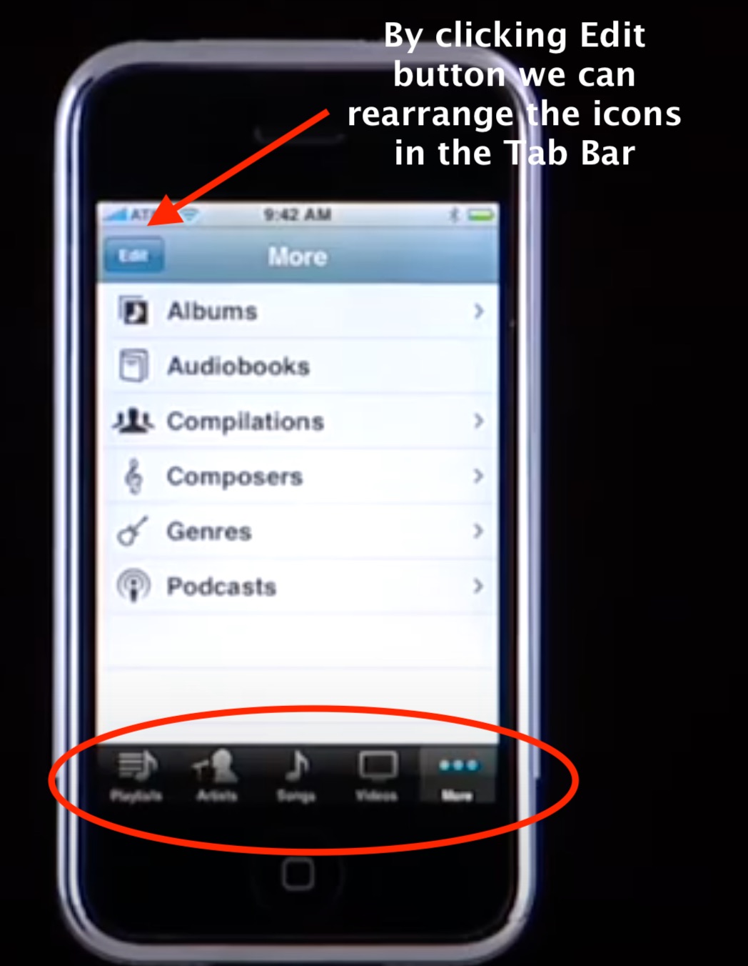
MusicScreen.jpg


3) Too much white background.

Some argue that necessity for Night Mode is the result of a user interface. I understand that white colour signifies simplicity and purity, and works very well with hardware. However, it doesn't always look good on screens. Here's a good example:

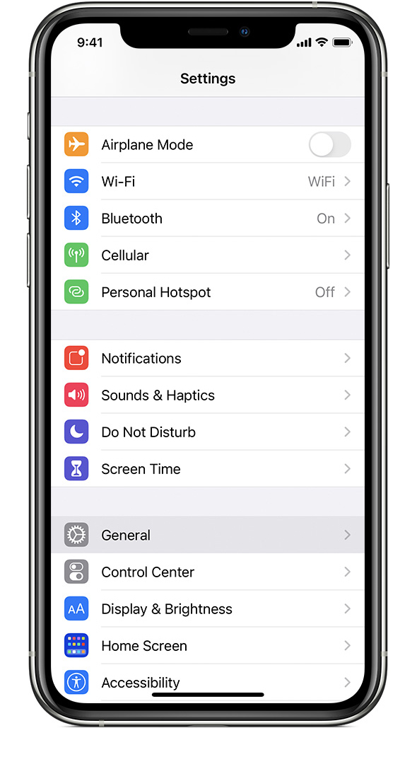
7-best-secret-features-ios-5.w1456.jpg
ios14-iphone11-pro-settings-general.jpg


There's no need for "dark mode" on iOS 5 because it incorporates different colours, making it easier to grasp information.

Same goes for the Messages App. It had that light blue background and now it's just white.

Apple_iOS15-avail_messages-photostack_09202021_carousel.jpg.large.jpg
accb4fc77d510361c0b4c75cbe815889.png


features_imessage.png


What are your thoughts?
 
Last edited:

Paddle1

macrumors 601
May 1, 2013
4,862
3,228
You're not taking into account the larger screens. If something like the end call button extends across the entire screen it makes it easier to hit accidentally.

Neither of the second incoming call screens are easy to understand honestly. The iOS 6 version lacks imagery so you have to read and understand it in a rush. The newer version has images however they're a bit vague making the same problem occur. Only someone that's already familiar with the screen can quickly make their way around it.

The same hierarchy is still in the Settings app, just now with shades of grey. (Particularly in iOS 15 where rounded corners are back.) This is more accessible than trying to differentiate with colors.

The rest of what you said is more of a personal preference thing IMO, like the design of Books or the Messages background.
 

Andrew73875

macrumors regular
Original poster
Feb 1, 2022
225
598
You're not taking into account the larger screens. If something like the end call button extends across the entire screen it makes it easier to hit accidentally.
Good point!

But still makes no sense why the "add contact" button was moved up from the bottom of the screen. And it happened with iOS7 when screens got larger.

0044-4-iphone-keypad.png
iphone-6-how-dial-call-3.jpg


The newer version has images however they're a bit vague making the same problem occur.
I think the first iteration is a bit easier. Especially the big red button and "ignore". The new "decline" button lacks context. Will it it decline my current phone call or the incoming one? I think many of us have seen memes like this:

c82ca405332c9c7e8caa4fe2f07a663e9205f138fcade2bf4d76bbc3a7d85d61_1.jpg
 

Mr.Blacky

Cancelled
Jul 31, 2016
1,880
2,583
Good point!

But still makes no sense why the "add contact" button was moved up from the bottom of the screen. And it happened with iOS7 when screens got larger.

0044-4-iphone-keypad.png
iphone-6-how-dial-call-3.jpg


I think the first iteration is a bit easier. Especially the big red button and "ignore". The new "decline" button lacks context. Will it it decline my current phone call or the incoming one? I think many of us have seen memes like this:

c82ca405332c9c7e8caa4fe2f07a663e9205f138fcade2bf4d76bbc3a7d85d61_1.jpg
Of course it would decline the incoming call. How would it decline the current phone call? It's already running.
 

Andrew73875

macrumors regular
Original poster
Feb 1, 2022
225
598
Yep! But "decline the incoming call" button is in the place where "decline the current call" is usually located. It can cause confusion. Basically, the red icon says one thing and the text says another. Also, if you tap two times it can end both calls.

c38403a7c7338ffc6a3f93e4b5bda44e.png
iphone-second-incoming-call-screen.jpg


In iOS 5 if you push the the big red "end call' button it would still end your current call. The button is not floating.

205611510_564938721551898_869730947225904655_n.jpg
614599d1351199740-iphone-5-call-failed-image.jpg
 
Last edited:

headlessmike

macrumors 65816
May 16, 2017
1,295
2,595
Yep! But "decline the incoming call" button is in the place where "decline the current call" is usually located. I think that's where some of this confusion comes from. This red picture says one thing to the subconscious and the text says another.

c38403a7c7338ffc6a3f93e4b5bda44e.png
iphone-second-incoming-call-screen.jpg


In iOS 5 if you push the the big red "end call' button it still would end your current call. The button is not floating.

205611510_564938721551898_869730947225904655_n.jpg
614599d1351199740-iphone-5-call-failed-image.jpg

I find the new interface clearer in this case. The big red decline button is probably the first one I'd look for, so it makes sense to me that it takes center stage. Pressing the red button to answer (in the old interface) was awkward.
 

headlessmike

macrumors 65816
May 16, 2017
1,295
2,595
I use oldOS from time to time. I don't miss many things from the pre-iOS 7 days.
Me too. My father has an iPhone 4 that still runs iOS 4 that I sometimes play with and I have an iPod touch running iOS 6. I'm always surprised by how slow and clunky the old systems feel by today's standards.
 

Reggaenald

Suspended
Sep 26, 2021
864
798
I agree on a lot of points. iOS is inefficient, considering the screen sizes, and is not ergonomic, considering the screen sizes. iOS 6 and prior were leaps better.
Apple just wants iOS to look as streamlined and basically generic as possible. Round and white everything. Form over function big time. iPhones seem to be more of a fashion accessory than a tool.
The day (that will never be) that Apple allows OS skins will be the day of the downfall of iOS’s current design language, bet.
 

Andrew73875

macrumors regular
Original poster
Feb 1, 2022
225
598
The rest of what you said is more of a personal preference thing IMO, like the design of Books or the Messages background.

It's debatable. Too much white on a big screen is actually very irritating for the eyes. It's like looking into a flashlight. That's why so many people asked for the night mode. But it is also not ideal. There's no need for the night mode if UI is balanced.

iPhone's keypad is the perfect example:

0044-4-iphone-keypad.png
iphone-6-how-dial-call-3.jpg


The big red decline button is probably the first one I'd look for, so it makes sense to me that it takes center stage. Pressing the red button to answer (in the old interface) was awkward.
The new design makes it possible to tap two times and end both calls. Especially if there's some lag.
 
Last edited:

satchmo

macrumors 603
Aug 6, 2008
5,031
5,712
Canada
Yep! But "decline the incoming call" button is in the place where "decline the current call" is usually located. It can cause confusion. Basically, the red icon says one thing and the text says another. Also, if you tap two times it can end both calls.

c38403a7c7338ffc6a3f93e4b5bda44e.png
iphone-second-incoming-call-screen.jpg


In iOS 5 if you push the the big red "end call' button it would still end your current call. The button is not floating.

205611510_564938721551898_869730947225904655_n.jpg
614599d1351199740-iphone-5-call-failed-image.jpg

The current design is rather confusing given you’ve got so much to look and a short time to decide.
You’ve got similar looking overlapping multicolored icons and descriptive text below it all trying to convey one thing.

Sure, red means hang up and green means pickup. And while the phone icons are positioned differently, they don’t mean much to a generation of users who have never seen or used a phone with a handle. A diagonal line across the icon would be instantaneously understood.

Or as you suggest going back to the beginning and just use descriptive text button. But obviously with more refined typography and aesthetics than the original.
 

Andrew73875

macrumors regular
Original poster
Feb 1, 2022
225
598
Yep, exactly. By the way, the original "second call screen" was shown during the first iPhone Keynote.

(timestamped video)
 

Andrew73875

macrumors regular
Original poster
Feb 1, 2022
225
598
How is that any better? Still have to read some buttons and decide. Making a spilt second decision is not easy when you don’t know what your looking for. Much easier when you do.

Yep, we have only text. But in the "new version" we have to decode both pictures and text.

In the iOS 5 we have a visual guide. "End Call+Answer" is at the bottom of the screen and has a red colour. We understand that it is related to the current call. Also double tapping will not end both calls.

"Ignore" and "Hold+Answer" are located in the submenu, so we have a hierarchy in our mind.

Less information + visual cues = faster decision making.
 

I7guy

macrumors Nehalem
Nov 30, 2013
34,345
24,091
Gotta be in it to win it
Yep, we have only text. But in the "new version" we have to decode both pictures and text.

In the iOS 5 we have a visual guide. "End Call+Answer" is at the bottom of the screen and has a red colour. We understand that it is related to the current call. Also double tapping will not end both calls.

"Ignore" and "Hold+Answer" are located in the submenu, so we have a hierarchy in our mind.

Less information + visual cues = faster decision making.
I understand your point of view though I don’t agree. Muscle memory is a lot of interfacing with software, imo. There is no muscle memory the first time one happens onto an unfamiliar screen. Trying to make a split second decision could lead to tapping the wrong choice.
 

Paddle1

macrumors 601
May 1, 2013
4,862
3,228
It's debatable. Too much white on a big screen is actually very irritating for the eyes. It's like looking into a flashlight. That's why so many people asked for the night mode. But it is also not ideal. There's no need for the night mode if UI is balanced.
I can agree excessively bright backgrounds can be a problem. The bigger screens play a part in that as well.
In the iOS 5 we have a visual guide. "End Call+Answer" is at the bottom of the screen and has a red colour. We understand that it is related to the current call. Also double tapping will not end both calls.

"Ignore" and "Hold+Answer" are located in the submenu, so we have a hierarchy in our mind.

Less information + visual cues = faster decision making.
I have to agree with @headlessmike also. Having a red answer button is counterintuitive.
 

mbert

macrumors member
Dec 18, 2016
51
51
I have been dissatisfied with iOS (and OSX) design ever since they abandoned the "nature" thing (water drops, 3D controls etc.). But that was more from an asthetic point of view.

Now with my new iPhone I find that some apps seem pretty difficult to use. Having come from Android I miss the consistent "back" mechanics (but, OK, that's more practical than visual). Also I really don't like those hard-to-recognise icons. For instance, in Music.app I needed to put my glasses on (I am far-sighted) in order to be able to use the app. The icons aren't particularly beautiful, but also - making it worse - are rather small and have little contrast against the background and look all the same from a distance. Very poor design IMO.

How I wish to have Apple's old beauty back.
 
Last edited:

Mr. Awesome

macrumors 65816
Feb 24, 2016
1,234
2,831
Idaho, USA
Also double tapping will not end both calls.
Is that true? In the iOS 6 design, the first tap ends the current call and takes you to the new one, and tapping again ends the new one. In the new design, the first tap ends the new call, and the second ends the original call. It's the same problem either way.
 
  • Like
Reactions: valleian

mectojic

macrumors 65816
Dec 27, 2020
1,236
2,377
Sydney, Australia
Everything made perfect sense to me back on iOS 5 and 6. It has never been as intuitive since.

“Simpler” design doesn’t actually mean simpler to navigate. Your example of off-white iOS 6 colours is a good one.

Just for one example, a large body of literature now suggests that serif font is easier to read than sans-serif, contrary to popular opinion. Anecdotally, I find this to be true.
 

Tozovac

macrumors 68040
Jun 12, 2014
3,021
3,229
I have been dissatisfied with iOS (and OSX) design ever since they abandoned the "nature" thing (water drops, 3D controls etc.). But that was more from an asthetic point of view.

Now with my new iPhone I find that some apps seem pretty difficult to use. Having come from Android I miss the consistent "back" mechanics (but, OK, that's more practical than visual). Also I really don't like those hard-to-recognise icons. For instance, in Music.app I needed to put my glasses on (I am far-sighted) in order to be able to use the app. The icons aren't particularly beautiful, but also - making it worse - are rather small and have little contrast against the background and look all the same from a distance. Very poor design IMO.

How I wish to have Apple's old beauty back.
Hallelujah. Great to read from others preaching what I’ve been complaining about for years. Flat, vague, “modern and fresh” interfaces suck, basically. More show than go.


Tozovac

macrumors 68040
Jun 12, 2014
3,021
3,229
It's debatable. Too much white on a big screen is actually very irritating for the eyes. It's like looking into a flashlight.

To me the all white screens look amateurish and unfinished drafts.

That's why so many people asked for the night mode. But it is also not ideal. There's no need for the night mode if UI is balanced.

Exactly!! Exactly!! If all white is so great, then why dark mode. If the excuses for much of the drabness, plainness in post-iOS 6 interfaces is for the sake of consistency, then dark mode completely contradicts that.

Why not stick with a balanced design, like before.
 
Last edited:
Register on MacRumors! This sidebar will go away, and you'll see fewer ads.