Become a MacRumors Supporter for $50/year with no ads, ability to filter front page stories, and private forums.
Thank goodness we have this option for “Large Icons” that we can turn off that doe—

Wait.

It just makes them smaller.

In the same spot.

What the hell are they even thinking?

View attachment 1837850View attachment 1837852View attachment 1837853

Thank goodness I have this giant screen so I can waste the utmost space.
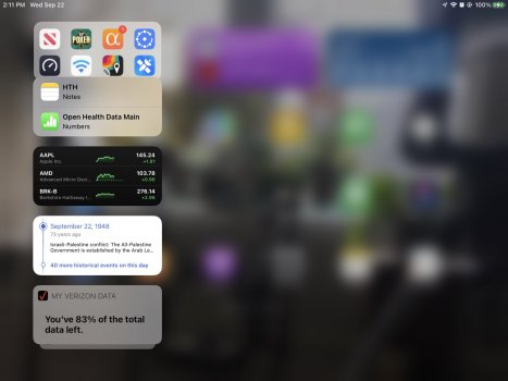
Anyone 'slide to the right' from the 'HOME ' screen and get the 'pre-Home' screen which now appears to be useless ? Unless its a setting I have the attached is what I get if I 'slide' the Home Screen right...but this (pre iOS 15 screen) won't allow me to use its space. Widgets I place on it just stay in a line on the left of the screen. Anyone else notice this? 'Left' page of iPad.jpeg
 
Anyone 'slide to the right' from the 'HOME ' screen and get the 'pre-Home' screen which now appears to be useless ? Unless its a setting I have the attached is what I get if I 'slide' the Home Screen right...but this (pre iOS 15 screen) won't allow me to use its space. Widgets I place on it just stay in a line on the left of the screen. Anyone else notice this? View attachment 1840474
Yeah, this seems a little weird now, but I use it for widgets I don't care to have on my Home Screen. They probably left this there so that the old style widgets can still be used since they can't be put on the Home Screen (like your Verizon one).
 
Also on the ICONs on the bottom - the App Library icon shows and I don't use app library on my iPhone and don't expect to on iPad and as far as I can tell I can't remove it from icon string on the bottom - I can remove other stuff but.
 
Also on the ICONs on the bottom - the App Library icon shows and I don't use app library on my iPhone and don't expect to on iPad and as far as I can tell I can't remove it from icon string on the bottom - I can remove other stuff but.
You can remove the App Library from the dock. Check under the Home Screen & Dock settings...
 
  • Like
Reactions: Blowback
Yeah, this seems a little weird now, but I use it for widgets I don't care to have on my Home Screen. They probably left this there so that the old style widgets can still be used since they can't be put on the Home Screen (like your Verizon one).
Yes...But are you able to put the Widgets anywhere on that page? When I tried it placed them only in the row currently at the left of the screen ????? (While leaving the rest of the space empty as posted...).
 
Yes...But are you able to put the Widgets anywhere on that page? When I tried it placed them only in the row currently at the left of the screen ????? (While leaving the rest of the space empty as posted...).
It's the same for me too. I don't think Apple updated or changed anything here though. This screen is called the Today View, and I typically access it from the Lock Screen, or when I'm in an app (swipe down for Notification Center, then swipe right). It'd be nice if widgets weren't limited to that one column though.

A "workaround" could be to dedicate the first home screen page to be widgets only.
 
Last edited:
Anyone 'slide to the right' from the 'HOME ' screen and get the 'pre-Home' screen which now appears to be useless ? Unless its a setting I have the attached is what I get if I 'slide' the Home Screen right...but this (pre iOS 15 screen) won't allow me to use its space. Widgets I place on it just stay in a line on the left of the screen. Anyone else notice this? View attachment 1840474
Is that what sidecar widgets look like in iPadOS 15? I.e. blurred screen and no option to slide in/out on homescreen like iPadOS 13/14?
 
Is that what sidecar widgets look like in iPadOS 15? I.e. blurred screen and no option to slide in/out on homescreen like iPadOS 13/14?
Yes, but sidecar isn't the right word to use here. (Sidecar is using the iPad as a secondary display for the Mac.) Apple calls this screen the Today View, and is the same as iPadOS 13/14. You can put any widgets here (old and modern), but the older style widgets that haven't been updated to the new modern style can only go here and not the Home Screen. Also as mentioned earlier, this screen can also be accessed from the Lock Screen, and when swiping right from the Notification Center.
 
  • Like
Reactions: bmac89
Yes, but sidecar isn't the right word to use here. (Sidecar is using the iPad as a secondary display for the Mac.) Apple calls this screen the Today View, and is the same as iPadOS 13/14. You can put any widgets here (old and modern), but the older style widgets that haven't been updated to the new modern style can only go here and not the Home Screen. Also as mentioned earlier, this screen can also be accessed from the Lock Screen, and when swiping right from the Notification Center.
Thanks! 👍
 
Is that what sidecar widgets look like in iPadOS 15? I.e. blurred screen and no option to slide in/out on homescreen like iPadOS 13/14?
No...not about 'sidecar' widgets....unless you're joking? I was just showing how on that 'first' screen' you can only locate widgets in that single left column; not anywheres on the page.
 
Anyone 'slide to the right' from the 'HOME ' screen and get the 'pre-Home' screen which now appears to be useless ? Unless its a setting I have the attached is what I get if I 'slide' the Home Screen right...but this (pre iOS 15 screen) won't allow me to use its space. Widgets I place on it just stay in a line on the left of the screen. Anyone else notice this? View attachment 1840474

Yes, it's the Today View and acts just like it does on my iPhone. I think when they first introduced it, they had a display of events that day, when your alarm is set to go off, etc. I put calendar, weather, "on this day" kind of widgets there on both my iPhone and iPad Pro.
 
Most of us have been on here since June complaining that this was a colossal mess and offered some really straight forward ways to solve it (like simply adding the ability to choose between the Today View Home Screen or Widgets Anywhere Home Screen) but now that the iOS 15 upgrades are happening en mass it's good to know it wasn't just a few of us who detested the "upgrade". I saw The Verge put up an entire article today talking about how bad iPadOS 15 home screen is. Maybe now Apple will take notice and offer us a way out of this.

 
Most of us have been on here since June complaining that this was a colossal mess and offered some really straight forward ways to solve it (like simply adding the ability to choose between the Today View Home Screen or Widgets Anywhere Home Screen) but now that the iOS 15 upgrades are happening en mass it's good to know it wasn't just a few of us who detested the "upgrade". I saw The Verge put up an entire article today talking about how bad iPadOS 15 home screen is. Maybe now Apple will take notice and offer us a way out of this.

What’s the point of having public betas if we leave all the bidding up to the tech press? Seriously the whole point was for average people to test the software and report bugs or suggestions. This isn’t the first time either. There were massive bugs that were reported early on in the iOS 13 betas that were not fixed by release.
 
  • Like
Reactions: Edric_1337
Re-design for the sake of pushing widgets to the user due to lack of honest and useful improvements. In the school the teacher would fail this “design”!, does Apple have a head of human interface design anymore?. Tim seldom uses Apple devices, is clear.
Hit the nail on the head, they've danced around real multitasking improvements (namely floating, resizable app windows) and instead made superficial changes which interfere with people's workflows and muscle memory just to have something "new". Either the people designing and approving this stuff aren't heavy iPad users (or their workflows are diametrically opposite to normal people), which is hard to believe, or this is the deliberate direction Apple is going in to make the iPad even more distinct from the Mac. Instead of a legit tablet computer, it's supposed to be an entertainment terminal for consuming Apple subscriptions and maybe some light work on the side. I'm staying with iPad OS 14 for the Today view and the tighter grid placement. Every extra screen I have to swipe to or app level I have to dig through is a waste of time. I've been burned by enough recent iOS "updates" that change the look, feel and UI of core apps to not fall for it again.

I recommend that everyone frustrated with these changes to downgrade (upgrade) back to iPad OS 14. Apple hasn't been explicit about it but maybe their decision to continue supporting the previous OS and not pushing users to the new one is a tacit acknowledgement that many people find these annual changes disruptive and disturbing. You can always change back once you learn that it has been improved, trying it on a secondary or tertiary device at first, but let other people be the guinea pigs for now.
 
Last edited:
Anyone able to post screenshots of the new iPad mini in landscape & portrait orientations? Would be most informative. Preferably without widgets. Just want to gauge how useful the mini is going to be.
 
Last edited:
Anyone able to post screenshots of the new iPad mini in landscape & portrait orientations? Would be most informative. Preferably without widgets. Just want to gauge how useful the mini is going to be.
Screen Shot 2021-09-24 at 9.59.39 PM.png
Screen Shot 2021-09-24 at 9.58.49 PM.png

With widgets but you can see the number of apps allowed width-wise in both orientations. Much more padding and less space-efficient compared to an iPhone.
 
  • Like
Reactions: klasma and GBstoic
Thank you. That looks loads better than I feared. Apple is going to get another customer after all.
 
So I can make the icons in the Dock the larger size I like, but not all the other app icons on my screen? That's just stupid Apple. Please fix this
 
I like the new iOS 15 Home Screen layout on my iPad Pro 11”. I only have 2 widgets on the main page, the rest of the pages are filled with a 5x6 grid of small icons in portrait mode. The tighter grid makes everything look neat and clean.
 
Last edited:
Same here
Refusing to upgrade to 15 on daily device having tested ios15 on another device. For iPads, in my view, the ios14 layout is far superior.

my test device with ios15 still looks like a mess. Such a waste of the screen space.

The fix is simple: give us the choice of ‘legacy ios14’ or ‘ios15’ layout. ios14 at least gave us the choice between more icons, or the more spaced out layout.
 
I like the new iOS 15 Home Screen layout on my iPad Pro 11”. I only have 2 widgets on the main page, the rest of the pages are filled with a 5x6 grid of small icons in portrait mode. The tighter grid makes everything look neat and clean.
Same here. The 11" iPad Pro has a different aspect ratio than the other iPads. It's taller/narrower, so I think that helps eliminate the "wasted space" seen on other iPads. The 5x6 grid is nice too. I've always thought it was weird when it used to be a 6x5 grid...6 icons across the shorter length, and 5 icons across the longer length. Now it's 5 the short way, and 6 the long way.
 
Apple didn't change the homescreen despite a lot of complaints. What a ****ing company are you that I have ever seen. You ****ed the ipads with the IOS 15..
 
Last edited by a moderator:
Register on MacRumors! This sidebar will go away, and you'll see fewer ads.