Royksöpp
macrumors 68030
I'm seriously considering getting it. Pale pink mixed with green is one of my favorite color combinations, plus the other wallets I own will also look good with it.It sure does!
I'm seriously considering getting it. Pale pink mixed with green is one of my favorite color combinations, plus the other wallets I own will also look good with it.It sure does!
I have the 11 Pro in goldTo me the sierra blue is the best colour Apple’s made so far. It’s not truly blue but more of a steely grey. I personally love mine, it’s such a nice change from my old gold 11 Pro (before that I always got the space grey colour because I hated the white bezels). Graphite is nice but boring in my opinion.
I love this quotes!"In some light, it looks steel, or icey, gray, almost like something taken from the movie “Frozen”.
While other times it has a nice blue tone to it. Before it changes into an almost feminine lavender kind of color.
Some times I find the color so fresh and great, while other times it looks dull and boring (not quite silver, not quite blue)."
This is why I ultimately got rid of my Sierra Blue. I think you summed it up (at least for me). I wasn't too found of how drastic it looks in different lighting conditions. Its not a bad color whatsoever, just wasn't for me. In some lighting it almost reminded me of a Nardo Grey Audi where sometimes it looked too pastel.
I've always loved the graphite coloured phones and snagged an iPhone 13 pm in graphite just the other day. I'm not sure if it was the combination of indoor/outdoor lightning but earlier this evening, I looked over at it and it looked almost brown which is my least favourite colour. I kind of wish I had got Sierra Blue instead but overall I'm not too fussed about it.

By the time you put a case on these things, what difference does it make?
By the time you put a case on these things, what difference does it make?
Or some people use transparent cases, so you can see the phone.Not everyone puts a case on. I don’t.
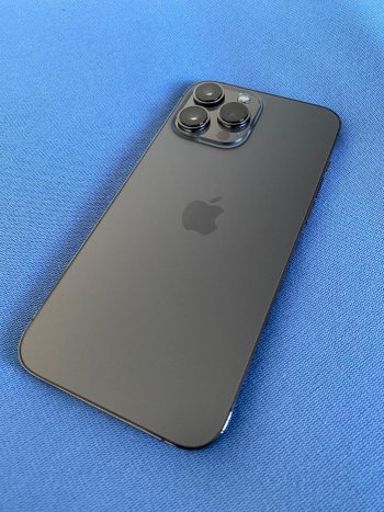
Having had a Graphite iPhone 11pro.......I never liked the way it looked under warm interior lighting. It looked a murky grey/green color (like sludge) instead of neutral grey."In some light, it looks steel, or icey, gray, almost like something taken from the movie “Frozen”.
While other times it has a nice blue tone to it. Before it changes into an almost feminine lavender kind of color.
Some times I find the color so fresh and great, while other times it looks dull and boring (not quite silver, not quite blue)."
This is why I ultimately got rid of my Sierra Blue. I think you summed it up (at least for me). I wasn't too found of how drastic it looks in different lighting conditions. Its not a bad color whatsoever, just wasn't for me. In some lighting it almost reminded me of a Nardo Grey Audi where sometimes it looked too pastel.