Become a MacRumors Supporter for $50/year with no ads, ability to filter front page stories, and private forums.

MacRumors

macrumors bot
Original poster
Apr 12, 2001
65,745
34,444


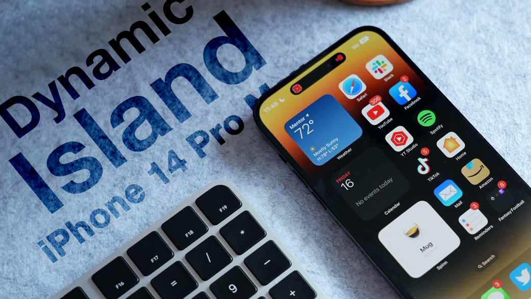
When Apple unveiled its latest iPhone 14 Pro models, many people were surprised by its innovative integration of software functions with the pill-shaped cutout at the top of the screen, which Apple calls the "Dynamic Island."
Dynamic-Island-Thumb-Alt.jpg

Display pixels around the Dynamic Island merge it into one pill-shaped area that changes size and shape to accommodate various types of alerts, notifications, and interactions, turning it into a kind of front-and-center information hub.

But what if you find content that appears in Dynamic Island distracting, especially when you're trying to focus on something else on your iPhone's screen?

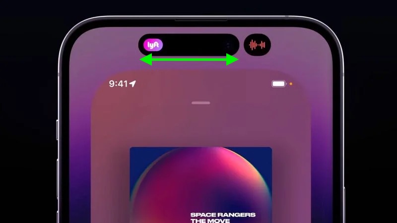
Unfortunately, there's currently no way to outright disable Dynamic Island content, as its behavior is baked into iOS 16. However, if you're distracted by its animations you can dismiss them by swiping left or right across the Dynamic Island, without affecting any related background activity.

For example, if an album in Apple Music is playing and you dismiss the audio waveform and artwork in the Dynamic Island, the music will continue to play in the background. The same goes for when you dismiss a timer – it will still count down in the background even though it is no longer visible on the screen.
dynamic-island-dismiss-content.jpg

If the Dynamic Island is split into two background activities and you want to get rid of one or both, use the same swipe gesture on the larger segment to make it disappear. Then, in the same way, swipe across the remaining activity that extends across the pill.

If you dismiss all activity in Dynamic Island, it will return the pill-shape to its previous inert status, leaving you to focus entirely on what else is on the screen.

Article Link: iPhone 14 Pro: How to Turn Off Dynamic Island Content
 
  • Like
Reactions: I7guy

deuxani

macrumors 6502a
Sep 2, 2010
709
743
I think the content of this article perfectly describes the current state of Apple’s OS’s. It’s getting so complex with no logical cues, manuals or explanations for users, that we have to read articles online to figure out basic functionality like this.

The amount of time it takes to explain some (older) people that left swipe from the top brings the Notification Center and right swipe brings Control Center or TouchID is not pressing the button but laying your finger on it…
 

scrm

macrumors member
Mar 20, 2009
38
154
Phase 1: “A seamless fusion of hardware and software, birthing an iconic new interaction method that’s fun as well as functional? Take my money!”

Phase 2: “Looks cool and my friends think so too but… is there a way to disable it?”

Phase 3: “The results are in: this was a design mistake. It wasn’t broken before, what was Apple thinking? At least the next version won’t have it!”

Case in point: MBP Touch Bar.

Dynamic island is now approaching phase 2.

IPadOS Stage Manager: about to land in phase 1. 😉
 

MauiPa

macrumors 68040
Apr 18, 2018
3,438
5,084
you mean if you don't want to use something you could just turn it off instead of incessantly complain about it? Like setting the Touch Bar to just be Function keys, or complain about it? Who knew?
 

klasma

macrumors 604
Jun 8, 2017
7,440
20,728
you mean if you don't want to use something you could just turn it off instead of incessantly complain about it? Like setting the Touch Bar to just be Function keys, or complain about it? Who knew?
Setting the Touch Bar to just be Function keys doesn’t solve the problem that you can’t feel the keys, have to look at them to use them, and have no tactile feedback of when you actuate them.

And as far as I know, you can’t turn off the DI and/or its animations.
 

Jim Lahey

macrumors 68030
Apr 8, 2014
2,740
5,676
They should replace it with a comparatively inconspicuous notch cut into the upper edge of the display that doesn’t look ridiculous and doesn’t pierce a searing black hole into all your content. Maybe next year? 🤔
 

MauiPa

macrumors 68040
Apr 18, 2018
3,438
5,084
Dynamic Island on the iPhone is equivalent to the Touch Bar on the MacBook Pro. Some will find it cool and a useful feature, others will see it as pointless.
What? You can turn them both off instead of complaining? Who knew? I love the touch bar, never ever used the function keys, but you can permanently set the touch bar to function keys. I’m struggling with some peoples logic. “ wow, I really don’t want that”. “But you can turn it off”. “No thanks, I prefer to rant”
 

MauiPa

macrumors 68040
Apr 18, 2018
3,438
5,084
They should replace it with a comparatively inconspicuous notch cut into the upper edge of the display that doesn’t look ridiculous and doesn’t pierce a searing black hole into all your content. Maybe next year? 🤔
Or do away with faceId and replace it with pictureId. That is secure, 2-d is hard to fool at all
 
Register on MacRumors! This sidebar will go away, and you'll see fewer ads.