Become a MacRumors Supporter for $50/year with no ads, ability to filter front page stories, and private forums.

MacRumors

macrumors bot
Original poster
Apr 12, 2001
65,245
33,524


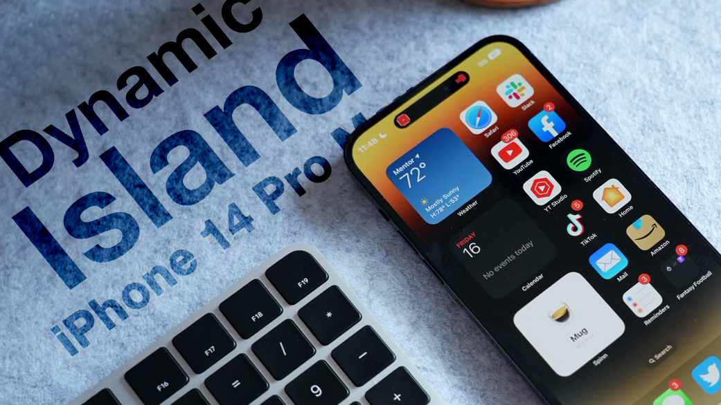
As a means to customize their iPhones, many users want to use custom app icons on their Home Screen. iOS itself doesn't offer a native option to easily change and use custom app icons, but thankfully, the new iPhone 14 Pro and Dynamic Island make it easier to use a workaround to do just that.
Dynamic-Island-Thumb-Alt.jpg

One of the most popular ways users have used custom app icons on iOS is with Shortcuts. Using the Shortcuts app on iOS, users can create a custom shortcut on their Home Screen with any image or custom app icon they wish that opens a specific app. The workaround has not been perfect since there are practical limitations that can be annoying.

custom-app-icon-shortcut-banner-2.jpeg
Intrusive banner when using custom app icons on the iPhone 13 and older

Every time you tap on a custom app icon shortcut on your Home Screen, a large banner appears at the top of your display to confirm the shortcut is running. Many users find the banner distracting and intrusive, which makes the workaround less than ideal.

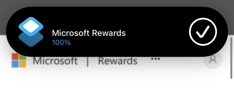
Thankfully, the new iPhone 14 Pro and the introduction of Dynamic Island make using custom app icons with Shortcuts more seamless and effortless. Dynamic Island on the latest high-end iPhones introduces an entirely new area at the top of the display where system-wide alerts and contextual information now appear at the top rather than obscuring other parts of iOS.


One alert that Apple has moved to Dynamic Island is Shortcuts. When running Shortcuts on the iPhone 14 Pro, there is no longer a banner that appears at the top of the display. Now, the shortcut runs seamlessly in Dynamic Island.

custom-app-icon-shortcut-dynamic-island.jpeg
Custom app icon Shortcut running on the ‌iPhone 14 Pro‌'s Dynamic Island


While Dynamic Island makes it easier to run custom app icon shortcuts, other limitations still exist. The most notable is that custom app icons still cannot show notification badges like normal apps. This can be annoying for users who want to use a custom app icon for social media or messaging apps, where notification badges are particularly useful.


Users creating custom app icons was a trend in 2020 following iOS 14, which introduced redesigned widgets to the Home Screen on the iPhone. Since then, Apple has more openly adopted the idea of users customizing iOS to their specific likings, making it easier to use custom app icons and, of course, the entirely personalized Lock Screen in iOS 16.

Article Link: iPhone 14 Pro: Using Custom App Icons Now Less Annoying Thanks to Dynamic Island
 
  • Love
Reactions: alexiaa

Solid_Snake

macrumors member
Sep 21, 2021
33
28
I think it’s more fun to upgrade in a group.
Reasons to Upgrade over the 13 Pro models:1) New design on the front, (2) New 48MP wide camera, (3) Satellite connectivity, (4) Better ultra wide camera, telephoto camera and the front camera, (5) New 5G chip (X65, (6) Crash detection, (7) better thermals, (8) Bluetooth 5.3, (9) Action mode, (10) Always on display.
 

bLackjackj

macrumors 6502a
Nov 14, 2016
920
1,867
Reasons to Upgrade over the 13 Pro models:1) New design on the front, (2) New 48MP wide camera, (3) Satellite connectivity, (4) Better ultra wide camera, telephoto camera and the front camera, (5) New 5G chip (X65, (6) Crash detection, (7) better thermals, (8) Bluetooth 5.3, (9) Action mode, (10) Always on display.
Reasons NOT to upgrade. 1) No Sat connectivity now 2) More annoying lower notch 3) 48mp Camera that takes 80mb photos 4) 48mp Photos only in RAW 5) Meh Ultrawide. 13 Pro Wide good enough 6) Another iteration of 5G that carriers won't utilize. Longer battery & better speed reach with 4G 7) Current Bluetooth no problem at all 8) Already have stabilization on 13Pro 9) Don't need always on. Prefer Always off and more battery, less screen time. 10) iPhone 15 Pro in 11 Months
 

dumastudetto

macrumors 603
Aug 28, 2013
5,502
8,231
Los Angeles, USA
* I never understood why people want to replace beautiful iOS iconography with their own sloppy replacements. Apple should make the banner bigger, not smaller, and more annoying (such as, freeze interaction with the launched app for 10 seconds) to really send a message to people.

* This statement does not apply to "cateye".
 
Last edited:

cateye

macrumors 6502a
Oct 18, 2011
714
2,749
I never understood why people want to replace beautiful iOS iconography with their own sloppy replacements. Apple should make the banner bigger, not smaller, and more annoying (such as, freeze interaction with the launched app for 10 seconds) to really send a message to people.
Sloppy? Sloppy?! (wail) I worked so hard on these icons! (sob) using recipes handed down from gramma when she used to use ResEdit in classic MacOS! (hiccup, sob) To make them my own and reflecting what I find important and delicious! (wheeze sob) If you're not going to appreciate what I do, then ENJOY YOUR "BEAUTIFUL" TV DINNER!! (full-on bawling, taking off apron, throwing it on counter, storming out of kitchen)
 
  • Like
Reactions: CarAnalogy

ProfessionalFan

macrumors 603
Sep 29, 2016
5,829
14,795
More annoying lower notch
This is certainly a take.

Not a good one, but a take. Of all the complaints, I haven't seen someone call it a "more annoying notch" before. Considering it isn't a "notch" and it now is useful instead of totally useless space.
 

dumastudetto

macrumors 603
Aug 28, 2013
5,502
8,231
Los Angeles, USA
Sloppy? Sloppy?! (wail) I worked so hard on these icons! (sob) using recipes handed down from gramma when she used to use ResEdit in classic MacOS! (hiccup, sob) To make them my own and reflecting what I find important and delicious! (wheeze sob) If you're not going to appreciate what I do, then ENJOY YOUR "BEAUTIFUL" TV DINNER!! (full-on bawling, taking off apron, throwing it on counter, storming out of kitchen)

If you've been using Apple products since the classic MacOS days, I salute your savvy investments. You clearly have impeccable taste, so I'm putting a disclaimer on my statement to exclude you.
 
  • Love
Reactions: cateye

mxjcmxjc

macrumors newbie
May 18, 2021
5
9
I'll wait for the iPhone 15 Pro Max/Ultra :). I don't find the notification that annoying to consider an upgrade.

I recently switched to Apple from Samsung (2021) and I have been loving the experience so far and not feeling the need to upgrade is par for the current course.
 

gavroche

macrumors 65816
Oct 25, 2007
1,465
1,590
Left Coast
When I use the launcher app to click on an app icon, the entire screen momentarily switches to the shortcuts app, then to the app I’m launching. I’d there a way to change that? Nothing from dynamic island has changed that.
 

adammusic

macrumors 6502a
Jun 6, 2007
685
912
Why am I getting gigantic dynamc island shortcut notifications sometimes?
 

Attachments

  • 47513277-0B3F-404C-9EFC-E672A8BB3EED.jpeg
    47513277-0B3F-404C-9EFC-E672A8BB3EED.jpeg
    190.1 KB · Views: 87

CrysisDeu

macrumors 6502a
Sep 16, 2018
868
1,266
Retrospectively, still feel this pill shape cut out should have been introduced on iPhone 13, maybe even as far back as iPhone 12.

Dynamic islands is welcome and a step in the right direction. Unfortunately, the notch hung around too long in my opinion.
The pill will hang around too long in the future. This is today’s Apple unfortunately
 

CarAnalogy

macrumors 601
Jun 9, 2021
4,865
8,807
That is an awfully positive spin. I prefer another phrasing. “Apple using shortcuts banner as stick to encourage upgrades.”

There is no reason the current shortcuts interface has to be as terrible as it is. I don’t use them because they are more annoying than just doing it manually. If I have to manually confirm and/or be stuck with an annoying notification that blocks my input, why bother.

Making them less ugly with an exclusive software feature is not the answer.
 

CarAnalogy

macrumors 601
Jun 9, 2021
4,865
8,807
It still irks me a little that Apple needs us to buy a phone with a Dynamic Island just to make these constantly regular, pop-up system UI banner notifications less annoying and cumbersome. They could have improved notifications on phones without a Dynamic Island too, just saying.
This. First it was the M1 and now Dynamic Island. If you don’t have the latest hardware Apple doesn’t care about you anymore. This has kind of always been true but it’s gotten extreme recently.

The notch is sooo last year :rolleyes:
 

bLackjackj

macrumors 6502a
Nov 14, 2016
920
1,867
This is certainly a take.

Not a good one, but a take. Of all the complaints, I haven't seen someone call it a "more annoying notch" before. Considering it isn't a "notch" and it now is useful instead of totally useless space.
No it's not a take. Useful? It takes up valuable real estate. Apple have attempted to control the Notch narrative for years, and it seems a lot are simply getting sucked in. It is still a notch/ pill, look under the sunlight. Software cannot hide it and it looks awful if you see it in person. It looks like the same notch, only lower and in your face. No thanks.
 
Register on MacRumors! This sidebar will go away, and you'll see fewer ads.