Become a MacRumors Supporter for $50/year with no ads, ability to filter front page stories, and private forums.
Never owned a case and never will. Since the 3g. Just never liked them. But I understand why most use a case. And nope never broke a screen or anything
Agreed! I stopped using cases after the iPhone 4. The stainless steel and the all-glass factor were too beautiful to be hiding away under a plastic or rubbery case. Not against cases or anything. I baby my iPhones and I'm overly gentle with them. It does come with a price but it's worth it.
 
Why do they always pick ugly and obnoxious colors? Every time I have to get a white phone because it's like they pull these color selections from women's athleisure catalogs. And the white color hasn't been that great since the XS.
I love the pink and blue, but they aren't Pro. This red won't be bright like Product Red. It's going to be like all the other "colors" that look dark gray/black.
 
  • Like
Reactions: Lyrics23
I really don't get all the excitement over colors. Is anyone really using these things without a case? I'd like to but I tried it with the iPhone 6 and ended up with a shattered phone, even though I'm a lot more careful than most.
I still use my iPhone 11 pro as my daily driver — never used a case, and dropped it a ton of times even though I am really careful with it. No skin, no case, no screen protector.
 
All subjective, of course. I like these a lot. The non pro 11’s were the worst to me
Admittedly I was so excited that they made a nice looking green with the 13 series that I upgraded from my 12. My taste probably doesn't align well with many people so it is definitely subjective. The non-pro 11s were also pretty bland, but of course I thought the midnight green 11 Pro was nice!
 
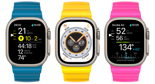
Based on a recent Apple PR release, I wouldn't be surprised if the pink and blue colors depicted here show up on at least one of their products this year. Folks may not remember, but eagle-eyed Apple fans noticed the unreleased light blue and pink Apple Watch Ultra ocean bands depicted in the Oceanic+ app page that was published two months ago (https://www.oceanicworldwide.com/oceanic-plus/) and they seem to perfectly match the colors shared by 9to5Mac. My guess is that Apple is experimenting with these colors and that we'll see one or more products with them during the next 10 months.
 

Attachments

  • webpage-banner-3.png
    webpage-banner-3.png
    396.9 KB · Views: 62
Is it just me or does it feel like this is the one rumor they get wrong every single year.... I don't remember them nailing a color yet. At least not this early in the rumor cycle. Once production starts then yeah its easy to figure out the color then.


The long wait for an orange iPhone goes on..
I really thought this was the year, with the watch ultra and all.
 
Is it just me, or are the colors getting worse every year? The 14 series is so bland it is sad and that pink and blue look awful. The burgundy looks decent, but not really my style.
I would agree that Apple needs to reevaluate their color palette. The non pro line has been a slightly different hue of the same colors for years. Pro line is one special color and the same gray/gold/white. Yawn 😴
 
I really don't get all the excitement over colors. Is anyone really using these things without a case? I'd like to but I tried it with the iPhone 6 and ended up with a shattered phone, even though I'm a lot more careful than most.

I actually had to take my case off to remind myself what the color was so....(black btw)
 
Register on MacRumors! This sidebar will go away, and you'll see fewer ads.