Got a tip for us?
Let us know
Become a MacRumors Supporter for $50/year with no ads, ability to filter front page stories, and private forums.
iPhone iPhone 5 Wallpapers - 640x1136 [Some may be NSFW]
- Thread starter iBell
- Start date
- Sort by reaction score
You are using an out of date browser. It may not display this or other websites correctly.
You should upgrade or use an alternative browser.
You should upgrade or use an alternative browser.
- Status
- Not open for further replies.


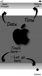
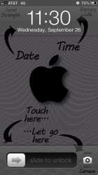
Brilliant job! The only problem - and it's in the original design - is that it must've been created before iOS5 allowed us to open the camera from the lock screen. The "Let go here" arrow points to the camera icon. I can live with that.
Thanks for all of your assistance in this thread.")
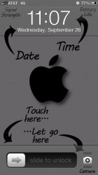
This kind of image is easy enough for a no-skills-in-Photoshop person like me to edit (read: crop and paste) in Preview, so I've moved some elements around to fit iOS6
Looks like this:

- Let Go Here was moved to fit the slider with the quick camera launcher
- Need Charging text moved below the battery icon, as the rotation lock/location services arrow/etc would overlap
- Touch Here was moved down to match the 'submerged' look of the Let Go Here text
- Date & Time moved slightly so the tip of the arrow touches the center line of the 'glass'
- Network Info moved down slightly so all of the text is below the status bar. Even with the text moved down, the hour number never touches the text at any time, as the time centers to the right
Everything's been moved actually
Download it here
I took this one a bit further by changing a few things and doing my best to create a transparent effect on the Lock Screen.
Let me know what you guys think.
Attachments
I took this one a bit further by changing a few things and doing my best to create a transparent effect on the Lock Screen.
Let me know what you guys think.
Here's what it looks like on the Lock Screen:
Attachments
Here's what it looks like on the Lock Screen:
I must say thats one hell of a ugly wallpaper. Sorry, just had to say it.
Moar girls pls. I was not allowed to say the word starting on p and ending on y but please, more girls.
iPhone 5 wall papers? i am trying to do some horror/Halloween backgrounds for October on my phone.
thank you in advance!
I didn't read the title of your post until I already resized a Halloween-ish image. I'm posting this anyway.


Here's what it looks like on the Lock Screen:
Looks interesting. Would you mind taking a look at my request on the previous page? Thanks so much.

That's fantatic! Thanks so much. I did forget to mention to exclude the text in red though. Otherwise, awesome and thanks again!
Here you go.
Attachments
I must say thats one hell of a ugly wallpaper. Sorry, just had to say it.
I admint, it's not the prettiest wallpaper... but it's hard trying to make the image transparent.
Here's an attempt with a slight pattern in the background. . .
Attachments
Looks interesting. Would you mind taking a look at my request on the previous page? Thanks so much.
If you mean your Post #1282, the link is Not Found. What does it link to? Or repeat your request?
Last edited:
iPhone 5 wall papers? i am trying to do some horror/Halloween backgrounds for October on my phone.
thank you in advance!


I admint, it's not the prettiest wallpaper... but it's hard trying to make the image transparent.
Here's an attempt with a slight pattern in the background. . .
I'm currently using the patterned version.
Thanks!Adding the white pattern to the darker version lightens up the whole design a bit and cuts the screen glare that the original white on black design has.
Last edited:
I took this one a bit further by changing a few things and doing my best to create a transparent effect on the Lock Screen.
Let me know what you guys think.
could u do this but with just the Apple logo and nothing else?
could u do this but with just the Apple logo and nothing else?
Here ya go. . .
Attachments
While she's attractive, the dimensions are off. This is not 640x1136.
I'd say her dimensions are right on.
If you mean your Post #1282, the link is Not Found. What does it link to? Or repeat request?
Post 1334. (But yes, 1282 was broken.)
I took this one a bit further by changing a few things and doing my best to create a transparent effect on the Lock Screen.
Let me know what you guys think.
Very cool. Do you have a plain grey wallpaper to use for the home screen?
Very cool. Do you have a plain grey wallpaper to use for the home screen?
I don't have it for the home screen, but here it is for the Lock Screen:
Attachments

I don't have it for the home screen, but here it is for the Lock Screen:
That works. Thanks! I just cropped the grey area to use as the home screen wallpaper.
I admint, it's not the prettiest wallpaper... but it's hard trying to make the image transparent.
Here's an attempt with a slight pattern in the background. . .
what is the font? could you give me the pds to convert it into Italian?
Would someone mine redoing this one with the transparent menu bar at the top? It's already the right size, just wanted the transparent bar. Thanks in advance.
ecco a te
Attachments
- Status
- Not open for further replies.
Register on MacRumors! This sidebar will go away, and you'll see fewer ads.